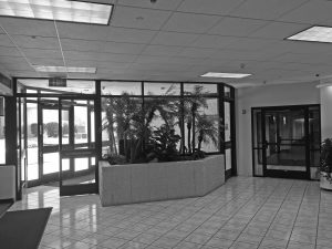
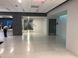
AT&T Office Lobby Renovation [2017] in Tempe, Arizona was a project that Serbin Studio helped design a high security entry and customer experience. Customers are the Data Center tenants, they do not work in the building but check in periodically. The customer experience needed to be re-designed.
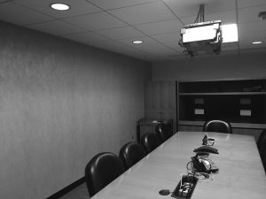
Conference Room Too Dark and Tight
Existing conference room was cramped, outdated and lacking latest technologies.
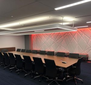
Two existing rooms were combined to make one large conference. The client wanted something artful, An accent wall was designed with an etched texture and LED color changing perimeter. A suspended light fixture helped lighten the mood. New carpet, ceiling tiles, furniture, and finishes were selected by Serbin Studio.
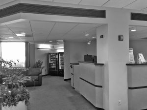
Check-In Lacked Visibility at Entry
The dark corner was home to vending machines and elevator. This area was to become the Customer Lounge. Visiting Data Center customers needed a space to have a quick bite to eat and lounge.
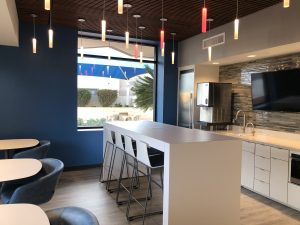
The new Customer Lounge was designed with new cabinets finished in plastic laminate. The flooring for the Lounge was vinyl. Two new windows were installed to let in natural light. Mixed furniture layout was designed with both high and low seating.
The existing elevator and vending machines remained in place. Frosted glass floor to ceiling wall was designed to screen the vending machines from the Lobby. Terrazzo tile replaced ceramic tile for the entire Lobby.
Lobby Vestibule Experience Was Outdated
The existing entry and restrooms were outdated.
The entry and reception security desk was completely reconfigured. The restrooms were renovated with ADA standards, new plumbing fixtures, and finishes. A new accent wall was designed for the Lobby to create color and texture. The end result was an entry sequence that made sense and provided modern control systems for ease of security.
