Whether you know you do it or not, wherever you go anywhere your eyes look for color balance. This week, I picked out some gems from my library to show color balance in my past travels.
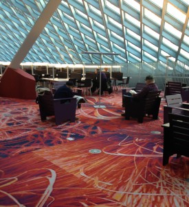
The top floor of the Seattle Public Library has great balance of color. For me, this balance is about complimentary colors playing with one another. The light powder puff blue window system makes the fiery red carpet tiles look redder. I love the depth of the pattern on the carpet, it draws the eye into the dark shadows and light accents on the flowers. The base of the column is matching the carpet and the dark furniture grounds the whole scene.
Tomato doll hangs inside the Owl Sprit in Port Townsend, Washington State. The interior of this place is a good balance of earthy and cool colors. I know if the interior was black and white ONLY the soft tortilla tacos with beans and rice would definitely NOT be as good. The interior colors, home made food and patchouli hippy vibe make this my all time favorite place to eat. Ever….for all time. Period. Done.
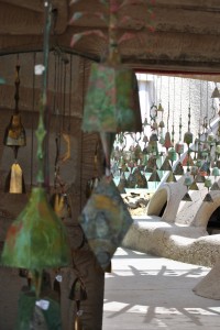
Color balance in the desert is hard to see because most colors are diluted by the intense sunlight. When it is overcast or early in the morning colors in the desert can really pop. Lily and I visited Cosanti, an artistic bell making studio designed by Paolo Soleri last June. I loved all the dusty turquoise and bronze colors against the sand colored structures that remind me of Luke Skywalker’s aunt and uncle’s home in Tatooine. *can’t believe I just looked that up for you*
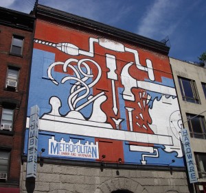
This graphic billboard was a visual relief in the tightly packed city of New York. It is a masterful example of how the dirty white and brick buildings sandwich the punchy art. This particular sky blue color works well because it is a crossover color which means it is a color most often found in nature. The bright white jumps out against the gray base below. “…the human eye sees white as a brilliant color. For that reason it works well for contrast, in signage, at point-of-purchase, in packaging, or any other usage where it will catch the eye.” – Leatrice Eiseman author of Pantone Guide to Communicating with Color.
Jeffrey wanted to show you his car photos. I chose this one out of the stash because the white is so snappy against all the green turf and red gravel. There is a lot of color on everyone’s clothing which doesn’t give the eye anywhere to rest. Try to imagine this Morgan in terra cotta! Cars definitely add interest when you are driving on a graphite freeway with sky blue overhead.
I hope you have a fun weekend!


