by Jeff Serbin | Feb 19, 2014 | Architectural Planning, Architecture, Blog, Planning
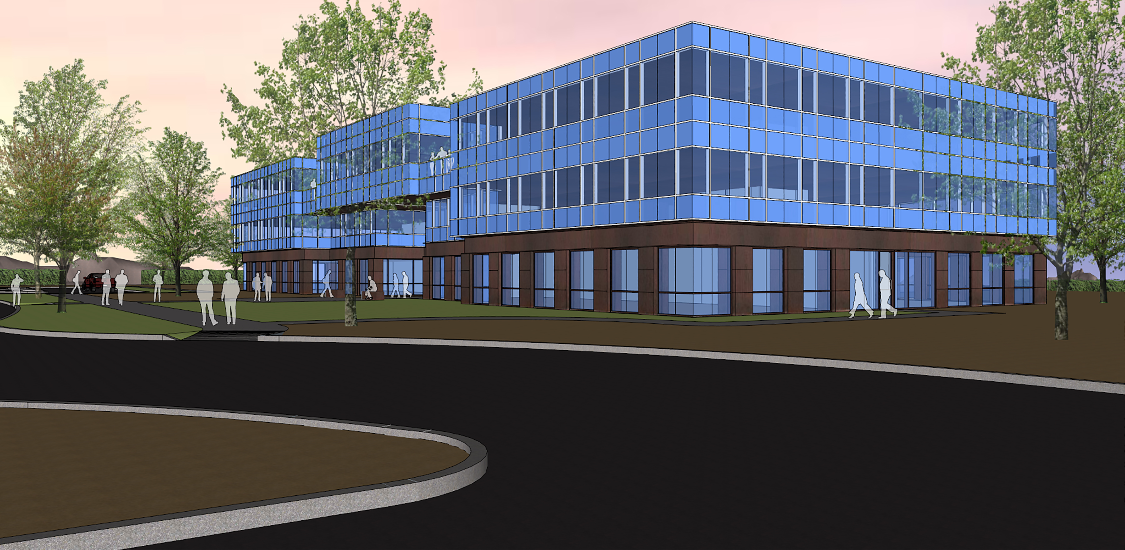
Creating an office building is about designing an environment that creates a place for the workforce to perform their tasks efficiently while enabling the building owners to maintain their assets easily.
click to enlarge[print_gllr id=1520]
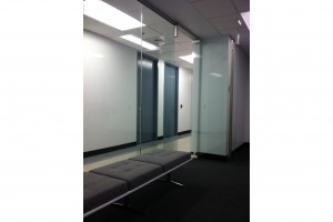
This 60,000+ square foot office building was designed to create that comfortable work environment. This sustainable facility utilizes low energy building components by incorporating the latest technologies. The building is designed with an efficient rentable to common space ratio, high performance exterior skin, low water use fixtures, energy efficient mechanical and electrical systems and environmental sensitive materials. It was designed with LEED GOLD in mind.
Some interesting facts about latest technologies.
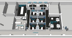
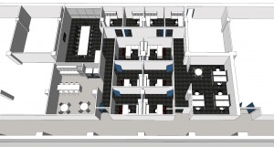
The shell of the building is just the beginning. Once tenants begin to occupy the floors, the real magic begins with space planning to create unique micro environments that satisfy the users needs while being efficient with space. The more wasted space there is, the more rent they need to pay and space to maintain.

Space after tenant improvement
SEE ALSO: Tailor Your Office Tenant Improvements

by Jeff Serbin | Feb 6, 2014 | Architectural Planning, Architecture, Blog, Collaboration, Planning
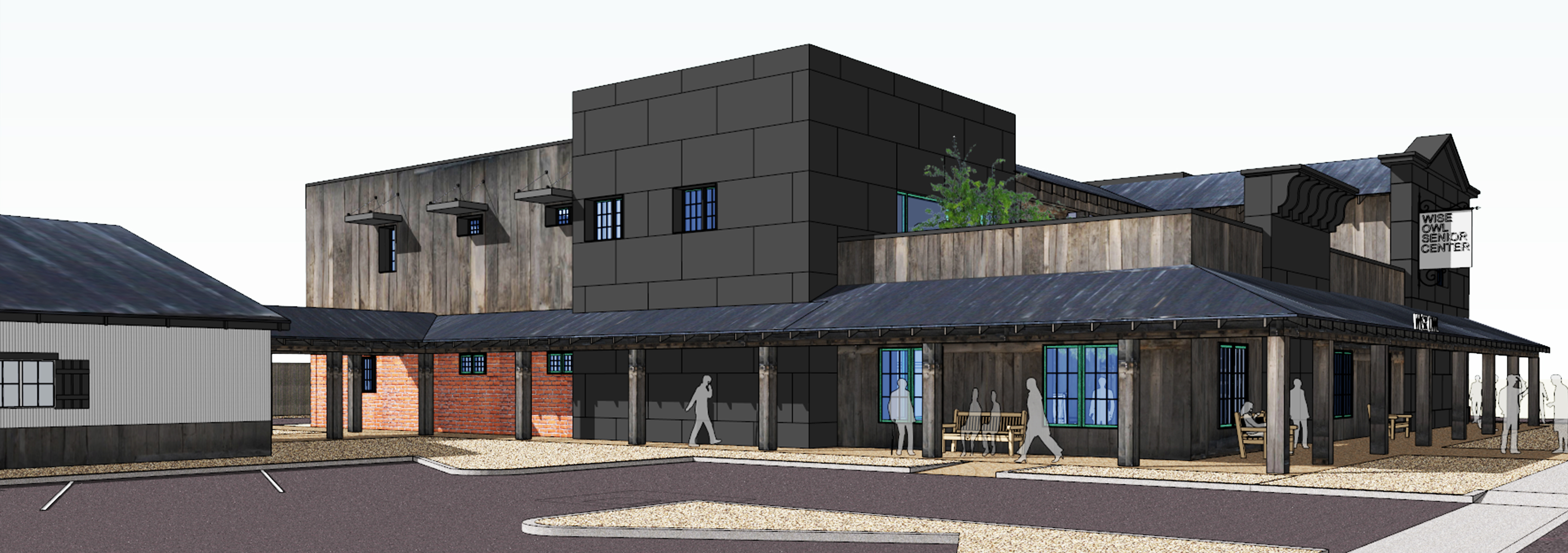
Have you heard the term “He is a wise old owl?” You can find many wise owls at Wickenburg’s local senior center, Wise Owl Senior Center, located just south of the Santa Fe Railroad tracks. It’s facility was founded in 1979 and has been wisely used over the years.

The existing 6,500 square foot facility has seen many card games (hopefully no strip poker), bingo games (I22), musical bands (I heard the Grateful Dead played there), billiard games (part of Color of Money was filmed there) that have been played in its facility over the years. The center has outgrown its use and the Foundation for Senior Living who operate it, are looking to revitalize the establishment, once it can gather enough gold nuggets from the local mines in and around Wickenburg within its talons.

Serbin Studio first task was a ‘programming session’ or fact gathering, working with the facility managers and users to get a grasp on how the facility operates within the existing building and how it operates. The current building lies outside the historic downtown core of Wickenburg and is camouflaged, like an owl, into the surrounding neighborhoods. Like an Owl who can turn its head as much as 270 degrees, Serbin Studio took its design a step further and designed a facility which looks a full 360 degrees.
The design is two stories and 14,000+ square feet, reflecting on the historic fabric of Wickenburg which is influenced by many things: mining, railroad and the ranch lifestyle. As an owl flys silently, the building pleasantly surprise its users once they step foot into the private courtyard. It’s amenities include a full service Dining Room and associated Kitchen and food distribution on its first floor. The second floor contains meeting rooms, a game room, computer center to email the grandchildren, offices and conference rooms to manage all the programs they offer. The second floor also offers and outdoor patio with views to the local mountain ranges so you can keep your eyes on those claims you may have in them mountains. It’s also a great place to watch the summer monsoon’s roll in from the North.
[print_gllr id=1420]
The project is only in the conceptual phases, however we hope the design will provide momentum to allow the facility to expand.
by Jeff Serbin | Jan 23, 2014 | Architectural Planning, Architecture, Blog, Graphics, Interiors, Planning
Leasing a commercial office space is one of the largest expenses incurred by new or expanding businesses, so it is important to do your due diligence. As an architect, I am usually called in when the lease is about to be signed and the business is trying to determine the cost and time involved in preparing a design for permitting and construction. From a designer’s viewpoint, this tends to raise a flag because it is important to look at the options in a space earlier in its selection.
Location can be driving many factors on where that space is located, but fitting your business within an existing building or space with its multitude of factors can affect its layout.
1) Square footage of space. Will it fit?
2) Orientation within the complex. Is it easily found, is it visible?
3) Orientation to parking and availability. Is there enough?
4) Restroom facilities. Are existing provided and to code? New bathrooms add significant costs.
5) Condition of existing mechanical / electrical systems. Depending on the type of business and its intended use, existing systems may be inadequate or not meeting current building codes.
6) Does it portray your business image or philosophy?
A well trained architect can look at a space to determine what may need to be addressed. We can look at the variety of options that are presented to you typically by a real estate agent. An architect can come up with a variety of layouts within the confines of a space to determine if it will fit with your needs before you sign the lease.
When you sign that lease and then hire a architect, it’s like buying a custom business suit without having it fitted first. Since its custom, it’s not returnable and you will be wearing an ill fitted suite for many years. It’s not really a custom suit, is it?
So next time your are looking to expand or update your current facility or lease in a new location, and your working with a real estate agent, hire an architect to help you with those design issues to make that space well fitted.
[print_gllr id=1372]
by Jeff Serbin | Jan 22, 2014 | Architectural Planning, Architecture, Blog, Interiors, Planning
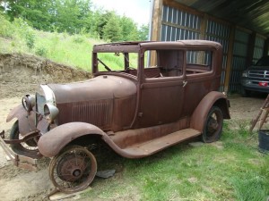
I recently visited the Barrett Jackson Automobile Auction in Scottsdale, Arizona to witness the old vs. new, the factory vs. custom, the ordinary vs. unique, items costing a few dollars to ones that will empty your wallet. Its all about DESIGN.

1920’s Ford Model A (barn find)
Just like architecture, historic vs. new, tract vs. custom, ordinary vs. unique, one can really gain an appreciation and inspiration from other forms of design. For some, design may come from fashion, looking at silhouettes, fabrics, colors and textures of clothing on a supermodel.
Others may get inspiration from nature, looking at the forms of plants or animals or shapes of minerals formed by thousands of years of pressure. For others, it’s the fashion of the automobile with its silhouettes, materials, colors and textures of a supercar.
As an architect, I am not customizing something on 4 wheels, but sitting on a concrete foundation. Just like a car with a destination in mind, sometimes with a focus of Horse Power or driving in style from point A to point B, architecture serves a purpose for creating a space to get work done in a quick and efficient manner or to live in luxury or style. And just like a car, buildings do need restoration, from structural frame up restoration or rotisserie restorations. Say that really fast about 10 times and you can be an auctioneer at the Barrett Jackson.

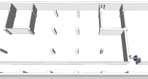
Space prior to restoration

Space after restoration
As an architect and working on tenant improvements, I feel like the early coach builders from the 1900’s or the custom car designers of today. The idea of taking an old building designed for a particular past use, cutting and chopping, moving elements, creating new spaces, changing finishes, selecting fabrics for the furniture is all part of the customization of architecture. It takes a bit of time and imagination to transform something from old to mimic designs of the past or create new concepts.

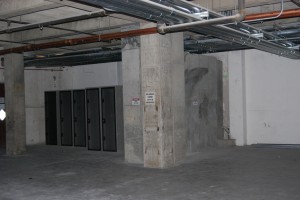
Space before tenant improvement

Space after restoration
All you need is an architect who specializes in customization of the built environment. One who understands and cares about the users and visitors, how they plan to use the space and the setting in which they want to work. One who looks in the past and towards the future. So the next time you are looking to design something new and exciting or retain something of old, look for ways to get inspired.

by Lara Serbin | Jan 15, 2014 | Blog, Collaboration, Commercial Architecture, Graphics, Planning
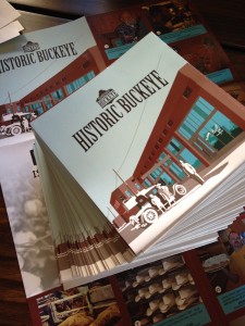
The view from the double swinging aluminum doors of the Chase Bank in Historic Buckeye is quite spectacular. Everything inside is a typical Chase interior except when you glance out the front doors which looks onto the rustic aged super graphics painted on the brick of the historic San Linda two story building. The rustic brick cropped image beyond the glass doors is such a stark contrast to the sleek commercial interior. You know you are in the heart of Historic Buckeye.

I was dropping off a stack of the brand new maps of Historic Buckeye. I had some banking to do and after I was done I shared the map with teller Blanca Villareal. She became very friendly as she explained, “I have lived in Buckeye since I was 10 years old.” She was excited that something had been done like this for Buckeye. The Buckeye she remembers was a robust down town full of activity and buzz. The flier made her feel hopeful for the future. She thought the maps would be a great item to give to a new client opening up an account. Blanca has noticed that more people are buying homes and opening new accounts in Buckeye. Derek Stephens, a third generation Buckeye local and personal banker for this particular Chase branch was happy to see the fliers. He opened up the flier and his whole face lit up, “This is awesome! I love the photo of Hobo Joe!”.
[print_gllr id=1403]
This map was a group effort designed and printed by the Buckeye Main Street Coalition. I am very proud indeed to be a member of this group. Our group combines the unique skills and vantage points of both public and private sectors to revitalize down town historic Buckeye commercial district. Through a gradual process that begins with small steps, sustainable improvements are being achieved.
Haiku for the week:
A Reflection On:
Hellbent dilema
or lofty grace following.
Stay up dancing too.
-Lara Serbin

by Lara Serbin | Jan 6, 2014 | Architectural Planning, Blog, Graphics, Planning
Last month I had the irresistible inspiration to design a custom flier for the local businesses in Historic Buckeye, Arizona. The project was first started at a Main Street Coalition mixer when the local business owners voiced a concern for a flier of some kind to attract more Main Street activity. Back in October I really had no idea what our team would come up with. I always keep a file of graphic examples I collect from my travels sometimes a well thought out menu, a smart city guide map, or a vintage travel postcard. The idea has to hit me and then I know I am ready to work.


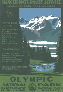
The graphic on left is the final artwork that I completed for the Historic Buckeye Flier. The postcard on the right was a treasure I picked up while driving with my family along the Olympic Coast last summer *had to buy a plush flying squirrel for Lily too*. See, one never knows when the stuff you save will become useful. The Olympic postcard sits on my bulletin board at my desk. I especially like how the mountains and everything are not outlined with a profile line to contain the color. It reminds me of Gustave Baumann color woodcuts. Now that is an art form I would like to try some day. First I have to master wood carving or at least carving into vinyl.


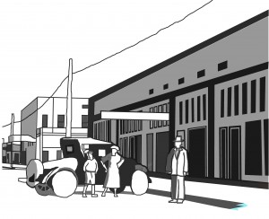
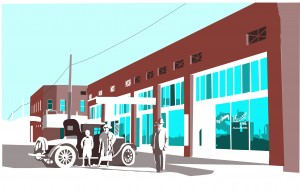
The image on the left is the first pass at rendering the Historic Main Street in Buckeye earlier in 2013. It is very basic, I was not even up to detailing the rims of the Model A at that time. The image on the right shows my expanded experience in just 2 months. I really like the subtractive nature of the white. I also liked how crooked the window panes are. For the flier, I tightened the shapes up considerably. But what a difference of spending some time to learn something new. It is all about repetition of the commands and being patient.


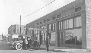
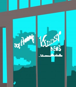
The black and white photo on the left is The Ware Building constructed in 1910 on the southeast corner of 4th Street and Monroe Avenue in Historic Buckeye. The graphic on the right is for anyone who wanted to see a zoom up on the window reflections. See the Model A?
There will be more on the flier itself in an upcoming post, this graphic is just a piece of the flier. The first 2 thousand are being printed right now. This is an important collaboration among Buckeye Main Street Coalition members, City of Buckeye stake holders and local business owners. I thank them for taking this step towards encouraging more activity for this new year!
You’re really going to like this: a weekly haiku.
Our World…
Pluck sleep as it sees
Eyes must alternate on grass
Violet dreaming.
-Lara Serbin
