by Lara Serbin | Nov 14, 2013 | Blog, Collaboration, Graphics, Planning
This is an update on the Buckeye Main Street Coalition project at Benbow Veterans Park Alley. The list of things to do for the alley are many but one of them is to design a super graphic mural for the back side of the Napa Auto Parts building. The design story goes like this:
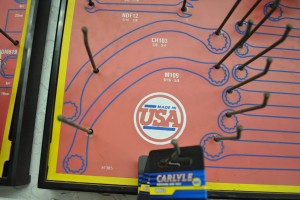
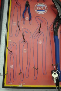
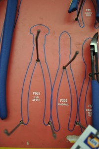
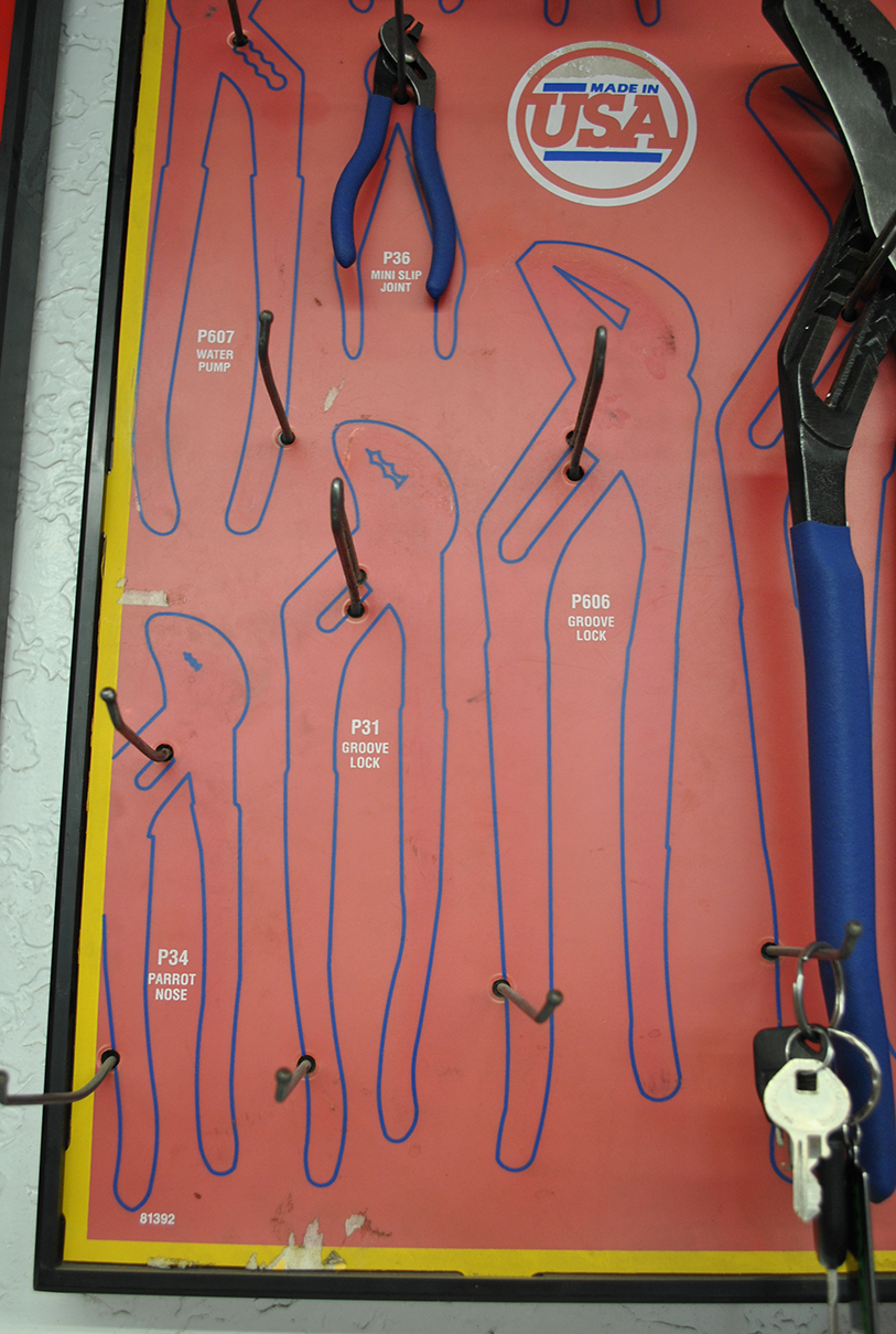
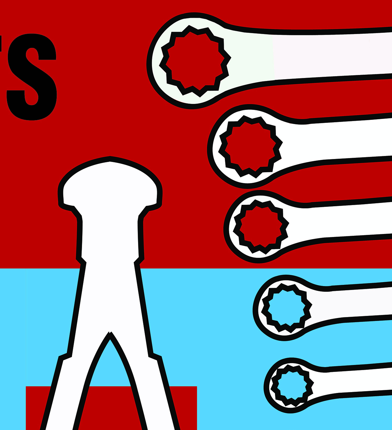
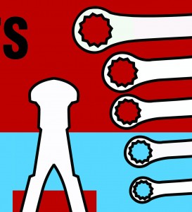
I shot some photos of the tool hooks inside Napa one day. It was a sunny day and there was a caballero talking shop with the guys behind the counter. The fluorescents were buzzing overhead and I scanned the walls for some kind of inspiration for the mural graphic. The shapes behind the tools hooks were perfect, so I photographed enough wrenches, diagonals, and end nippers until I was satisfied.
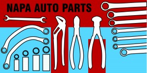
Did I mention that before my daughter’s recent bat mitzvah I didn’t know how to use Adobe Illustrator? I taught myself how to use the program and managed to do graphics for her western themed party. So I was ready to try working up the graphics for the Napa mural. The cool thing about the Illustrator program is that once you draw the graphic you can enlarge it to building size and it won’t become pixelated and fuzzy. It is a beautiful thing! The graphic on the left is my end product.
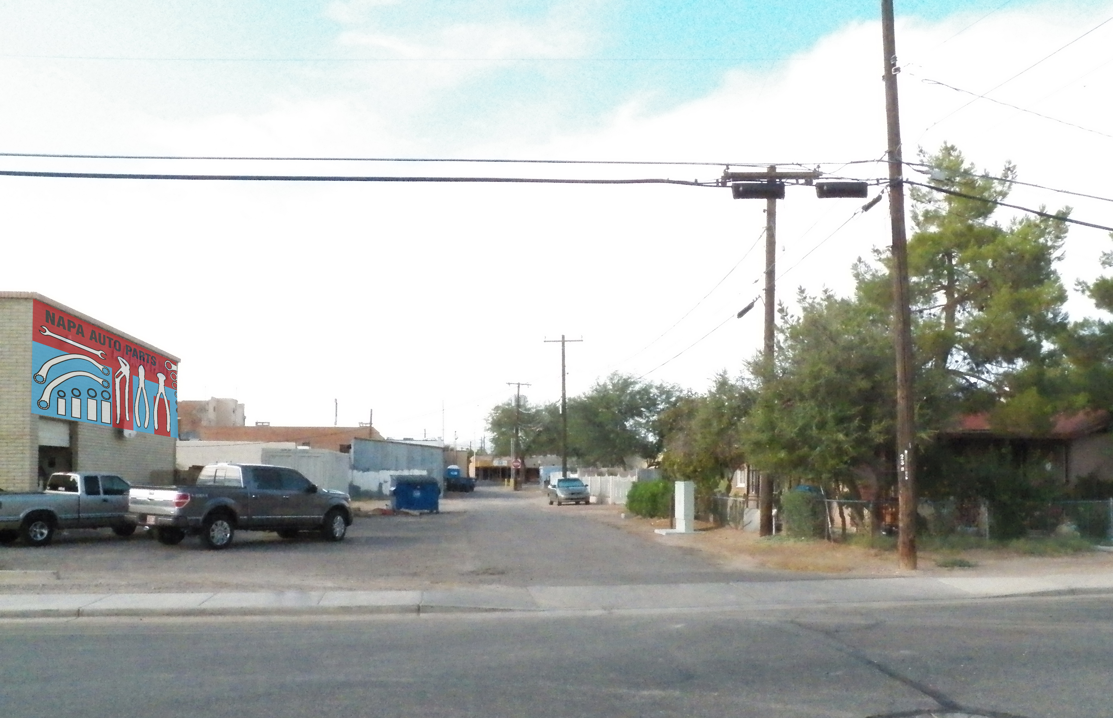
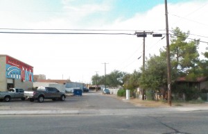
The photo on the right is the alley with Napa Auto Parts building on the left. See the future mural? The photo below is looking north into the entry to the Alley. Currently, semis unload at the back of house of the Napa Auto Parts. See the garage door there in back of the trucks? Ford is the official truck in Buckeye.
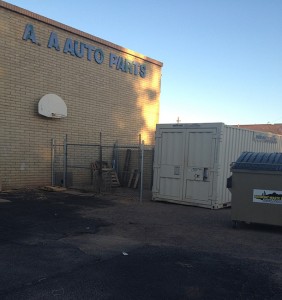

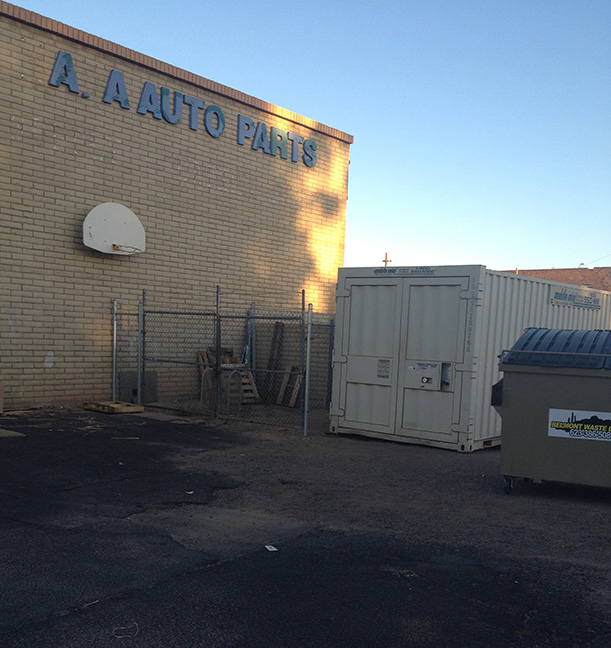
Here is the wall up close. Mike, the owner of Napa has agreed to clean up the wall to get ready for the new mural. Bye bye basketball hoop and decayed letters. I am thinking this mural will help his business by advertising what is inside. Who would ever guess he has everything you would need for your auto inside this beige building.

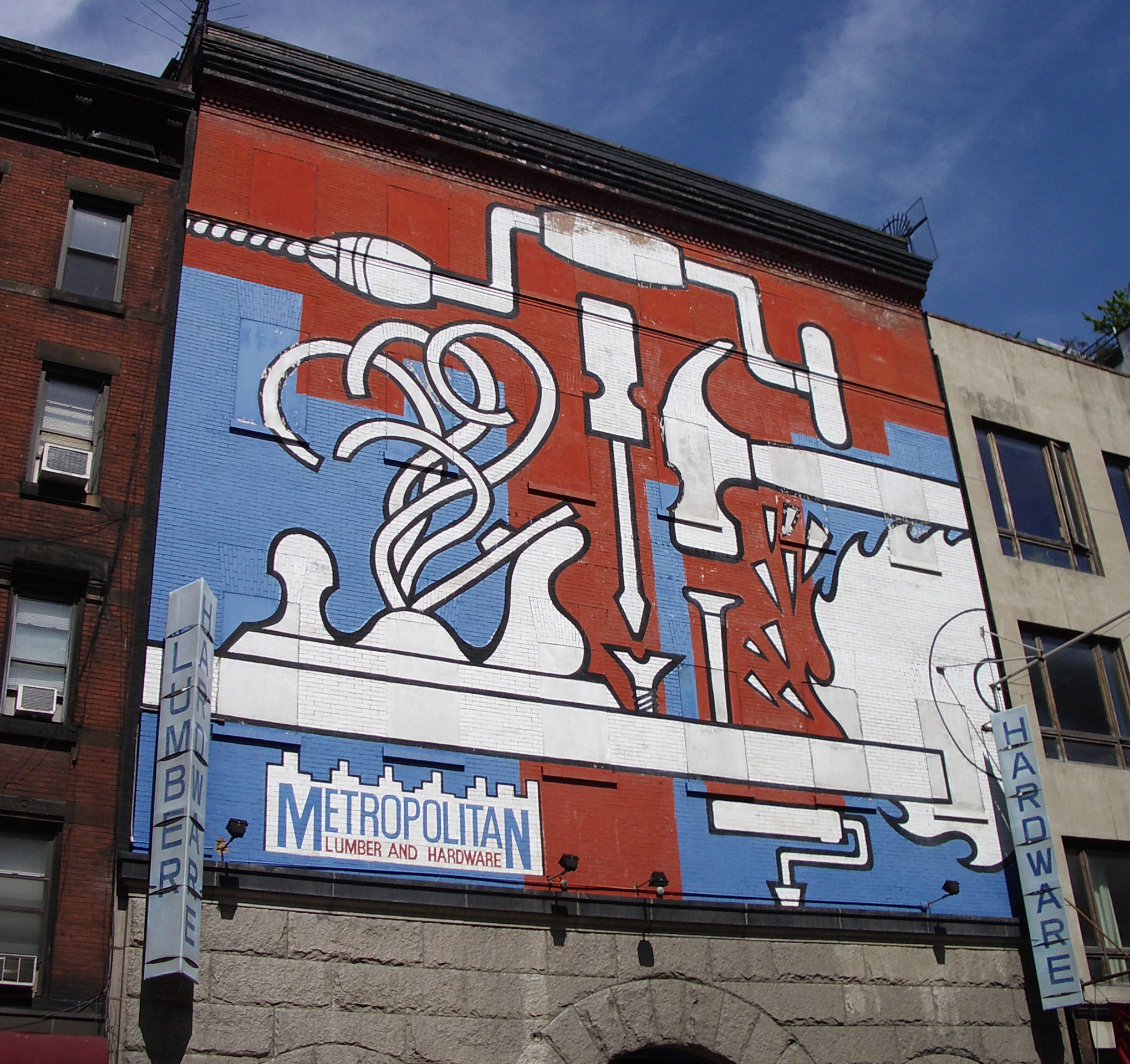
This was the mural that inspired me. This photo was taken from Metropolitan Lumber and Hardware in New York City a few years ago. Do you want to see the Napa mural close up? Ok…wait just a minute.
Even if this was the mural it would look amazing. Those thick profiles too…

by Lara Serbin | Nov 9, 2013 | Architecture, Blog, Collaboration
I really get a kick out of public speaking. This week I was invited to speak to the kids in the Drafting class at Estrella Foothills High School. I decided to go general and personal so no power point. I was kind of all over the place but found my stride after this guy up front yawned in my face. I have to remember to make it about them in some way.
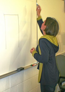
No matter how advanced computers get I want kids to learn how to sketch. Drawing an idea in front of people creates understanding so quickly. I hope at least a couple of them get a hold of some buff trace paper and markers. I have 2 more high schools to visit this month. I think I will stick to the rule of 3 topics: training to be an architect, experience working for architects and the journey of having my own firm.
by Lara Serbin | Oct 24, 2013 | Architecture, Blog, Collaboration
I just rsvp’d for my 20 year reunion at the College of Architecture at the University of Arizona in Tucson. I just got totally excited about this when I saw the centrum with those terrific columns they installed when we were there. The columns are not there anymore. All the good times came rushing back to me. Funny that I am still wearing Birkenstocks while I check off that I am coming to the event. How could I not come. I hope lots of my alums show up. We are or were such a competitive bunch. I guess that is why I watch Project Runway because it reminds me of the pressure to come up with a design idea and make it work.

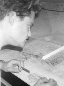
There is Jeffrey and I working away in studio. Studio work was best done at night. Today College of Architecture is looking really slick and modern. When we were at school we occupied the older building with no fancy computers. We were actually discouraged from the professors to use any computer aided design and wearing clothing that fit well.
Top Ten Reasons for Being at Studio:
1. Jeffrey.
2. No clean up ordinance.
3. Walking to 7 Eleven for pretzels and soda.
4. Eavesdropping on people using the sole pay phone.
5. Studio smell.
6. Thrift store couches to take naps during an all-nighter.
7. Laughing at Shawn Shahabi and Brian Farling.
8. That guy who always wore 50’s clothes.
9. John Mele impersonations of Professor Bogosian.
10. When the structures professor said my design was so good he could roast an ox in there.
Just Flip the Plan!

For Madison Dwight.
by Lara Serbin | Oct 18, 2013 | Architecture, Blog, Collaboration, Commercial Architecture, Planning
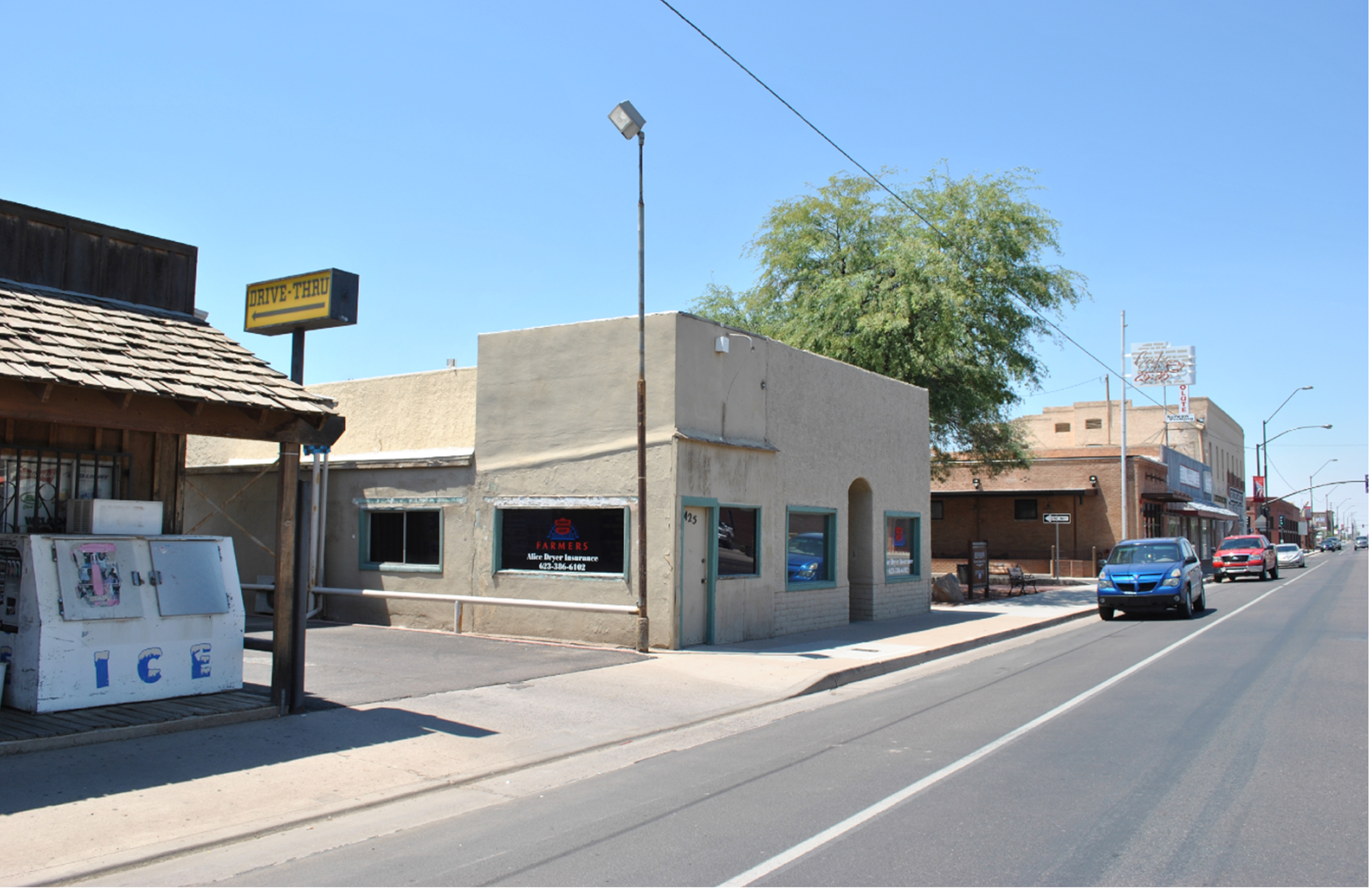
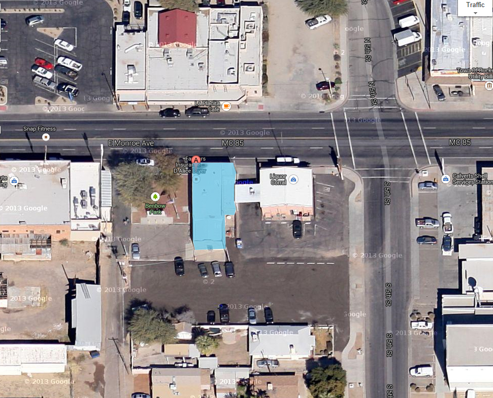
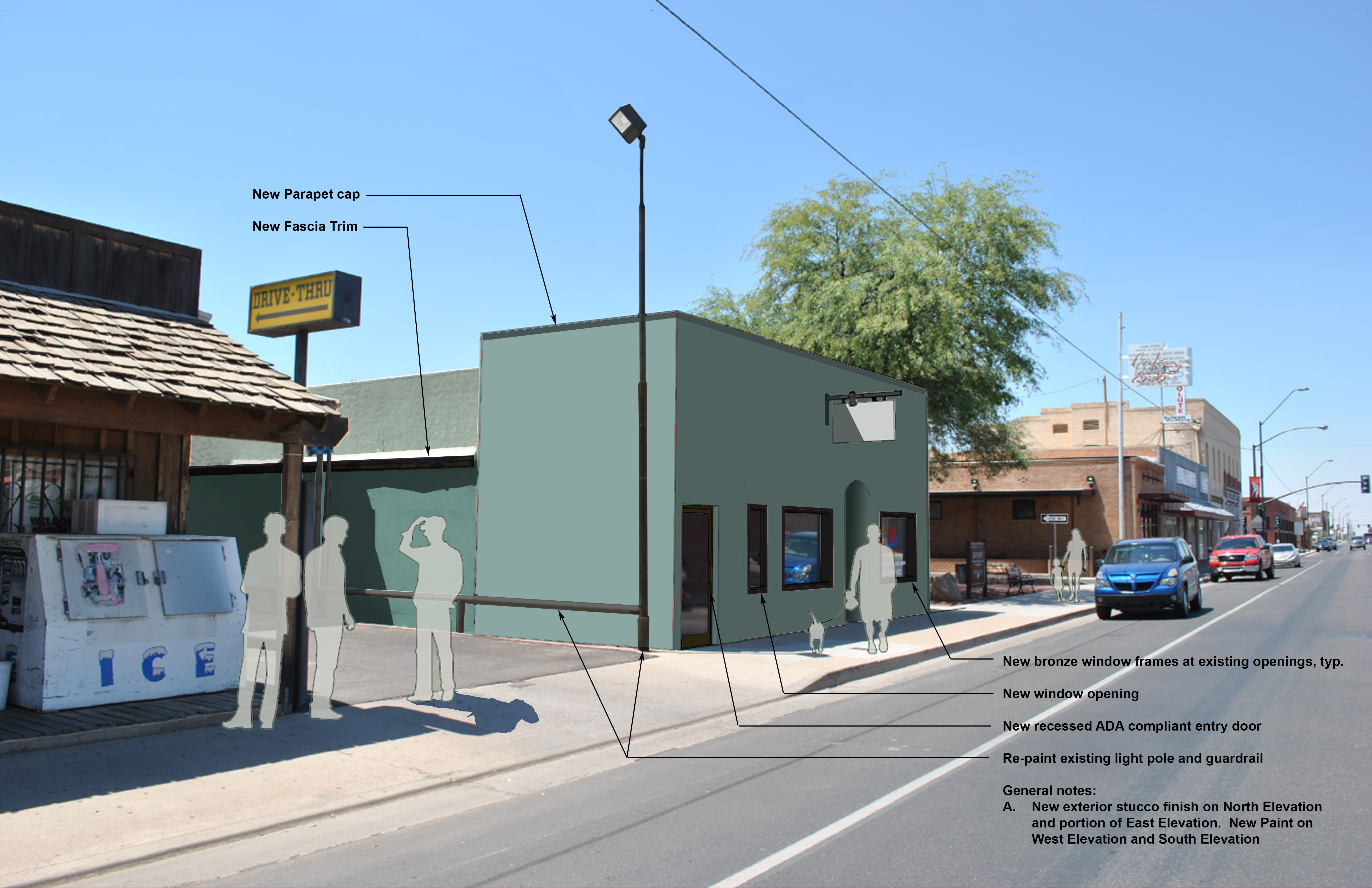
Alice Dryer Insurance Building is a project Serbin Studio has been working on for the last year. If you read last weeks post I talked about the alley improvements along the Benbow Veterans Park. See the big green mesquite tree in the before and after photos, well that is where the Benbow Park is and the alley as well. This is the epicenter of revitalization all the result of Buckeye Main Street Coalition steadfast commitment to change.


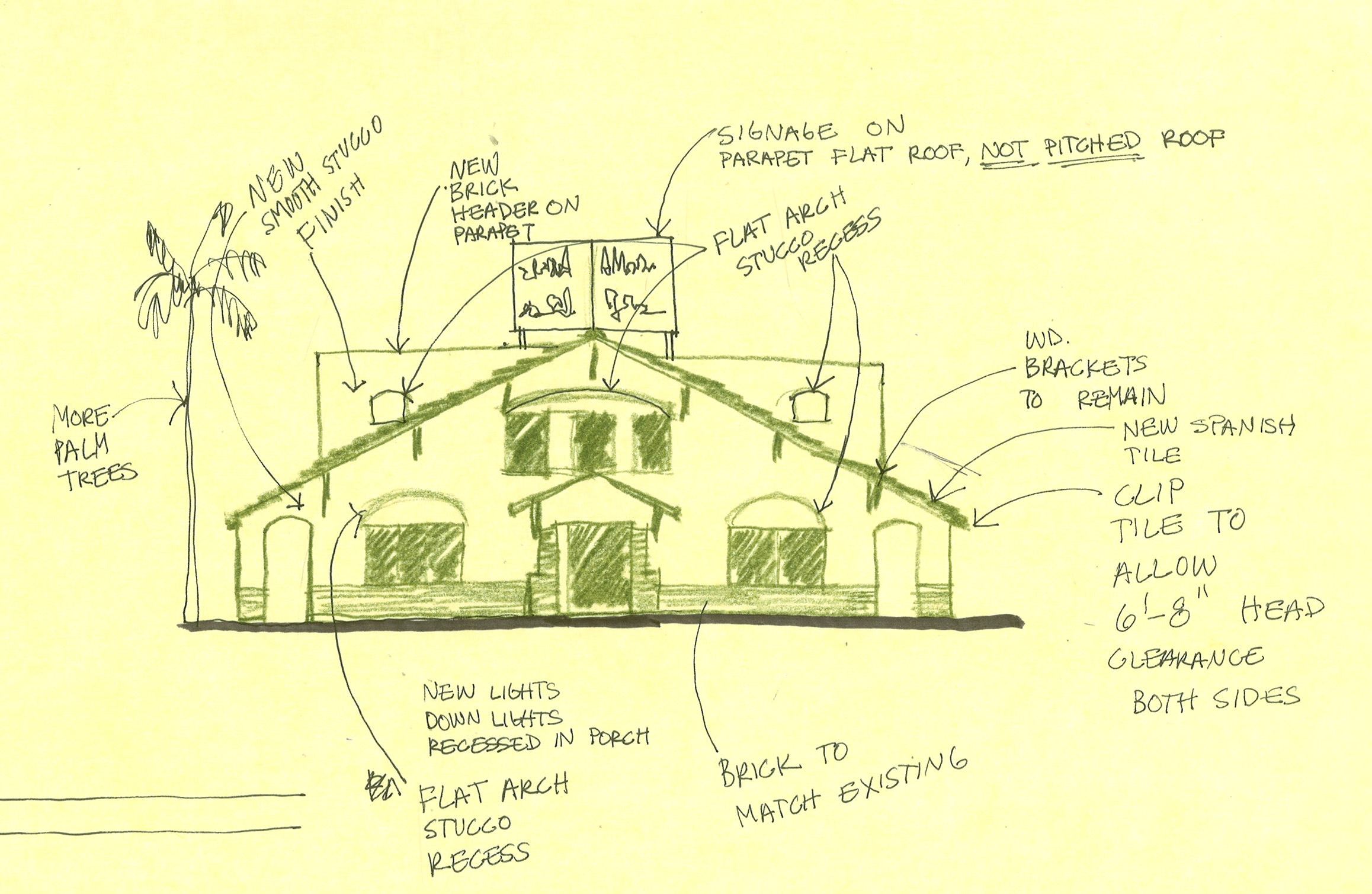
So what do you think of the dusty teal? The photo to the right is what Alice’s current building looks like. She has occupied this building for the last 36 years and is ready to clean up the look. If you can see Levi’s Absolute Screen building a little further down, it is a denim blue color. Brick on the San Linda Hotel on the far corner, blue denim on Levi’s building, brick on Café 24:35 and then dusty teal on Alice’s building. Rhythm. I can’t wait for construction on this project!
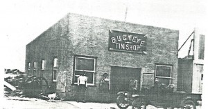
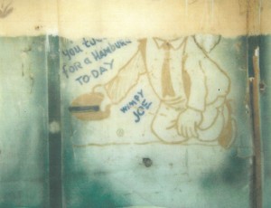
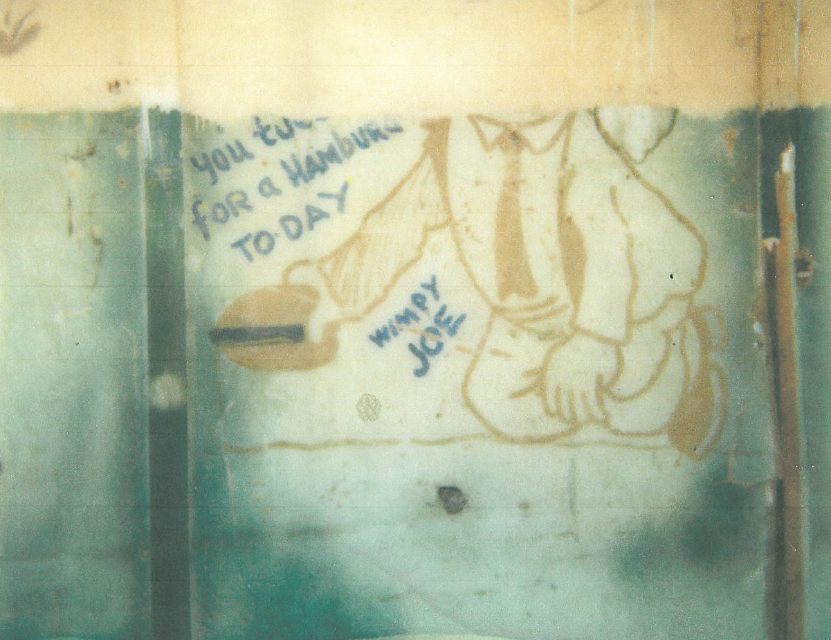
Many piles of cardboard and glue were the result of me coming up with alternative ideas to improve the façade but at the end of the day I kept it simple just like the original Buckeye Tin Shop of 1900’s Buckeye. The Tin Shop later evolved into grocery, bath house and audio shop. In the 30’s an addition was built on the east end for a slim burger joint called Joe’s Eats. The remains of the bar stools are still there in the floor today. Ann McArthur who works with Alice can remember sitting on those bar stools watching the flow of a sweaty cook hashing out patties for a Buckeye lunch rush. The Wimpy from Popeye graphic is still on the interior bearing wall with the famous saying, “I will gladly pay Tuesday for a hamburger today!”
Special thank you to Buckeye Mayor Meck, Council members and Buckeye Main Street Coalition for making this project a reality.

by Lara Serbin | Sep 6, 2013 | Architectural Planning, Architecture, Blog, Collaboration, Graphics, Planning
I took one of those personality tests this week. Only because it was required by my Executive Forum group that I belong too. I really hate those things. I didn’t like my results when I read through them probably because they were so right on the MONEY. My review makes me sound like some superficial name dropper who wants to please everybody. I am such a people pleaser at my core. I am an outfielder. I take time to catch the ball. But I do like to be part of a team. I actually prefer to be managed. This is so true. Just tell me what to do. If I am in a management role I will inspire others to action. I do have to be careful not to overpraise people. My reason for being is Aesthetics. Period. Are you so surprised? A girl in the outfield who wants everything to look pretty. I really saw my strengths in yesterday’s design review meeting. *why is this in italics?*
I am the Design Chairperson for Buckeye Main Street Coalition. Yesterday we all met to review some remodel plans for one of the historic buildings along Monroe. There are the more domineering members of the group who immediately analyzed the square footage of the new remodel. I could see myself sitting and taking this in. I didn’t have any comments right away. We all feel comfortable with one another. We all agreed that the smartest response was to retain the historic nature of the front façade.
I had my role of buff tracing paper and my pencils ready. Tracing paper is invaluable because you can lay it over a photo or façade and sketch any changes over it. You can see through it. You can lay many layers over the photo to keep evolving the idea. My pens were not allowing me to sketch fast enough and I didn’t have a black Prisma pencil so I used Kelp Green. I started to zone out while everyone was talking. I loved that moment sitting there with my team helping them put down on paper what it was they were thinking. We had gone over this project through emails months ago but meeting face to face was so much more effective. This sketching and listening is my reason for being. I want to do this more. I could sketch like that everyday. It is not the same sketching by myself at my light table. I like listening to my team because they have been in their position for decades and know what to do. Some of them have gone to church services in the building. The thing I like the most about my team is the speed they make decisions.
It was good to know that even though I will never be the pitcher I do add to the team standing in the outfield with my nerdy LLBean canvas bag.

by Lara Serbin | Aug 30, 2013 | Architectural Planning, Architecture, Blog, Collaboration, Graphics
Whether you know you do it or not, wherever you go anywhere your eyes look for color balance. This week, I picked out some gems from my library to show color balance in my past travels.
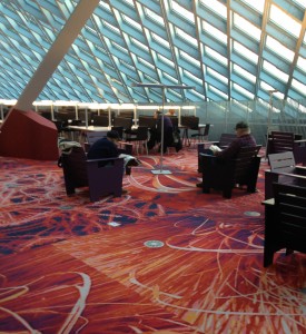
The top floor of the Seattle Public Library has great balance of color. For me, this balance is about complimentary colors playing with one another. The light powder puff blue window system makes the fiery red carpet tiles look redder. I love the depth of the pattern on the carpet, it draws the eye into the dark shadows and light accents on the flowers. The base of the column is matching the carpet and the dark furniture grounds the whole scene.

Tomato doll hangs inside the Owl Sprit in Port Townsend, Washington State. The interior of this place is a good balance of earthy and cool colors. I know if the interior was black and white ONLY the soft tortilla tacos with beans and rice would definitely NOT be as good. The interior colors, home made food and patchouli hippy vibe make this my all time favorite place to eat. Ever….for all time. Period. Done.
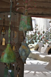
Color balance in the desert is hard to see because most colors are diluted by the intense sunlight. When it is overcast or early in the morning colors in the desert can really pop. Lily and I visited Cosanti, an artistic bell making studio designed by Paolo Soleri last June. I loved all the dusty turquoise and bronze colors against the sand colored structures that remind me of Luke Skywalker’s aunt and uncle’s home in Tatooine. *can’t believe I just looked that up for you*

This graphic billboard was a visual relief in the tightly packed city of New York. It is a masterful example of how the dirty white and brick buildings sandwich the punchy art. This particular sky blue color works well because it is a crossover color which means it is a color most often found in nature. The bright white jumps out against the gray base below. “…the human eye sees white as a brilliant color. For that reason it works well for contrast, in signage, at point-of-purchase, in packaging, or any other usage where it will catch the eye.” – Leatrice Eiseman author of Pantone Guide to Communicating with Color.
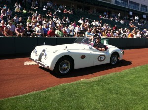
Jeffrey wanted to show you his car photos. I chose this one out of the stash because the white is so snappy against all the green turf and red gravel. There is a lot of color on everyone’s clothing which doesn’t give the eye anywhere to rest. Try to imagine this Morgan in terra cotta! Cars definitely add interest when you are driving on a graphite freeway with sky blue overhead.
I hope you have a fun weekend!
Lara Serbin