by Lara Serbin | Jan 15, 2014 | Blog, Collaboration, Commercial Architecture, Graphics, Planning
The view from the double swinging aluminum doors of the Chase Bank in Historic Buckeye is quite spectacular. Everything inside is a typical Chase interior except when you glance out the front doors which looks onto the rustic aged super graphics painted on the brick of the historic San Linda two story building. The rustic brick cropped image beyond the glass doors is such a stark contrast to the sleek commercial interior. You know you are in the heart of Historic Buckeye.
I was dropping off a stack of the brand new maps of Historic Buckeye. I had some banking to do and after I was done I shared the map with teller Blanca Villareal. She became very friendly as she explained, “I have lived in Buckeye since I was 10 years old.” She was excited that something had been done like this for Buckeye. The Buckeye she remembers was a robust down town full of activity and buzz. The flier made her feel hopeful for the future. She thought the maps would be a great item to give to a new client opening up an account. Blanca has noticed that more people are buying homes and opening new accounts in Buckeye. Derek Stephens, a third generation Buckeye local and personal banker for this particular Chase branch was happy to see the fliers. He opened up the flier and his whole face lit up, “This is awesome! I love the photo of Hobo Joe!”.
[print_gllr id=1403]
This map was a group effort designed and printed by the Buckeye Main Street Coalition. I am very proud indeed to be a member of this group. Our group combines the unique skills and vantage points of both public and private sectors to revitalize down town historic Buckeye commercial district. Through a gradual process that begins with small steps, sustainable improvements are being achieved.
Haiku for the week:
A Reflection On:
Hellbent dilema
or lofty grace following.
Stay up dancing too.
-Lara Serbin
by Lara Serbin | Jan 6, 2014 | Architectural Planning, Blog, Graphics, Planning
Last month I had the irresistible inspiration to design a custom flier for the local businesses in Historic Buckeye, Arizona. The project was first started at a Main Street Coalition mixer when the local business owners voiced a concern for a flier of some kind to attract more Main Street activity. Back in October I really had no idea what our team would come up with. I always keep a file of graphic examples I collect from my travels sometimes a well thought out menu, a smart city guide map, or a vintage travel postcard. The idea has to hit me and then I know I am ready to work.

The graphic on left is the final artwork that I completed for the Historic Buckeye Flier. The postcard on the right was a treasure I picked up while driving with my family along the Olympic Coast last summer *had to buy a plush flying squirrel for Lily too*. See, one never knows when the stuff you save will become useful. The Olympic postcard sits on my bulletin board at my desk. I especially like how the mountains and everything are not outlined with a profile line to contain the color. It reminds me of Gustave Baumann color woodcuts. Now that is an art form I would like to try some day. First I have to master wood carving or at least carving into vinyl.
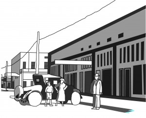

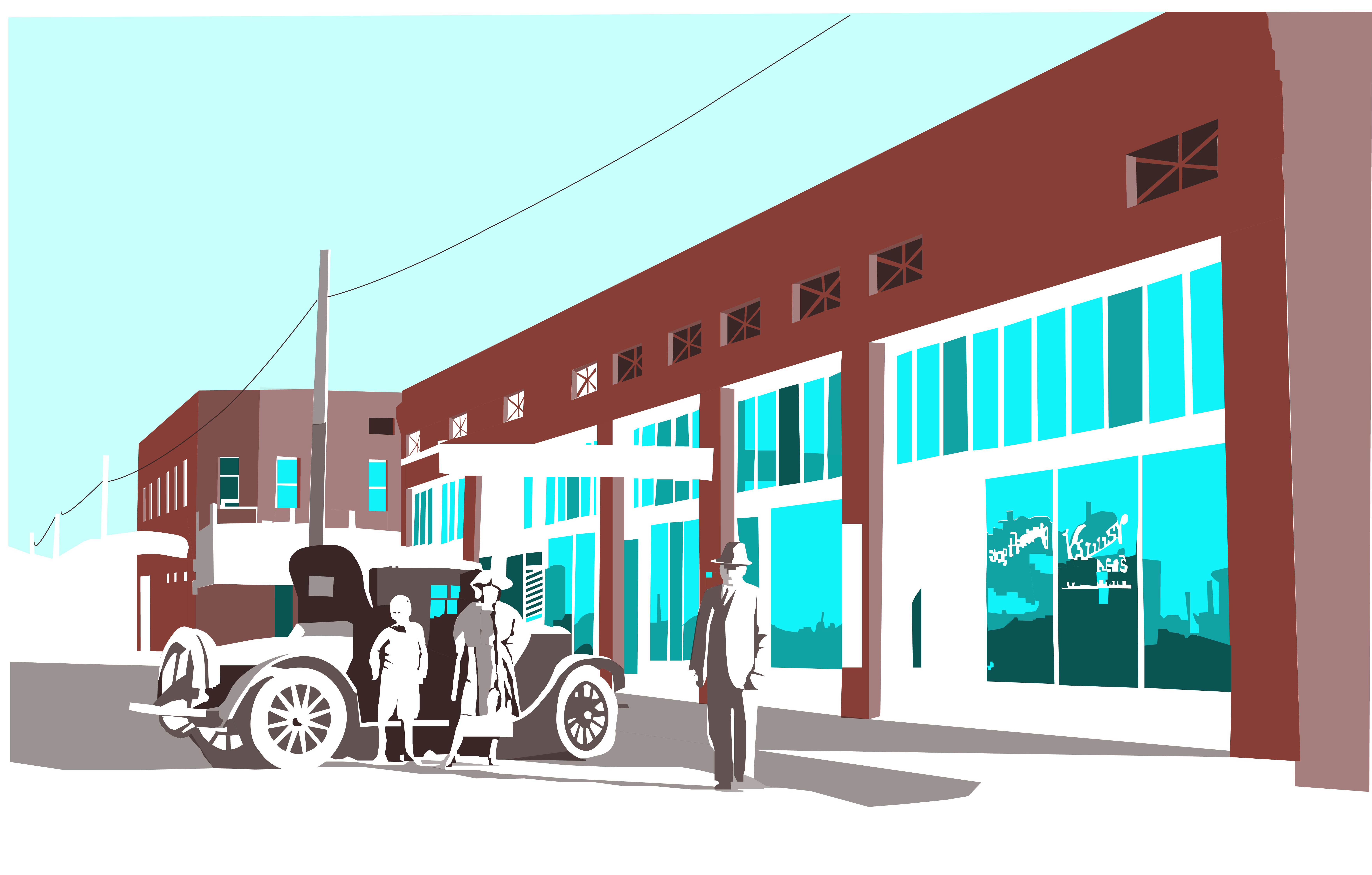
The image on the left is the first pass at rendering the Historic Main Street in Buckeye earlier in 2013. It is very basic, I was not even up to detailing the rims of the Model A at that time. The image on the right shows my expanded experience in just 2 months. I really like the subtractive nature of the white. I also liked how crooked the window panes are. For the flier, I tightened the shapes up considerably. But what a difference of spending some time to learn something new. It is all about repetition of the commands and being patient.
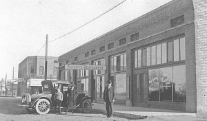
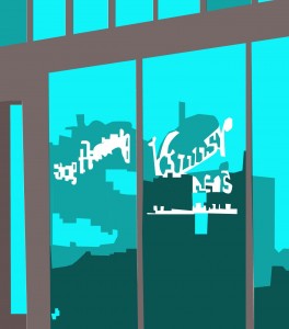
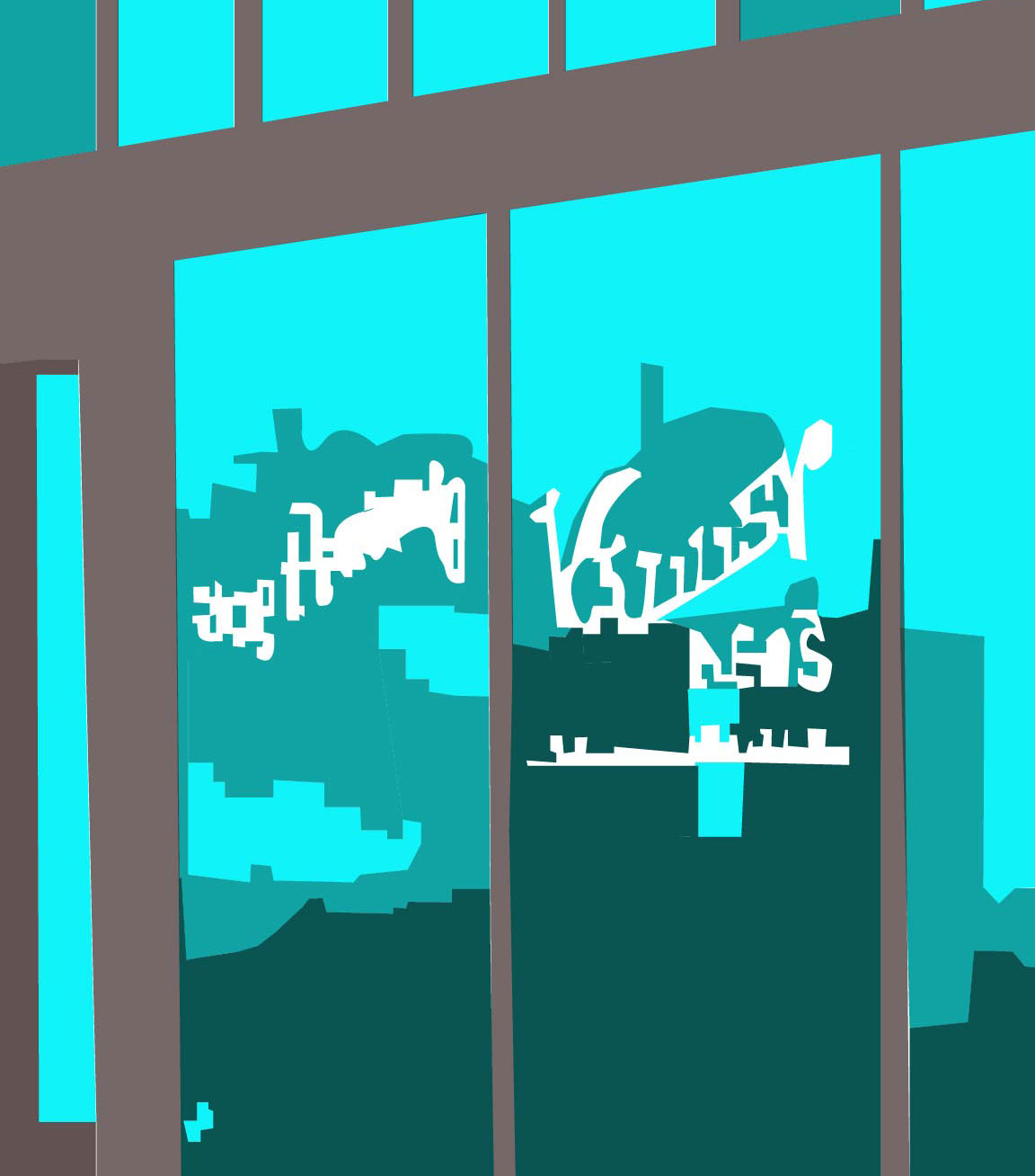
The black and white photo on the left is The Ware Building constructed in 1910 on the southeast corner of 4th Street and Monroe Avenue in Historic Buckeye. The graphic on the right is for anyone who wanted to see a zoom up on the window reflections. See the Model A?
There will be more on the flier itself in an upcoming post, this graphic is just a piece of the flier. The first 2 thousand are being printed right now. This is an important collaboration among Buckeye Main Street Coalition members, City of Buckeye stake holders and local business owners. I thank them for taking this step towards encouraging more activity for this new year!
You’re really going to like this: a weekly haiku.
Our World…
Pluck sleep as it sees
Eyes must alternate on grass
Violet dreaming.
-Lara Serbin
by Lara Serbin | Dec 16, 2013 | Architecture, Blog
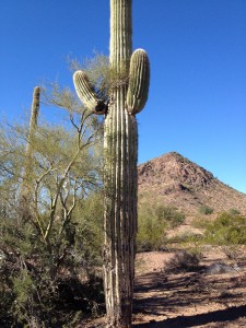
My family and I went on the West Valley Rock & Mineral Club field trip. The main stops were Dixie Mine to look for turquoise, 4th of July Butte to dig up Agates and finally Sundad Ghost Town. Looking for rocks doesn’t cost anything, its fun to find a cool rock and I really love listening to Chuck’s stories during the hot dog cook out in the desert during lunch.
Remember https://serbinstudio.com/exploring-harquahala-ghost-mining-town/, well Chuck went on that trip too. There were about 15 WVRM members yesterday which included these 2 crazy guys from Kentucky with super thick accents. It was like they just stepped off their homemade time machine last stop Vietnam War. One of them thought I looked more like a Pat! Once he knew my name he said it perfectly. Nicest and liveliest guys you ever want on a WVRM trip.

Jeff and Chuck have the most rock and mineral knowledge of the crew. Our second stop after finding a lot of turquoise treasures at the Dixie Mine was 4th of July Butte, Chuck said “This is where people from Phoenix would come to set off fireworks since they weren’t allowed to blow up anything in Phoenix!” The Butte must have been famous after the age of the auto, I mean who would ride in a horse and carriage for 70 plus miles to the middle of nowhere!
As we got out of our dusty cars, jeeps and trucks we took in the mountains all around us with cool names like Yellow Medicine Butte and Woolsey Peak. The kids were running around all excited after Chuck informed everyone, “You wanna cross the road and look fur Blue Agates along side of the washes, everything west of the roads bin picked over!”
 Chuck was right, we all found tons of Agate. Since I am flexible and tiny my tactic was to crouch under the brambling Palo Verde trees growing in the middle of the washes. I quickly found glints of cool greyish blue in the dried mud. After I broke my nail and cut my finger digging them out I held them up to the sun and I could see the rock glowing from within. The outside is porous with small holes like a sponge and the inside is like looking into the eye of a dark desert monsoon. Awesome! It is miraculous something so gorgeous is just laying covered in dust and mud in the desert.
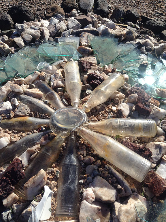
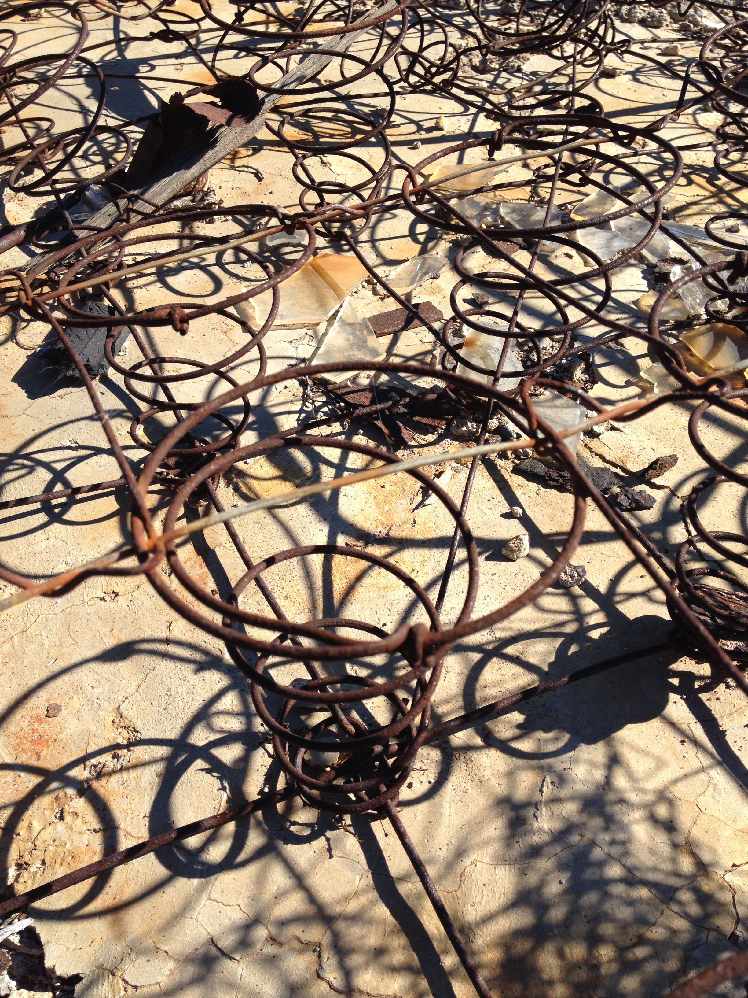
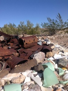
 We did end our trip at Sundad a hippie ghost town. There were no buildings just neatly arranged organic shapes with rusted out trinkets and beautiful broken glass in the center. The site did have a peace and love vibe it was still giving off from it’s once thriving Hippie Commune of the 1960’s and 70’s.
Stop your car and walk in the desert.
by Jeff Serbin | Dec 3, 2013 | Architectural Planning, Architecture, Blog, Interiors, Planning
Sidewalks are traveled slowly by foot, taking us from point A to point B. They aren’t measured in Miles per Hour(MPH) but in Cubic Feet. Most of the time we traverse them without much thought. They aren’t typically architectural masterpieces of design, but monotonous slabs of grey concrete.

Existing sidewalk before replacement.
Sidewalks come in many colors, textures and finishes like that sweater you bought on Cyber Monday from American Eagle, but placing too much design may be trendy or outdated in years to come. A nicely designed sidewalk although can complement a building when designed properly. In the case of Digital Realty’s Data Center building in downtown Phoenix, the sidewalks are meant to take a back seat and not compete but complement with their new architectural façade.
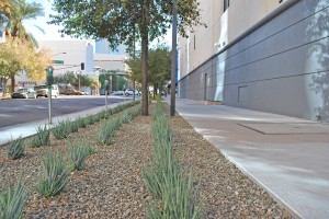
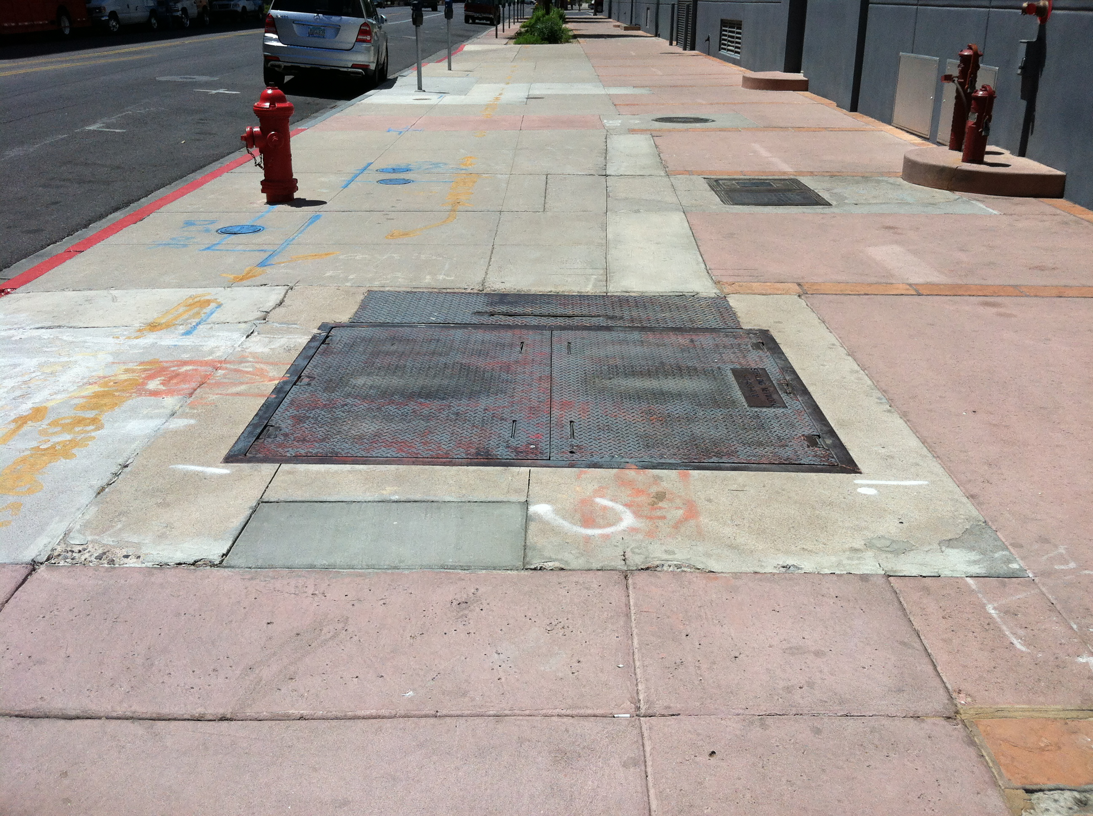
Digital Realty East Sidewalk after construction.
In 2012, Digital Realty revitalized their facility at 120 East Van Buren Street. The building sits upon a downtown city block in Phoenix and is surrounded on all 4 sides by sidewalks. The building which originally housed The Arizona Republic Newspaper when constructed in the 1940’s, now houses Digital Realty’s Data Center. It’s sidewalks over the years had morphed into a variety of colors, textures and finishes. The sidewalks which were owned and maintained by the City of Phoenix, had bits of sandstone and pink concrete to reflect a south western motif. It was not complimentary to the forward looking façade and was haphazardly cut and replaced to allow for a variety of utilities that had been installed over the years. This made the sidewalks a bit of an eyesore. Landscape was not cohesive and City of Phoenix street lighting was inefficient. Archaic high pressure sodium lighting surrounded the site, not new energy efficient LED which are becoming the norm.
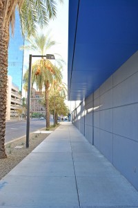
Digital Realty South Sidewalk after construction.
So in 2012, Serbin Studio and Digital Realty began the master plan design of new sidewalks around the facility. Digital’s brand is modern and sleek, representing the digital world of fast moving data. Their speed is more reflective of a Porsche Carrera GT driving 208 MPH than a Honda Accord in the slow lane.
Digital Realty South Sidewalk after construction.
In 2013, Serbin Studio’s design was constructed for the new sidewalks, updated LED site lighting and landscape by DPR Construction. The sidewalks around Digital Realty are containing a fast and furious digital world, bringing you data not in MPH miles per hour or cubic feet, but in mbps megabits per second.
by Jeff Serbin | Nov 20, 2013 | Architectural Planning, Architecture, Blog, Collaboration, Graphics, Interiors, Planning
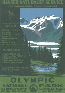
Last summer, I had the opportunity to travel along the Western coast of Washington State in the Olympic National Park. It’s vast mountain ranges with it’s hundreds of thousands of acres of pristine undisturbed forests, it’s 73 miles of coastline, give you a sense of tranquility. However, I stumbled upon something which left me feeling unsettled.

Tsunami warning
We visited a well-known coastal beach, Ruby Beach. It’s very impressive with it’s monumental Sea stacks. On our way down the path to the beach I saw a very dis-concerning sign. What to do in the event of a Tsunami, where to go! My plans to spend hours building an 8th Wonder of the World sand castle only be destroyed by a wave was squashed.
This evacuation plan essentially said “Run like hell to the highest point!” I definitely would obey if I saw a looming wave coming my way. All I could conjure up was videos I had seen on YouTube of the Tsunamis around the globe. Tranquility (T-RAN-Quility), no more.
As an architect, one of our responsibilities is to create buildings which are safe that have a clear path to exit, just in case you have to “Run”. We all had fire drills in elementary school, right?
Exit Plan
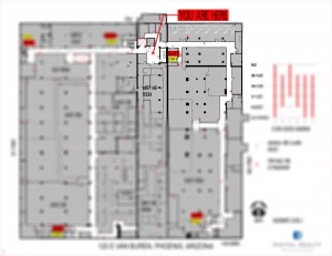
Recently, I had the opportunity to prepare one of these plans for a building. By code, a building has to prepare evacuation maps (floor plans) for public buildings to teach people how to exit from that building. Who better else to do so, an Architect. In a small building, it’s likely obvious, but when you are within a large building with multiple floors and various paths of travel, it does become important.
This building has 6 floors and over 300,000 square feet. The plans typically show where the stairs, elevators, fire extinguishers and the fire pulls. I learned at elementary school never to play with one.
The code doesn’t really tell you where they should go, just what should be on them. Typically it’s at the elevator lobby. Essentially, the plans are graphic design projects because they have to be clear, accurate and look pretty.
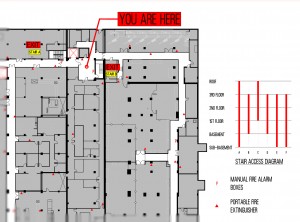
Exit Plan Enlarged
So hopefully in your travels on a Washington Coast beach or within a large building, you’re only running when nature calls.
by Lara Serbin | Nov 14, 2013 | Blog, Collaboration, Graphics, Planning
This is an update on the Buckeye Main Street Coalition project at Benbow Veterans Park Alley. The list of things to do for the alley are many but one of them is to design a super graphic mural for the back side of the Napa Auto Parts building. The design story goes like this:
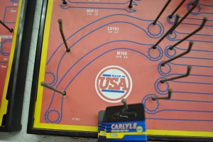
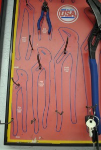
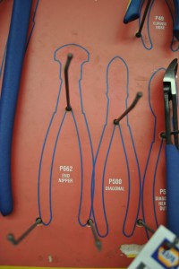
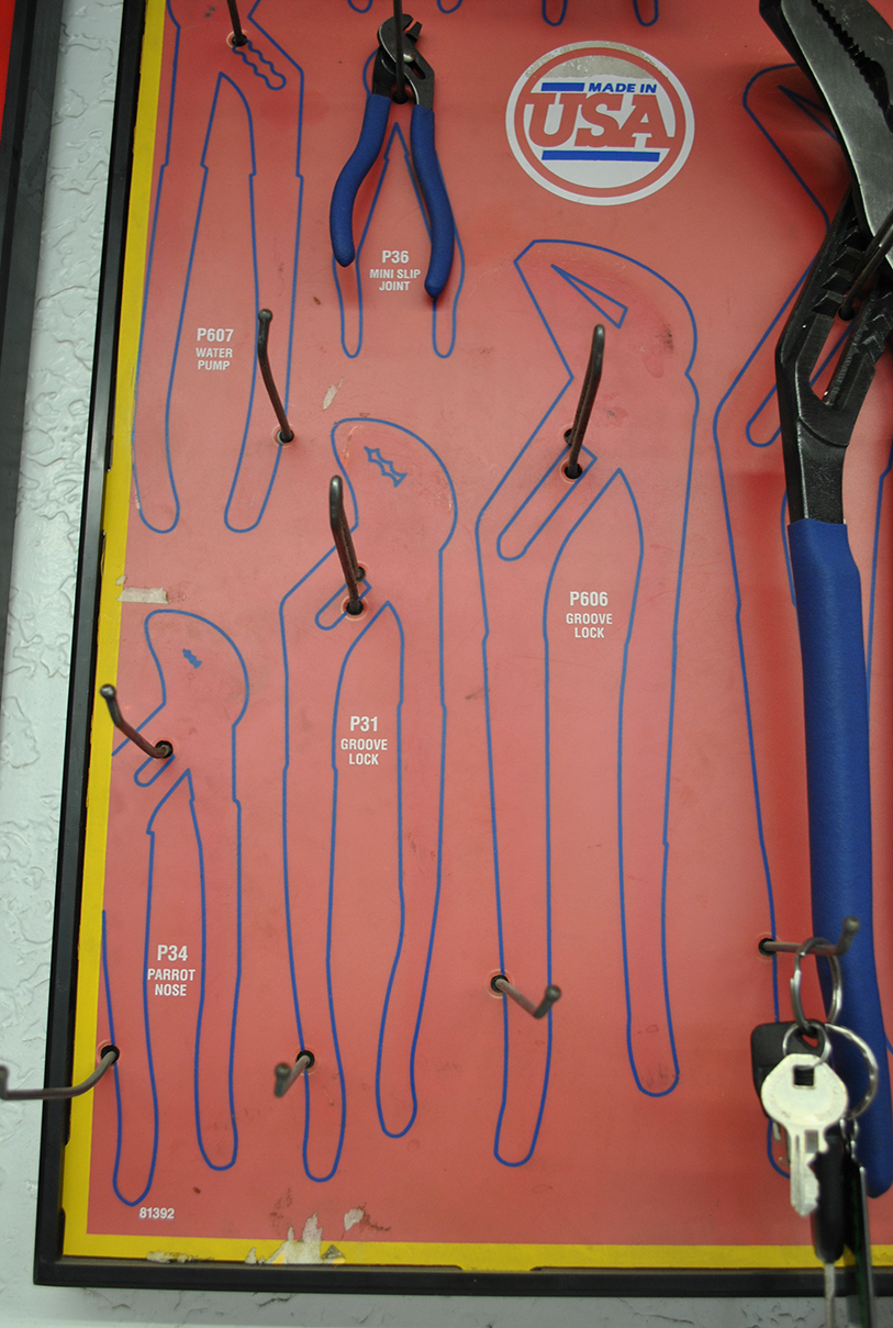
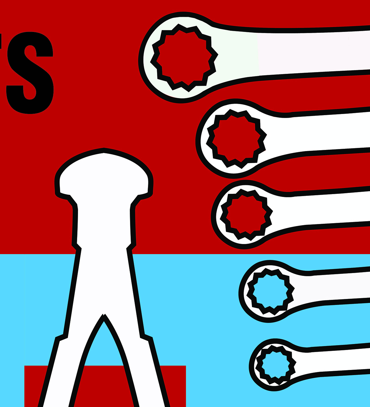
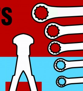
I shot some photos of the tool hooks inside Napa one day. It was a sunny day and there was a caballero talking shop with the guys behind the counter. The fluorescents were buzzing overhead and I scanned the walls for some kind of inspiration for the mural graphic. The shapes behind the tools hooks were perfect, so I photographed enough wrenches, diagonals, and end nippers until I was satisfied.
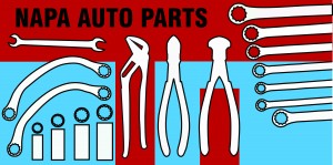
Did I mention that before my daughter’s recent bat mitzvah I didn’t know how to use Adobe Illustrator? I taught myself how to use the program and managed to do graphics for her western themed party. So I was ready to try working up the graphics for the Napa mural. The cool thing about the Illustrator program is that once you draw the graphic you can enlarge it to building size and it won’t become pixelated and fuzzy. It is a beautiful thing! The graphic on the left is my end product.
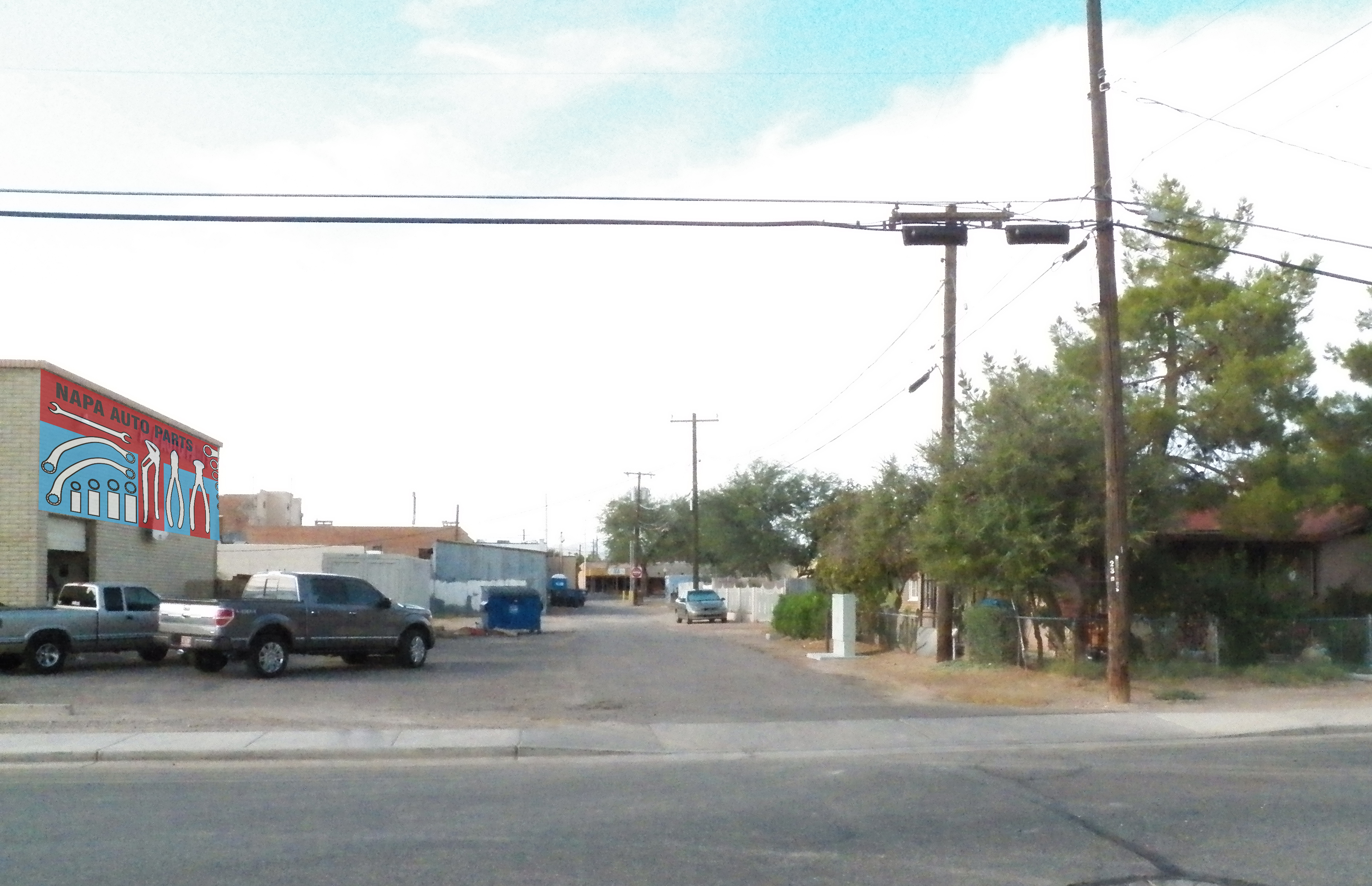
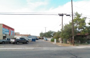
The photo on the right is the alley with Napa Auto Parts building on the left. See the future mural? The photo below is looking north into the entry to the Alley. Currently, semis unload at the back of house of the Napa Auto Parts. See the garage door there in back of the trucks? Ford is the official truck in Buckeye.
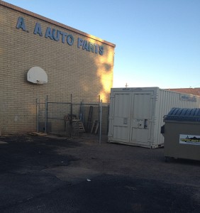

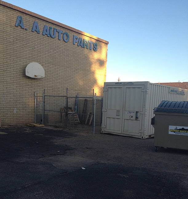
Here is the wall up close. Mike, the owner of Napa has agreed to clean up the wall to get ready for the new mural. Bye bye basketball hoop and decayed letters. I am thinking this mural will help his business by advertising what is inside. Who would ever guess he has everything you would need for your auto inside this beige building.

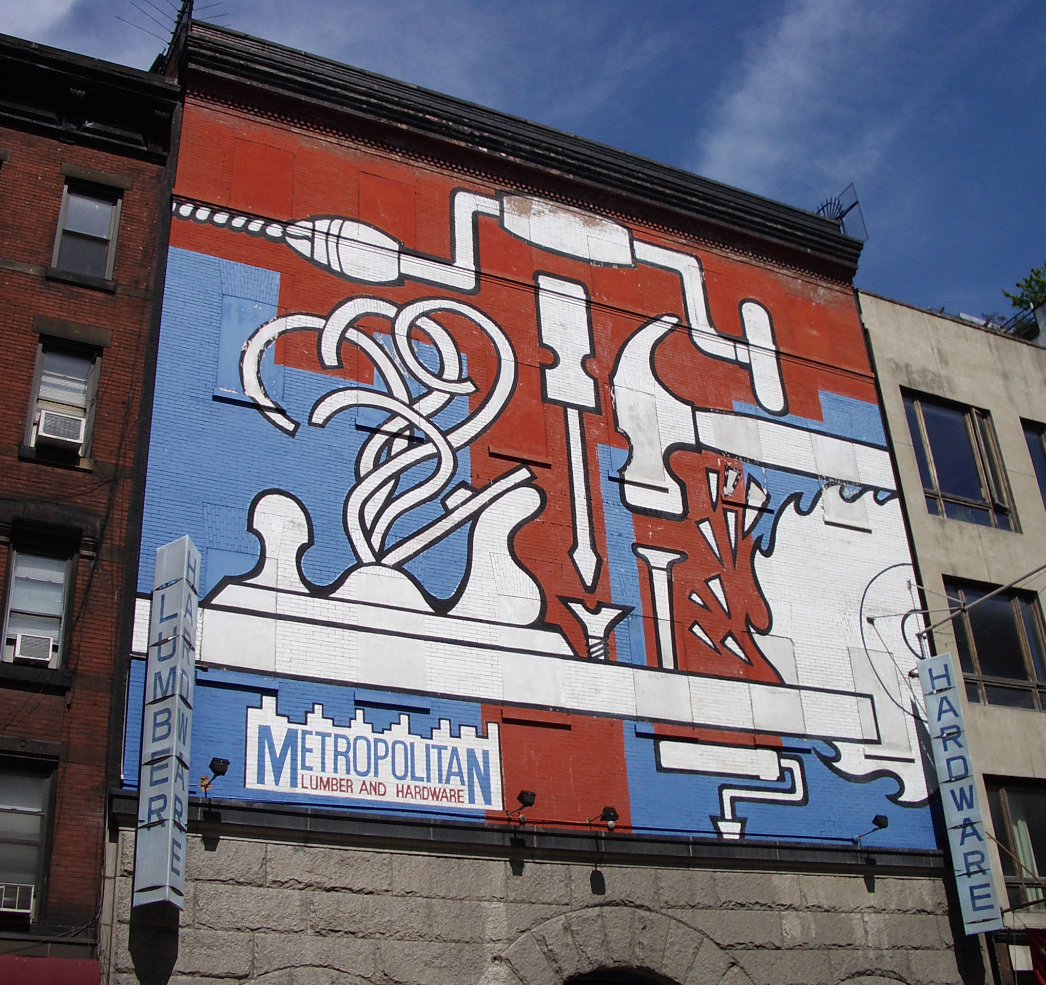
This was the mural that inspired me. This photo was taken from Metropolitan Lumber and Hardware in New York City a few years ago. Do you want to see the Napa mural close up? Ok…wait just a minute.
Even if this was the mural it would look amazing. Those thick profiles too…