by Lara Serbin | Aug 30, 2013 | Architectural Planning, Architecture, Blog, Collaboration, Graphics
Whether you know you do it or not, wherever you go anywhere your eyes look for color balance. This week, I picked out some gems from my library to show color balance in my past travels.
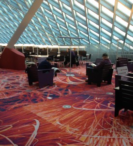
The top floor of the Seattle Public Library has great balance of color. For me, this balance is about complimentary colors playing with one another. The light powder puff blue window system makes the fiery red carpet tiles look redder. I love the depth of the pattern on the carpet, it draws the eye into the dark shadows and light accents on the flowers. The base of the column is matching the carpet and the dark furniture grounds the whole scene.

Tomato doll hangs inside the Owl Sprit in Port Townsend, Washington State. The interior of this place is a good balance of earthy and cool colors. I know if the interior was black and white ONLY the soft tortilla tacos with beans and rice would definitely NOT be as good. The interior colors, home made food and patchouli hippy vibe make this my all time favorite place to eat. Ever….for all time. Period. Done.
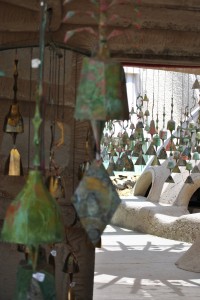
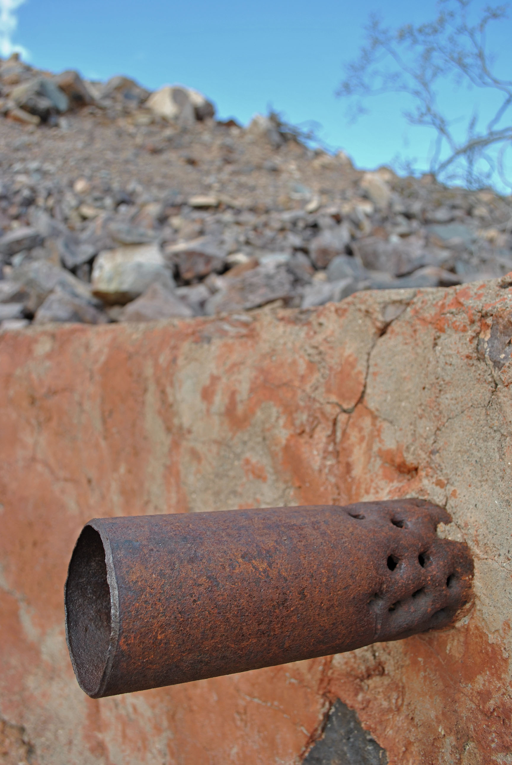
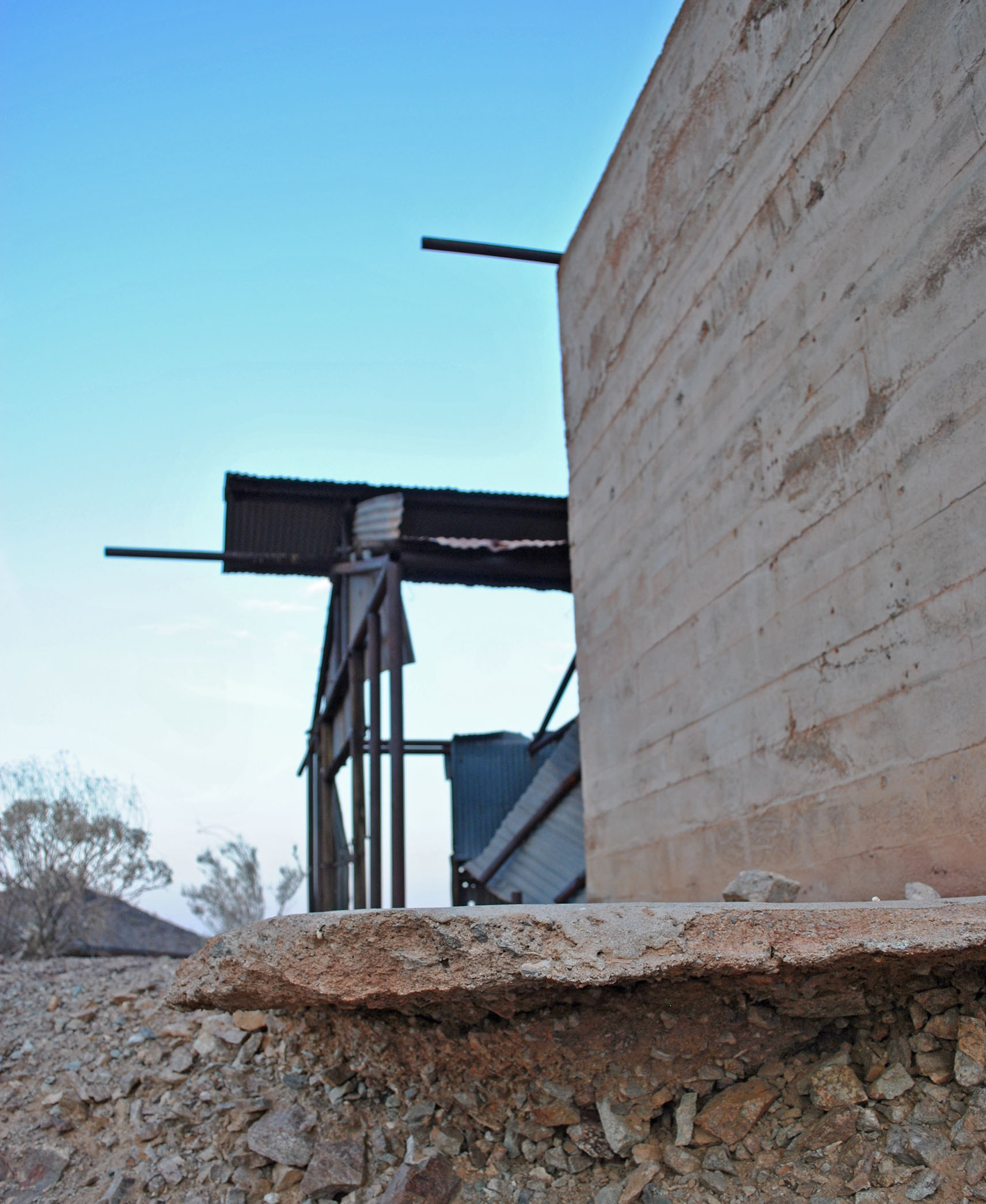
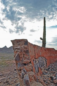
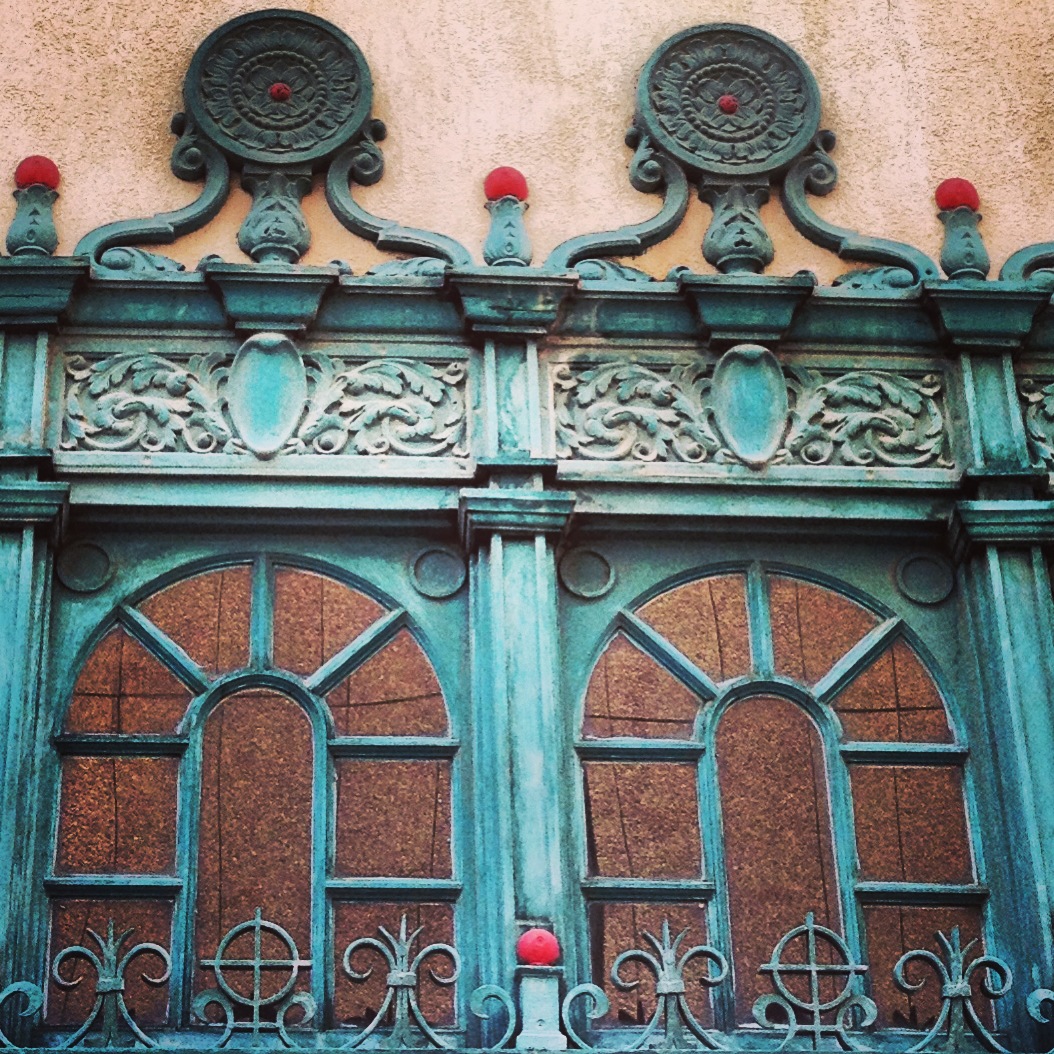
Color balance in the desert is hard to see because most colors are diluted by the intense sunlight. When it is overcast or early in the morning colors in the desert can really pop. Lily and I visited Cosanti, an artistic bell making studio designed by Paolo Soleri last June. I loved all the dusty turquoise and bronze colors against the sand colored structures that remind me of Luke Skywalker’s aunt and uncle’s home in Tatooine. *can’t believe I just looked that up for you*
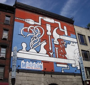
This graphic billboard was a visual relief in the tightly packed city of New York. It is a masterful example of how the dirty white and brick buildings sandwich the punchy art. This particular sky blue color works well because it is a crossover color which means it is a color most often found in nature. The bright white jumps out against the gray base below. “…the human eye sees white as a brilliant color. For that reason it works well for contrast, in signage, at point-of-purchase, in packaging, or any other usage where it will catch the eye.” – Leatrice Eiseman author of Pantone Guide to Communicating with Color.
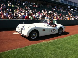
Jeffrey wanted to show you his car photos. I chose this one out of the stash because the white is so snappy against all the green turf and red gravel. There is a lot of color on everyone’s clothing which doesn’t give the eye anywhere to rest. Try to imagine this Morgan in terra cotta! Cars definitely add interest when you are driving on a graphite freeway with sky blue overhead.
I hope you have a fun weekend!
Lara Serbin
by Lara Serbin | Aug 27, 2013 | Architecture, Blog


by Lara Serbin | Aug 22, 2013 | Architectural Planning, Architecture, Blog, Collaboration, Data Center Design, Planning

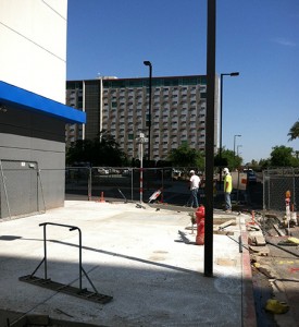
In 2010, Digital Realty, a world wide data center company completed an exterior upgrade on a local Phoenix landmark building. The building was built in 1947 for the Arizona Republic and then bought in late 90’s by Sterling [now I/O], and purchased by it’s current owners, Digital Realty in 2006. Isn’t is interesting that the building was built for a newspaper printing company with steady news on paper and now it has digital data constantly flowing in through colorful cables. This is Jeffrey’s post, but I had to add that.
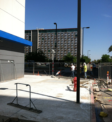
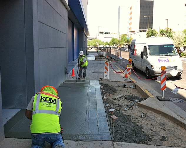
On a hot May Day back in 2012, Gary and I took a walk around the building. It is located smack in the middle of downtown Phoenix, bounded by major streets named after past Presidents. We have Van Buren on the South side, Polk on the North and 1st and 2nd streets frame its East and West boundaries. As we walked the exterior, Gary pointed out sidewalks with various finishes, irregular cut sandstone (cheesy Southwest), salmon colored concrete (making you hungry), and grey concrete (exciting). It had been butchered throughout the years to allow for utilities to enter the building, feeding it power, water and data.
We both agreed something needed to be done to bring the sidewalks up to the sleek elegance of the recent exterior building make over including new texturing, paint, lighting and signage. We both knew the City would expect something in return for upgrading sidewalks. Did they want our first child?
In a long extensive back and forth tennis rally, working with the City of Phoenix Streets Department, Economic Development, we came to an agreement on new LED street lighting, with a resolution to who was to install and pay for this extra expense that we did not anticipate or plan to cover.

The project is now in final stages of completion. Sidewalks have been pulverized into small pieces, removed and replaced with new shiny, ok actually dull grey concrete which compliments the Grey Digital exterior and matches the City of Phoenix standard sidewalks. The new plants add a touch of green. Digital Realty exterior upgrade at 120 East Van Buren will be complete.
by Lara Serbin | Aug 16, 2013 | Architectural Planning, Architecture, Blog
Buckeye, Arizona is a fast growing Town located about 45 minutes west of down town Phoenix. Serbin Studio’s is minutes away from historic Buckeye so we spend a lot of time in Buckeye. One of Buckeye’s long standing traditions is funerals. Buckeye is a tight knit community where people recall going to kindergarten with their accountant or meeting their future husband when they were 5 years old at a garden party. I have been around long enough to know that funerals are big social events in Buckeye. Today, I showed up on the wrong Friday for a funeral but it turned out great because I took photos of the 1928 Spanish Colonial Ganley’s Buckeye Funeral Home. Could you just see me with my big camera taking photos of the building with everyone standing outside being all respectful. I got all my photos out of my system for next Friday. I was lucky to be able to chat with the owner Phil Ganley who is the second generation of Ganley’s Buckeye Funeral Home. While he was moving a casket out of his suburban at 9:00am in the morning at the corner of Baseline Road and Central Boulevard I asked him if I could take some photos of his building.

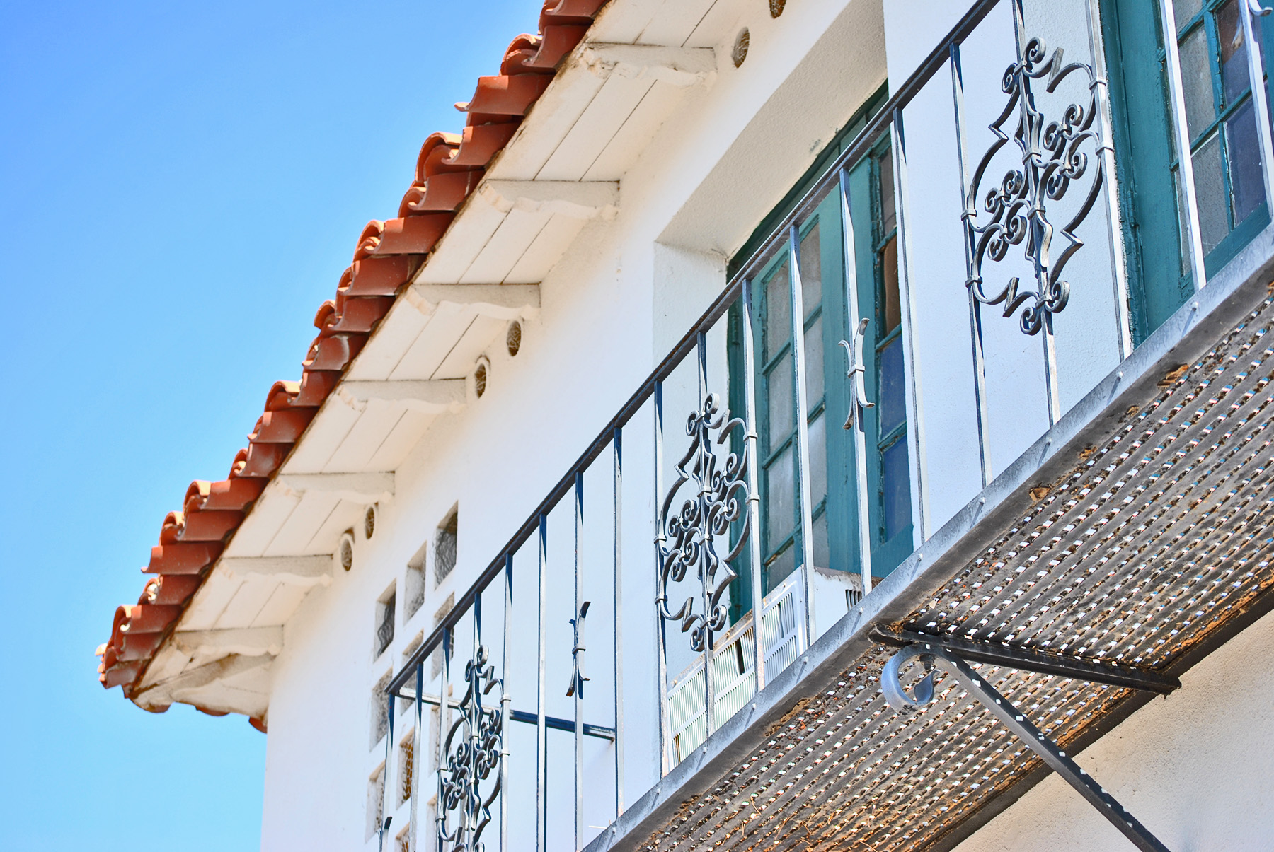
During the late 1920’s this building was part of an expansive idea to create an upscale town called Valencia just north of the train tracks and Buckeye Canal. The Miller Cattle Company was the developer who surveyed the land and commissioned this building to serve as a retail anchor. When the Ganleys moved to Buckeye in 1939 they occupied this building which was built with retail in mind originally, but the Great Depression created a change in direction. Phil explained that when he was a boy the family lived on the second floor and he would stand on the balcony in the photo above and look at the southern mountain range with down town Buckeye in the foreground. Ganley remembered nothing being around this building when he was a kid. He would ride his bike into down town Buckeye to see what was going on.
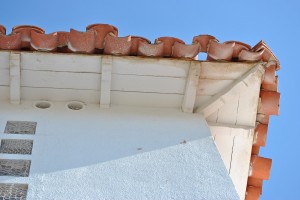
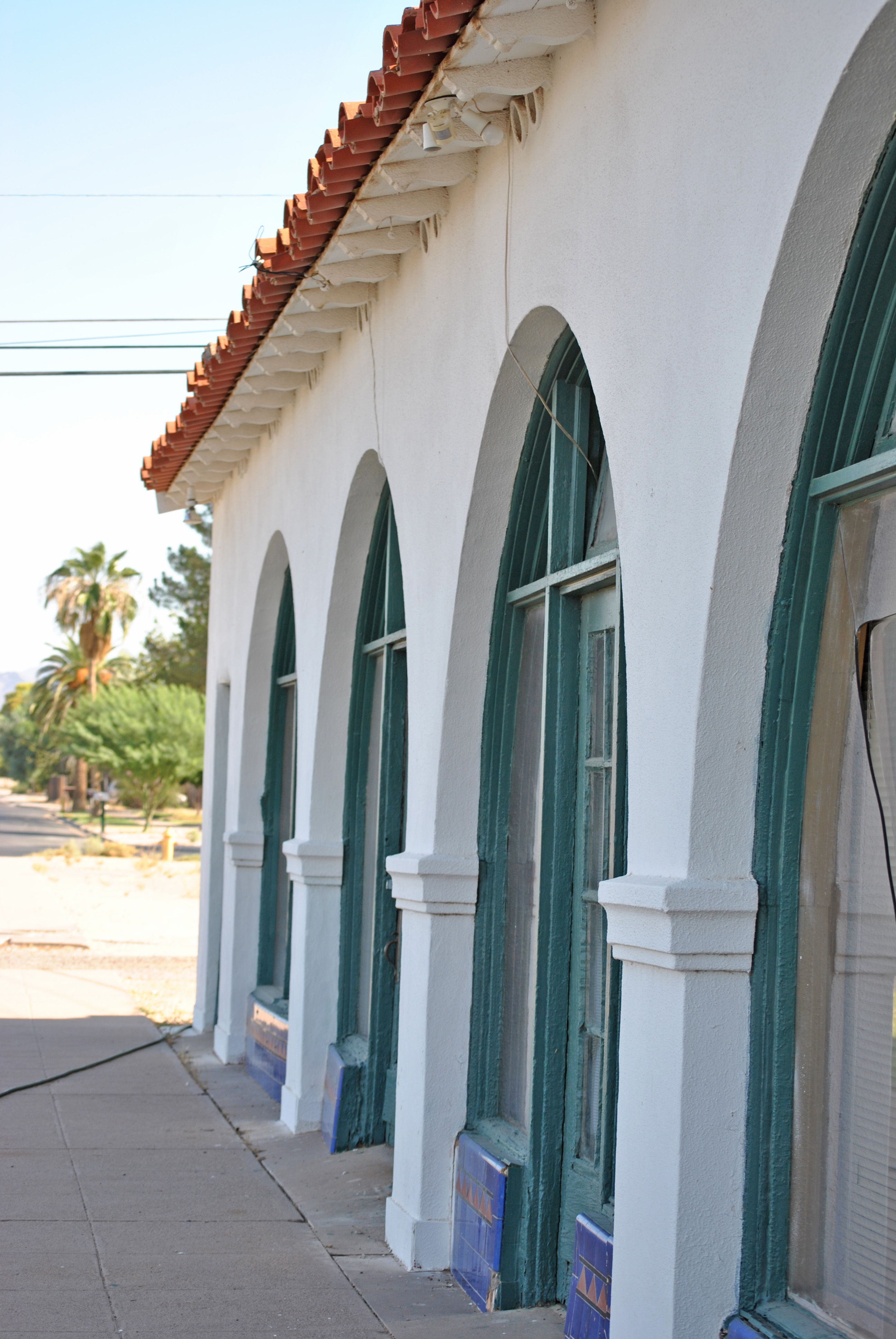
The building has been well preserved and still has charming detail. Indigo and terra cotta ceramic tile was a sustainable choice for the base of the arched storefront. The stucco is smooth and reminds me of Andalusian architecture of Spain the way it is scallops cut outs adorn openings. The white stucco contrasts with the vintage terra cotta roof tiles. The doors and window frames are original wood frame and maintained with many layers of teal paint. I did take a peek through the corner window. I was standing under a petite black metal light fixture where a bird had made a nest in the cage like housing. The white lace curtains seemed they had been drawn back for hundreds of years. Faded floral wall paper, pastel wood trim and vinyl squares made up the interior finish. I could imagine someone named Joy or Marty arranging a floral arrangement in front of the reach in cooler. Thanks to the Ganleys this classic building is still in operation and continues to creates an elegant place for local families to gather and pay their respect to ones who have died. With the help of my book Buckeye The First 100 Years 1888-1988 I can safely say that when this book was published in 1988, “Of the approximately five thousand people in the three cemeteries, he (Phil’s father, Paul Ganley) has buried at least four thousand of them during his 47 years in Buckeye.”. If you want to see some great examples of sustainable architecture take a visit to Buckeye, Arizona.

by Lara Serbin | Aug 8, 2013 | Architectural Planning, Architecture, Blog, Interiors, Planning
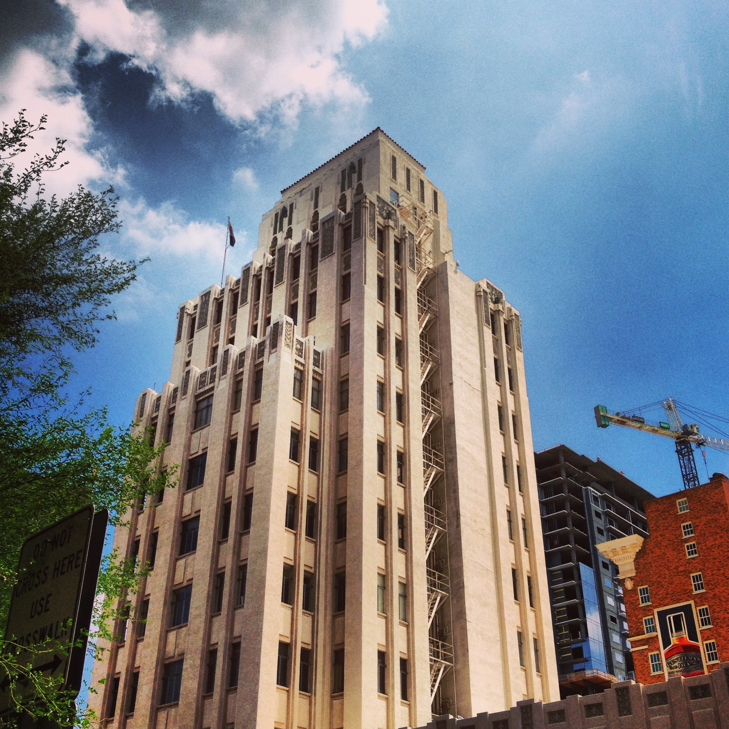
Here at Serbin Studio we like historic architecture. I was in downtown Phoenix a couple weeks ago and went inside the historic Luhrs Tower. Just for fun. It was the art-deco elevator door detail, the ornately painted ceiling beams and round button chandelier that enticed me to climb up the tight stair case that was behind the elevators. The finishes were consistent on all floors and walls so I had no sense of differentiation per floor.
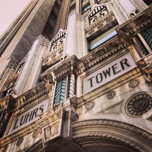

At the top of each stair landing was a restroom either Men or Women alternating every other floor. The co-workers must have had a tight knit social environment rubbing shoulders walking the stairs and waiting for the coast to clear until exiting the restroom. The drinking fountains are original and so tiny that potted plants have taken residency. One of the landings had a functioning office reception. A few framed vintage Life Magazine covers were equally spaced behind a dark wooden desk. I was surprised a gum chewing receptionist wearing a polka dot dress hiding spectators under the desk didn’t look up at me. You must understand this building is an icon situated in the down town core of Phoenix, Arizona. As a German immigrant, George H.N. Luhrs came to Phoenix in 1878 and commissioned the art-deco Luhrs Tower in 1929. It has a sibling, The Luhrs Building, a block away on Central Avenue and Jefferson Street.


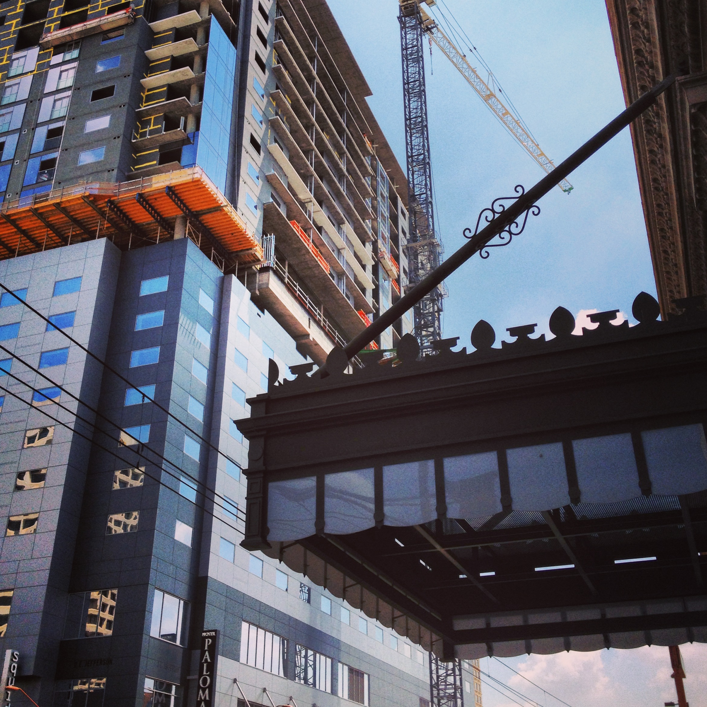
With new city center projects erupting these days, I believe that it is important to preserve what history we do have in Phoenix. The photo above on the left is what I like to see. The complex fussy detail against the sleek gray panels of the high rise in construction. The building skin on the gray modern building sheds all unnecessary detail, it is about efficiency for the height of the structure. The detail on the metal and glass canopy of The Luhrs Building is closer to the eye so it has more detail, it was modern for it’s time.
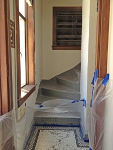

The upper double digit floors had the most current construction activity. Simple renovations like replacing deteriorated window and door frames with mahogany to match the existing finish the interior throughout. I loved the restroom doors too even though they practically opened out into the stair enclosure. Who paints gold leaf letters on glass anymore, and that “O” is too cool.

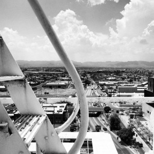
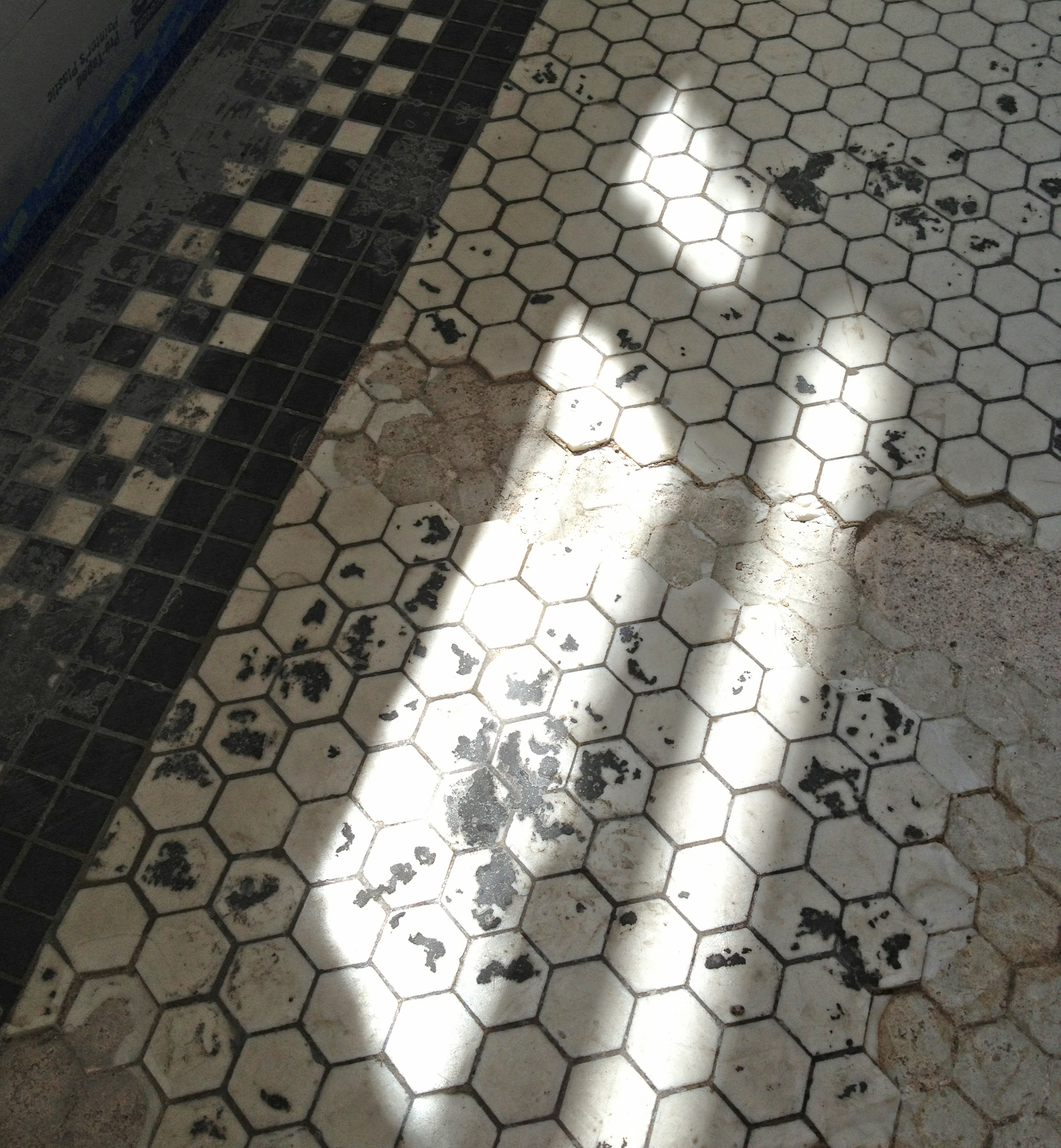
The fish scale black and white tiles are wonderfully decayed. The tiles were being replaced with like replacements. One of the windows in the renovation clutter was left ajar and so I captured the view looking towards South Mountain. This is probably more what it looked like when it was first built. Back in the day, the Luhrs Tower was one of the tallest buildings in downtown Phoenix. I felt great appreciation for the care taker of the Luhrs Tower as I explored as high as I could climb up those marble steps.