by Lara Serbin | Oct 18, 2013 | Architecture, Blog, Collaboration, Commercial Architecture, Planning
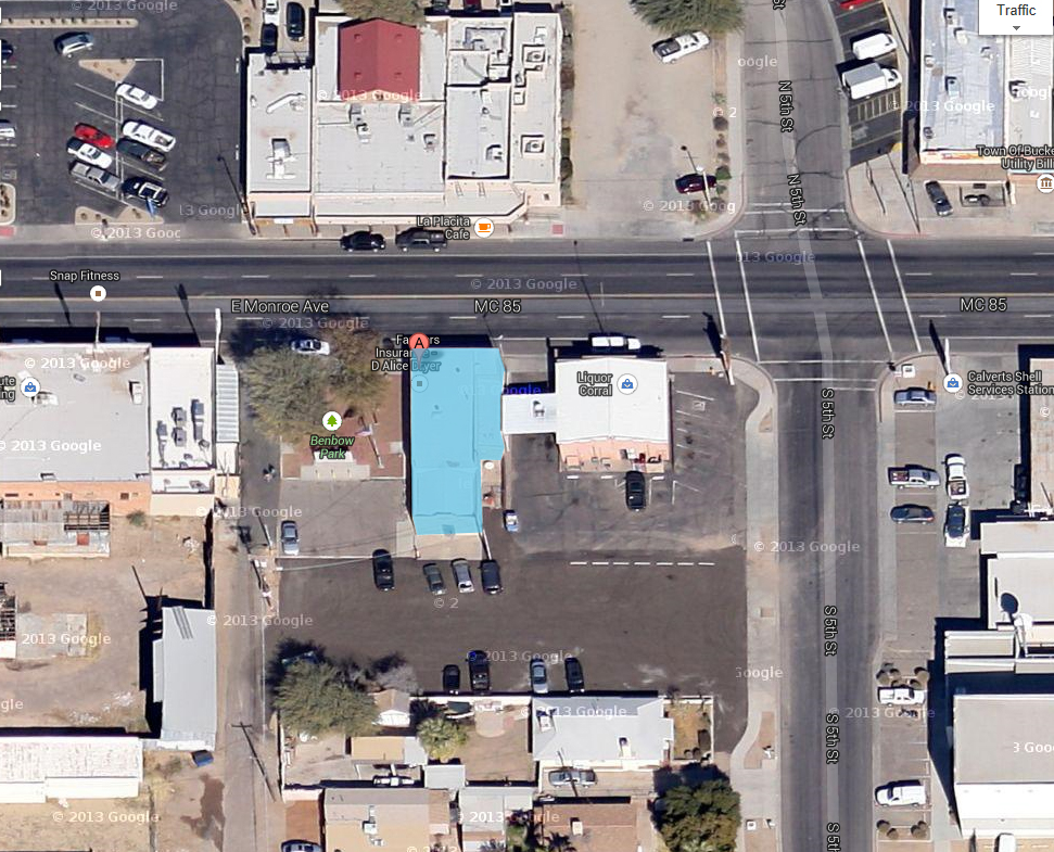
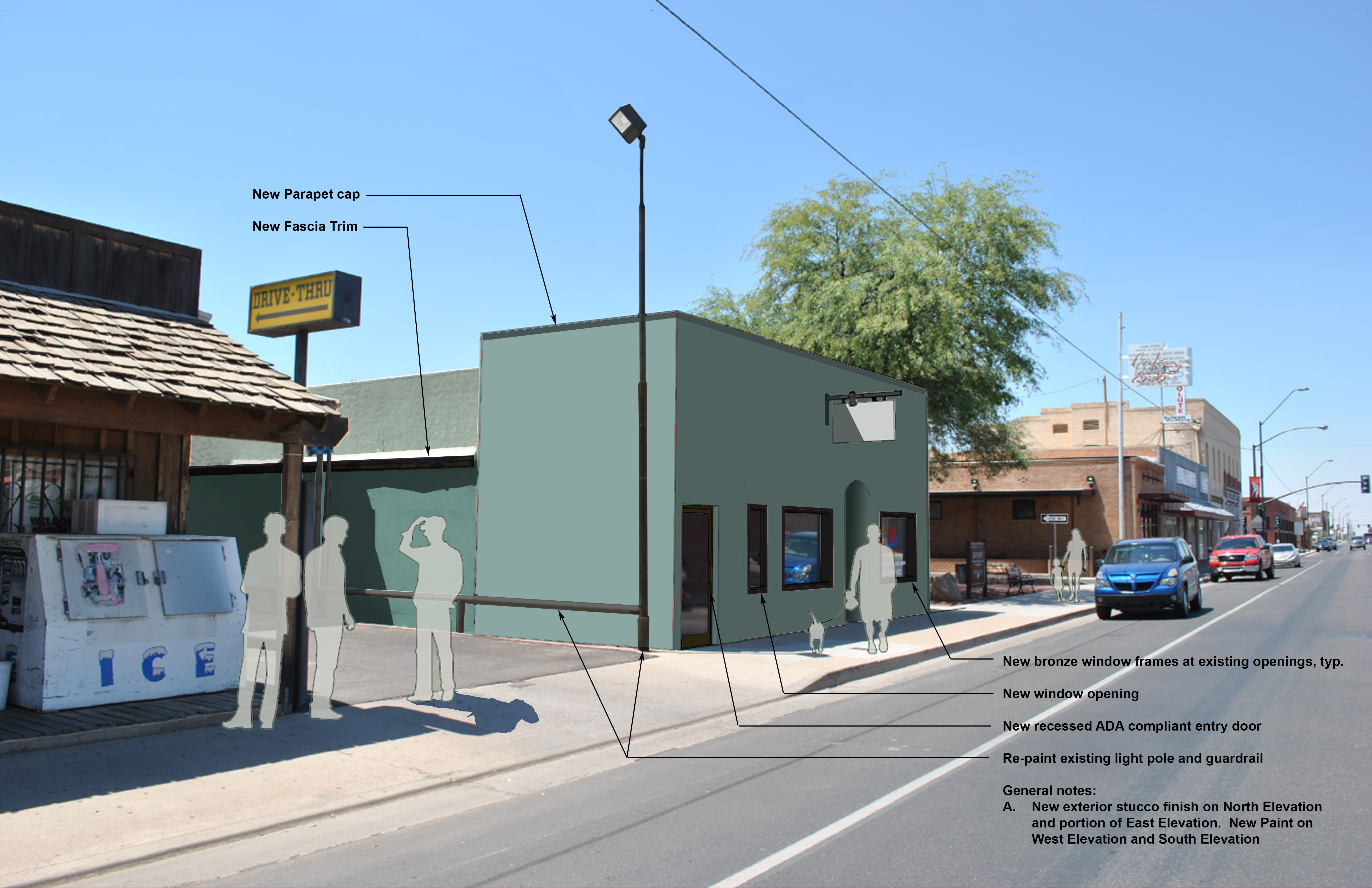
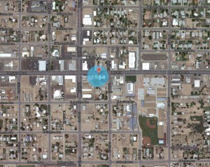
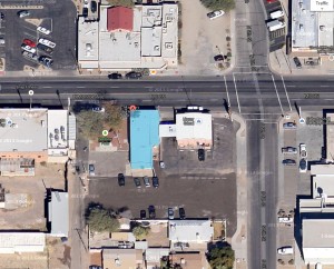
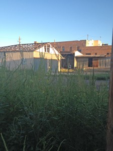
Alice Dryer Insurance Building is a project Serbin Studio has been working on for the last year. If you read last weeks post I talked about the alley improvements along the Benbow Veterans Park. See the big green mesquite tree in the before and after photos, well that is where the Benbow Park is and the alley as well. This is the epicenter of revitalization all the result of Buckeye Main Street Coalition steadfast commitment to change.


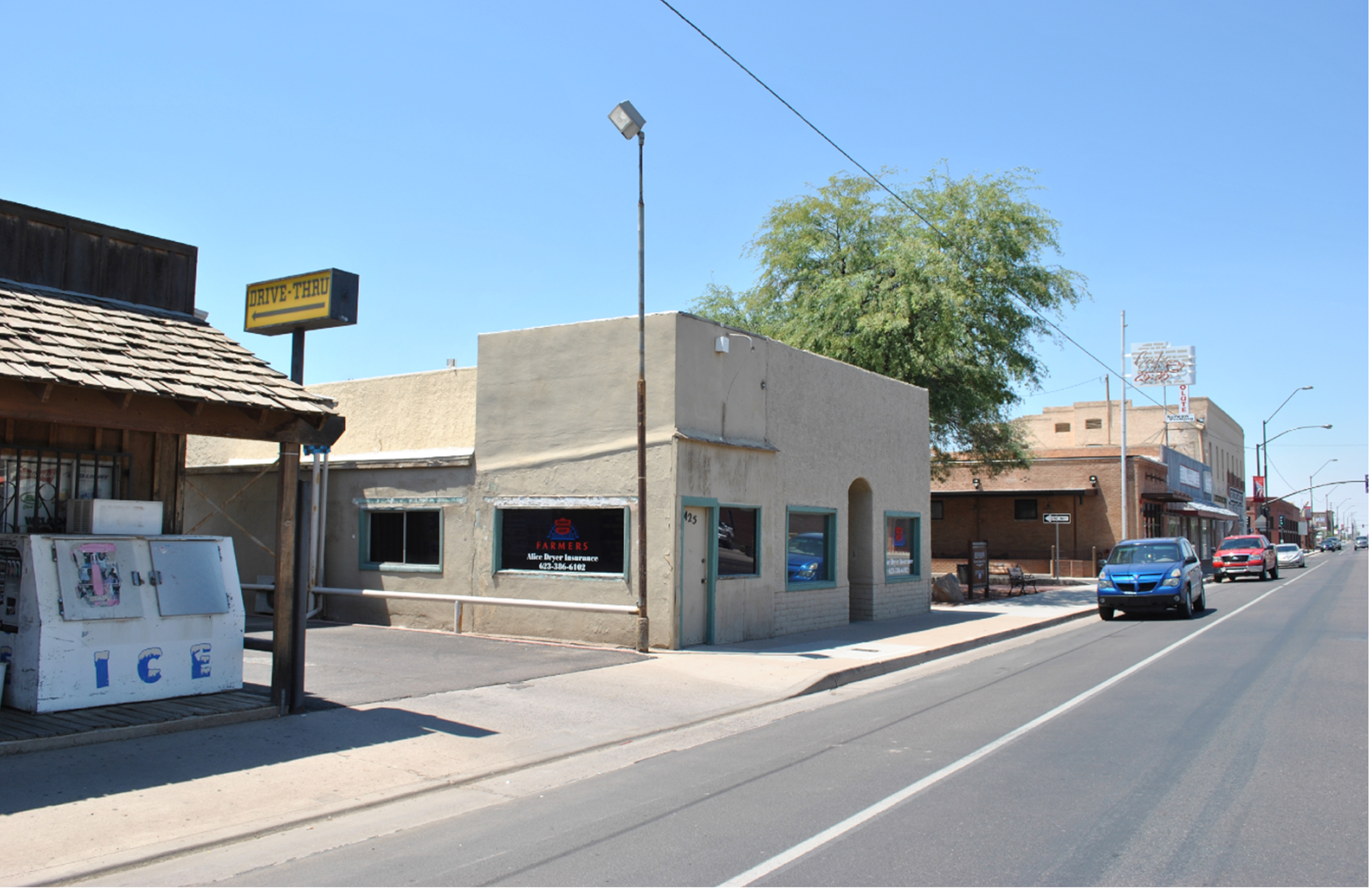
So what do you think of the dusty teal? The photo to the right is what Alice’s current building looks like. She has occupied this building for the last 36 years and is ready to clean up the look. If you can see Levi’s Absolute Screen building a little further down, it is a denim blue color. Brick on the San Linda Hotel on the far corner, blue denim on Levi’s building, brick on Café 24:35 and then dusty teal on Alice’s building. Rhythm. I can’t wait for construction on this project!
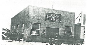
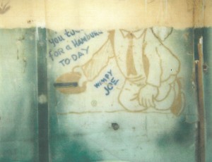
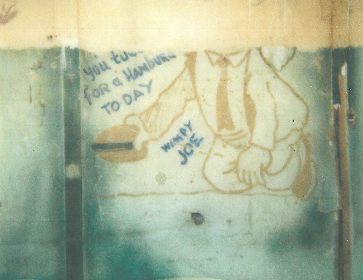
Many piles of cardboard and glue were the result of me coming up with alternative ideas to improve the façade but at the end of the day I kept it simple just like the original Buckeye Tin Shop of 1900’s Buckeye. The Tin Shop later evolved into grocery, bath house and audio shop. In the 30’s an addition was built on the east end for a slim burger joint called Joe’s Eats. The remains of the bar stools are still there in the floor today. Ann McArthur who works with Alice can remember sitting on those bar stools watching the flow of a sweaty cook hashing out patties for a Buckeye lunch rush. The Wimpy from Popeye graphic is still on the interior bearing wall with the famous saying, “I will gladly pay Tuesday for a hamburger today!”
Special thank you to Buckeye Mayor Meck, Council members and Buckeye Main Street Coalition for making this project a reality.

by Lara Serbin | Oct 9, 2013 | Architecture, Blog, Graphics, Planning
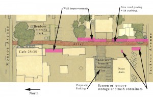
Historic Buckeye is starting to shape up in so many ways. Buckeye Main Street Coalition will be working on the Alley along Benbow Veterans Park. This alley is top of the hit list for 2013-2016 Design Initiatives because it is at the epicenter for the latest revitalization efforts. The alley is the artery for Café 25:35 and Benbow Veterans Park which both recently completed new construction efforts. Pedestrians flock to both of these attractions. BMSC wants to see more of this forward moving activity along the main street in Buckeye. The activity is already motivating shop keepers like Sharon Torres of Buckeye Valley News to transform their building facades as well. The ball is rolling and gaining speed.
Lara Serbin, photo credit: Sharon Torres, Buckeye Valley News
Torres is currently remodeling the interior of Buckeye Valley News so she can offer Wi Fi, books to read, vintage type writers to play with and a lounge for teens. The interior smelled of fresh paint from the metal shelving being painted next to turn of the century printing presses.


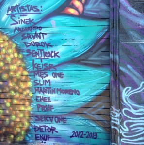
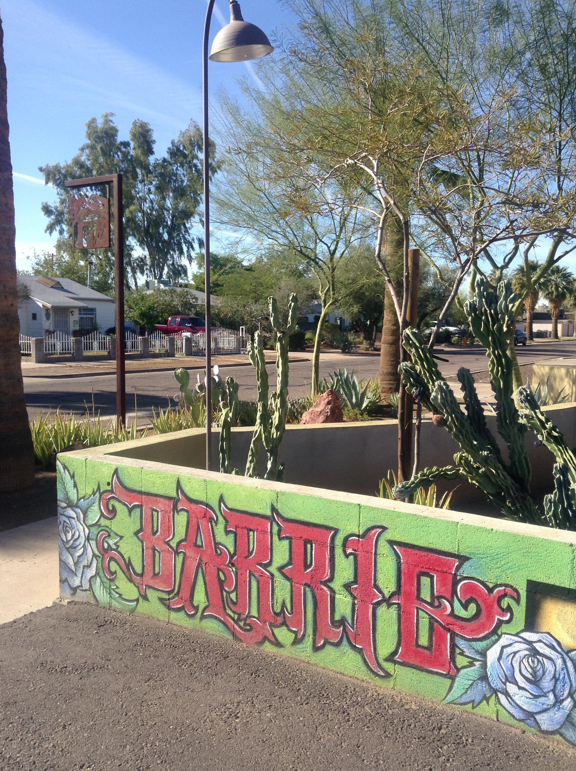
Painted super graphics on the outside of Buckeye Valley News could have huge potential for all pedestrians to feel they have just found a special place on their way to meet a friend for lunch. Torres mentioned how she liked band entertainment in the allies of Denver, Colorado. Sounds like a road trip. There could be outdoor seating, colorful graphics, green and mutli-purpose zones. The super art above is from Barrio Café in Phoenix, Arizona. The art community have taken over the buildings in Phoenix with murals. I have been there several time to take photos. I like how the artistas have a group signature. Torres and many other Buckeye stakeholders would like to see rodeo and historic images of Buckeye. We have to start somewhere and the alley is a good place.


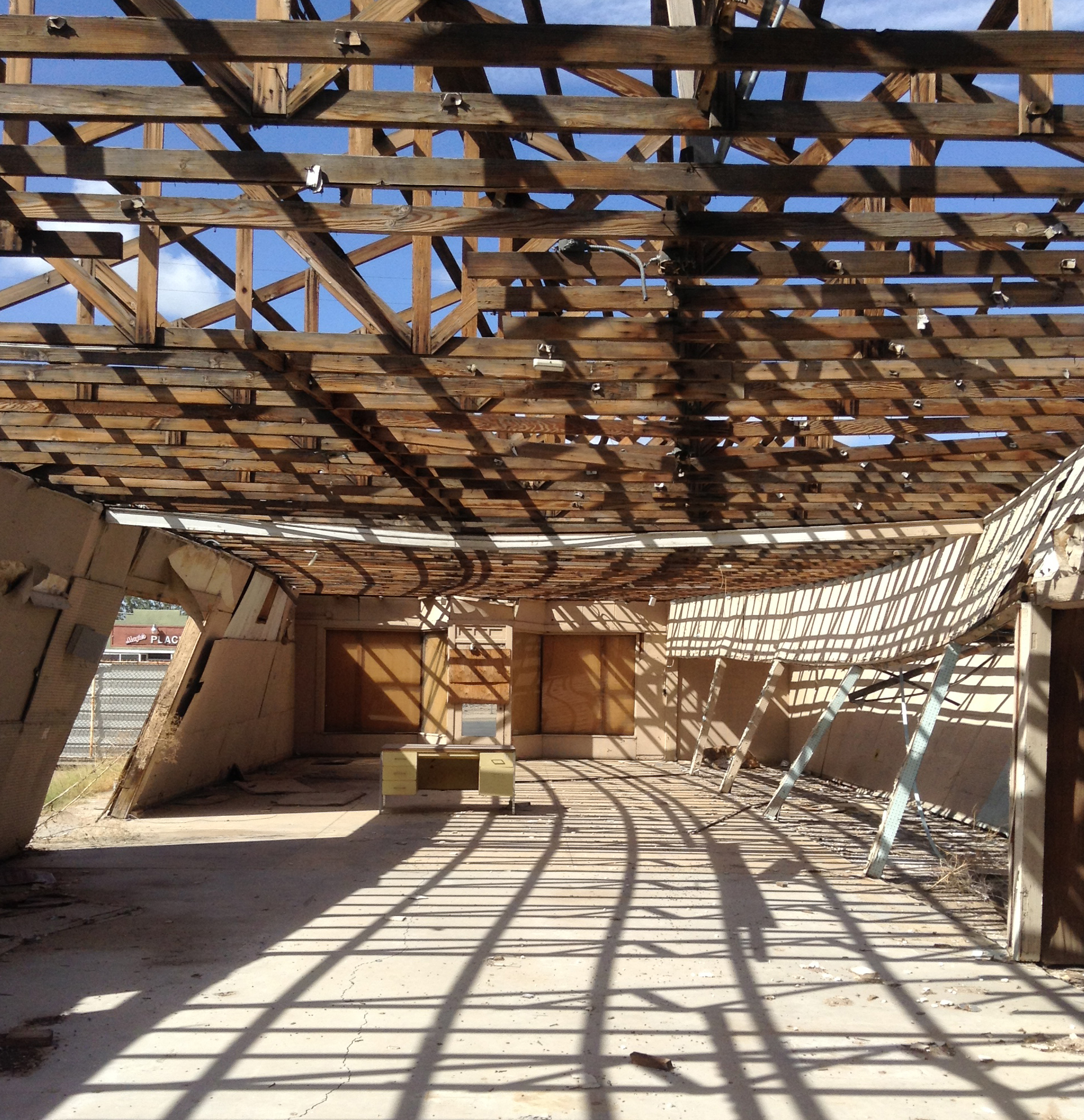
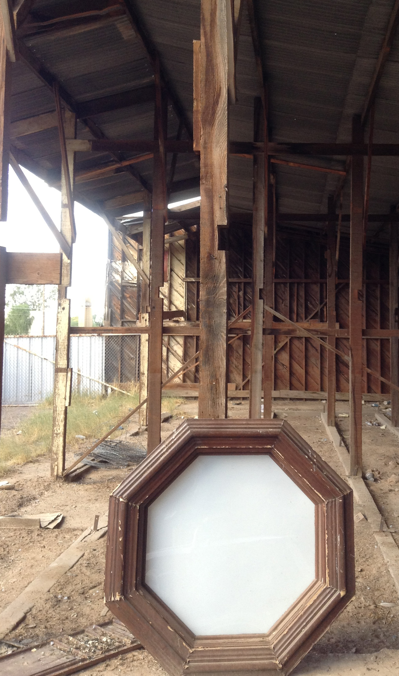
This is a weeded gap entry to the skeletal remains of the old O’Malley Building. I have to say I felt fearful standing under the buckling building today and watching the pigeon find a landing place on the trusses. Boarded up squares are storefront windows facing 4th Street, which is a prominent main street perpendicular to Monroe Avenue. This lot is at the intersection of two infamous Avenues of Buckeye.
Torres has lots of ideas for this desolate lot that she sometimes visits being that it is next door to the Buckeye Valley News. Torres and I both believe in saving as much as we can of downtown Buckeye. Every piece of metal panel, rotted wood and peeled paint has value for future use. Torres would like to see the lot turned into a farmers market. Her ideas were inspirational to me today. It is good to have a friend who understands the value of history and the character it can add for future generations.

by Lara Serbin | Oct 1, 2013 | Architectural Planning, Architecture, Blog
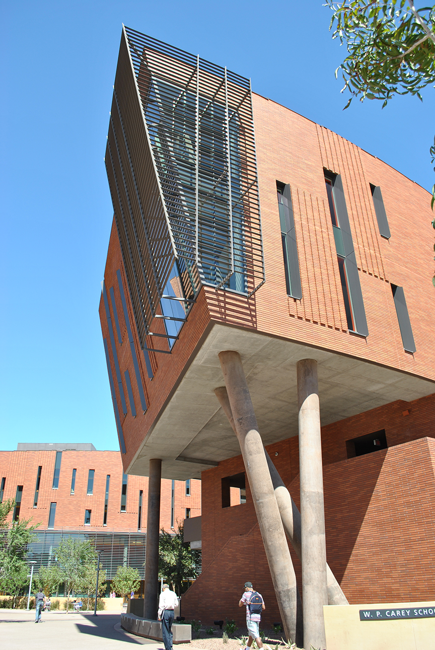
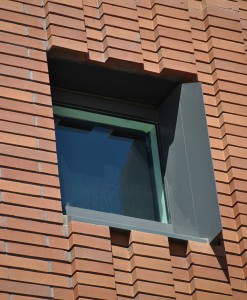
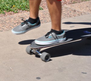
It was another sunny hot day at ASU campus as I was checking out the recently completed McCord Hall by architects Kohn Pederson Fox Associates from New York. This brand new building is part of the W.P. Carey School of Business on Lemon and Normal Street *definitely not normal*. I felt like I was going to get run over by this skate boarder whizzing by me as he was texting, back pack off the shoulder and then a guitar case in the other hand. Most guys skated, there were a few girl skaters but the majority of girls had beach cruisers in pastel colors or just walked with totally unreasonable sandals as they moved by the new 129,000 square foot facility.

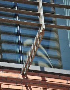
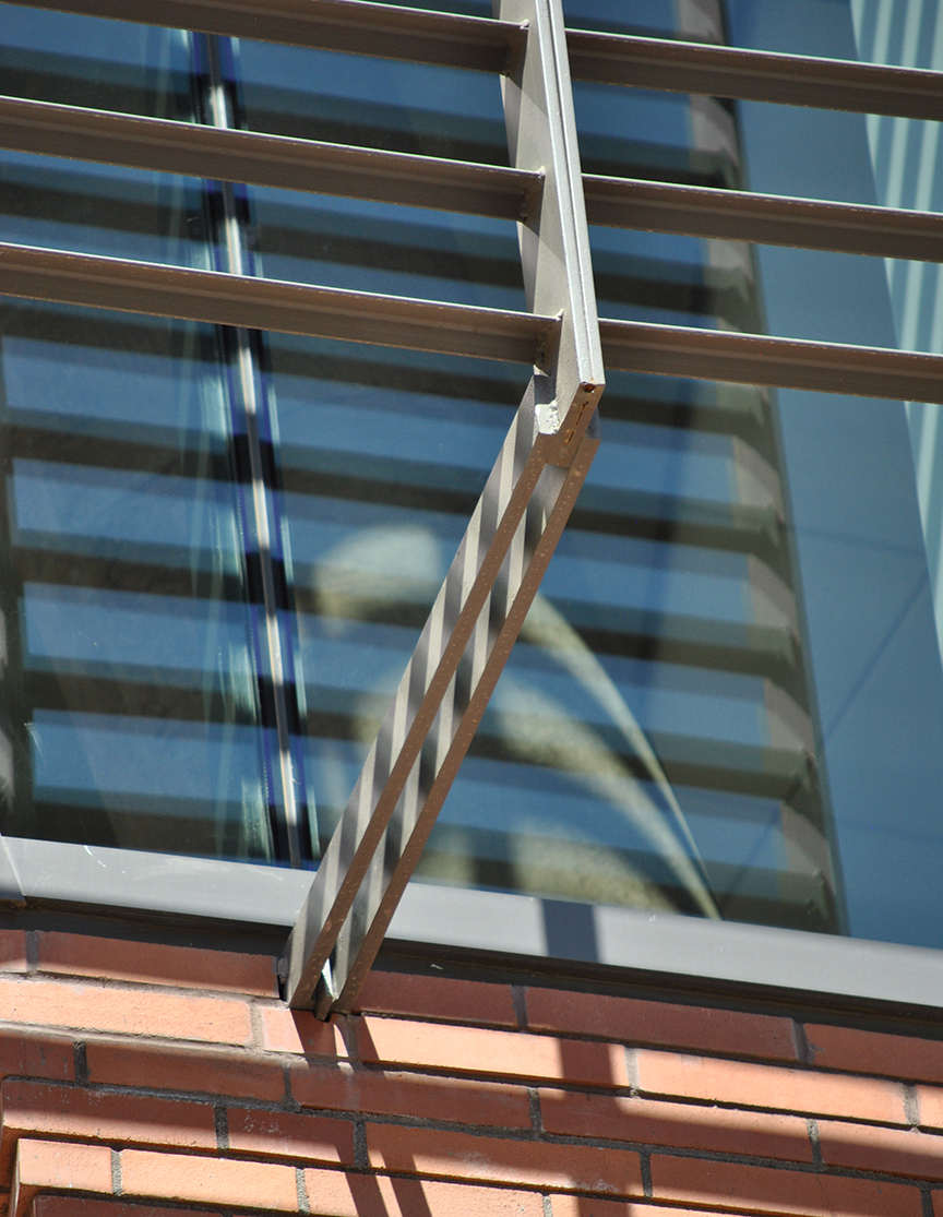
Most of the campus is brick, this addition has a gorgeous bluish hued brick and it is even prettier in person. The concrete columns twisted together reminds me of someone standing needing to relieve themselves. I walked the perimeter and went inside but could only gain access to the second floor, the higher floors were locked off even trying to punch through with the elevator. The photo above in the middle is a detail of the steel metal screen over the corner fenestration. I like the steel detail but maybe they could have added a pitch fork at the end. FEAR THE FORK. Could have had more fun in the details.
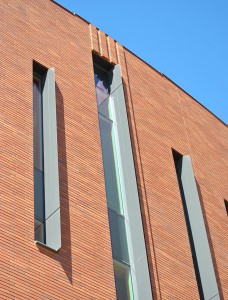
I love the shadows in the horizontal grout lines of the brick. Pure genius how they only have the vertical grout lines shown, it accentuates a horizontal movement and then it gets interrupted in a good way with vertical fins on the narrow ribbon windows. I like the gray fins on the windows but they should have been placed on the opposite side of the window, the shadow is cast on the brick and not on the window where it needs to be to block the sun.
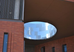

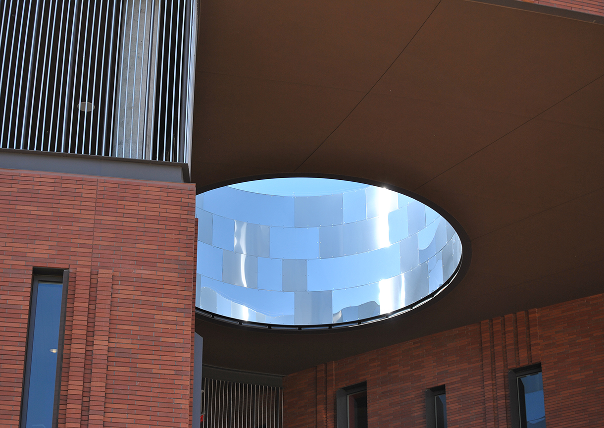
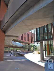
There are two main buildings and when they connect all sorts of architectural tricks happen. The point of connection is an engaging and dynamic space. The oculus in the roof is exciting and lets in some light but could have been better if clad in a charcoal gray metal and matte finish. The uneven shiny steel panels cheapens the surrounding heavy feeling building materials.
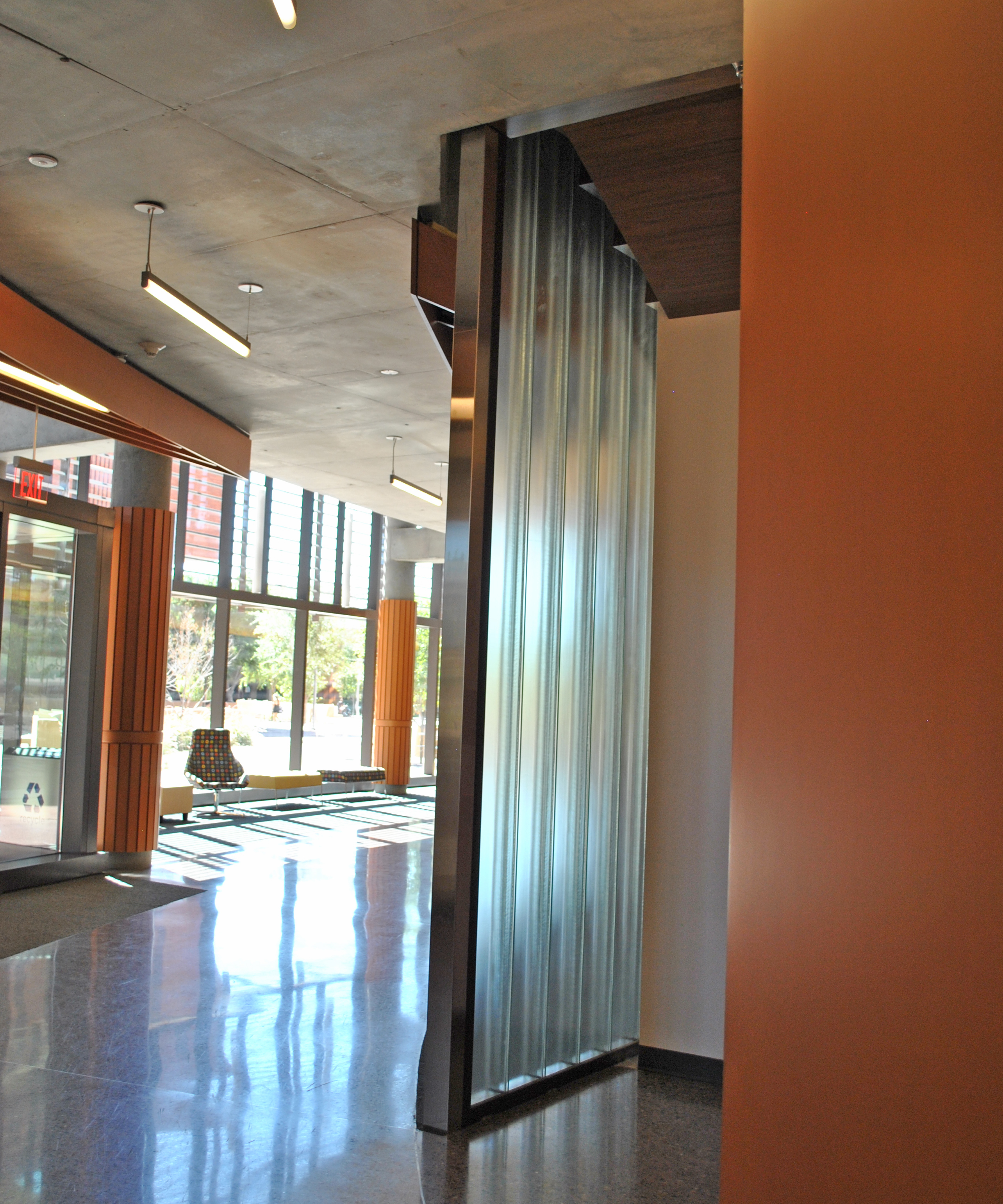
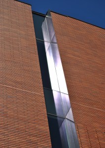
The interior was really well lit and impressive. The photo in the middle shows the vertical glass block. Vertical continuous glass block, what more do I need in life? It would have been even cooler if they could have found a way to end the glass block without the steel frame edge. Steel frame on the bottom is ok but not on the vertical. The glass would have been more HUSH.
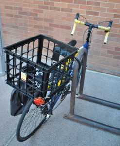
This student used plastic zip ties to secure the basket to the bike for books, do you really think they are going to care about the solid wood hand rail that helps them up the stairs? Later after their Business Team Class they will toss in a 6 pack of Ramen Noodle Soup Beef Flavor in this bike basket and then have to pay a porton of the $57 million dollars it took to build this college building. I believe that buildings need to uplift and inspire but at the same time be practical.

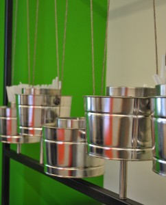
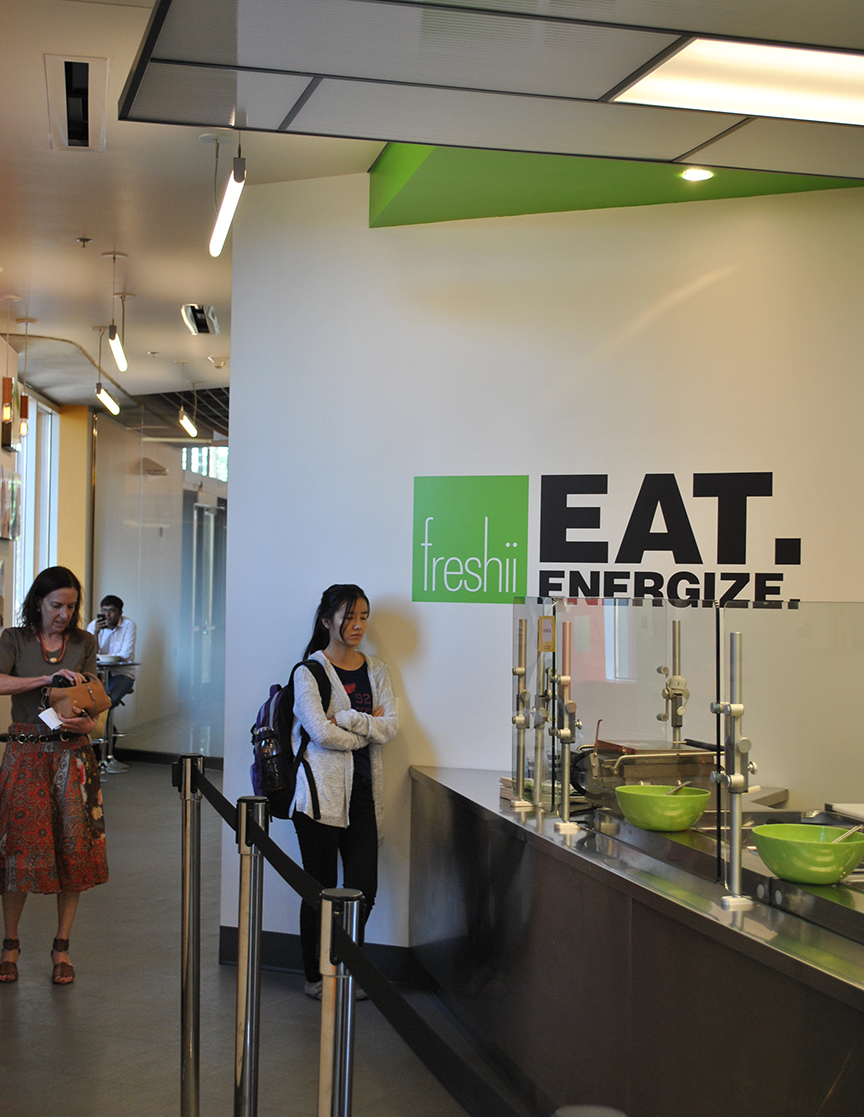
I had lunch at freshii just before I had to jet. College food has come a long way from Louie’s Lower Level *Fear the Cat*. At this place I had tofu over rice noodles and steamed veggies. It was funny that I could have kale at college! I had no where to throw away my straw sleeve and I wasn’t about to open this huge metal garbage can to do it. The little buckets are for plastic ware, too crafty cute for my taste. I liked the outdoor eating patio and listening to the smartly worded chatter, watching skaters and finally some guy gave me a pocket Jesus calendar for 2013.
Lara

by Lara Serbin | Sep 17, 2013 | Architectural Planning, Architecture, Blog, Planning
I don’t have a signature style, but I do have a signature approach to building projects. I like to pursue projects that I have a fondness for. A few years back I asked myself what I would really like to work on as an architect and I thought of fixing up historic buildings in Buckeye, Arizona. From Serbin Studio it takes about 20 minutes for me to get to historic Buckeye. It makes sense to work in my own community. I feel at home when I am in Buckeye. The people who live in the Town still read the paper and talk to one another daily. When I say talk to each other, I mean talking face to face at the Elk’s Lodge or just in passing at Café 25:35, a local haunt for burgers with names like Palo Verde! Alice Dryer, owner of Dryer Insurance has a penguin figurine collection that would blow you clear to Tonopah. What more could you want in a Town?
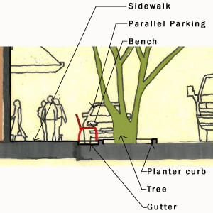
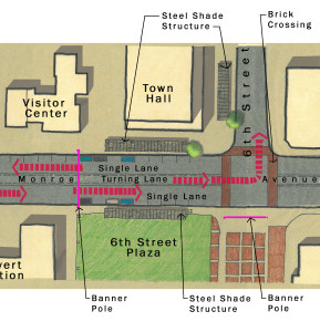

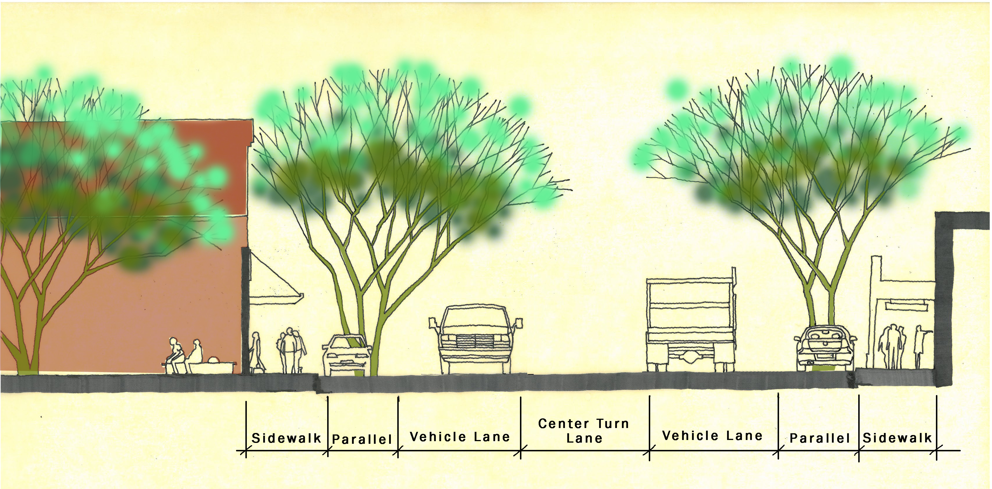
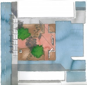
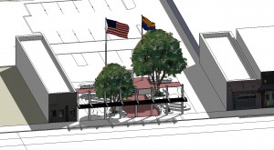
Monroe Street Scape 2013-2014
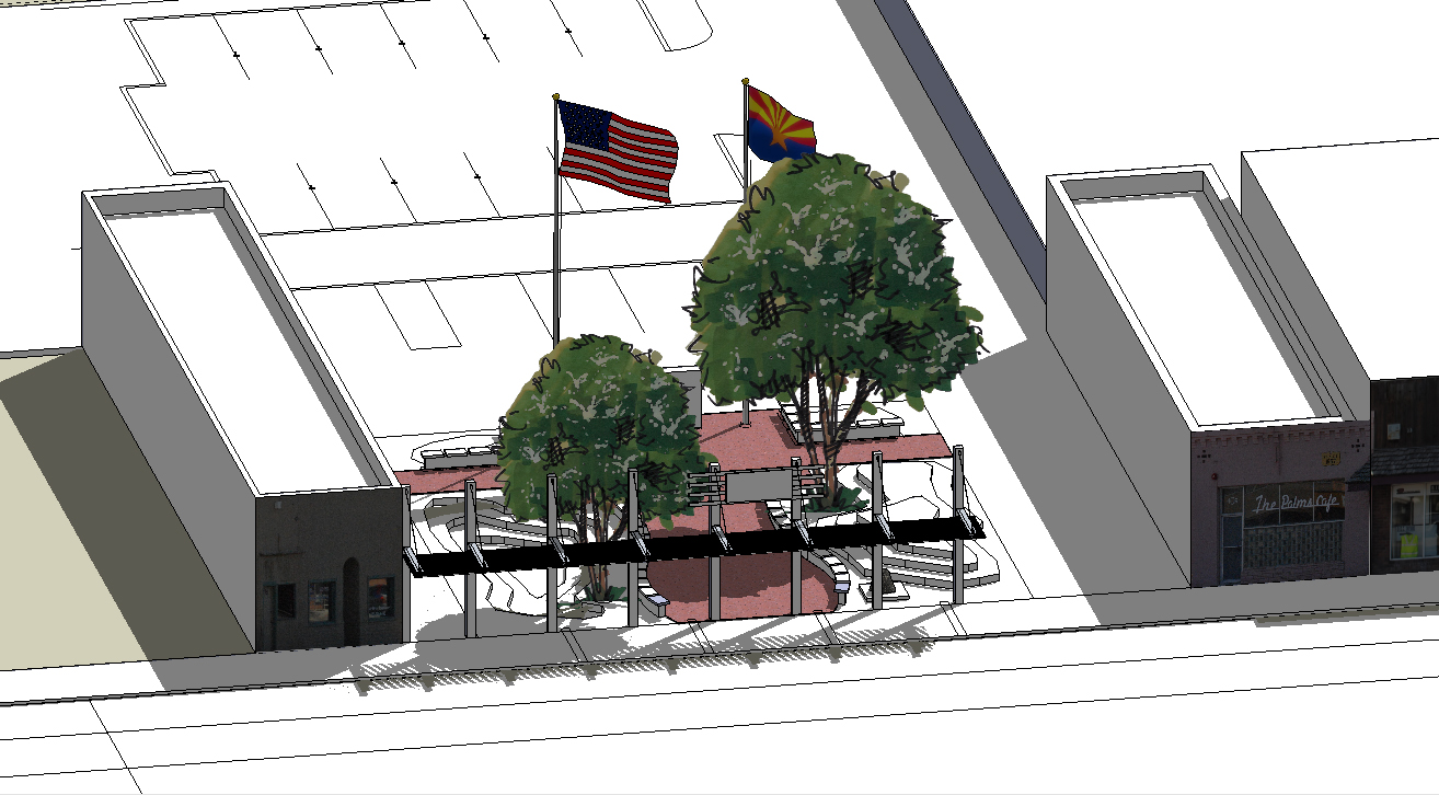
The Monroe Street Scape project is a collaborative project between Serbin Studio and Buckeye Main Street Coalition. Serbin Studio provided the necessary drawings to convey what the business owners wanted in terms of the most logical placement of trees, banner poles, brick cross walks and side walk shade structures. This is an ongoing project that will be executed by WC Scoutten in collaboration with Buckeye Main Street Coalition.
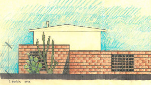
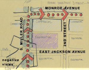
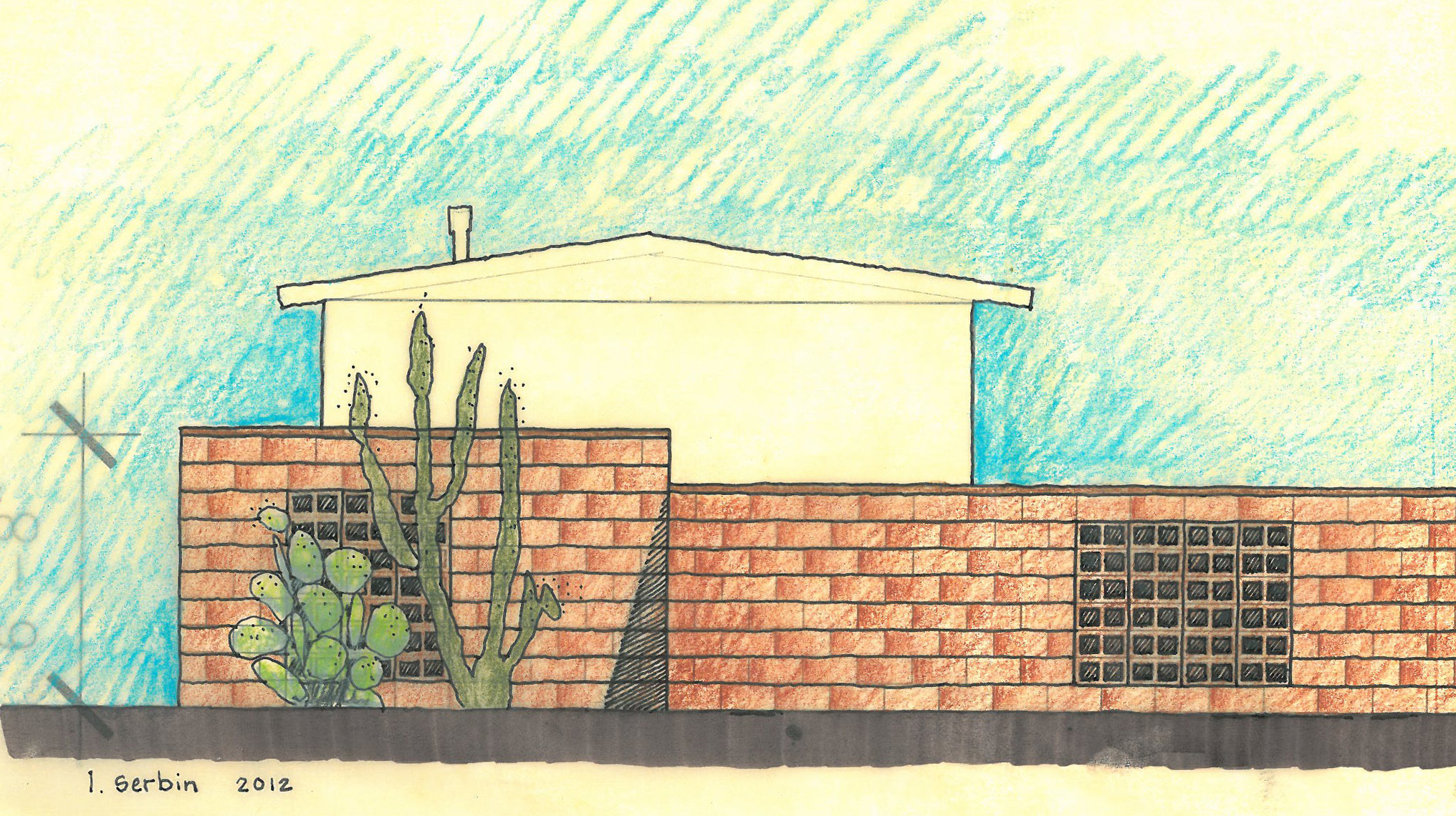
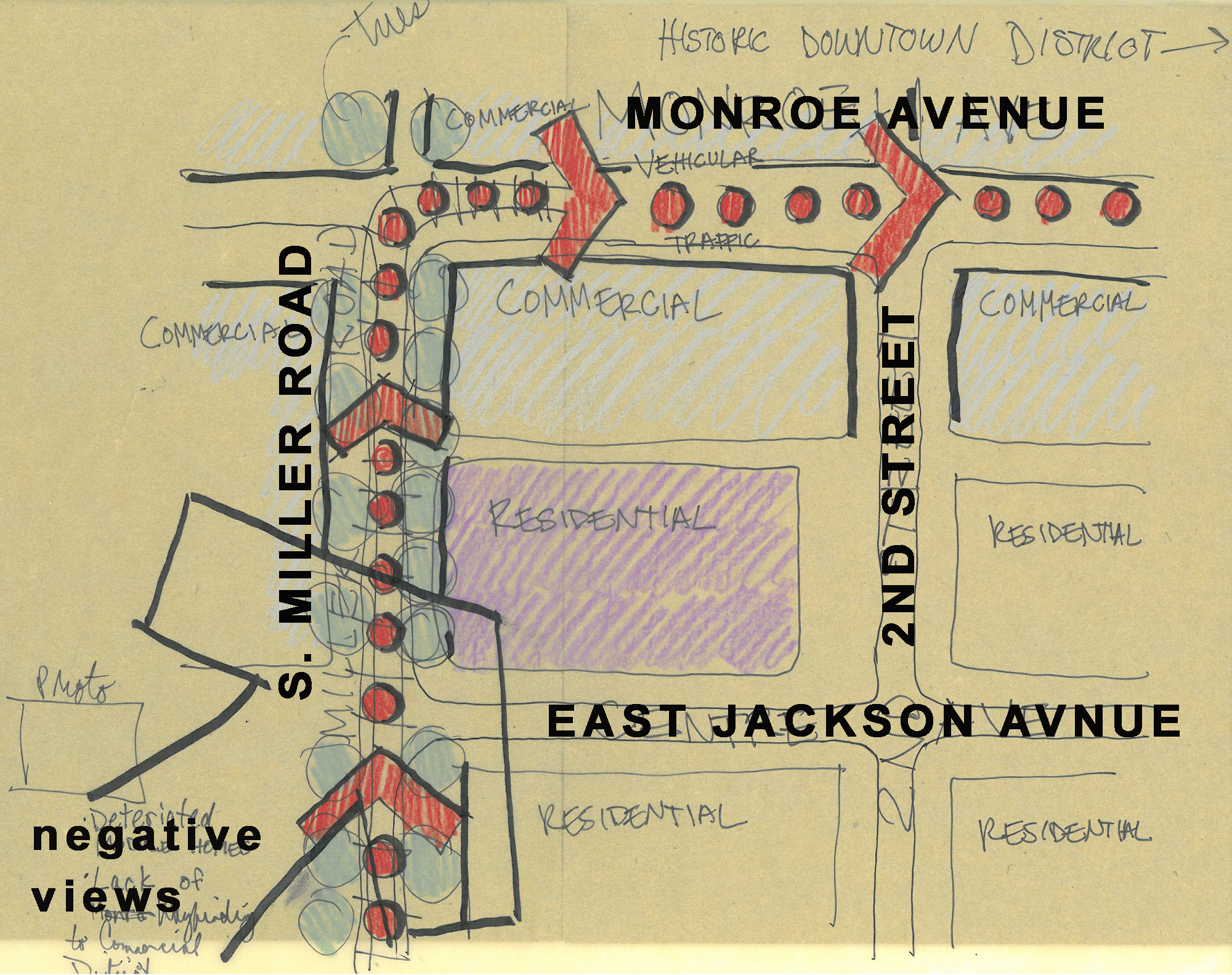
Miller Jackson Gateway 2012
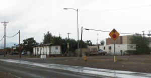
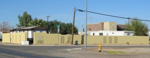
This project started with the Town of Buckeye tapping Buckeye Main Street Coalition to do something about the blight on the N/E corner of Jackson and Miller. Main Street and Serbin Studio provided a wall concept that would allow for partial screening of the trailer park. I mean the roof pitches of the trailers really weren’t so bad if the base was cleaned up with a residential scaled wall. The key was to get the height just right…not too tall and not too low. We didn’t want residents to hang laundry over the wall *don’t get any ideas now* but we didn’t want the wall to cover too much. BMSC is not done on this corner, we still want to add native trees and a horse trail.
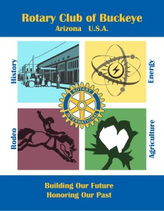
Buckeye Graphics 2012
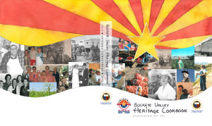
The Buckeye Women’s Club was talking about creating a cookbook of local recipes for the Arizona Centennial. A standard cover for the Buckeye Valley Heritage Cookbook was being kicked around so I offered to help them out with creating something that would be more custom made. All the photos used on the cover were carefully selected by Pat Rovey and Verlyne Meck. Serbin Studio did the watercolor sun and composed the graphics in photoshop. Rotary Club of Buckeye needed a new image for their trading banner. Lara Serbin worked with Charlene Powers *it was all Charlene’s idea* to create the four quadrants that represent Buckeye’s major industries that keeps Buckeye Open For Business.
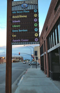

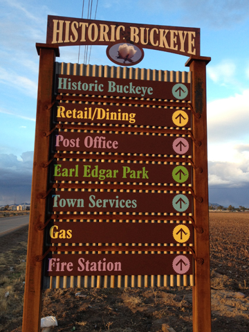
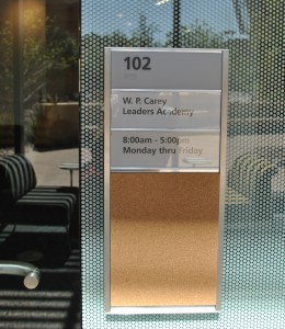
Wayfinding Signage 2012-2013
Buckeye Main Street Coalition and Serbin Studio was involved in the design of the Wayfinding signage posts that cover Monroe Avenue and Miller Avenue in down town Buckeye. WC Scoutten was the engineer and Motivational Systems constructed the monuments for the Town of Buckeye. The signs help direct visitors to the local attractions with colorful arrows against a dark rustic metal shingle sign. The corrugated panels are a throw back to the local cotton gin construction materials.
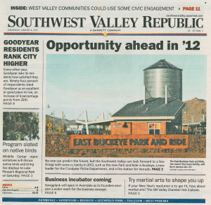
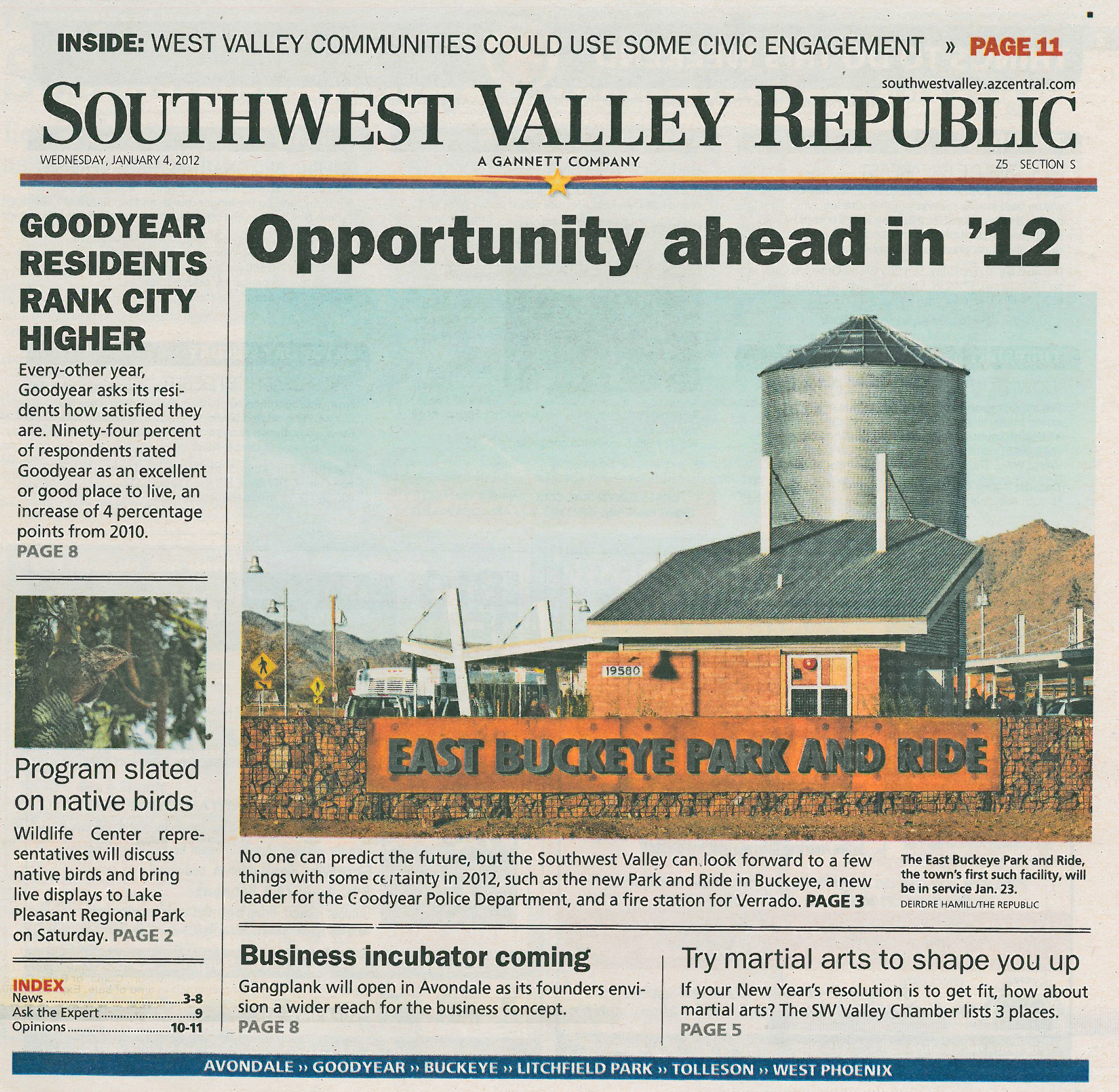
East Buckeye Park and Ride 2012
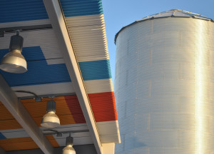
East Buckeye Park and Ride 2011-2012
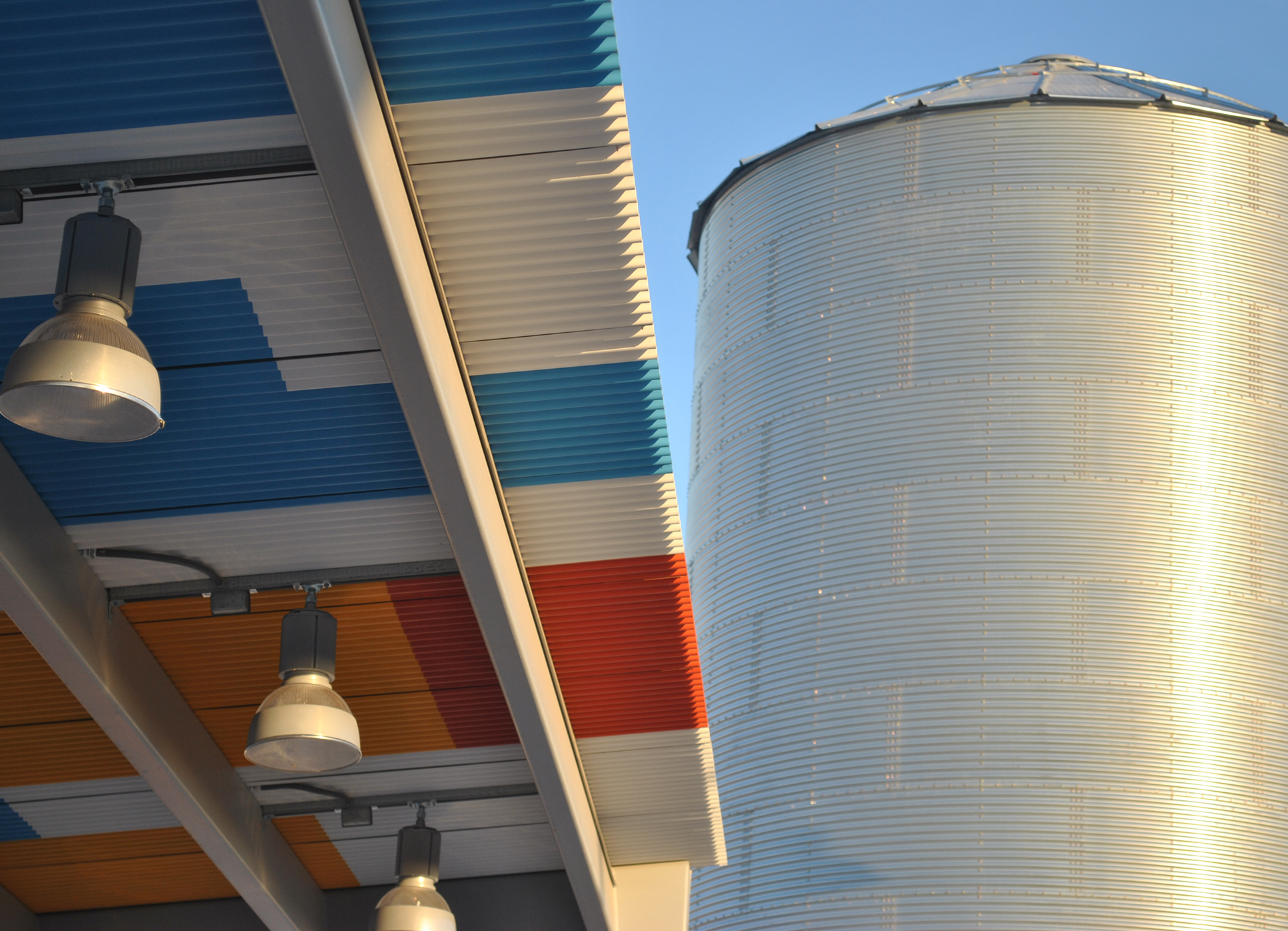
Serbin Studio was the architect of record for this Town of Buckeye public project. W.C. Scoutten was the engineer for the project and Hunter Construction was the contractor. The project includes plenty of parking structure canopies so you can leave your car in the shade while taking the bus to a far flung destination. It is a connector for transit situated along Interstate 10 and Jackrabbit Road. You can see it from the freeway if you look for the shining galvanized silo that anchors the site.
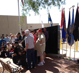
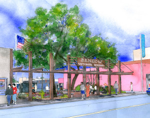

Benbow Veterans Park 2011-2012
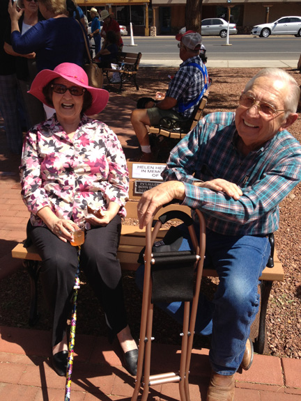
This was the first project I worked collaboratively with Buckeye Main Street Coalition. It is a park dedicated to the fallen military and civil officers of Buckeye, Arizona. The original memorial wall was situated at the Buckeye Police Precinct on South Apache Road. The wall was in bad shape and out of the public foot traffic on Main Street. BMSC transformed the historic Sidewalk Park to Benbow Veterans Park with a new memorial wall in black polished granite and benches for public events like Veterans Day. Since the groundbreaking ceremony in 2012 many people visit the park daily to chill out under the huge mesquite shade trees and talk to Frank.
Jimmy Mack…all this time I thought it was Jimmy Back. Now I can sleep.

by Lara Serbin | Sep 6, 2013 | Architectural Planning, Architecture, Blog, Collaboration, Graphics, Planning
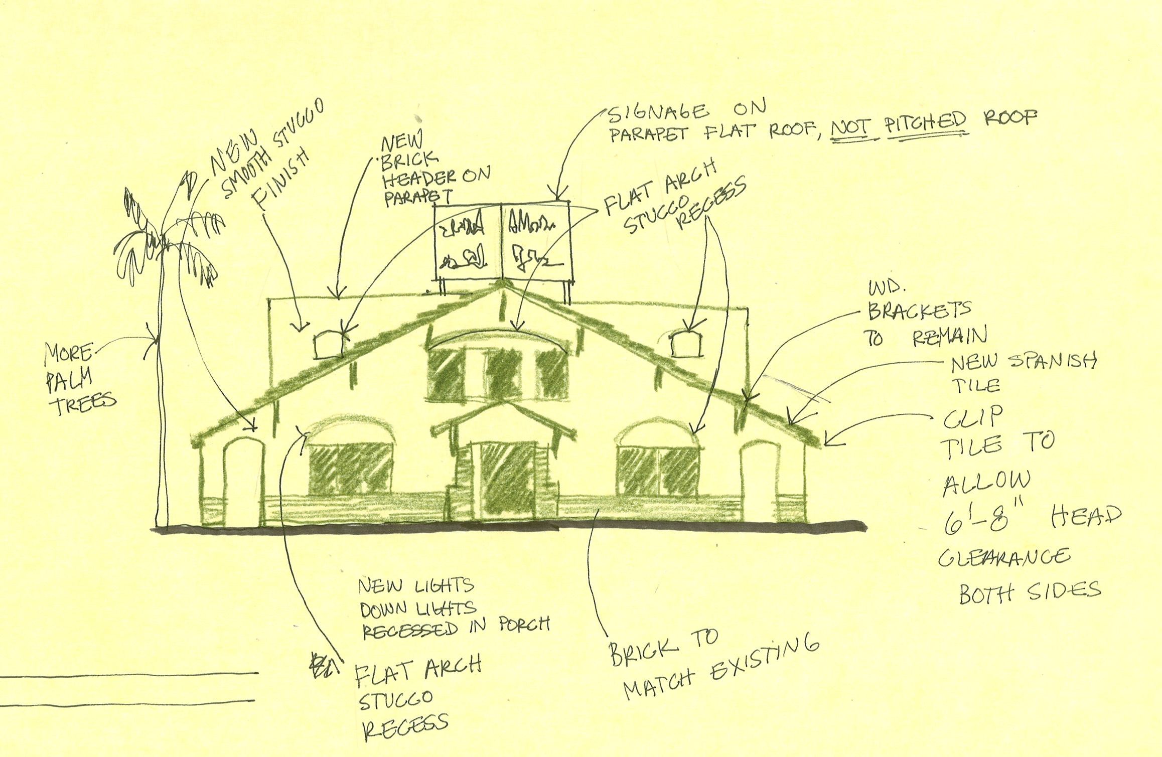
I took one of those personality tests this week. Only because it was required by my Executive Forum group that I belong too. I really hate those things. I didn’t like my results when I read through them probably because they were so right on the MONEY. My review makes me sound like some superficial name dropper who wants to please everybody. I am such a people pleaser at my core. I am an outfielder. I take time to catch the ball. But I do like to be part of a team. I actually prefer to be managed. This is so true. Just tell me what to do. If I am in a management role I will inspire others to action. I do have to be careful not to overpraise people. My reason for being is Aesthetics. Period. Are you so surprised? A girl in the outfield who wants everything to look pretty. I really saw my strengths in yesterday’s design review meeting. *why is this in italics?*
I am the Design Chairperson for Buckeye Main Street Coalition. Yesterday we all met to review some remodel plans for one of the historic buildings along Monroe. There are the more domineering members of the group who immediately analyzed the square footage of the new remodel. I could see myself sitting and taking this in. I didn’t have any comments right away. We all feel comfortable with one another. We all agreed that the smartest response was to retain the historic nature of the front façade.
I had my role of buff tracing paper and my pencils ready. Tracing paper is invaluable because you can lay it over a photo or façade and sketch any changes over it. You can see through it. You can lay many layers over the photo to keep evolving the idea. My pens were not allowing me to sketch fast enough and I didn’t have a black Prisma pencil so I used Kelp Green. I started to zone out while everyone was talking. I loved that moment sitting there with my team helping them put down on paper what it was they were thinking. We had gone over this project through emails months ago but meeting face to face was so much more effective. This sketching and listening is my reason for being. I want to do this more. I could sketch like that everyday. It is not the same sketching by myself at my light table. I like listening to my team because they have been in their position for decades and know what to do. Some of them have gone to church services in the building. The thing I like the most about my team is the speed they make decisions.
It was good to know that even though I will never be the pitcher I do add to the team standing in the outfield with my nerdy LLBean canvas bag.