by Jeff Serbin | Feb 19, 2014 | Architectural Planning, Architecture, Blog, Planning
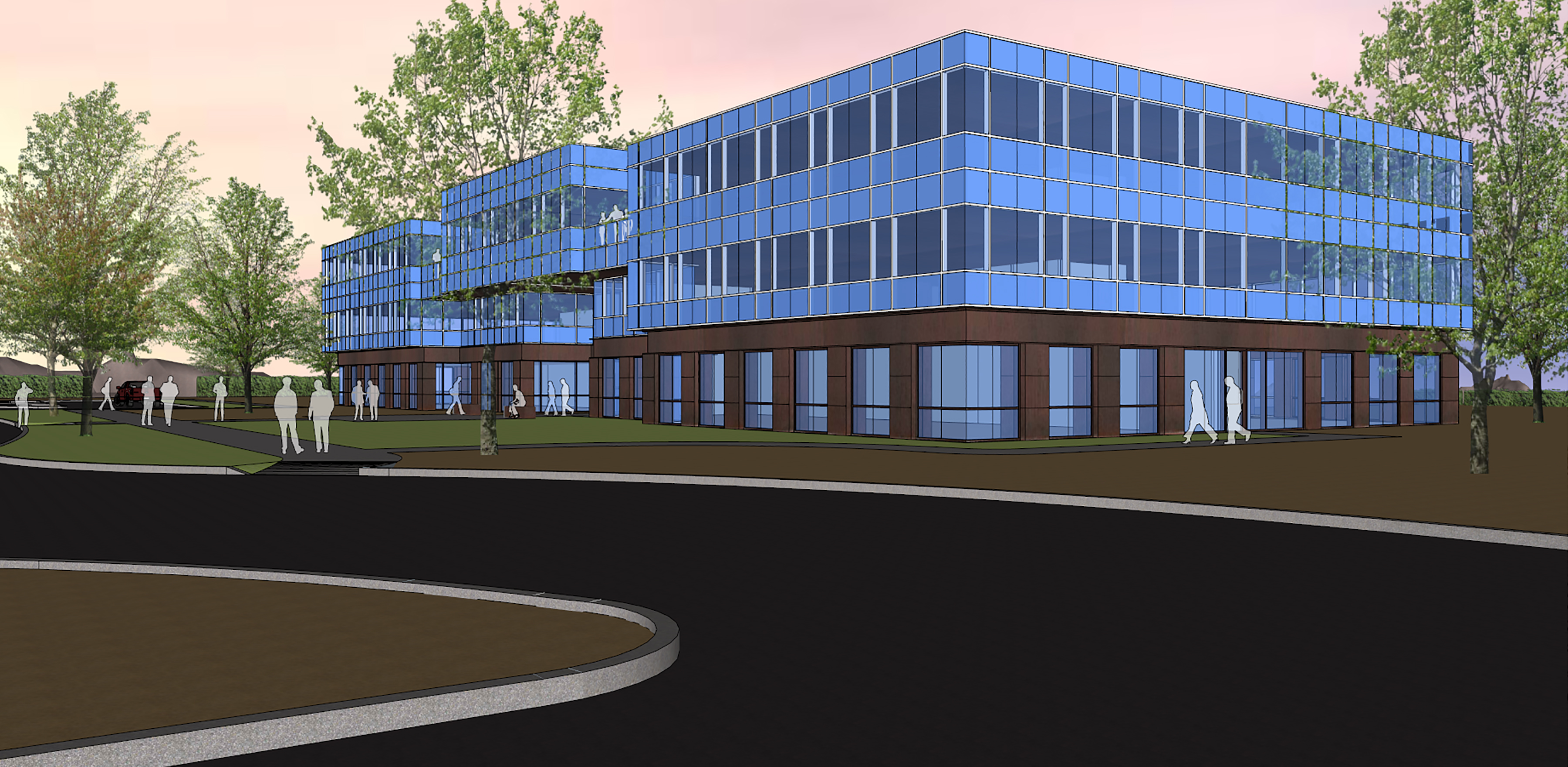
Creating an office building is about designing an environment that creates a place for the workforce to perform their tasks efficiently while enabling the building owners to maintain their assets easily.
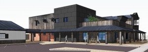
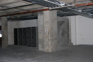
click to enlarge[print_gllr id=1520]
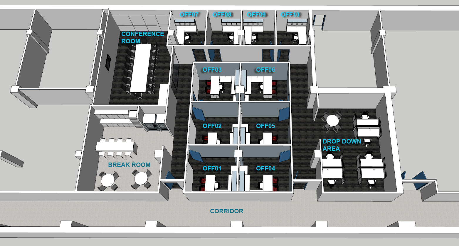
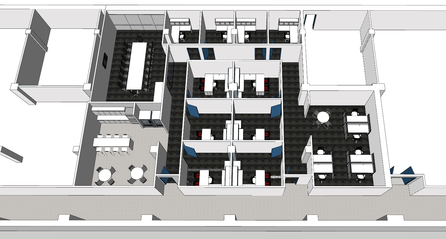
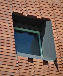
This 60,000+ square foot office building was designed to create that comfortable work environment. This sustainable facility utilizes low energy building components by incorporating the latest technologies. The building is designed with an efficient rentable to common space ratio, high performance exterior skin, low water use fixtures, energy efficient mechanical and electrical systems and environmental sensitive materials. It was designed with LEED GOLD in mind.
Some interesting facts about latest technologies.
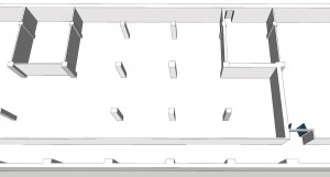
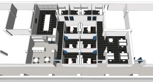
The shell of the building is just the beginning. Once tenants begin to occupy the floors, the real magic begins with space planning to create unique micro environments that satisfy the users needs while being efficient with space. The more wasted space there is, the more rent they need to pay and space to maintain.
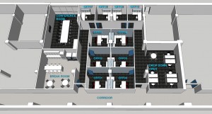
Space after tenant improvement
SEE ALSO: Tailor Your Office Tenant Improvements

by Jeff Serbin | Feb 6, 2014 | Architectural Planning, Architecture, Blog, Collaboration, Planning
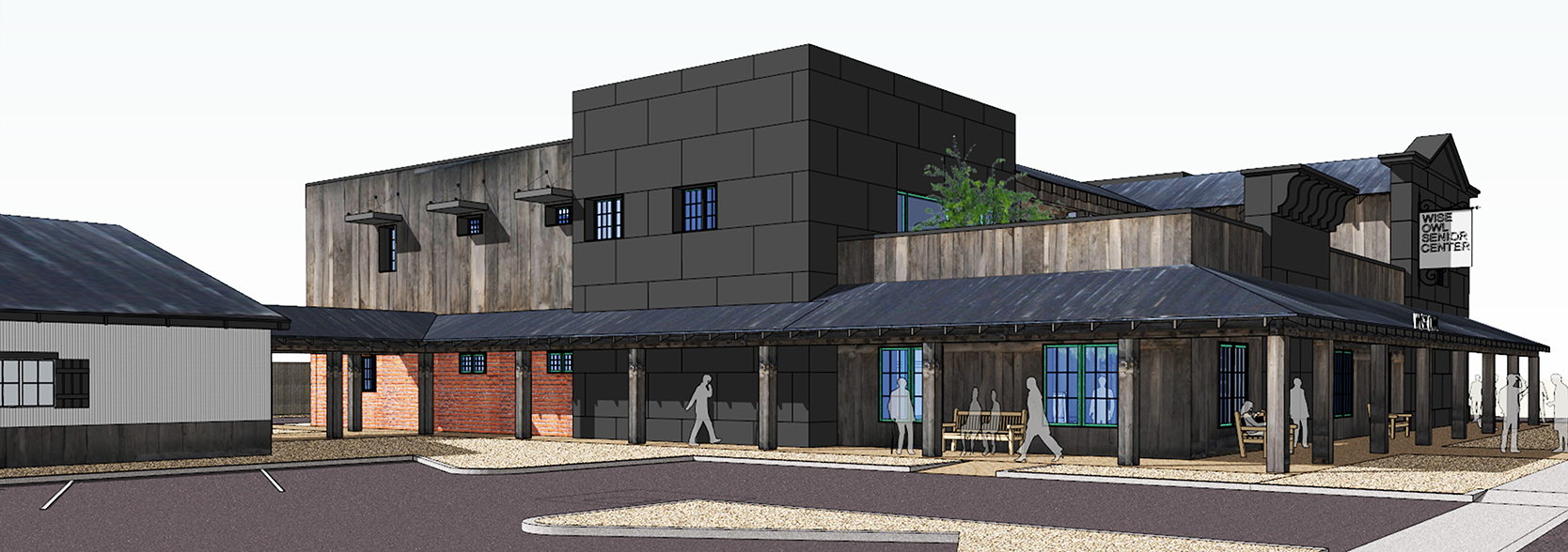
Have you heard the term “He is a wise old owl?” You can find many wise owls at Wickenburg’s local senior center, Wise Owl Senior Center, located just south of the Santa Fe Railroad tracks. It’s facility was founded in 1979 and has been wisely used over the years.
The existing 6,500 square foot facility has seen many card games (hopefully no strip poker), bingo games (I22), musical bands (I heard the Grateful Dead played there), billiard games (part of Color of Money was filmed there) that have been played in its facility over the years. The center has outgrown its use and the Foundation for Senior Living who operate it, are looking to revitalize the establishment, once it can gather enough gold nuggets from the local mines in and around Wickenburg within its talons.

Serbin Studio first task was a ‘programming session’ or fact gathering, working with the facility managers and users to get a grasp on how the facility operates within the existing building and how it operates. The current building lies outside the historic downtown core of Wickenburg and is camouflaged, like an owl, into the surrounding neighborhoods. Like an Owl who can turn its head as much as 270 degrees, Serbin Studio took its design a step further and designed a facility which looks a full 360 degrees.
The design is two stories and 14,000+ square feet, reflecting on the historic fabric of Wickenburg which is influenced by many things: mining, railroad and the ranch lifestyle. As an owl flys silently, the building pleasantly surprise its users once they step foot into the private courtyard. It’s amenities include a full service Dining Room and associated Kitchen and food distribution on its first floor. The second floor contains meeting rooms, a game room, computer center to email the grandchildren, offices and conference rooms to manage all the programs they offer. The second floor also offers and outdoor patio with views to the local mountain ranges so you can keep your eyes on those claims you may have in them mountains. It’s also a great place to watch the summer monsoon’s roll in from the North.
[print_gllr id=1420]
The project is only in the conceptual phases, however we hope the design will provide momentum to allow the facility to expand.
by Jeff Serbin | Jan 22, 2014 | Architectural Planning, Architecture, Blog, Interiors, Planning
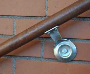
I recently visited the Barrett Jackson Automobile Auction in Scottsdale, Arizona to witness the old vs. new, the factory vs. custom, the ordinary vs. unique, items costing a few dollars to ones that will empty your wallet. Its all about DESIGN.
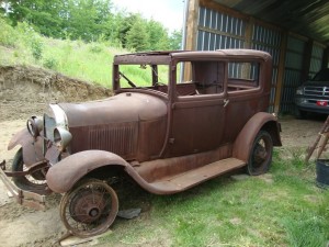
1920’s Ford Model A (barn find)
Just like architecture, historic vs. new, tract vs. custom, ordinary vs. unique, one can really gain an appreciation and inspiration from other forms of design. For some, design may come from fashion, looking at silhouettes, fabrics, colors and textures of clothing on a supermodel.
Others may get inspiration from nature, looking at the forms of plants or animals or shapes of minerals formed by thousands of years of pressure. For others, it’s the fashion of the automobile with its silhouettes, materials, colors and textures of a supercar.
As an architect, I am not customizing something on 4 wheels, but sitting on a concrete foundation. Just like a car with a destination in mind, sometimes with a focus of Horse Power or driving in style from point A to point B, architecture serves a purpose for creating a space to get work done in a quick and efficient manner or to live in luxury or style. And just like a car, buildings do need restoration, from structural frame up restoration or rotisserie restorations. Say that really fast about 10 times and you can be an auctioneer at the Barrett Jackson.
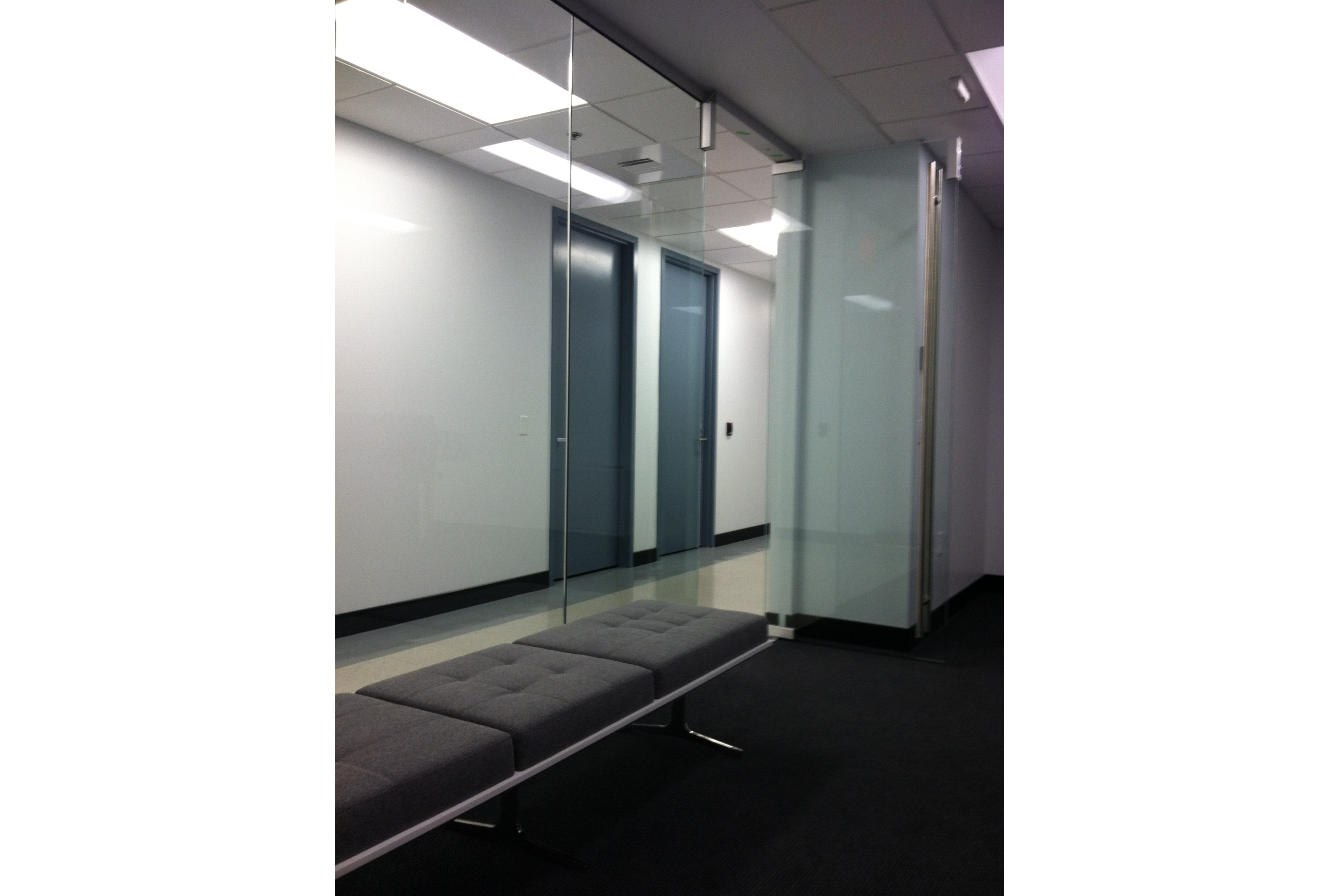
Space prior to restoration
Space after restoration
As an architect and working on tenant improvements, I feel like the early coach builders from the 1900’s or the custom car designers of today. The idea of taking an old building designed for a particular past use, cutting and chopping, moving elements, creating new spaces, changing finishes, selecting fabrics for the furniture is all part of the customization of architecture. It takes a bit of time and imagination to transform something from old to mimic designs of the past or create new concepts.
Space before tenant improvement
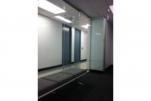
Space after restoration
All you need is an architect who specializes in customization of the built environment. One who understands and cares about the users and visitors, how they plan to use the space and the setting in which they want to work. One who looks in the past and towards the future. So the next time you are looking to design something new and exciting or retain something of old, look for ways to get inspired.

by Lara Serbin | Oct 1, 2013 | Architectural Planning, Architecture, Blog
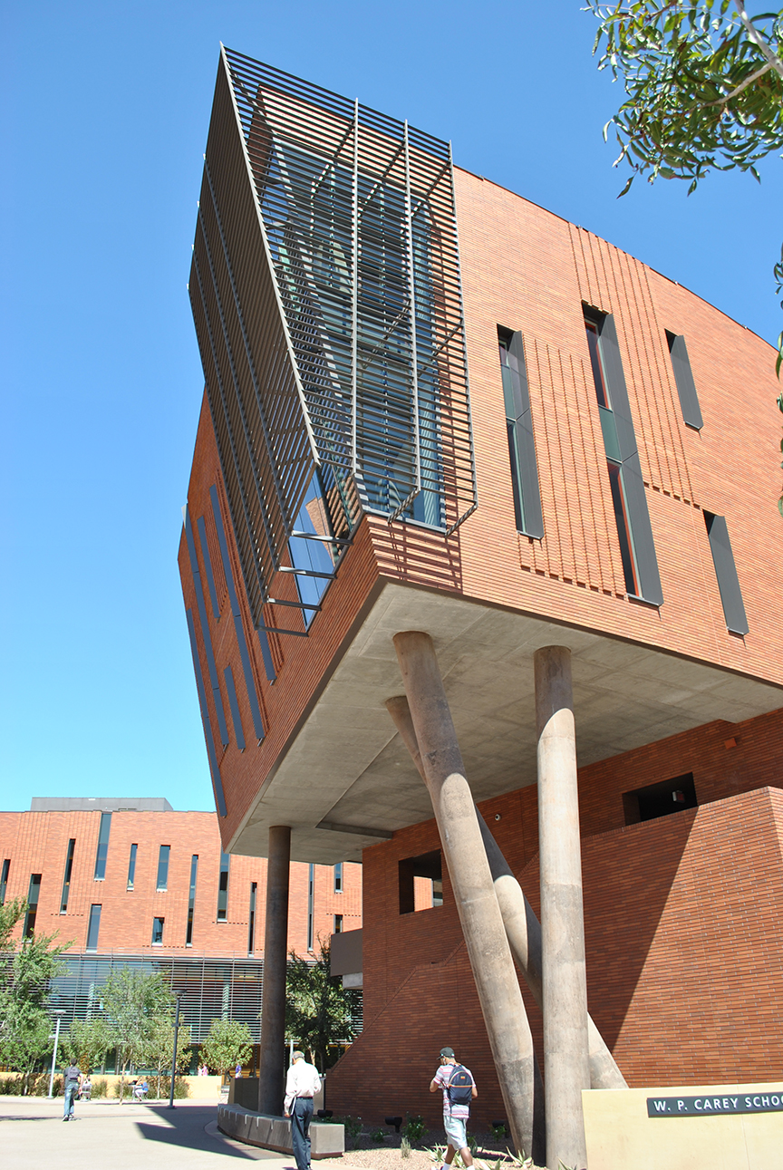
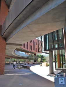
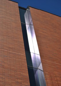
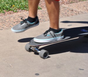
It was another sunny hot day at ASU campus as I was checking out the recently completed McCord Hall by architects Kohn Pederson Fox Associates from New York. This brand new building is part of the W.P. Carey School of Business on Lemon and Normal Street *definitely not normal*. I felt like I was going to get run over by this skate boarder whizzing by me as he was texting, back pack off the shoulder and then a guitar case in the other hand. Most guys skated, there were a few girl skaters but the majority of girls had beach cruisers in pastel colors or just walked with totally unreasonable sandals as they moved by the new 129,000 square foot facility.

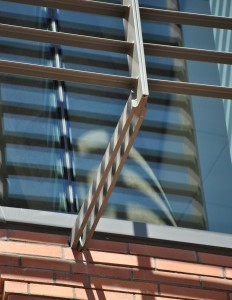
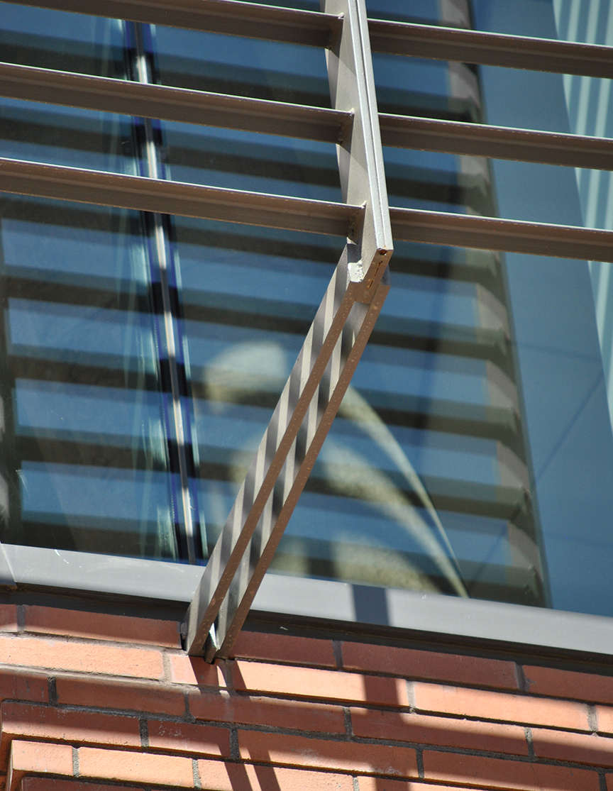
Most of the campus is brick, this addition has a gorgeous bluish hued brick and it is even prettier in person. The concrete columns twisted together reminds me of someone standing needing to relieve themselves. I walked the perimeter and went inside but could only gain access to the second floor, the higher floors were locked off even trying to punch through with the elevator. The photo above in the middle is a detail of the steel metal screen over the corner fenestration. I like the steel detail but maybe they could have added a pitch fork at the end. FEAR THE FORK. Could have had more fun in the details.
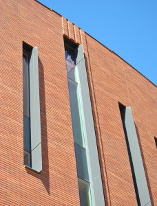
I love the shadows in the horizontal grout lines of the brick. Pure genius how they only have the vertical grout lines shown, it accentuates a horizontal movement and then it gets interrupted in a good way with vertical fins on the narrow ribbon windows. I like the gray fins on the windows but they should have been placed on the opposite side of the window, the shadow is cast on the brick and not on the window where it needs to be to block the sun.
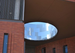

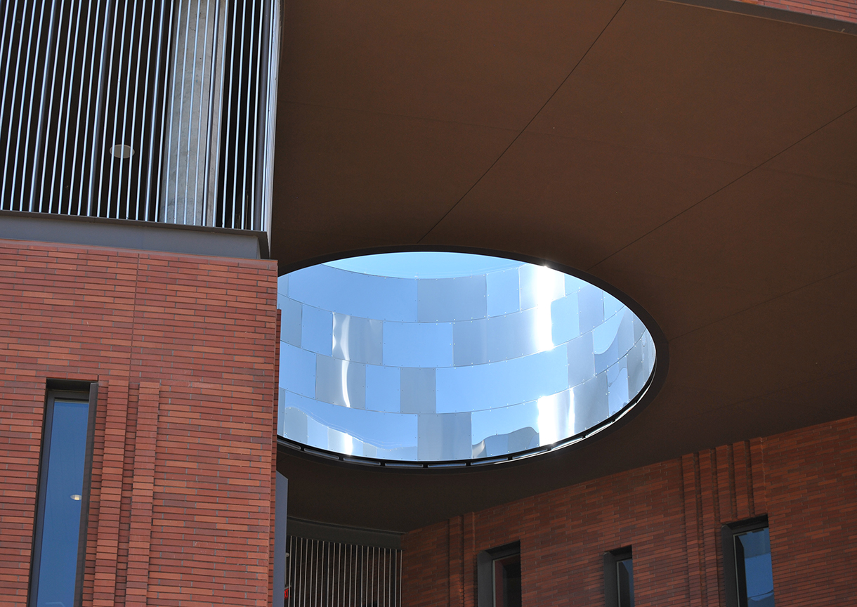
There are two main buildings and when they connect all sorts of architectural tricks happen. The point of connection is an engaging and dynamic space. The oculus in the roof is exciting and lets in some light but could have been better if clad in a charcoal gray metal and matte finish. The uneven shiny steel panels cheapens the surrounding heavy feeling building materials.
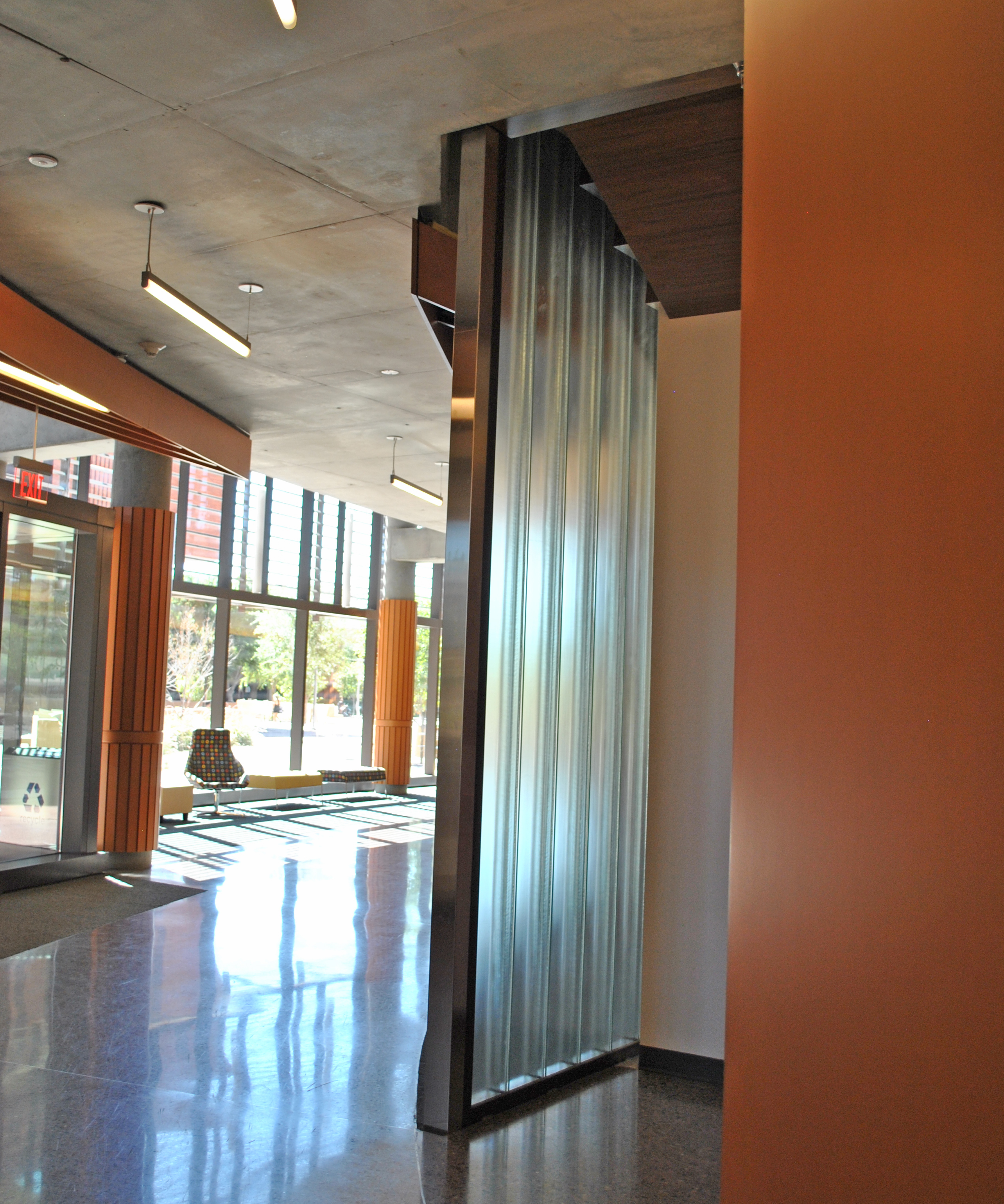
The interior was really well lit and impressive. The photo in the middle shows the vertical glass block. Vertical continuous glass block, what more do I need in life? It would have been even cooler if they could have found a way to end the glass block without the steel frame edge. Steel frame on the bottom is ok but not on the vertical. The glass would have been more HUSH.
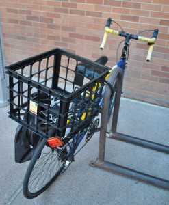
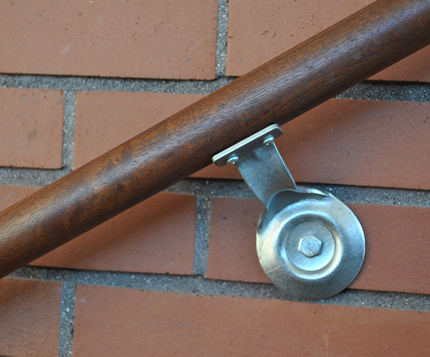
This student used plastic zip ties to secure the basket to the bike for books, do you really think they are going to care about the solid wood hand rail that helps them up the stairs? Later after their Business Team Class they will toss in a 6 pack of Ramen Noodle Soup Beef Flavor in this bike basket and then have to pay a porton of the $57 million dollars it took to build this college building. I believe that buildings need to uplift and inspire but at the same time be practical.

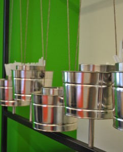
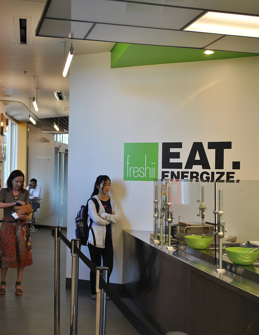
I had lunch at freshii just before I had to jet. College food has come a long way from Louie’s Lower Level *Fear the Cat*. At this place I had tofu over rice noodles and steamed veggies. It was funny that I could have kale at college! I had no where to throw away my straw sleeve and I wasn’t about to open this huge metal garbage can to do it. The little buckets are for plastic ware, too crafty cute for my taste. I liked the outdoor eating patio and listening to the smartly worded chatter, watching skaters and finally some guy gave me a pocket Jesus calendar for 2013.
Lara
by Lara Serbin | Jun 14, 2013 | Blog
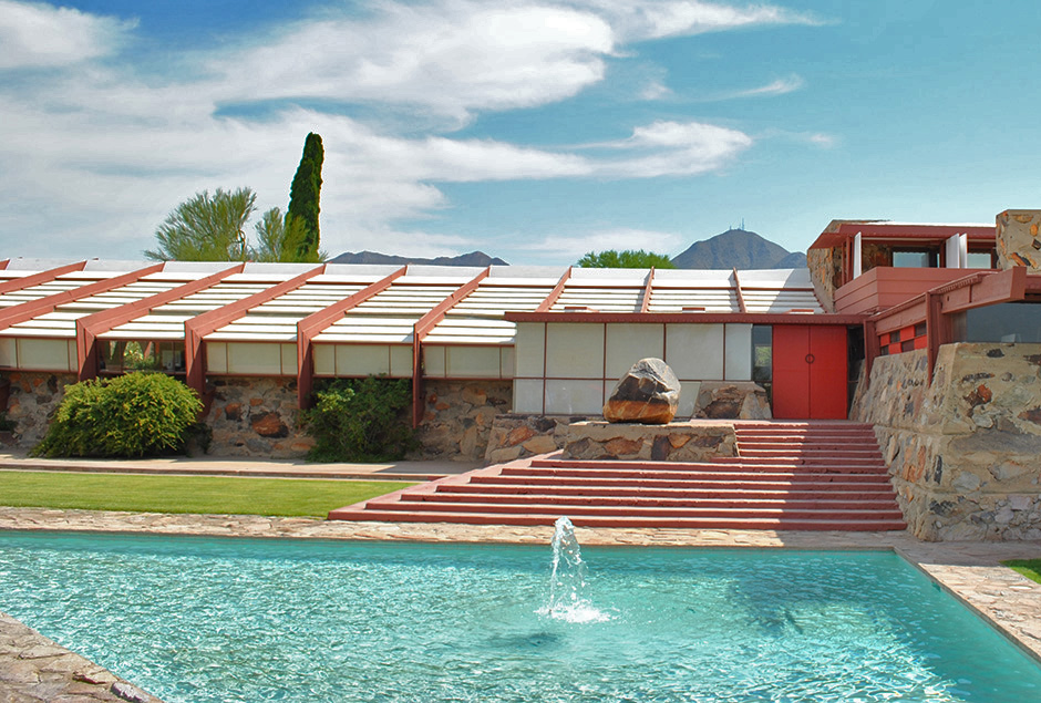
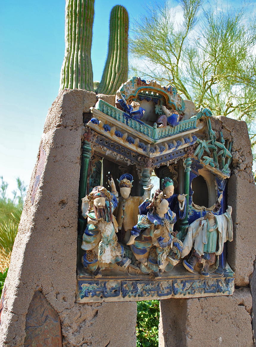
To Taliesin West for a 9am tour is where I was headed today, and my daughters actually enjoyed themselves. Lily wished she lived there which impressed me. When I asked her why she said she liked the secret tight feeling hallways and small funny shaped doorways. The entry ways captivated me most. I found all my favorite colored Prisma colored pencils used in a frozen symphony of texture and rhythm.
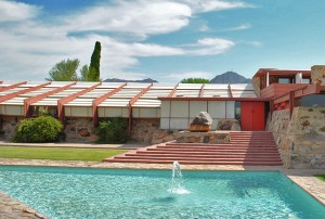
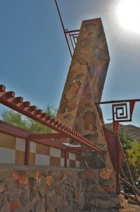
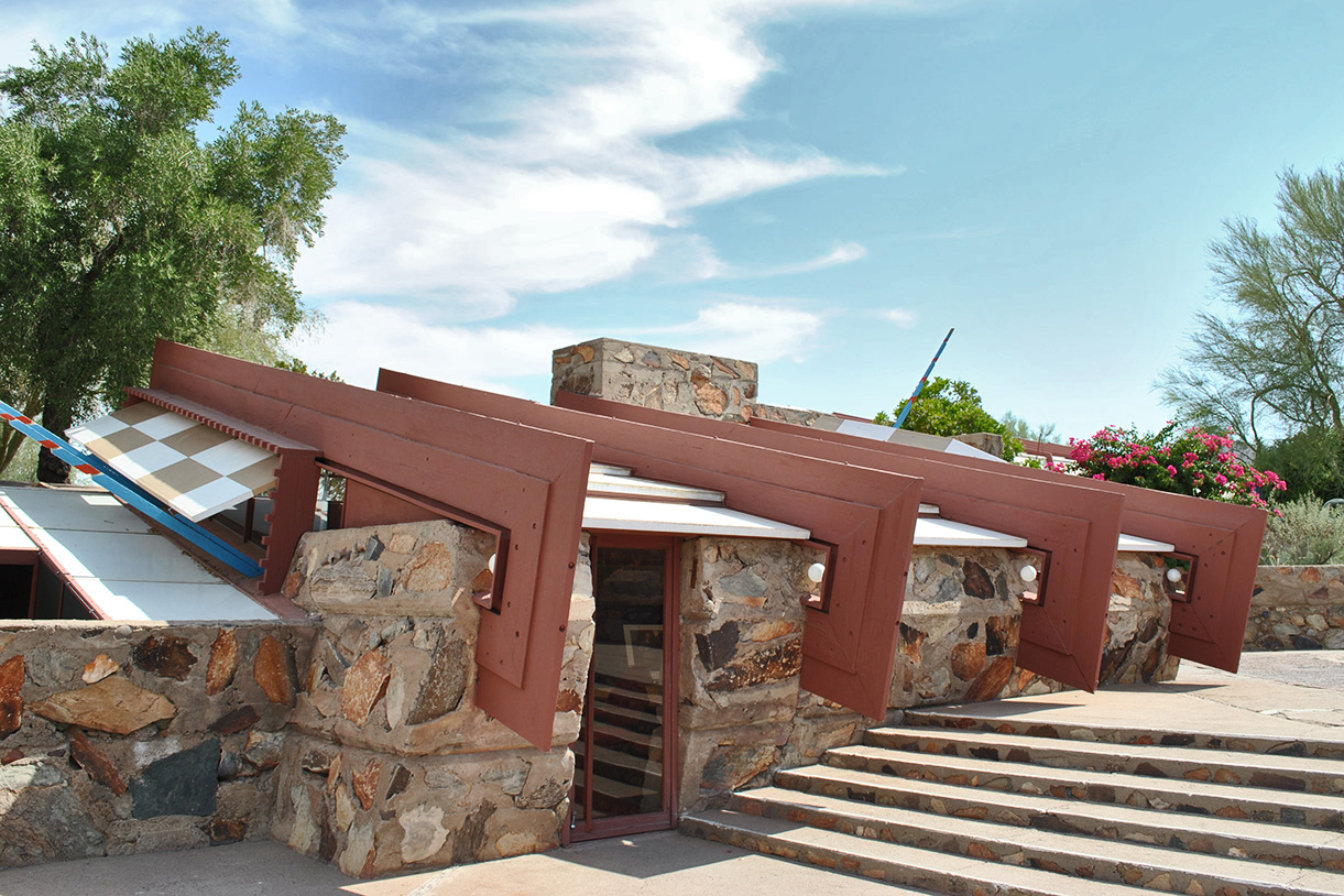
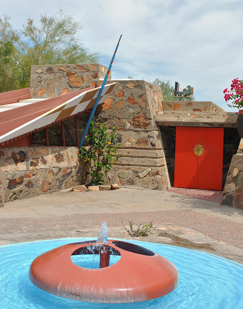
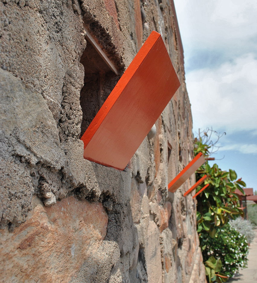
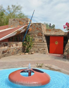
The entry shown in the middle photo is jaw dropping with the turquoise and non-photo blue sky sandwhiching the taupe stone. I love the Cherokee Red used for the punchy accent on the door and checker board window panel to the right of the double doors. The guide had mentioned that this was Frank Lloyd Wrights winter home, working studio and fellowship for his students. Wright called Taliesin West his sketch because it was his design testing laboratory. In the 30’s and 40’s this site in the very north east end of Scottsdale was so remote that he and his fellow architects were uninterrupted to experiment with cutting edge ideas.


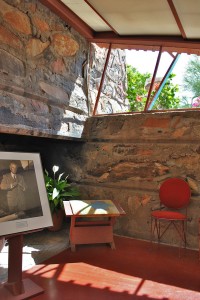
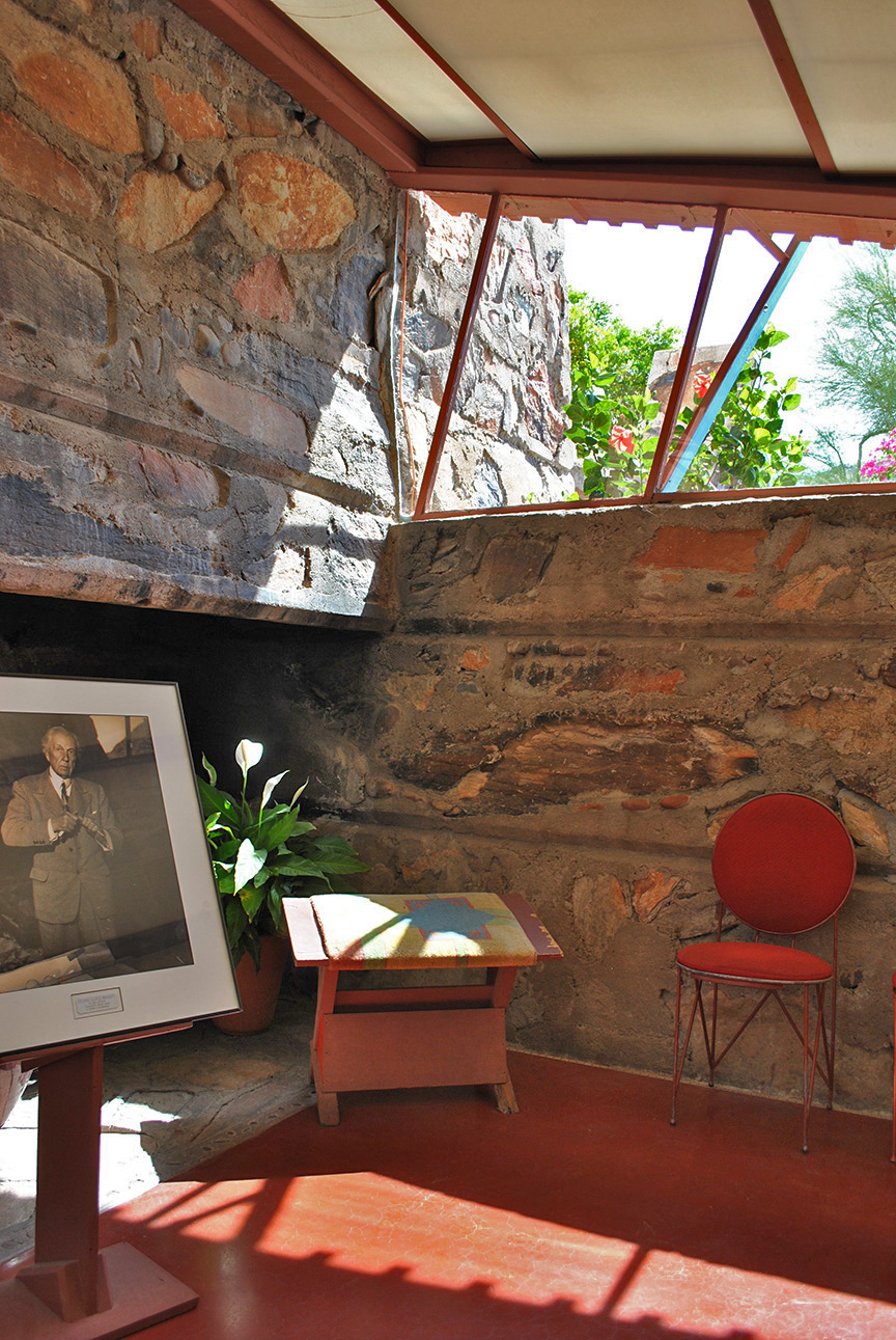
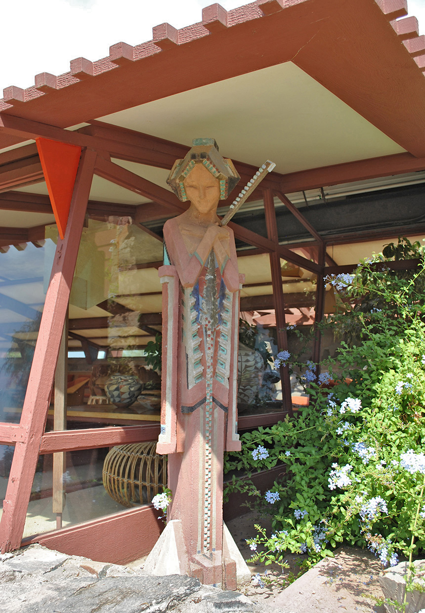
Wright thought the most appropriate primary shape in the desert was the triangle. The triangle having three sides is echoed everywhere at Taliesin West. I loved the reflecting pool in the shape of the triangle. The photo on the right was taken by me as I was sitting in Wrights office. It was here that he would welcome clients and present his impressive ideas, drawings and models on a huge wood table. Back in the day there was no glass in the windows or roof. Hemp cloth was stretched across the terra cotta painted steel above and used as flaps at doorways and window openings. Can you imagine how rustic that must have been? Wright lived and worked here in the winter months so he wore a full tweed suit everyday to work. I could have stayed in this space all day just soaking it in. Wright designed and built a fireplace in every room and outdoor patio. Having an office to receive clients with a fireplace is certainly a nice touch to make them feel at home. I love the terra cotta concrete floors! The middle photo is the entry to Wright’s office. As I entered I felt embraced by the tight space and super low ceiling and then once I walked in I felt expansive as the space opened up.
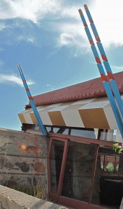
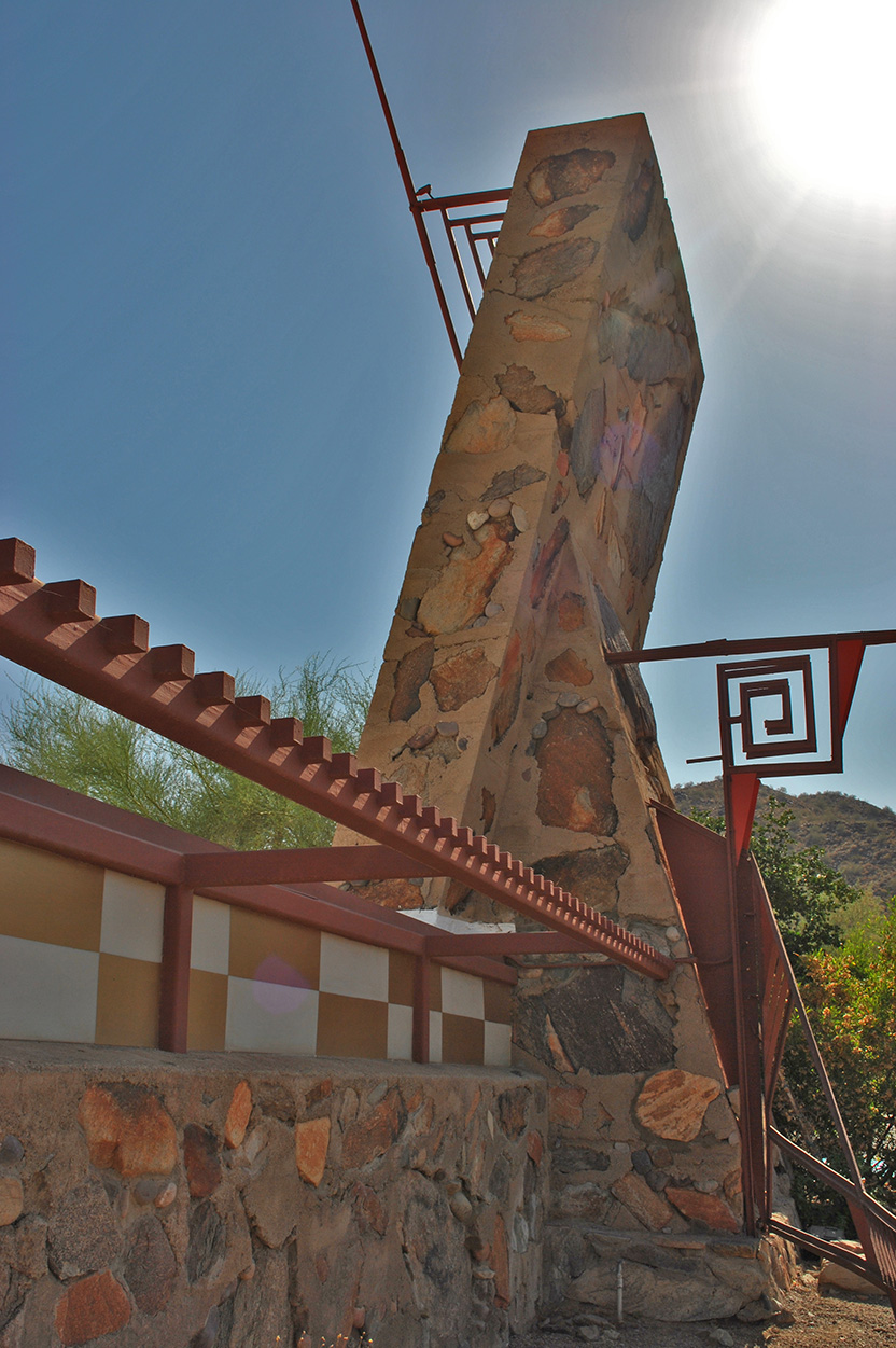
Gold leaf checker board with turquoise spears…glorious! I love the folded planes. The photo on the left is from the building on the first row of photos with the grand entry. This is the Drafting Room. The middle photo is the entry to the underground auditorium used for Taliesin Nights. This underground space has 98% perfect acoustics because there is not one 90 degree angle inside. The poured in place deadens the sound as well. Taliesin Nights was a weekly event for guests, clients, students, artists and family to visit Taliesin West for dinner and entertainment. Everyone dressed for the occasion and met in Mr. Wright’s living room for live piano, second was dinner in the underground theatre and finally, guests would proceed to the Music Pavilion for a live musical or theatre production.

Eva my daughter liked Wrights living room best. She said that it was like a fairy tale. There was no roof but 3 layers of cloth over the terra cotta steel frame. The light quality was perfect when we were sitting there listening to the guide. I was sitting in a Taliesin Wing Back chair designed specifically for the space. Before the air conditioning was installed, all the cloth was removed from the windows and roof members before the facility was vacated for the annual migration back to Taliesin in Wisconsin. When the caravan returned to Arizona in the winter they would have to spend weeks clearing out all the dead and live animals that would roost in the living room space. The photo above is a glimpse inside the fairy tale like space.
I am grateful that I live in Arizona and this place is there for me to visit. Can’t imagine lighting a fire in one of those fireplaces right this red hot minute but the fresh inspiration is so necessary.