by Lara Serbin | Jan 6, 2014 | Architectural Planning, Blog, Graphics, Planning
Last month I had the irresistible inspiration to design a custom flier for the local businesses in Historic Buckeye, Arizona. The project was first started at a Main Street Coalition mixer when the local business owners voiced a concern for a flier of some kind to attract more Main Street activity. Back in October I really had no idea what our team would come up with. I always keep a file of graphic examples I collect from my travels sometimes a well thought out menu, a smart city guide map, or a vintage travel postcard. The idea has to hit me and then I know I am ready to work.

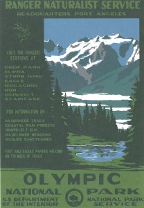
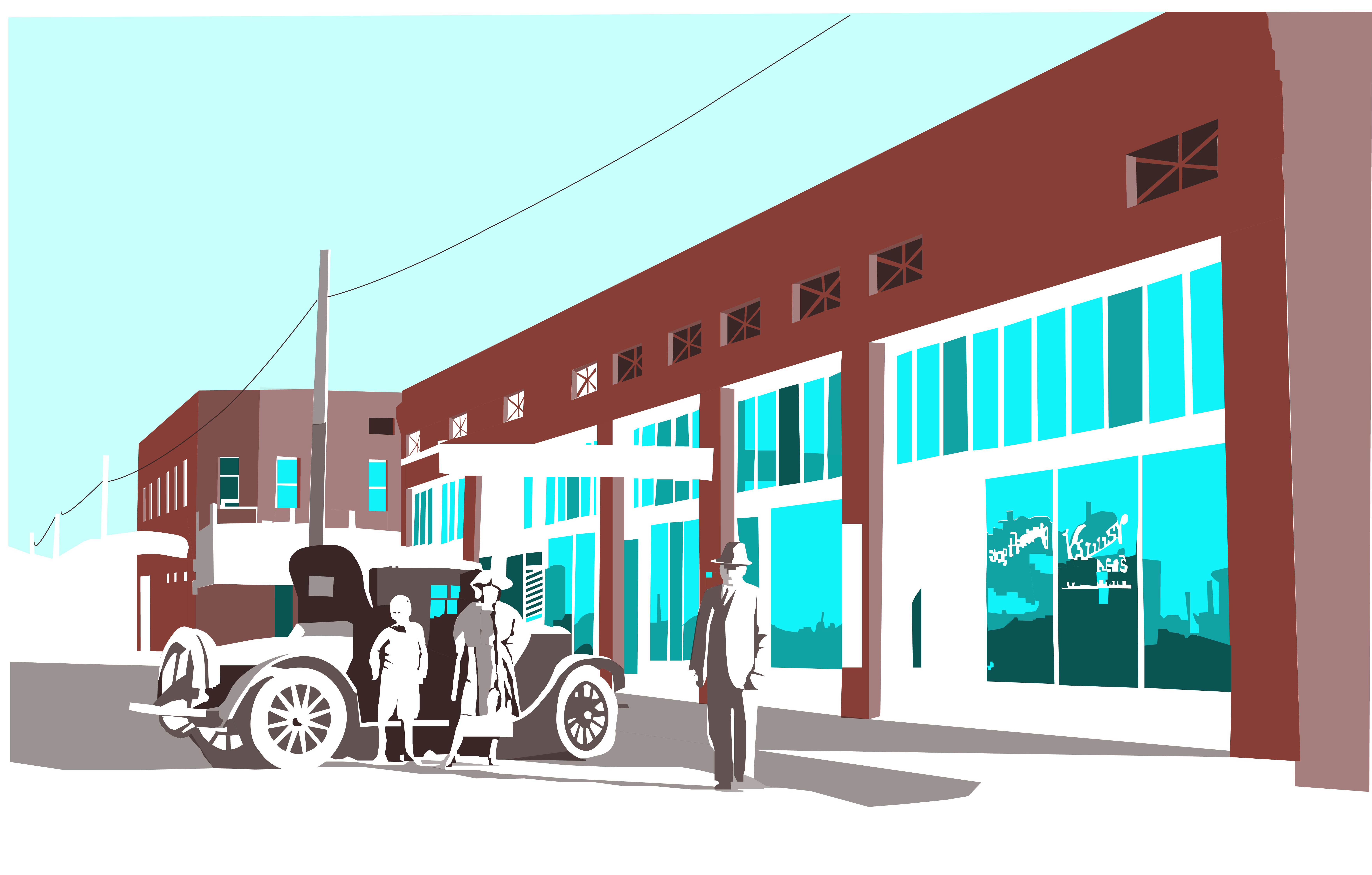
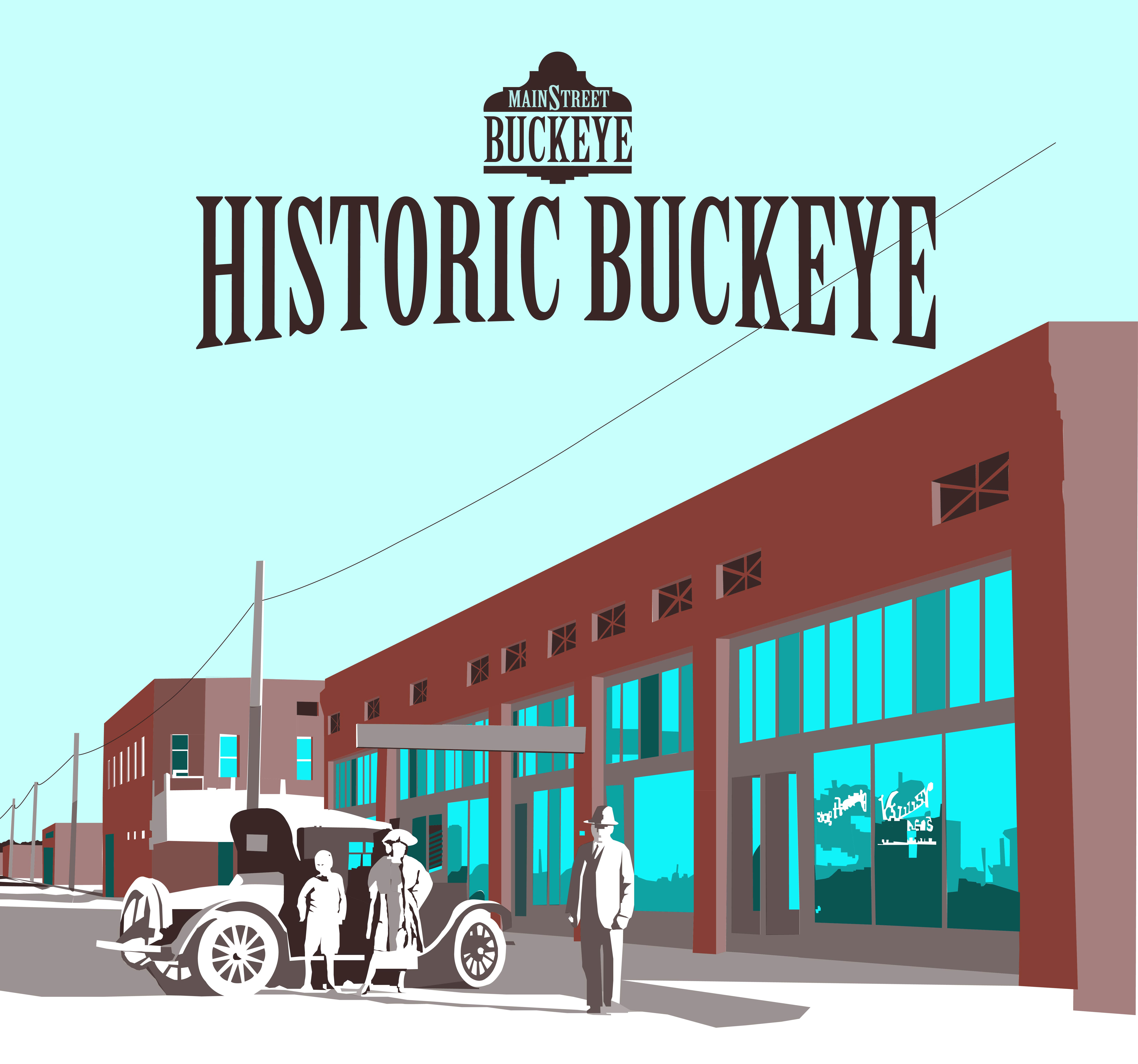
The graphic on left is the final artwork that I completed for the Historic Buckeye Flier. The postcard on the right was a treasure I picked up while driving with my family along the Olympic Coast last summer *had to buy a plush flying squirrel for Lily too*. See, one never knows when the stuff you save will become useful. The Olympic postcard sits on my bulletin board at my desk. I especially like how the mountains and everything are not outlined with a profile line to contain the color. It reminds me of Gustave Baumann color woodcuts. Now that is an art form I would like to try some day. First I have to master wood carving or at least carving into vinyl.
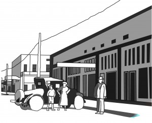

The image on the left is the first pass at rendering the Historic Main Street in Buckeye earlier in 2013. It is very basic, I was not even up to detailing the rims of the Model A at that time. The image on the right shows my expanded experience in just 2 months. I really like the subtractive nature of the white. I also liked how crooked the window panes are. For the flier, I tightened the shapes up considerably. But what a difference of spending some time to learn something new. It is all about repetition of the commands and being patient.
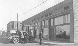
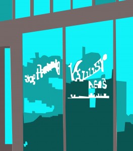
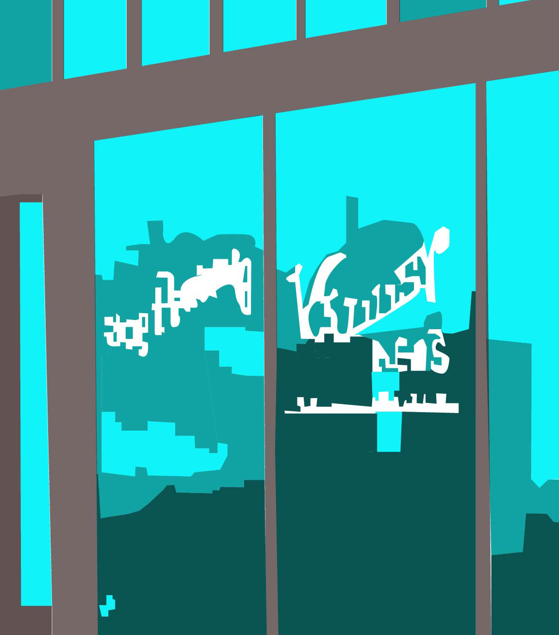
The black and white photo on the left is The Ware Building constructed in 1910 on the southeast corner of 4th Street and Monroe Avenue in Historic Buckeye. The graphic on the right is for anyone who wanted to see a zoom up on the window reflections. See the Model A?
There will be more on the flier itself in an upcoming post, this graphic is just a piece of the flier. The first 2 thousand are being printed right now. This is an important collaboration among Buckeye Main Street Coalition members, City of Buckeye stake holders and local business owners. I thank them for taking this step towards encouraging more activity for this new year!
You’re really going to like this: a weekly haiku.
Our World…
Pluck sleep as it sees
Eyes must alternate on grass
Violet dreaming.
-Lara Serbin
by Jeff Serbin | Dec 3, 2013 | Architectural Planning, Architecture, Blog, Interiors, Planning
Sidewalks are traveled slowly by foot, taking us from point A to point B. They aren’t measured in Miles per Hour(MPH) but in Cubic Feet. Most of the time we traverse them without much thought. They aren’t typically architectural masterpieces of design, but monotonous slabs of grey concrete.

Existing sidewalk before replacement.
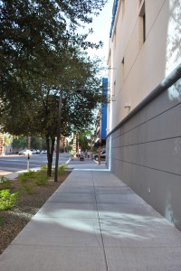
Sidewalks come in many colors, textures and finishes like that sweater you bought on Cyber Monday from American Eagle, but placing too much design may be trendy or outdated in years to come. A nicely designed sidewalk although can complement a building when designed properly. In the case of Digital Realty’s Data Center building in downtown Phoenix, the sidewalks are meant to take a back seat and not compete but complement with their new architectural façade.
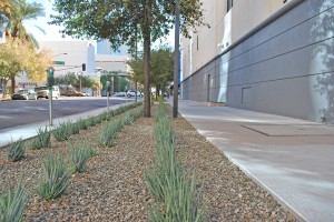
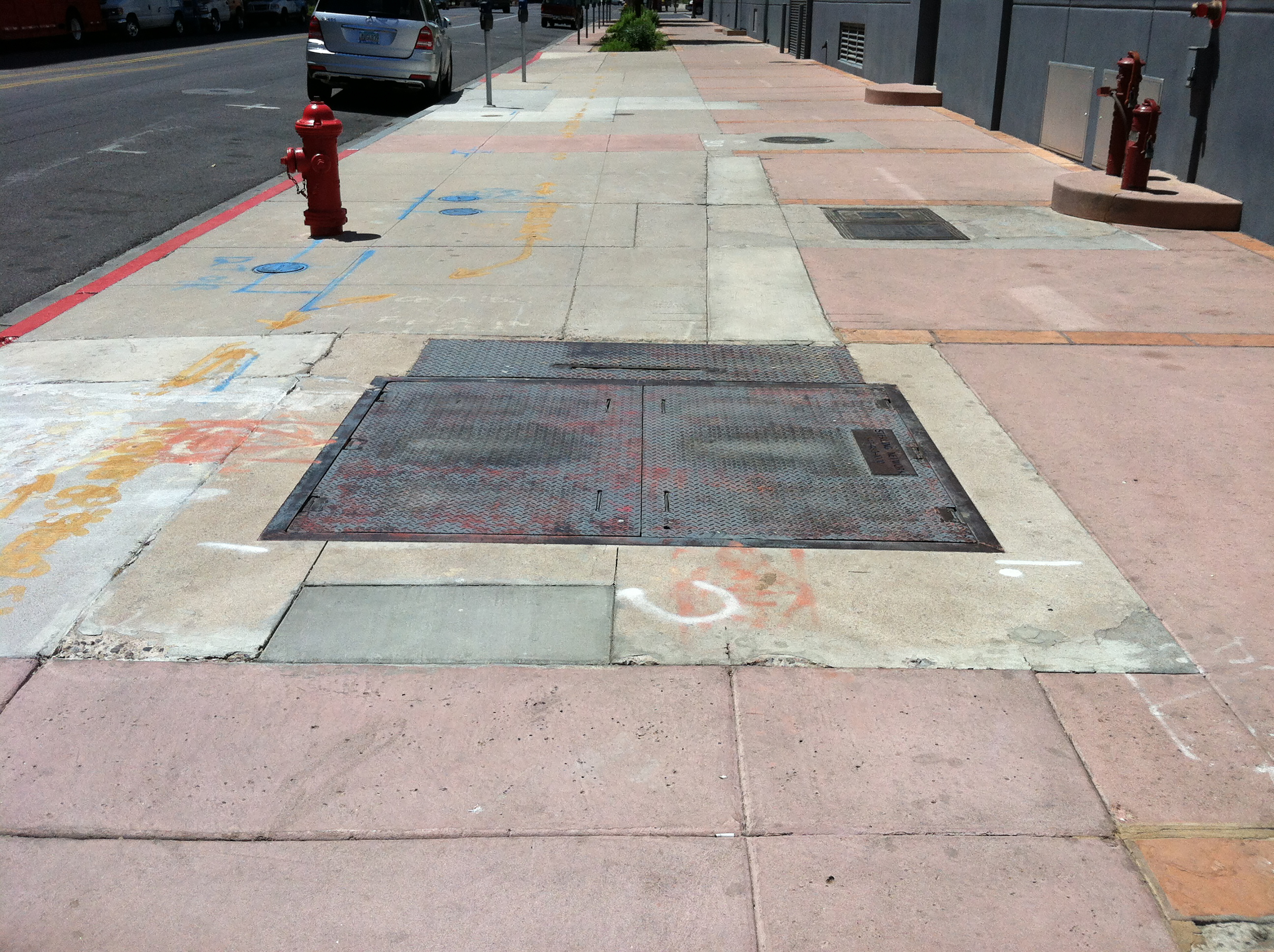
Digital Realty East Sidewalk after construction.
In 2012, Digital Realty revitalized their facility at 120 East Van Buren Street. The building sits upon a downtown city block in Phoenix and is surrounded on all 4 sides by sidewalks. The building which originally housed The Arizona Republic Newspaper when constructed in the 1940’s, now houses Digital Realty’s Data Center. It’s sidewalks over the years had morphed into a variety of colors, textures and finishes. The sidewalks which were owned and maintained by the City of Phoenix, had bits of sandstone and pink concrete to reflect a south western motif. It was not complimentary to the forward looking façade and was haphazardly cut and replaced to allow for a variety of utilities that had been installed over the years. This made the sidewalks a bit of an eyesore. Landscape was not cohesive and City of Phoenix street lighting was inefficient. Archaic high pressure sodium lighting surrounded the site, not new energy efficient LED which are becoming the norm.
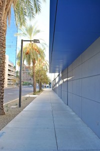
Digital Realty South Sidewalk after construction.
So in 2012, Serbin Studio and Digital Realty began the master plan design of new sidewalks around the facility. Digital’s brand is modern and sleek, representing the digital world of fast moving data. Their speed is more reflective of a Porsche Carrera GT driving 208 MPH than a Honda Accord in the slow lane.
Digital Realty South Sidewalk after construction.
In 2013, Serbin Studio’s design was constructed for the new sidewalks, updated LED site lighting and landscape by DPR Construction. The sidewalks around Digital Realty are containing a fast and furious digital world, bringing you data not in MPH miles per hour or cubic feet, but in mbps megabits per second.
by Jeff Serbin | Nov 20, 2013 | Architectural Planning, Architecture, Blog, Collaboration, Graphics, Interiors, Planning
Last summer, I had the opportunity to travel along the Western coast of Washington State in the Olympic National Park. It’s vast mountain ranges with it’s hundreds of thousands of acres of pristine undisturbed forests, it’s 73 miles of coastline, give you a sense of tranquility. However, I stumbled upon something which left me feeling unsettled.

Tsunami warning
We visited a well-known coastal beach, Ruby Beach. It’s very impressive with it’s monumental Sea stacks. On our way down the path to the beach I saw a very dis-concerning sign. What to do in the event of a Tsunami, where to go! My plans to spend hours building an 8th Wonder of the World sand castle only be destroyed by a wave was squashed.
This evacuation plan essentially said “Run like hell to the highest point!” I definitely would obey if I saw a looming wave coming my way. All I could conjure up was videos I had seen on YouTube of the Tsunamis around the globe. Tranquility (T-RAN-Quility), no more.
As an architect, one of our responsibilities is to create buildings which are safe that have a clear path to exit, just in case you have to “Run”. We all had fire drills in elementary school, right?
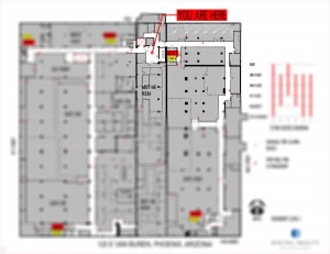
Exit Plan
Recently, I had the opportunity to prepare one of these plans for a building. By code, a building has to prepare evacuation maps (floor plans) for public buildings to teach people how to exit from that building. Who better else to do so, an Architect. In a small building, it’s likely obvious, but when you are within a large building with multiple floors and various paths of travel, it does become important.
This building has 6 floors and over 300,000 square feet. The plans typically show where the stairs, elevators, fire extinguishers and the fire pulls. I learned at elementary school never to play with one.
The code doesn’t really tell you where they should go, just what should be on them. Typically it’s at the elevator lobby. Essentially, the plans are graphic design projects because they have to be clear, accurate and look pretty.
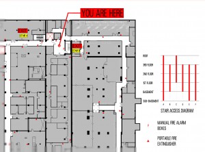
Exit Plan Enlarged
So hopefully in your travels on a Washington Coast beach or within a large building, you’re only running when nature calls.

by Lara Serbin | Nov 9, 2013 | Architecture, Blog, Collaboration
I really get a kick out of public speaking. This week I was invited to speak to the kids in the Drafting class at Estrella Foothills High School. I decided to go general and personal so no power point. I was kind of all over the place but found my stride after this guy up front yawned in my face. I have to remember to make it about them in some way.
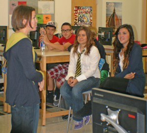
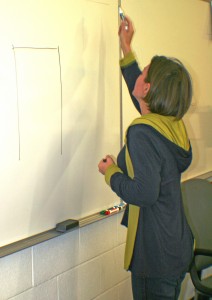
No matter how advanced computers get I want kids to learn how to sketch. Drawing an idea in front of people creates understanding so quickly. I hope at least a couple of them get a hold of some buff trace paper and markers. I have 2 more high schools to visit this month. I think I will stick to the rule of 3 topics: training to be an architect, experience working for architects and the journey of having my own firm.
by Lara Serbin | Oct 24, 2013 | Architecture, Blog, Collaboration
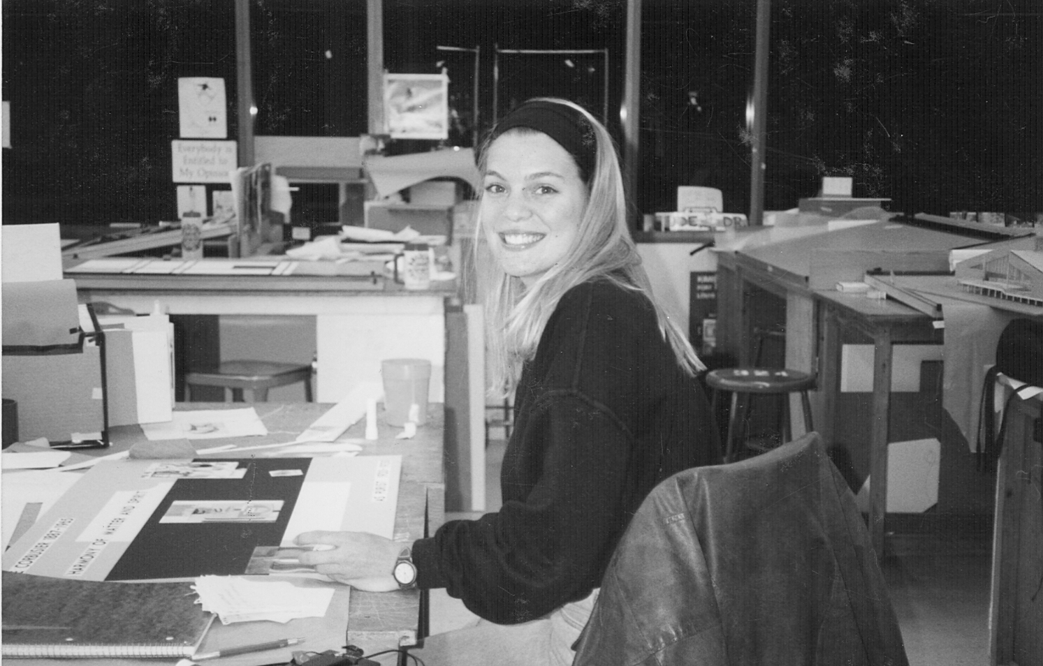
I just rsvp’d for my 20 year reunion at the College of Architecture at the University of Arizona in Tucson. I just got totally excited about this when I saw the centrum with those terrific columns they installed when we were there. The columns are not there anymore. All the good times came rushing back to me. Funny that I am still wearing Birkenstocks while I check off that I am coming to the event. How could I not come. I hope lots of my alums show up. We are or were such a competitive bunch. I guess that is why I watch Project Runway because it reminds me of the pressure to come up with a design idea and make it work.

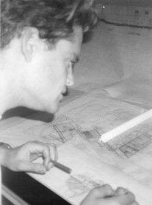
There is Jeffrey and I working away in studio. Studio work was best done at night. Today College of Architecture is looking really slick and modern. When we were at school we occupied the older building with no fancy computers. We were actually discouraged from the professors to use any computer aided design and wearing clothing that fit well.
Top Ten Reasons for Being at Studio:
1. Jeffrey.
2. No clean up ordinance.
3. Walking to 7 Eleven for pretzels and soda.
4. Eavesdropping on people using the sole pay phone.
5. Studio smell.
6. Thrift store couches to take naps during an all-nighter.
7. Laughing at Shawn Shahabi and Brian Farling.
8. That guy who always wore 50’s clothes.
9. John Mele impersonations of Professor Bogosian.
10. When the structures professor said my design was so good he could roast an ox in there.
Just Flip the Plan!

For Madison Dwight.