Design and construction is a lengthy process not understood by many. From my experience, the typical client wants to occupy a space faster than what is feasible. I am a realist when it comes to project schedules and typically that may not be what the client wants to hear who has an un-realistic goal. I prefer to …
This industry has many moving parts, puzzles to be solved and involves multiple people; the target ‘time’ is sometimes hard to pin down. Let me describe a typical process from 10,000 feet level.
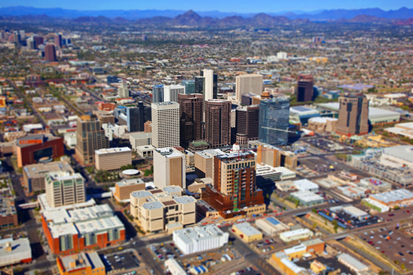
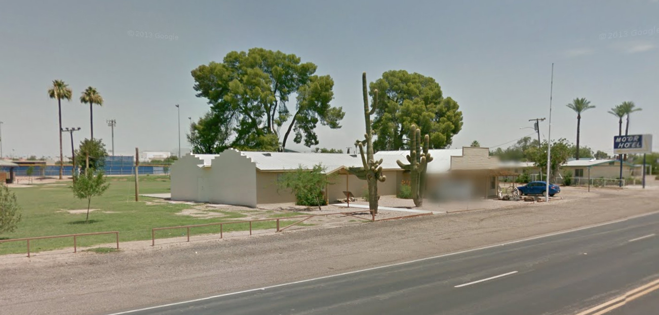
Aerial of what City?
1) CLIENT CALLS THE ARCHITECT
No two clients, no two projects, no two buildings and no two sites are alike.
(I have had a repeat client within a repeat building with repeat city inspectors using a repeat contractor. But this is not common). Determination of time to complete a project varies.
2) ARCHITECT GATHERS A TEAM
Mechanical, Plumbing, Electrical, Structural, Civil, Interiors etc. Projects vary in building type and scale. Project schedules can be dictated by teams availability. Engineers vary in expertise. The team must be appropriate for the project. Gathering a team takes time.
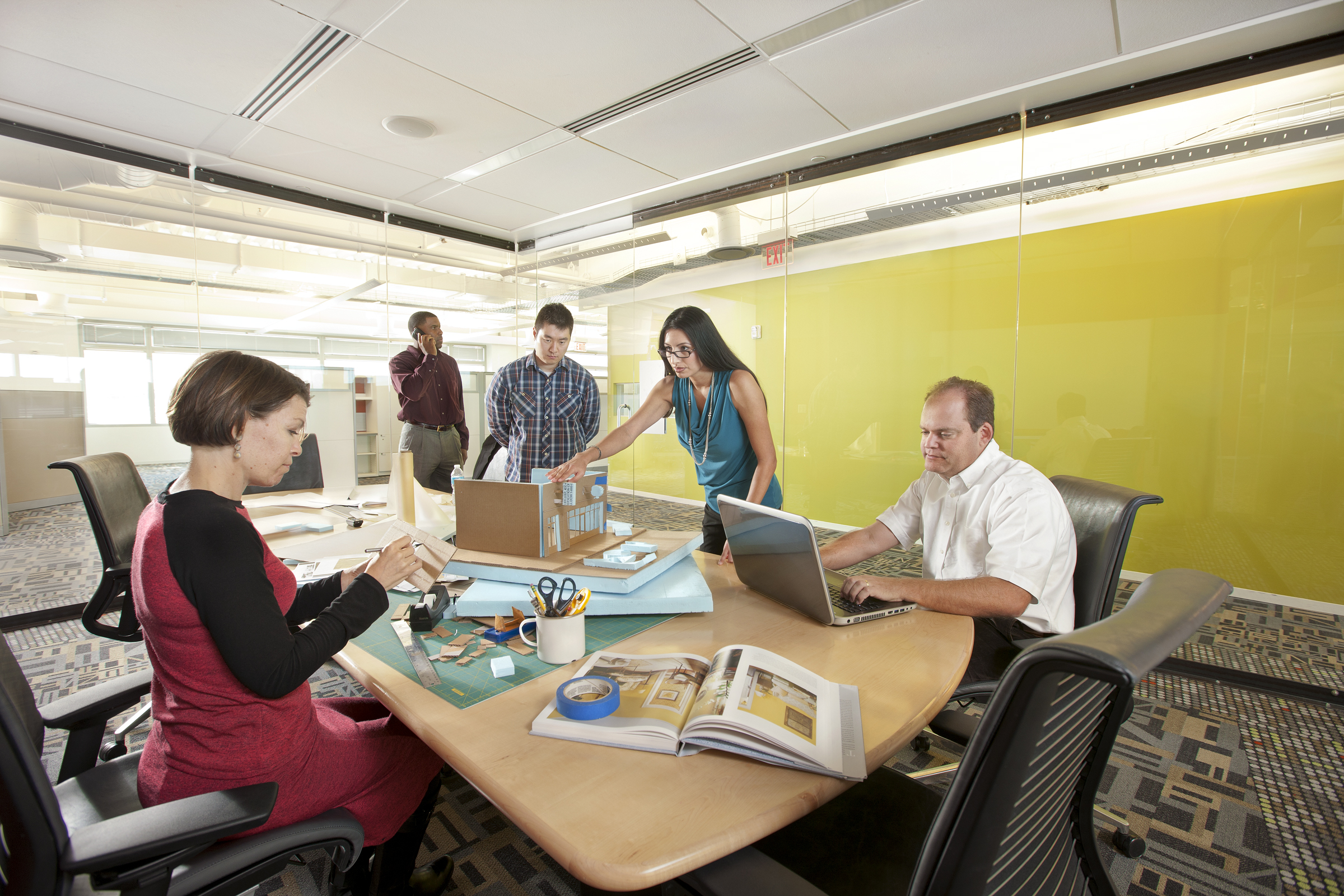
Serbin Studio’s Current Office
3) EXISTING VS. NEW BUILDING
No two properties are alike. With an existing building, architects must understand what the existing conditions are and what information is available (original drawings?). Every city is unique in building codes and inspectors. When we submit drawings to the city for permitting, it is out of our control how much time is needed for a city permit review process.
4) PROPOSAL TIME
Typically with smaller and less sophisticated clients, they inquire about fees. A client is buying a service influenced by many factors, not buying a product. Teams have to be gathered based upon scope. Proposals require thought to ensure the architect has covered all services. This process takes time and it is impossible to give a quote over the phone.
5) DESIGN TIME – Let us look at a typical process at 10,000 ft level.
Phase 1 – Schematic Design
Architects are like Nancy Drew (Lara) and Shirlock Home (Jeff) to uncover all the facts. This would include time to gather information from the client, understand in-direct influences from the surrounding context, City and code constraints, the list goes on and on. The information gathered transforms into a schematic design. Good time for a cost estimate.
Phase 2 – Design Development
Once a schematic design is chosen, further development of the project includes definition of systems (structural, mechanical, electrical etc.) and building materials.
Phase 3 – Construction Documentation
Once the building systems and materials are chosen, the architect and engineers put together documents that are used for permitting and final pricing by the contractor. An architect can assist in the recommendation of a contractor. The process should take a few weeks to complete dependent on the size of the project.
Phase 4 – Construction
During construction, questions arise and the architect should be consulted. We can be your eyes to uncover un-warranted changes made by the contractor. It is common for people be stuck in their ways and build things how they have done in the past. The architect and engineer are conscious about every line, note and drawing that is on that set. A contractor should ask to deviate from the plan, not beg for mercy after the fact.
I make every attempt to follow through on promises and prefer to follow the moto ‘UNDER PROMISE, OVER DELIVER’. However the most important element is communication. No matter what field you are in, if a deadline is fast approaching and you feel that you may not be able to keep that promise, letting your client know is the best approach.
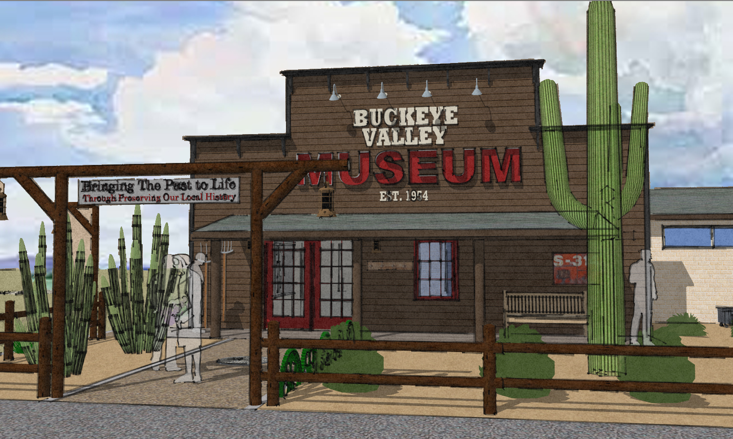
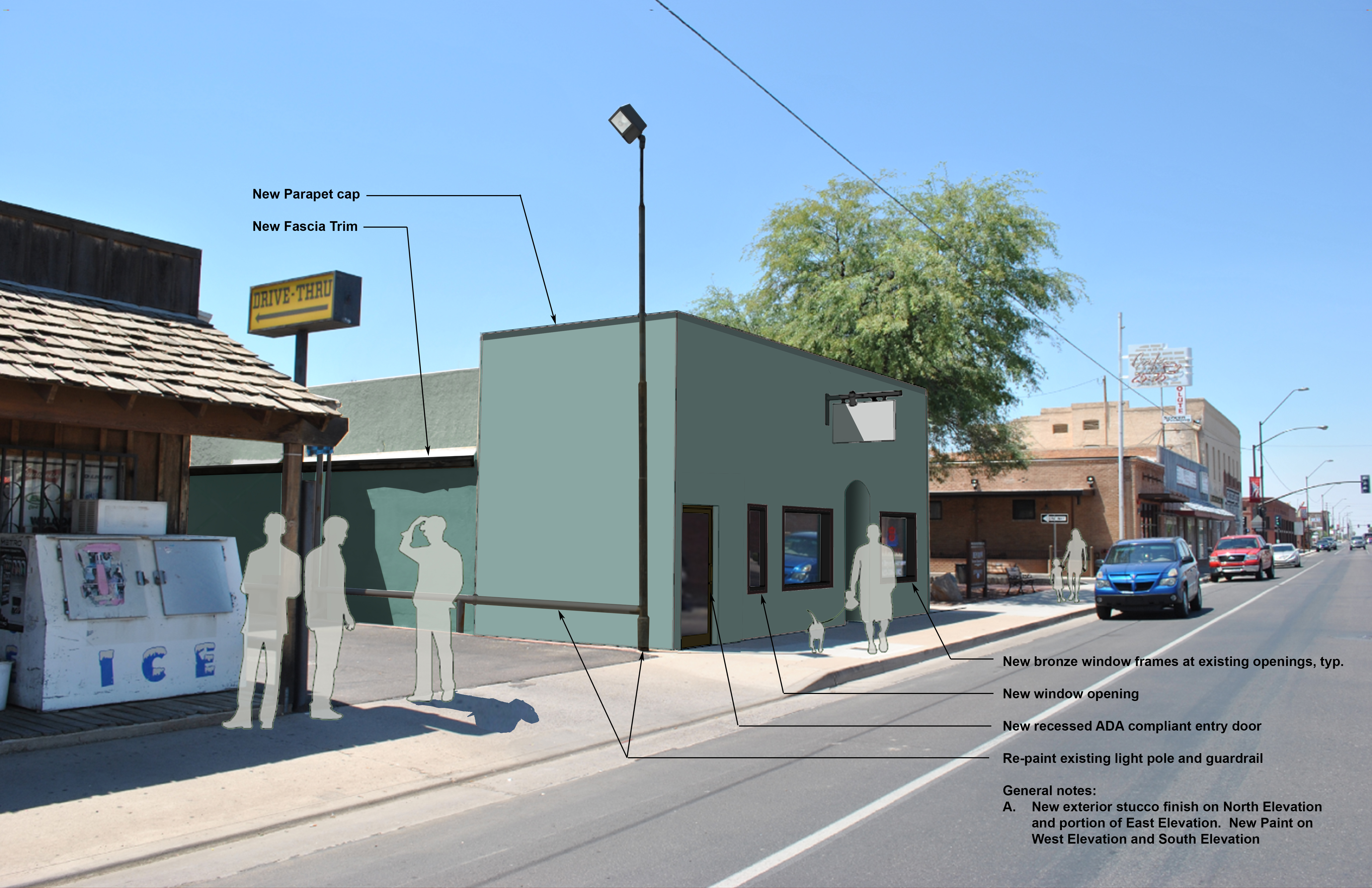
A few months ago, Serbin Studio was approached by the Buckeye Valley Historical Society with an architectural challenge. A conceptual design for the exterior of the existing ‘Buckeye Valley Museum’ so that the architecture reflects their mission, ‘To bring a better understanding and appreciation of the history and cultural significance of Buckeye Valley’.
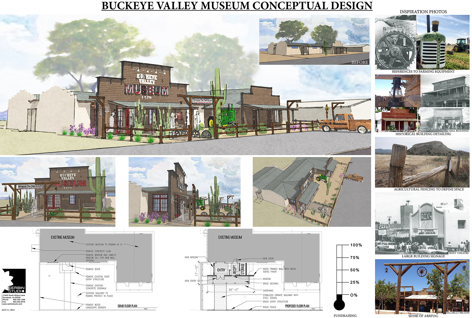
Presentation Board Click on it for larger image
Conceptual Design of Buckeye Valley Museum
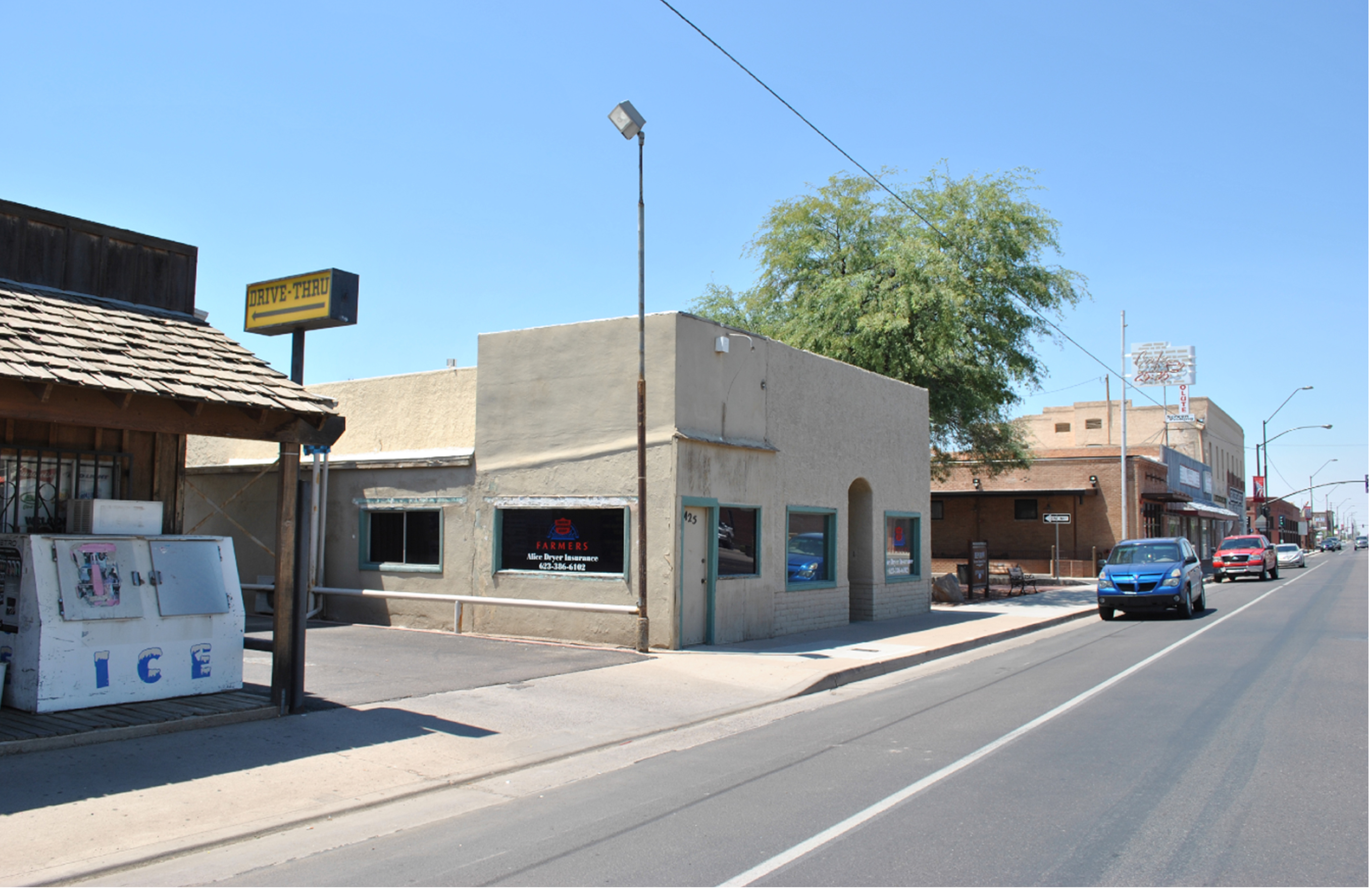
The building today lightly reflects back to the historic architecture of Buckeye Valley and through time has blended into the historic fabric in a way that the building is not apparent to the average visitor in Buckeye.
Original Museum renovation to look like Kell store
Current museum 2014 . Beige is not the new black. Consult a color specialist when you paint your building. Did I mention Lara Serbin is a color expert.
Buckeye has a long history dating back to 1885. Prior to the mid 1970’s, the main highway from Phoenix to California passed through downtown Buckeye. But just as we have seen in the ‘CARS‘ movie, the highway system was created and now by-passes historic downtown.
Since being part of a 3rd generation Arizona family and member of the Buckeye Main Street Coalition, I had a good strong foundation for understanding the Museum’s architectural significance. However with every project, further research exposed us to hidden treasures that are only talked about amongst Buckeye residents.
Some inspirations were:
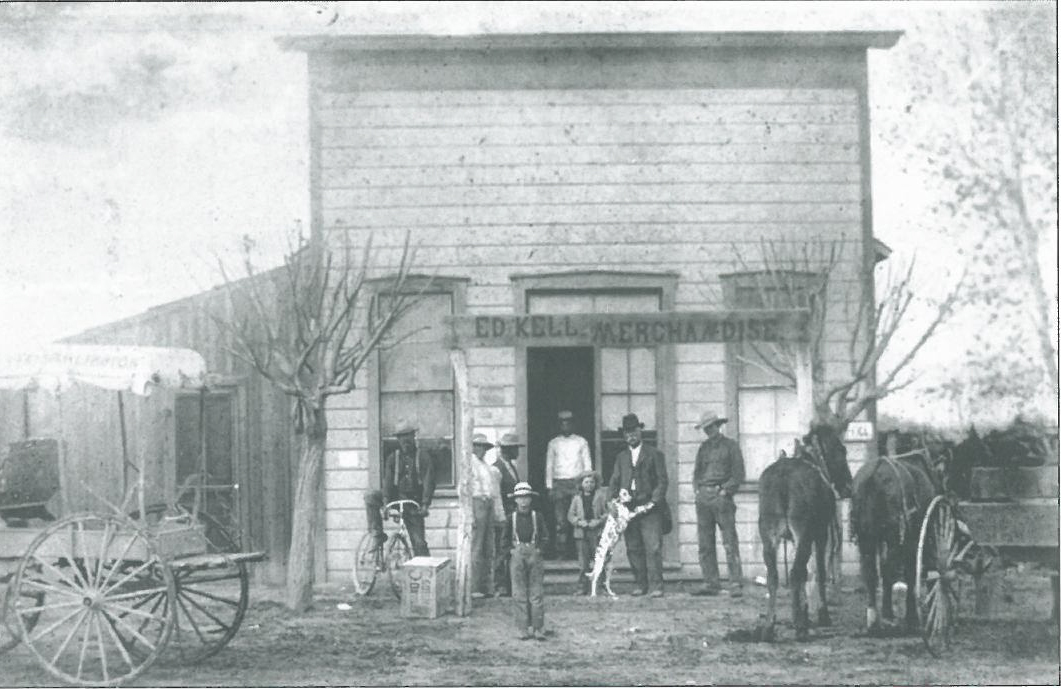
Kell Store built in 1890’s
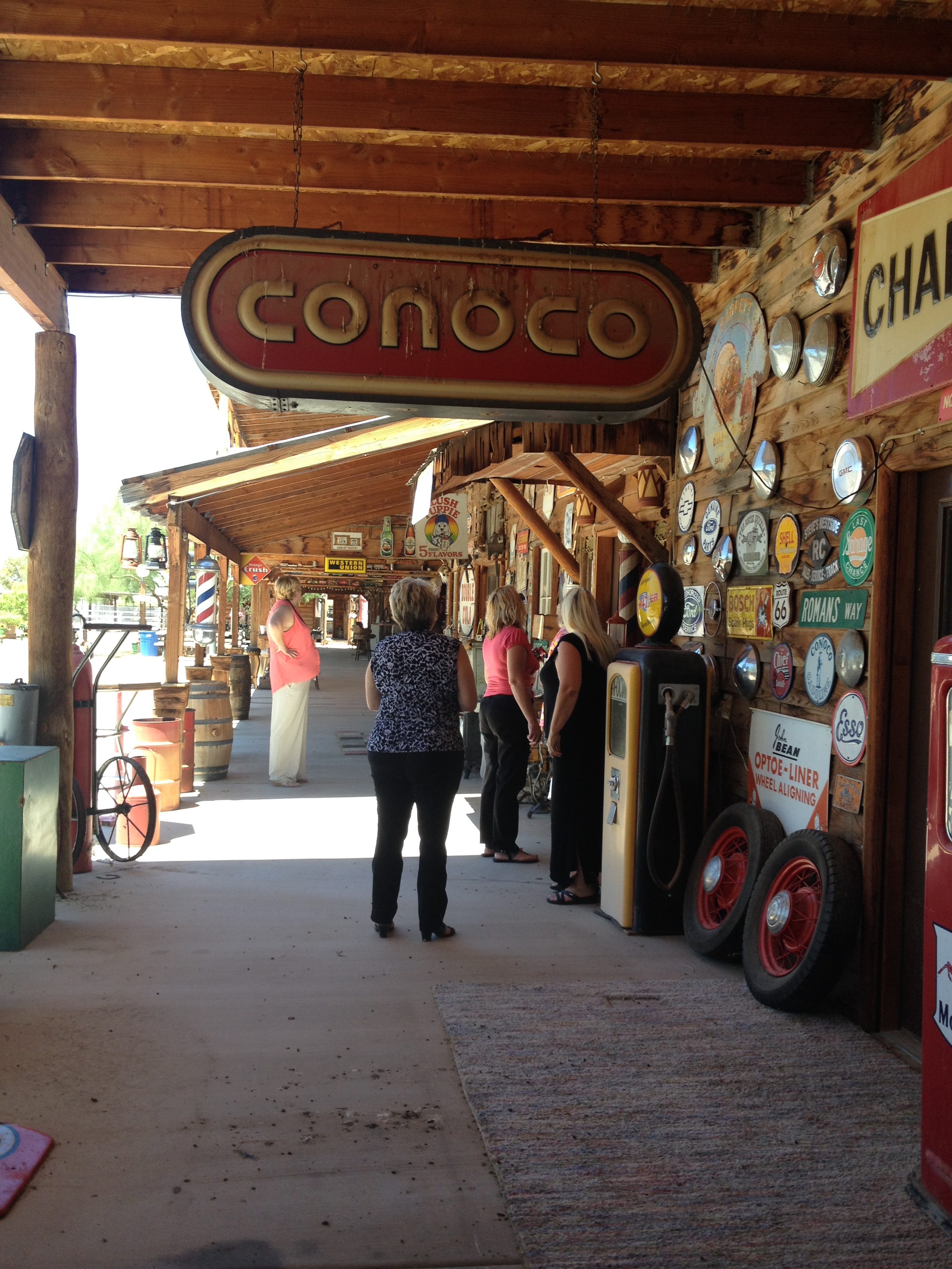
Hillbilly Hilton. If you get a chance, take a tour of this snapshot in time
Our intent was to minimally alter the interior exhibits and through the use of architectural features, contextual materials and textures enhance the exterior of the building so it clearly indicates what it is, ‘Buckeye Valley Museum’. We created a sense of arrival and a clear pathway into Buckeye’s history. The exterior is now a snapshot of the history and hidden gems within.
Presentation Board
The museum had a re-opening on September 27, 2014 and is open Friday’s and Saturday’s from 11 am – 4 pm. The interior renovation is complete. The museum is now on a fund raising campaign to raise money and materials to complete the exterior facade upgrades. For further information, contact the Buckeye Valley Museum at 602-230-1299.
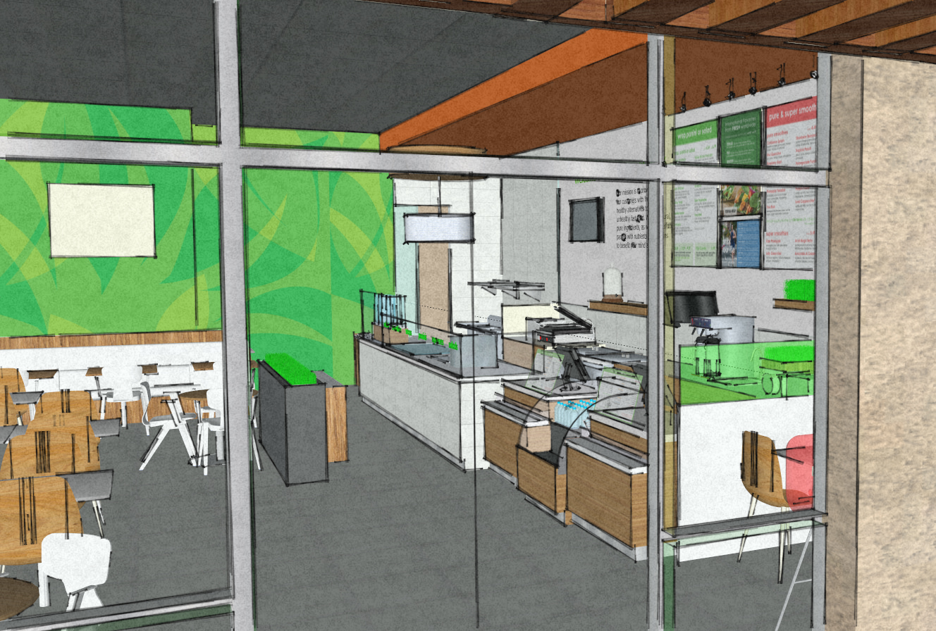
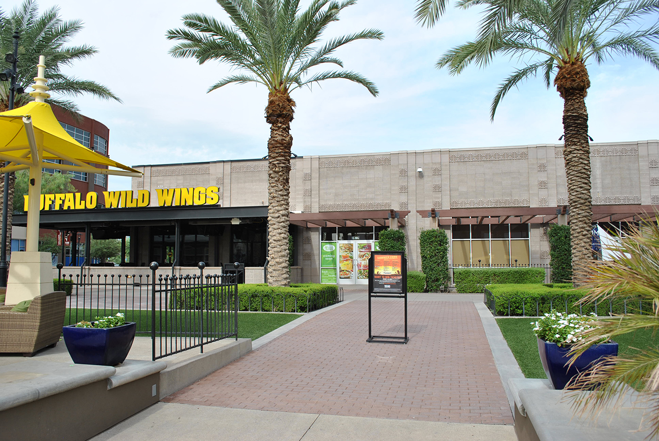
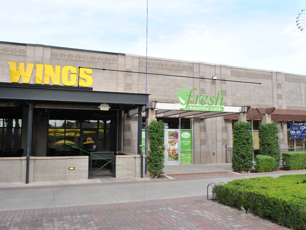
Super Bowl 2015 has created a push for restaurant design in and around Westgate City Center in Glendale, Arizona. Westgate is anchored by a 2-story AMC Theatre and University of Phoenix Stadium. We are working with J.J. Girn , an entrepreneur and franchisor of Fresh Healthy Café a new dining experience moving into the Entertainment District at Westgate. During the design phase of this project I had decided to see Malifacent the movie with my kids. To kill time we hung out in the splash pad area. As I looked to find the empty suite where Fresh was going to be located I noticed how big and bold Buffalo Wings signage was. It occurred to me that we needed to make sure the signage on Fresh was just as bright and tall.
Signage
It is important to use contrast so signage will read correctly. Look at the photo on the left above, the yellow lettering really POPS! Fresh Healthy Cafe uses bright lime green and white for their branding so the sign will be able to compete with Buffalo Wild Wings. I was against putting the signage on the gray block wall being that it would be too far back from Wings lettering. This just proves how important it is to look at your design from every angle not just as if you were standing in front of the storefront looking straight on. Or even worse never getting out to see a movie! Most people will take 6 seconds to make up their mind about the visual message of a storefront. You have to convey a positive attraction quickly or it is a design failure. Like a friendly wave saying “Come on over here, I am clean and fun inside!”
The rendering above is what the final design will look like. We thank Bootz and Duke Signage Company for helping us make this a reality.
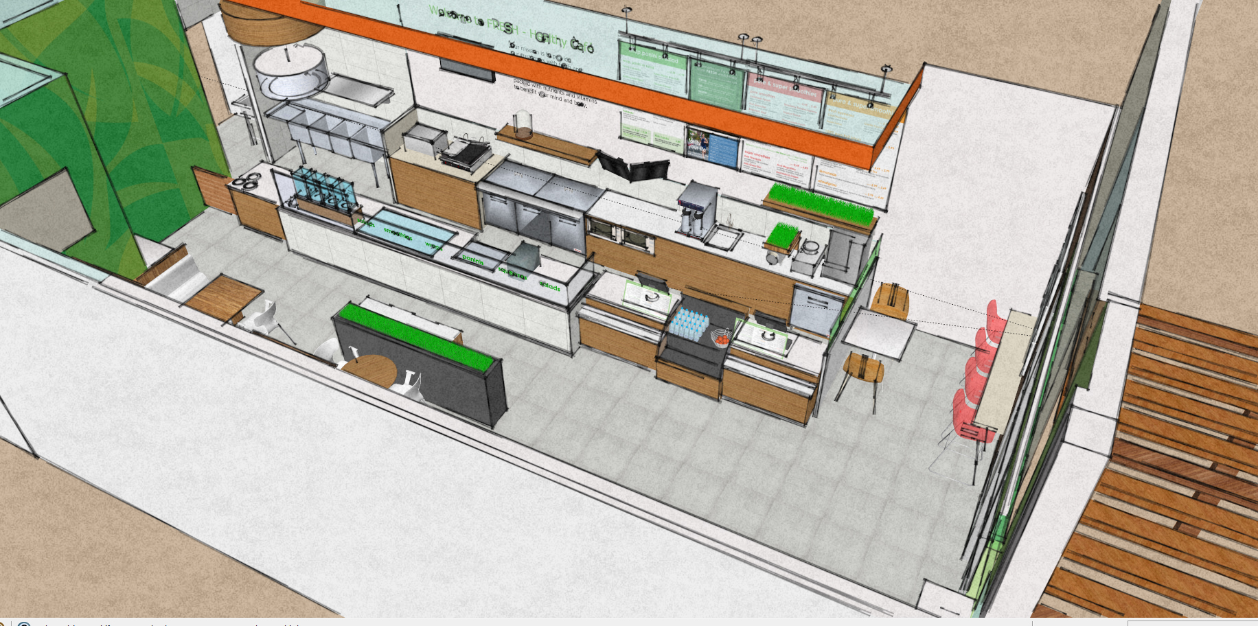
Most of the equipment to make the healthy wraps, smoothies and salads was established when we first came on board. We took the concept from Fresh Healthy Cafe and then verified clearances, finalized finishes, light fixture layout and the design of the outdoor patio eating area. We satisfied all the code requirements and worked with the building management and City of Glendale. We even helped our client select the building contractor. We spoke with the candidates past clients to ensure this build out will be complete in time for the BIG GAME!
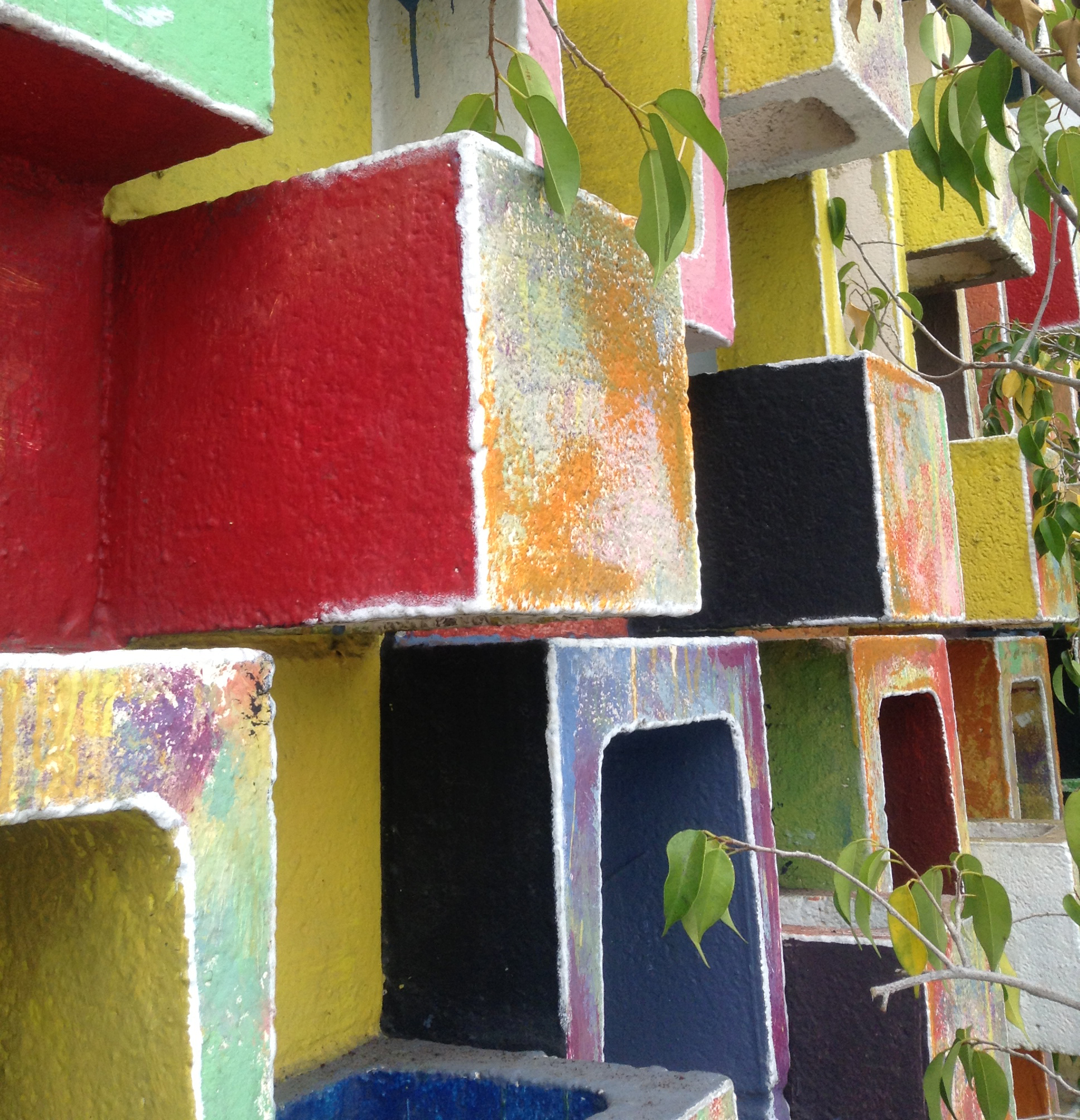
When designing anything it must be functional and meaningful. The photo below is a stop shot. That’s when I make whoever is driving stop the car so I can take a photo. The architect probably used this 1960’s CMU pattern on many of their buildings back in the day. But someone creative added the sweet colors so it caught my eye. Is it meaningful? Yes, it keeps the rain out of the inside of the building and heavily armed knights charging the wall with x-calibers.
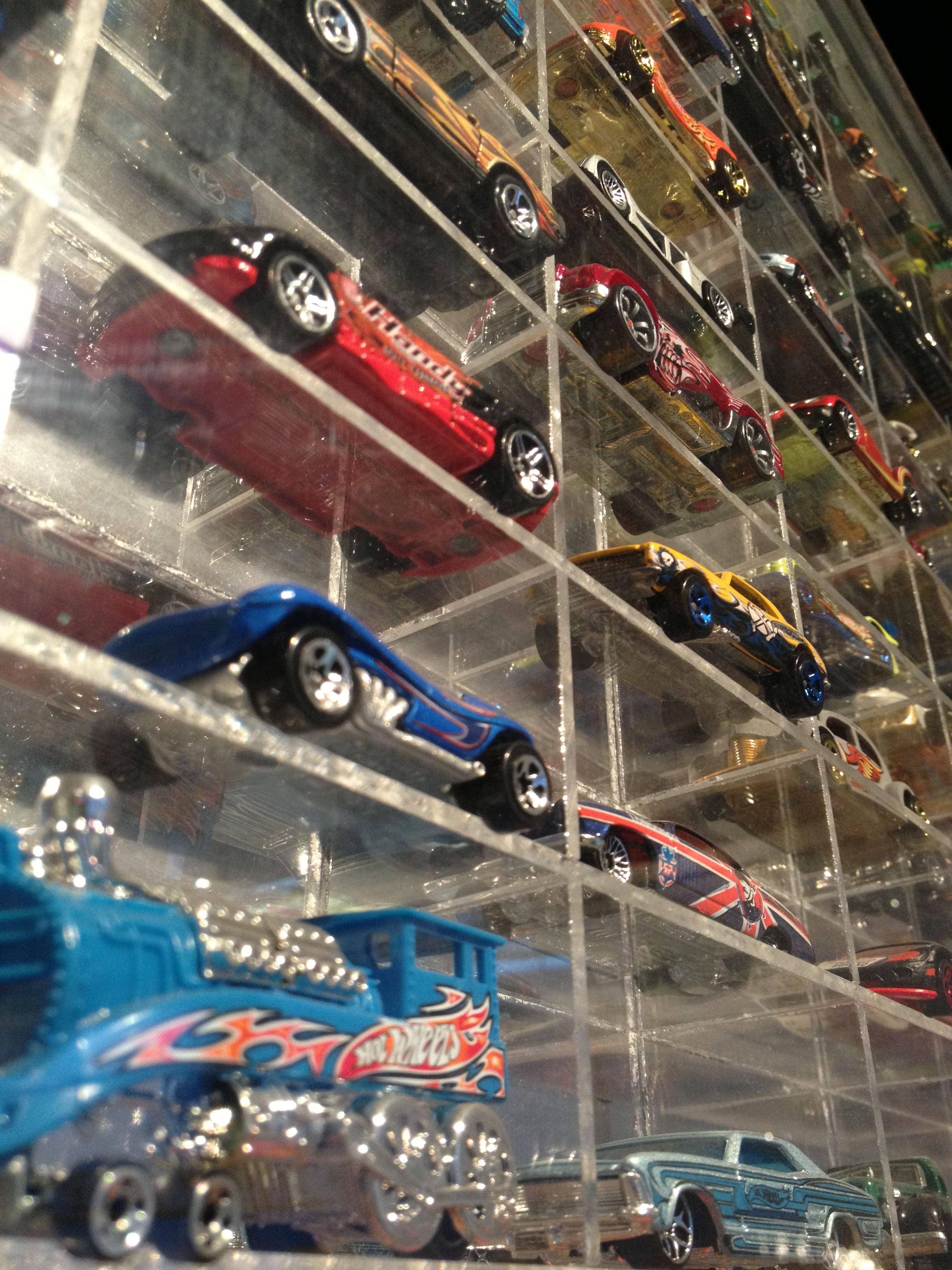
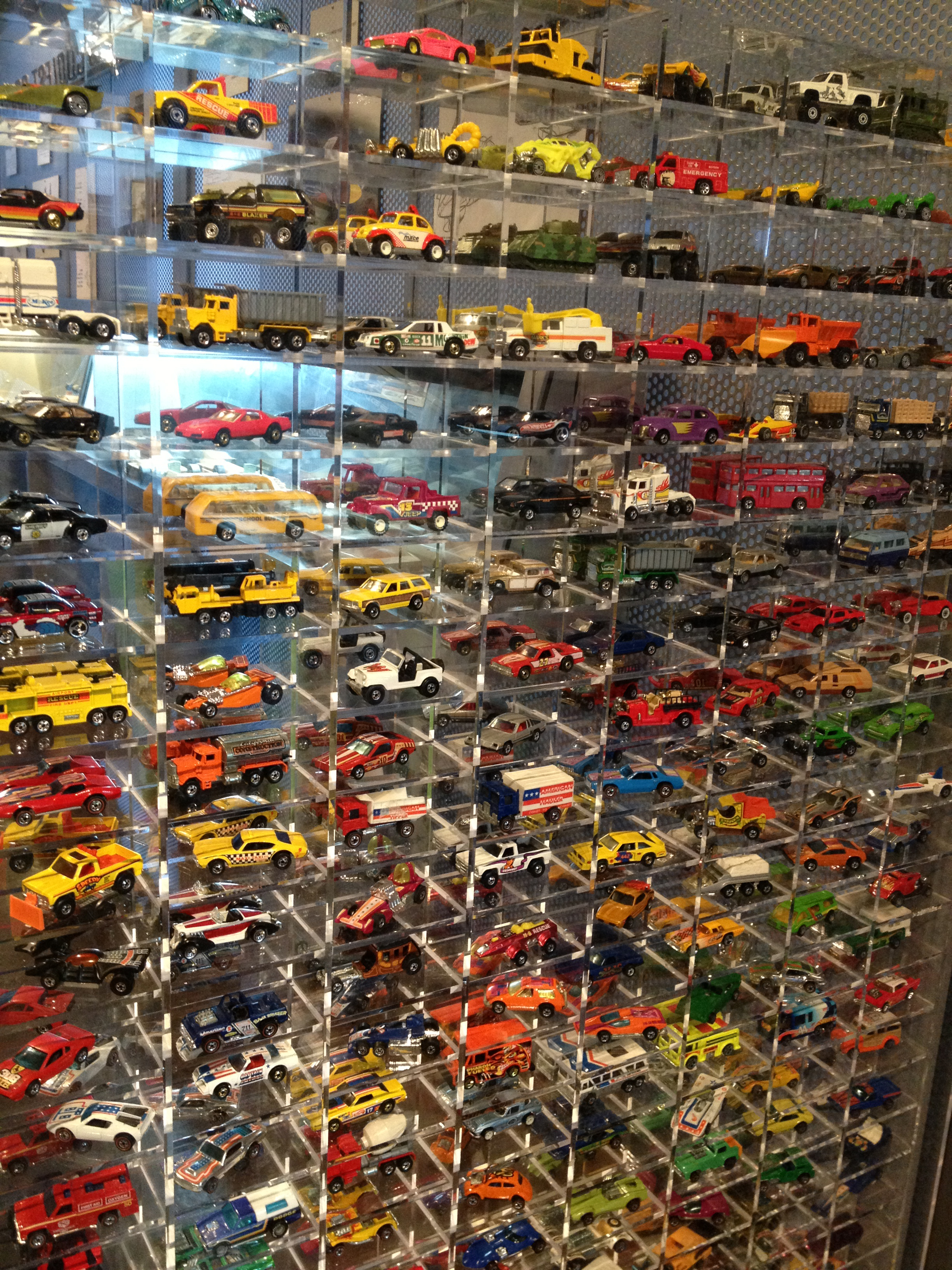
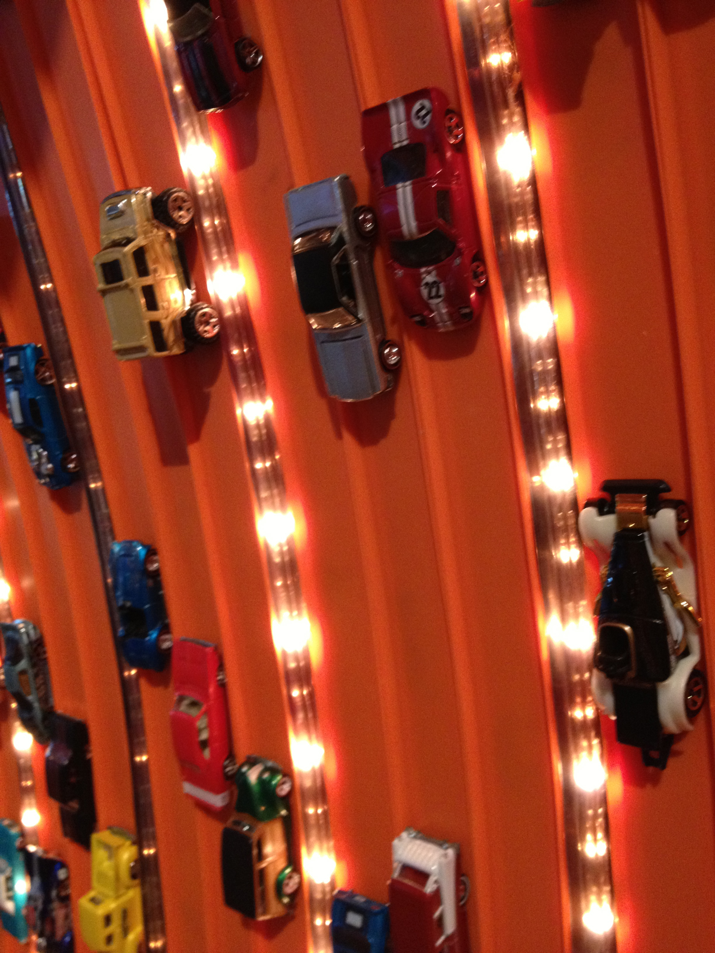
It is easy to get caught up in design especially architecture and forget that people are actually going to use your design after you leave your new building or whatever you designed. The photos below are from the Peterson Automotive Museum in Los Angeles. I like this exhibit because it reminds the visitor of playing with cars. I always like when collections of any kind are showcased. To make it more meaningful and fun they could design a ramp and let you race cars. The orange track has the cars permanently mounted. Cool but too static and boring.
You need to look at the problem from a different angle or a different outfit. Stepping back is a good way to do this. Changing into flip flops and shorts could work too. Ask a friend for their perspective.
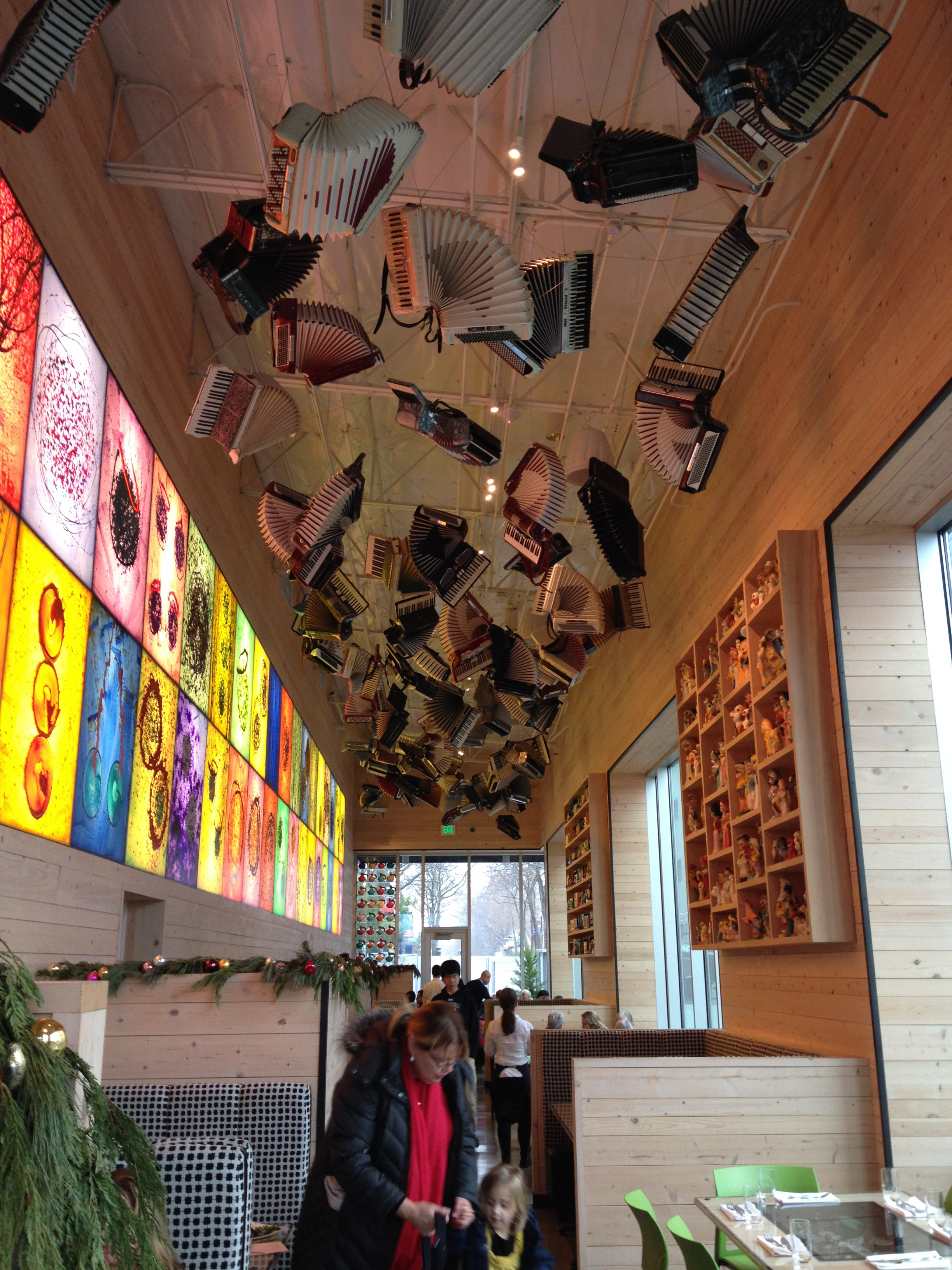
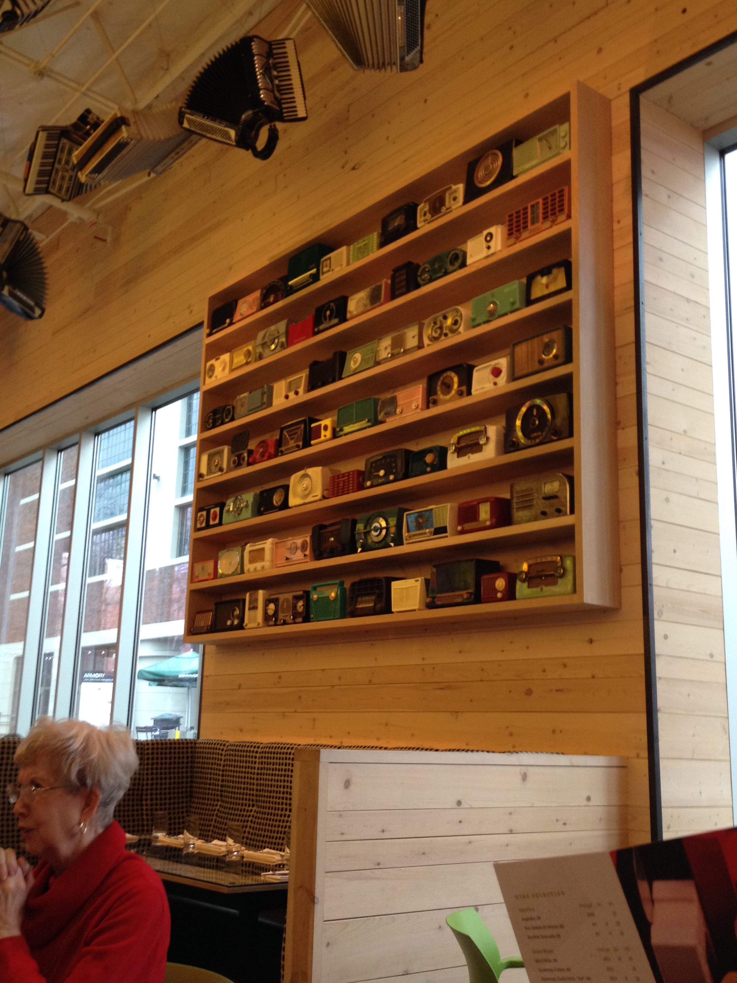
The Collections Cafe in Seattle is a great example of meaningful design. Forgive me for not listing the designer, whoever you are… Can I be you? You rock! Suspended accordions, vintage transistor radios, and creepy yard sale poodle statues are all part of Dale Chihuly’s private collection. Hence the name of the Cafe. Crazy I know! It was a sequential understanding of one artist’s work. First you start in the dark gallery where the glass art is the main focus. Then you have lunch at this cozy cafe and absorb visual clues of Chihuly’s inspirations for his work. I could imagine him looking around at flea markets in hopes of finding another fishing lure for his extensive collection.
The menu design is wonderful too with a continuation of shapes and color. The whole design package is a design win!
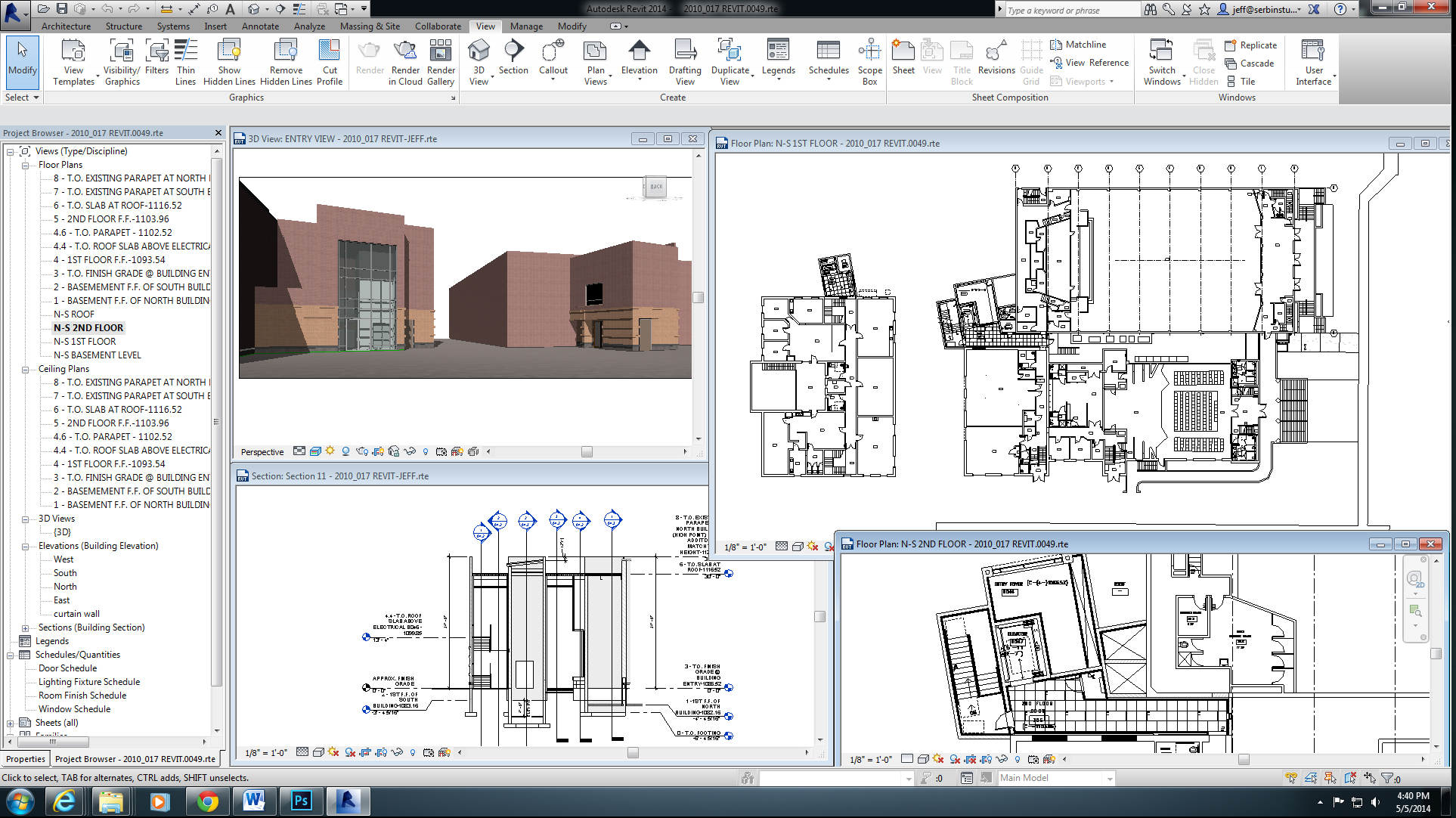
As architects, our virtual world we design eventually becomes a reality. At least that is what our intentions are when designing the built environment (buildings). We have many numerous tools, such as complex computer programs like REVIT, a 3dimensional modeling program more difficult to fly than a 777 Boeing airplane ORSketchup, equivalent to hopping on the neighbors bike for the first time and going for a joy ride. Whatever tool is your fancy, we can develop ideas into a virtual reality.
REVIT – Center for the Arts
About 10 years ago, I stumbled across TV glasses. Skymall made it mainstream or so it tried, but the cost of the glasses were outside the reach of many. It gave opportunity to immerse oneself into a world of movies or tv with little periphery distraction. It’s displays however were still like watching a tv set, not following the motion of your head. I thought it would be a cool idea to take this technology and use it somehow to present architectural ideas, but it was too premature.
VIRTUAL IMMERSION
Fast Forward 2012, Oculus Rift is developed, eventually purchased on March 25, 2014 by Facebook for 2 billion dollars to develop further for gaming platforms and other yet to be explored uses. It contains LCD screens and 3-axis gyros, accelerometers and magnetometers to track head movement. This allows the user to look around virtual worlds.
ARCHITECTS VIRTUAL WORLD
As an Architect, I have dreamed up scenario’s in which I could utilize a technology such as this to present my ideas. Imagine developing designs in 3dimensions and incorporating this into a world that is becoming more digitized (Google Streets). What if we could join the two together into a virtual presentation.
Imagine walking down a virtual street while a designer presents before and after views of the streetscape. This would enable a designer to express their ideas with more reality.
Before Image
After remodel image
This could further be enhanced by entering a 3dimensional virtual world of a building, highlighting the spaces to get a sense of the spatial relationships. I envision this not in an exact replica of reality, but more in a conceptual stage to convey ones ideas. I feel that is has to be simple and affordable so designers can incorporate this into their projects. Having to use someone who specializes only in creating virtual reality presentations will only stunt the creativity process. Here is just one example of my virtual world, created in sketchup without holding onto the handlebars.
Now imagine if YOU could control where you walked and what direction you were looking in.
Remember, this is not reality, but virtual reality.
I am excited what the future has in store, are you?
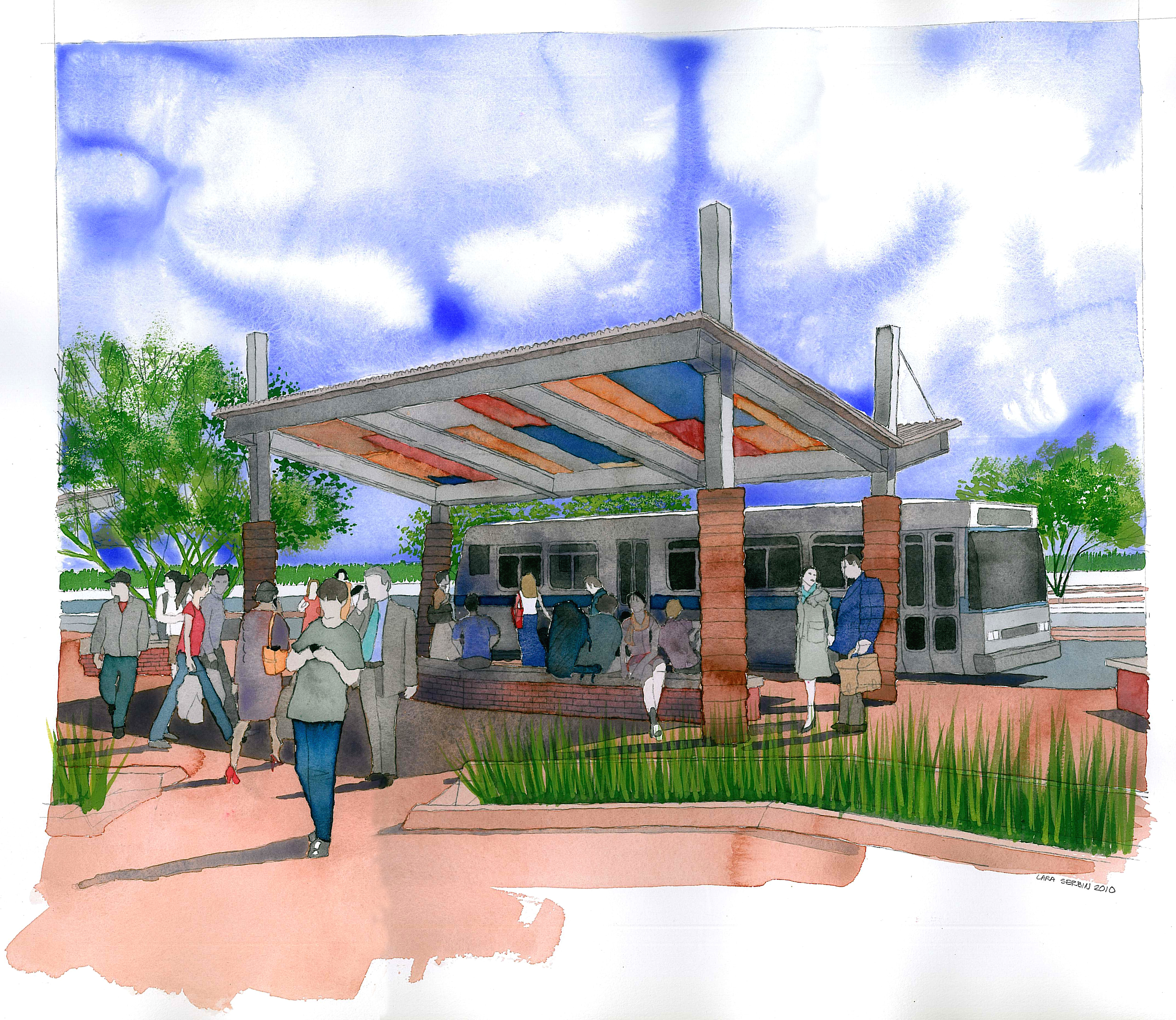
Architects depend on presentation to convey their ideas to their clients. Presentations come in many facets, from hand drawn images on paper, computer generated drawings shown on a screen and physical models.
Watercolor of Buckeye Park and Ride
LACMA – Los Angeles County Museum of Art Peter Zumthor’s Design Model
THE VIRTUAL WORLD
But what we really want is virtual reality to go places that are developed in our minds yet not here. Architects have been creating virtual reality in their sketchbooks and drawings boards for ages but today we are even closer to further immerse ourselves into the worlds we create.
GAMING
Computer gaming has shown us that we can escape into the various worlds. Some games I have seen are fairly detailed and there are examples that are highly fantasy.
HOLOGRAPHIC VIRTUAL REALITY
As movies develop further and video becomes more advanced, people are developing ways to bring a virtual reality into a new dimension. Just check out what the people at AV Solutions have developed to create this holographic virtual world. www.avconcepts.com
DRAWING BY HAND
The artfulness of hand drawn images are becoming a thing of the past. We used to pride ourselves in our office that we still produced water color images of our designs, however there has been a shift to put the pencil down and really focus on what technology can do for us.
Every so often, I see an article in an architectural magazine with a STARCHITECT stating that the art of hand drawings is being lost to the computer, but if you notice they are usually 80+ years old. They never learned the art of the computer. I don’t believe they are wrong, just right for themselves. One must realize that technology is just another tool for the modern architect to convey their designs.
“The computer is wonderful for certain things, but it is hard for your mind and hand to work together unless you continue to draw … they don’t have to be beautiful drawings, just get it down. It is your language, you cannot give it up” Michael Graves
DRAWING BY COMPUTER
If you grew up using DRAWSOMETHING2, imagine how good you would be creating those images once only possible with pen, pencil or brush. You can now “let your fingers do the walking”, (another quote from past time) and create master pieces. I’ve seen some amazing renderings watching my kids play DRAWSOMETHING2.
As the STARCHITECT’S are getting younger and developing their careers during the computer age, I believe we will hear less of the grumbling about the pencil being lost and more about embracing new ways to present our ideas.