by Lara Serbin | Sep 6, 2013 | Architectural Planning, Architecture, Blog, Collaboration, Graphics, Planning
I took one of those personality tests this week. Only because it was required by my Executive Forum group that I belong too. I really hate those things. I didn’t like my results when I read through them probably because they were so right on the MONEY. My review makes me sound like some superficial name dropper who wants to please everybody. I am such a people pleaser at my core. I am an outfielder. I take time to catch the ball. But I do like to be part of a team. I actually prefer to be managed. This is so true. Just tell me what to do. If I am in a management role I will inspire others to action. I do have to be careful not to overpraise people. My reason for being is Aesthetics. Period. Are you so surprised? A girl in the outfield who wants everything to look pretty. I really saw my strengths in yesterday’s design review meeting. *why is this in italics?*
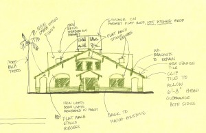
I am the Design Chairperson for Buckeye Main Street Coalition. Yesterday we all met to review some remodel plans for one of the historic buildings along Monroe. There are the more domineering members of the group who immediately analyzed the square footage of the new remodel. I could see myself sitting and taking this in. I didn’t have any comments right away. We all feel comfortable with one another. We all agreed that the smartest response was to retain the historic nature of the front façade.

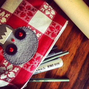
I had my role of buff tracing paper and my pencils ready. Tracing paper is invaluable because you can lay it over a photo or façade and sketch any changes over it. You can see through it. You can lay many layers over the photo to keep evolving the idea. My pens were not allowing me to sketch fast enough and I didn’t have a black Prisma pencil so I used Kelp Green. I started to zone out while everyone was talking. I loved that moment sitting there with my team helping them put down on paper what it was they were thinking. We had gone over this project through emails months ago but meeting face to face was so much more effective. This sketching and listening is my reason for being. I want to do this more. I could sketch like that everyday. It is not the same sketching by myself at my light table. I like listening to my team because they have been in their position for decades and know what to do. Some of them have gone to church services in the building. The thing I like the most about my team is the speed they make decisions.

It was good to know that even though I will never be the pitcher I do add to the team standing in the outfield with my nerdy LLBean canvas bag.

by Lara Serbin | Aug 22, 2013 | Architectural Planning, Architecture, Blog, Collaboration, Data Center Design, Planning


In 2010, Digital Realty, a world wide data center company completed an exterior upgrade on a local Phoenix landmark building. The building was built in 1947 for the Arizona Republic and then bought in late 90’s by Sterling [now I/O], and purchased by it’s current owners, Digital Realty in 2006. Isn’t is interesting that the building was built for a newspaper printing company with steady news on paper and now it has digital data constantly flowing in through colorful cables. This is Jeffrey’s post, but I had to add that.
On a hot May Day back in 2012, Gary and I took a walk around the building. It is located smack in the middle of downtown Phoenix, bounded by major streets named after past Presidents. We have Van Buren on the South side, Polk on the North and 1st and 2nd streets frame its East and West boundaries. As we walked the exterior, Gary pointed out sidewalks with various finishes, irregular cut sandstone (cheesy Southwest), salmon colored concrete (making you hungry), and grey concrete (exciting). It had been butchered throughout the years to allow for utilities to enter the building, feeding it power, water and data.

We both agreed something needed to be done to bring the sidewalks up to the sleek elegance of the recent exterior building make over including new texturing, paint, lighting and signage. We both knew the City would expect something in return for upgrading sidewalks. Did they want our first child?
In a long extensive back and forth tennis rally, working with the City of Phoenix Streets Department, Economic Development, we came to an agreement on new LED street lighting, with a resolution to who was to install and pay for this extra expense that we did not anticipate or plan to cover.

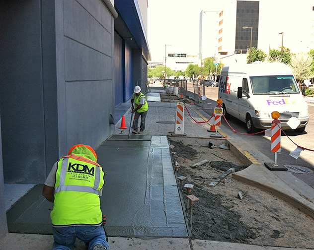
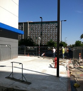
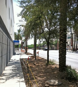
The project is now in final stages of completion. Sidewalks have been pulverized into small pieces, removed and replaced with new shiny, ok actually dull grey concrete which compliments the Grey Digital exterior and matches the City of Phoenix standard sidewalks. The new plants add a touch of green. Digital Realty exterior upgrade at 120 East Van Buren will be complete.

by Lara Serbin | Aug 8, 2013 | Architectural Planning, Architecture, Blog, Interiors, Planning
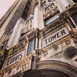
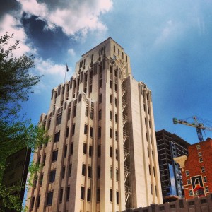
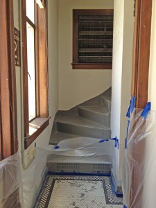
Here at Serbin Studio we like historic architecture. I was in downtown Phoenix a couple weeks ago and went inside the historic Luhrs Tower. Just for fun. It was the art-deco elevator door detail, the ornately painted ceiling beams and round button chandelier that enticed me to climb up the tight stair case that was behind the elevators. The finishes were consistent on all floors and walls so I had no sense of differentiation per floor.


At the top of each stair landing was a restroom either Men or Women alternating every other floor. The co-workers must have had a tight knit social environment rubbing shoulders walking the stairs and waiting for the coast to clear until exiting the restroom. The drinking fountains are original and so tiny that potted plants have taken residency. One of the landings had a functioning office reception. A few framed vintage Life Magazine covers were equally spaced behind a dark wooden desk. I was surprised a gum chewing receptionist wearing a polka dot dress hiding spectators under the desk didn’t look up at me. You must understand this building is an icon situated in the down town core of Phoenix, Arizona. As a German immigrant, George H.N. Luhrs came to Phoenix in 1878 and commissioned the art-deco Luhrs Tower in 1929. It has a sibling, The Luhrs Building, a block away on Central Avenue and Jefferson Street.


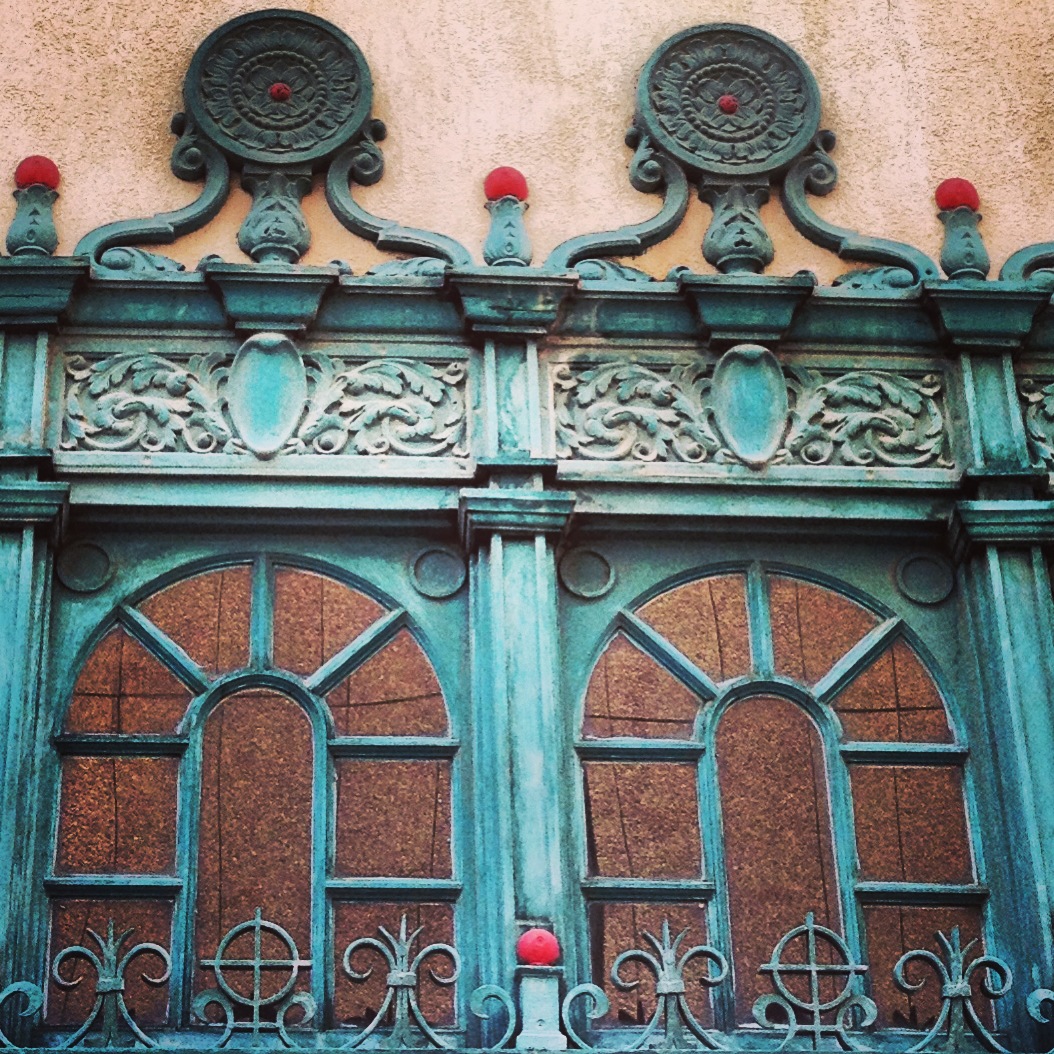
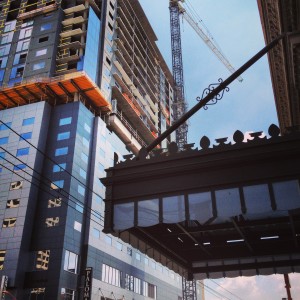
With new city center projects erupting these days, I believe that it is important to preserve what history we do have in Phoenix. The photo above on the left is what I like to see. The complex fussy detail against the sleek gray panels of the high rise in construction. The building skin on the gray modern building sheds all unnecessary detail, it is about efficiency for the height of the structure. The detail on the metal and glass canopy of The Luhrs Building is closer to the eye so it has more detail, it was modern for it’s time.


The upper double digit floors had the most current construction activity. Simple renovations like replacing deteriorated window and door frames with mahogany to match the existing finish the interior throughout. I loved the restroom doors too even though they practically opened out into the stair enclosure. Who paints gold leaf letters on glass anymore, and that “O” is too cool.


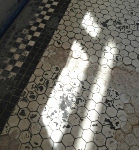
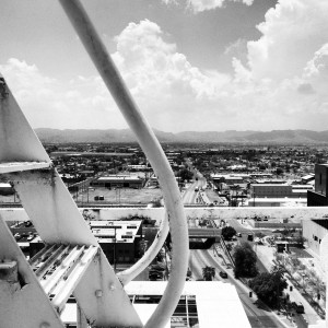
The fish scale black and white tiles are wonderfully decayed. The tiles were being replaced with like replacements. One of the windows in the renovation clutter was left ajar and so I captured the view looking towards South Mountain. This is probably more what it looked like when it was first built. Back in the day, the Luhrs Tower was one of the tallest buildings in downtown Phoenix. I felt great appreciation for the care taker of the Luhrs Tower as I explored as high as I could climb up those marble steps.

