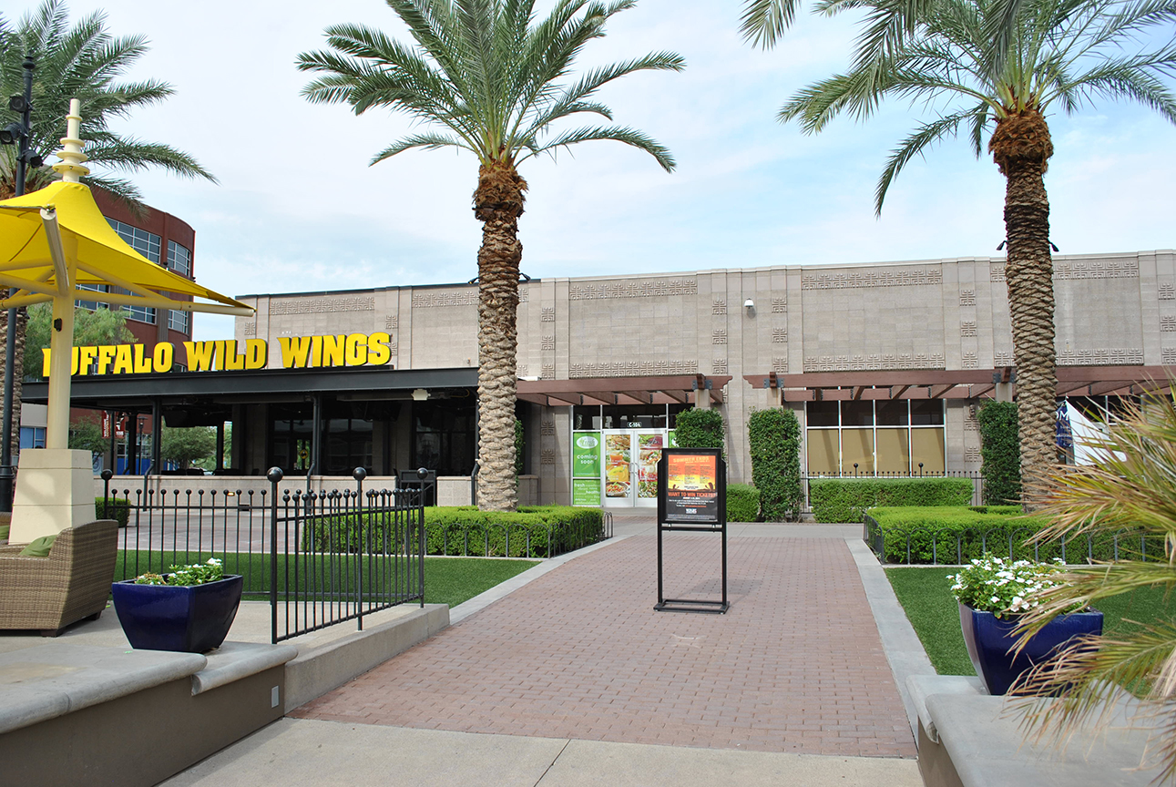
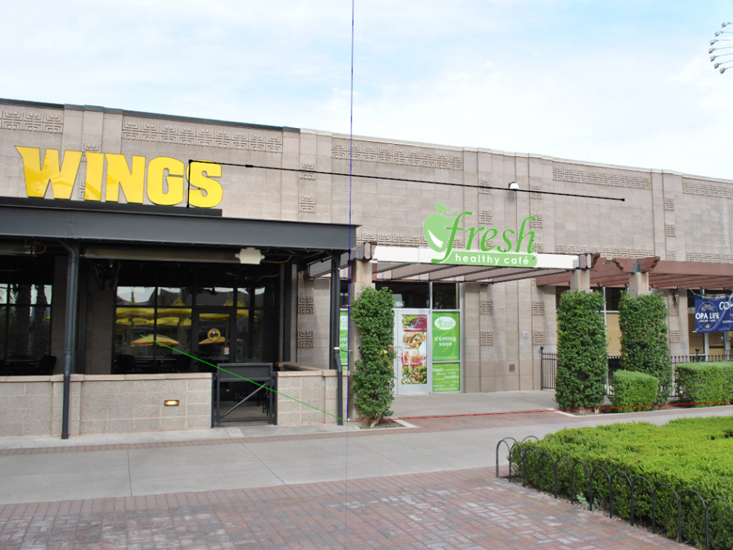
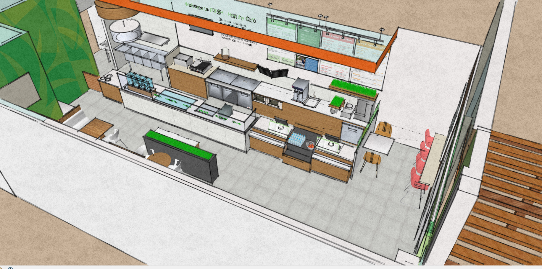
Super Bowl 2015 has created a push for restaurant design in and around Westgate City Center in Glendale, Arizona. Westgate is anchored by a 2-story AMC Theatre and University of Phoenix Stadium. We are working with J.J. Girn , an entrepreneur and franchisor of Fresh Healthy Café a new dining experience moving into the Entertainment District at Westgate. During the design phase of this project I had decided to see Malifacent the movie with my kids. To kill time we hung out in the splash pad area. As I looked to find the empty suite where Fresh was going to be located I noticed how big and bold Buffalo Wings signage was. It occurred to me that we needed to make sure the signage on Fresh was just as bright and tall.
Signage
It is important to use contrast so signage will read correctly. Look at the photo on the left above, the yellow lettering really POPS! Fresh Healthy Cafe uses bright lime green and white for their branding so the sign will be able to compete with Buffalo Wild Wings. I was against putting the signage on the gray block wall being that it would be too far back from Wings lettering. This just proves how important it is to look at your design from every angle not just as if you were standing in front of the storefront looking straight on. Or even worse never getting out to see a movie! Most people will take 6 seconds to make up their mind about the visual message of a storefront. You have to convey a positive attraction quickly or it is a design failure. Like a friendly wave saying “Come on over here, I am clean and fun inside!”
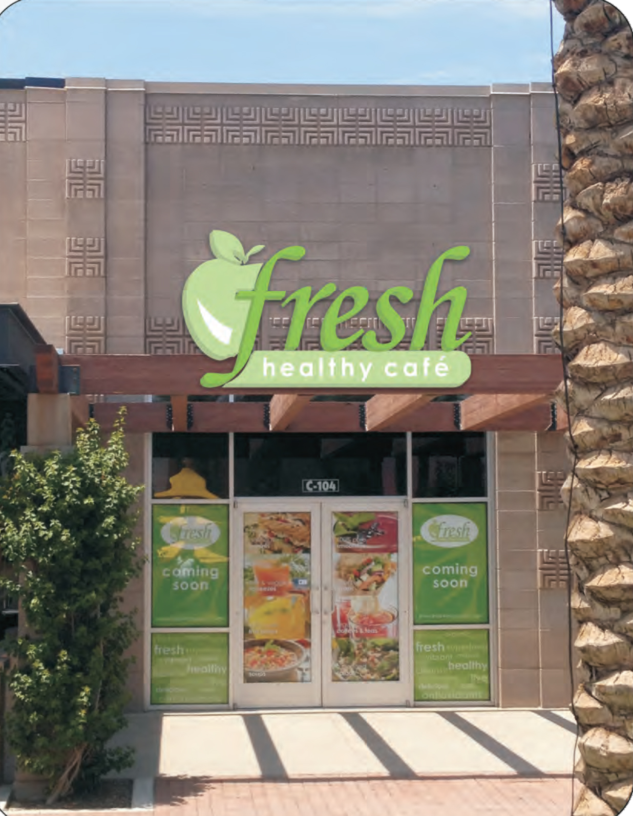
The rendering above is what the final design will look like. We thank Bootz and Duke Signage Company for helping us make this a reality.
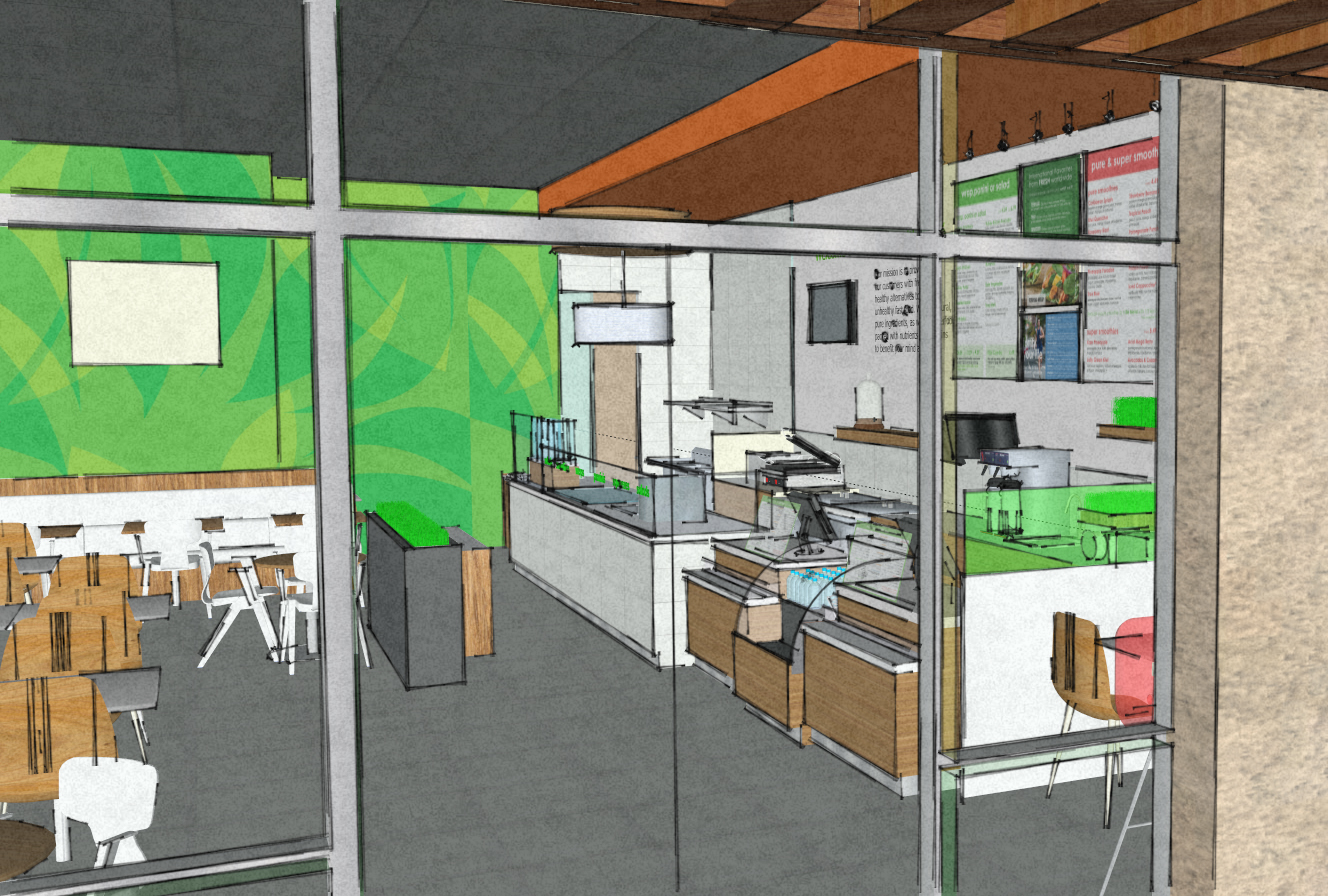
Most of the equipment to make the healthy wraps, smoothies and salads was established when we first came on board. We took the concept from Fresh Healthy Cafe and then verified clearances, finalized finishes, light fixture layout and the design of the outdoor patio eating area. We satisfied all the code requirements and worked with the building management and City of Glendale. We even helped our client select the building contractor. We spoke with the candidates past clients to ensure this build out will be complete in time for the BIG GAME!
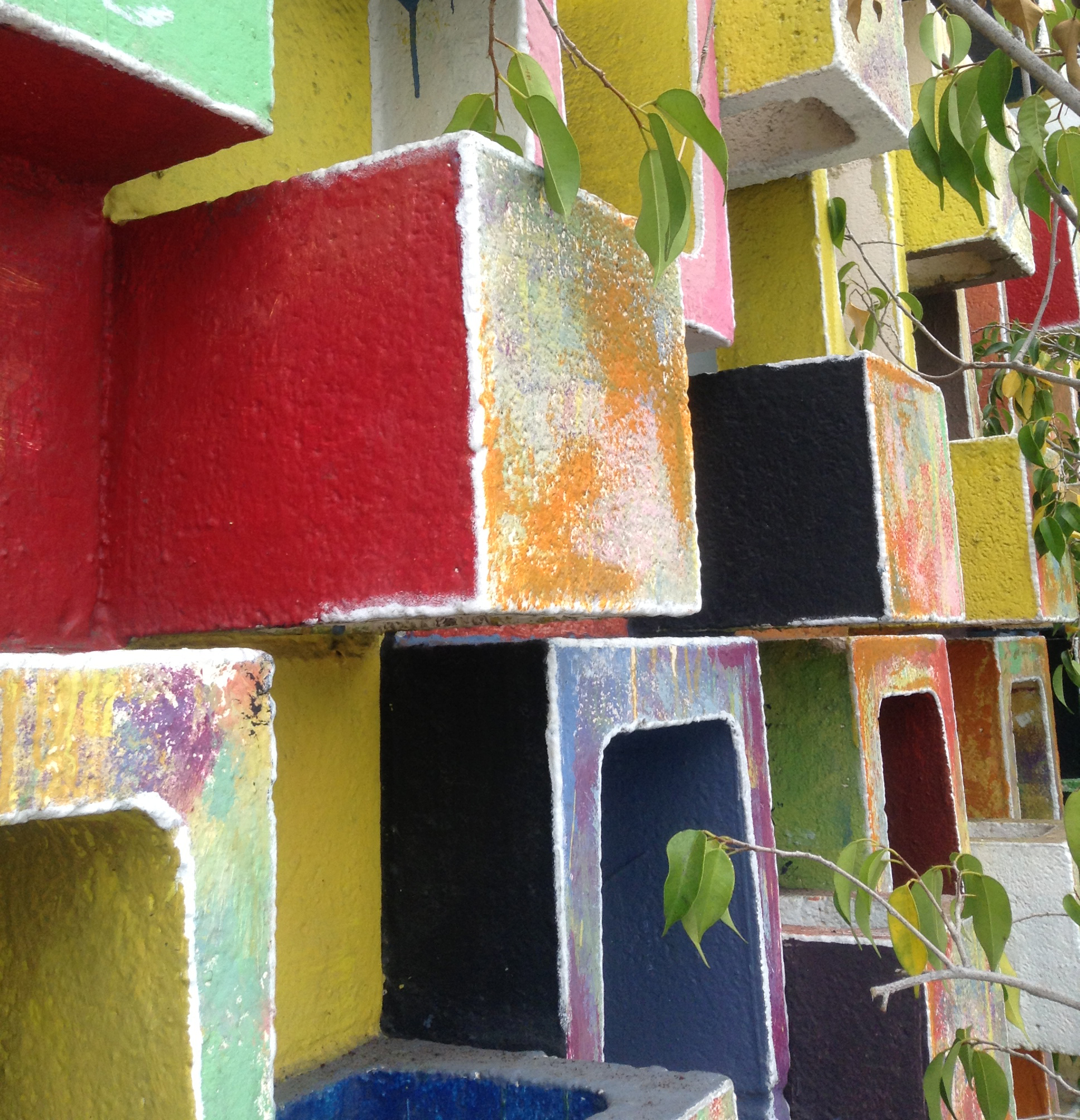
When designing anything it must be functional and meaningful. The photo below is a stop shot. That’s when I make whoever is driving stop the car so I can take a photo. The architect probably used this 1960’s CMU pattern on many of their buildings back in the day. But someone creative added the sweet colors so it caught my eye. Is it meaningful? Yes, it keeps the rain out of the inside of the building and heavily armed knights charging the wall with x-calibers.
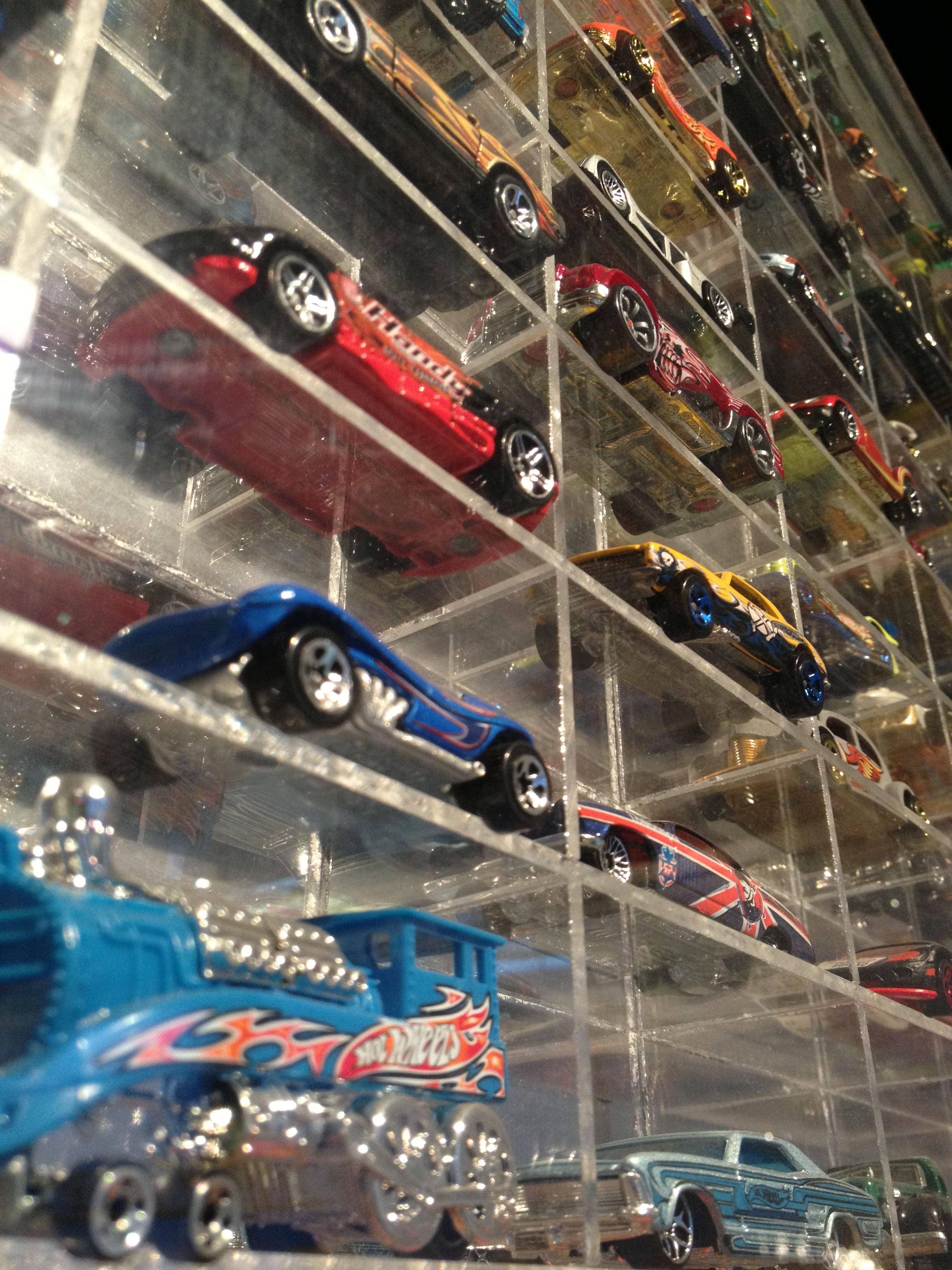
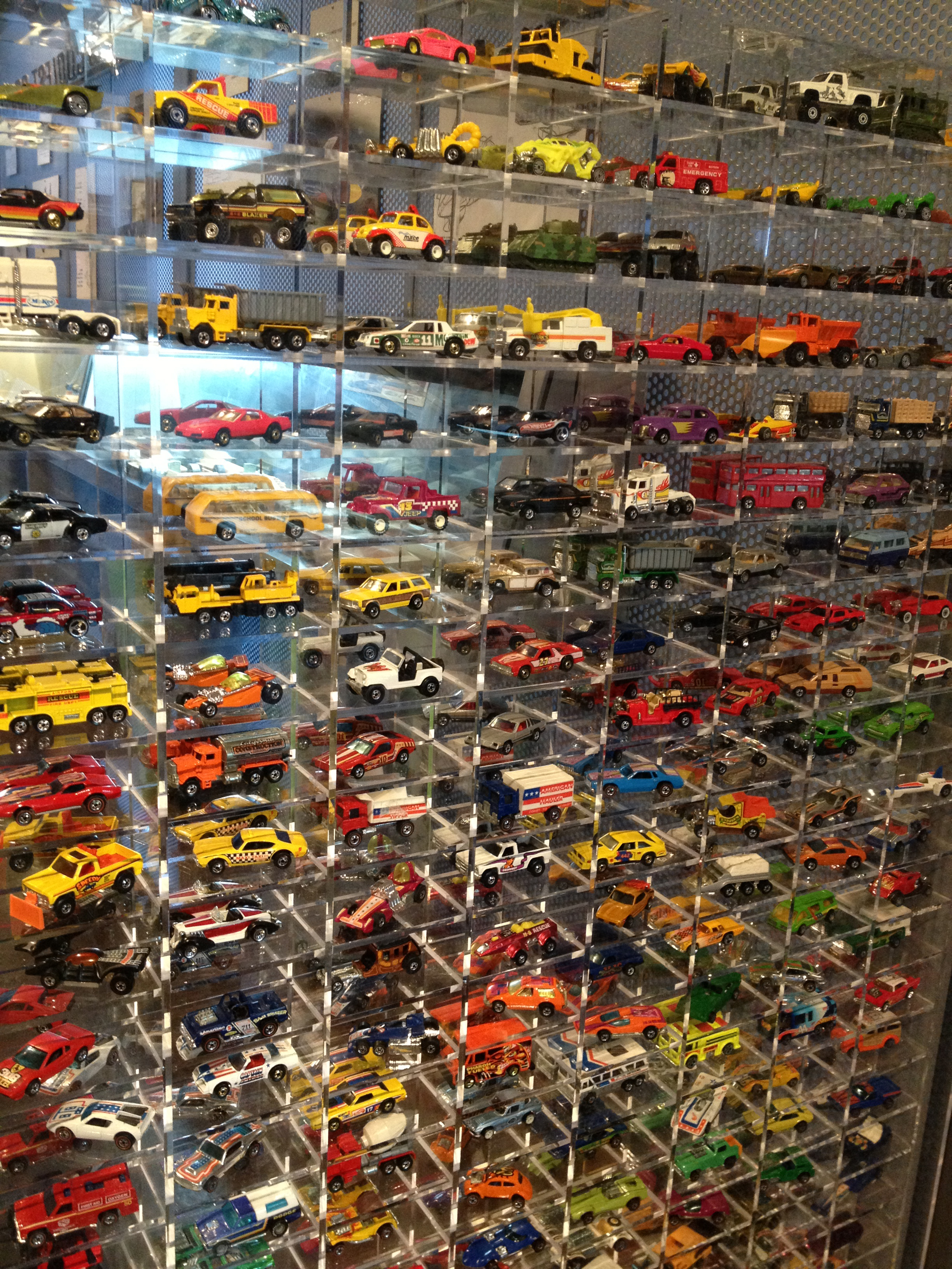
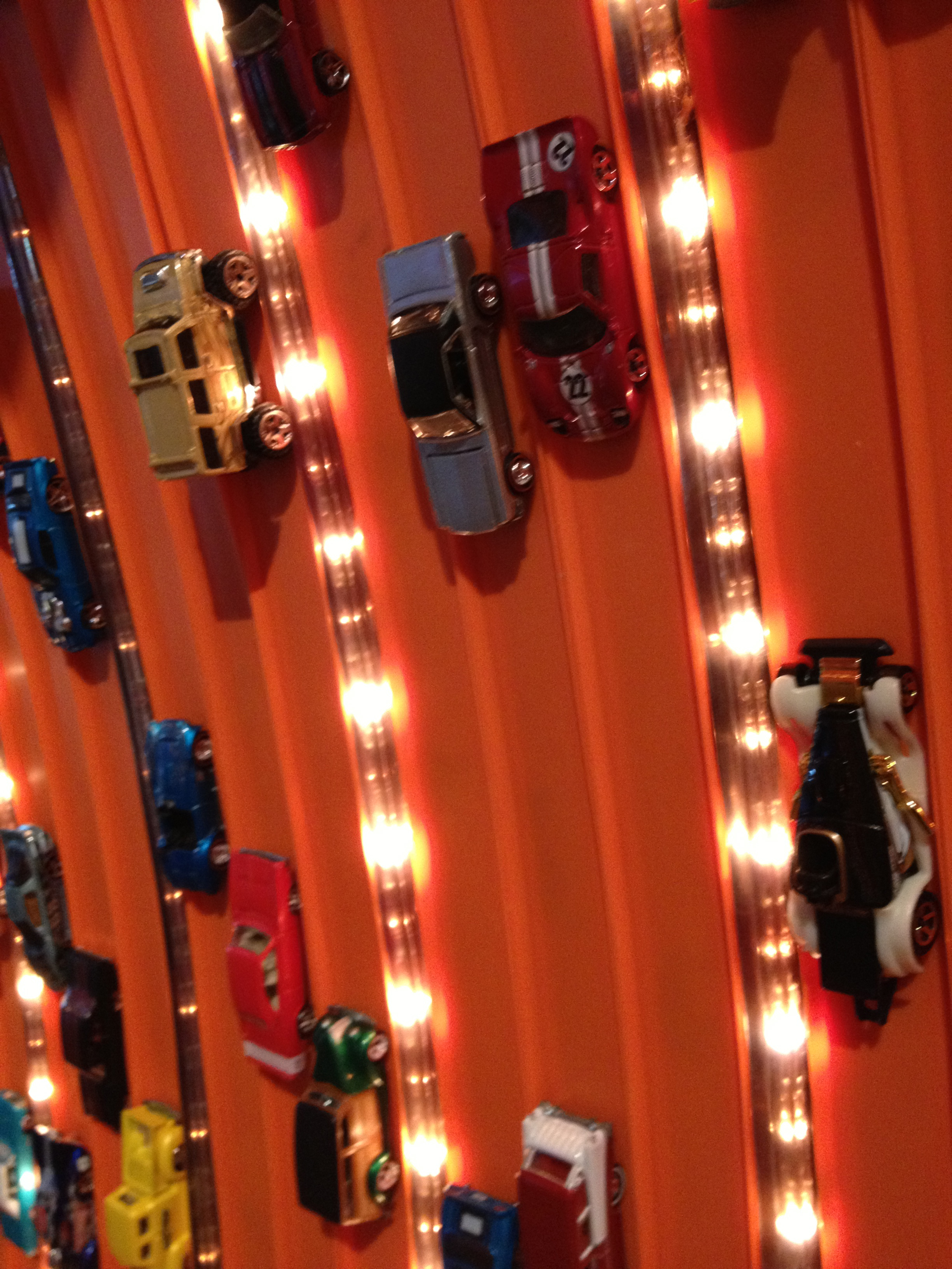
It is easy to get caught up in design especially architecture and forget that people are actually going to use your design after you leave your new building or whatever you designed. The photos below are from the Peterson Automotive Museum in Los Angeles. I like this exhibit because it reminds the visitor of playing with cars. I always like when collections of any kind are showcased. To make it more meaningful and fun they could design a ramp and let you race cars. The orange track has the cars permanently mounted. Cool but too static and boring.
You need to look at the problem from a different angle or a different outfit. Stepping back is a good way to do this. Changing into flip flops and shorts could work too. Ask a friend for their perspective.
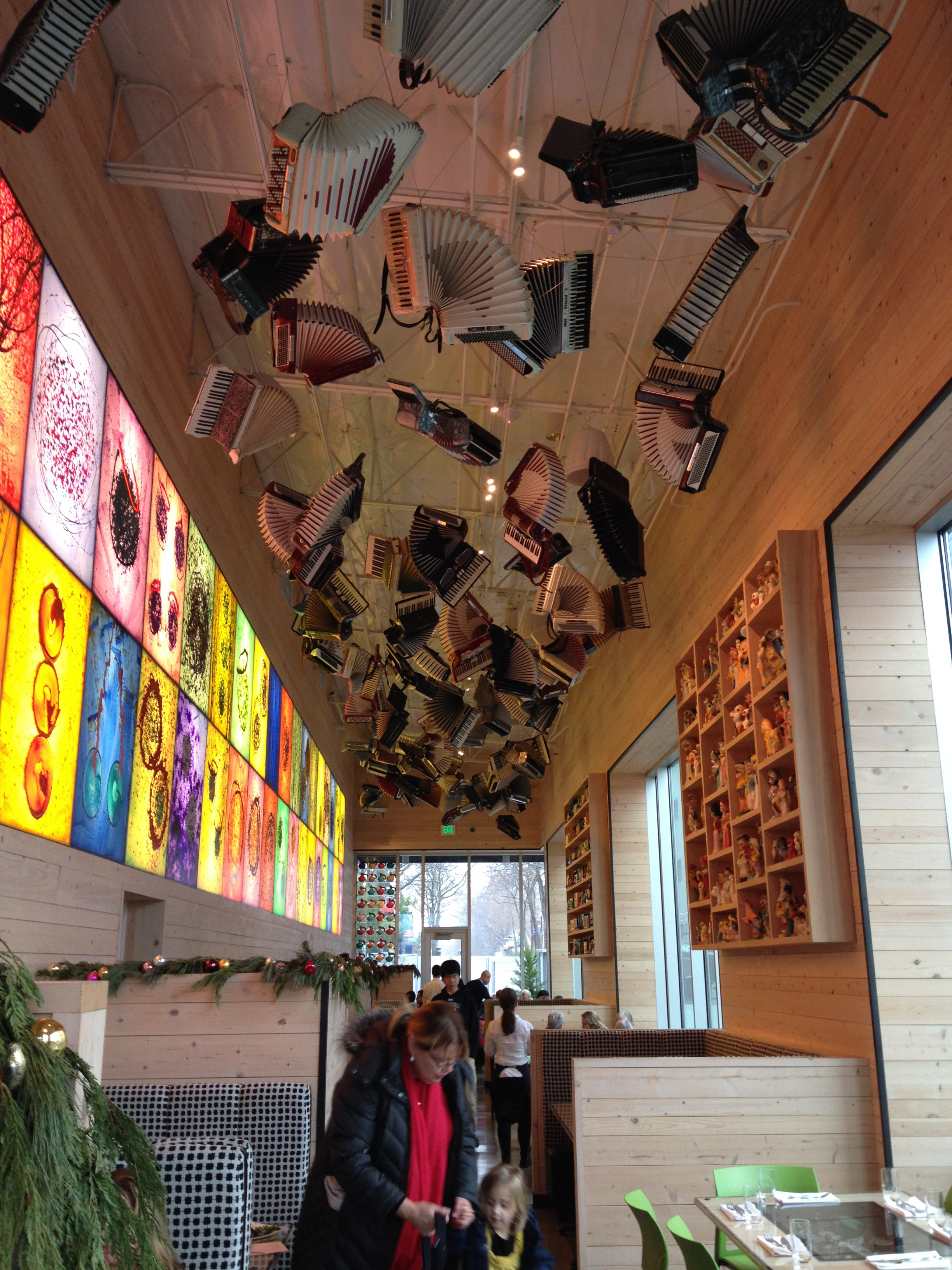
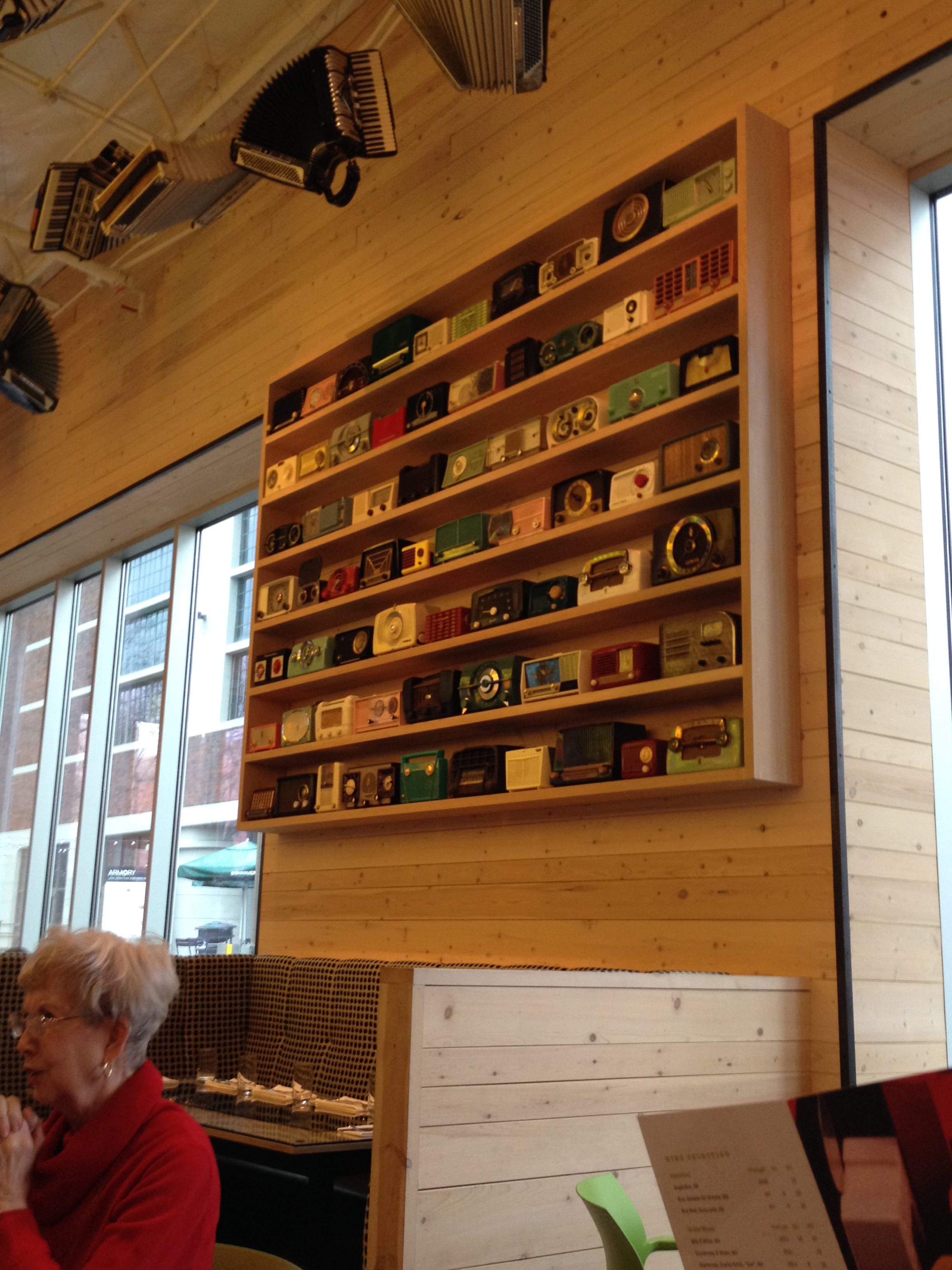
The Collections Cafe in Seattle is a great example of meaningful design. Forgive me for not listing the designer, whoever you are… Can I be you? You rock! Suspended accordions, vintage transistor radios, and creepy yard sale poodle statues are all part of Dale Chihuly’s private collection. Hence the name of the Cafe. Crazy I know! It was a sequential understanding of one artist’s work. First you start in the dark gallery where the glass art is the main focus. Then you have lunch at this cozy cafe and absorb visual clues of Chihuly’s inspirations for his work. I could imagine him looking around at flea markets in hopes of finding another fishing lure for his extensive collection.
The menu design is wonderful too with a continuation of shapes and color. The whole design package is a design win!
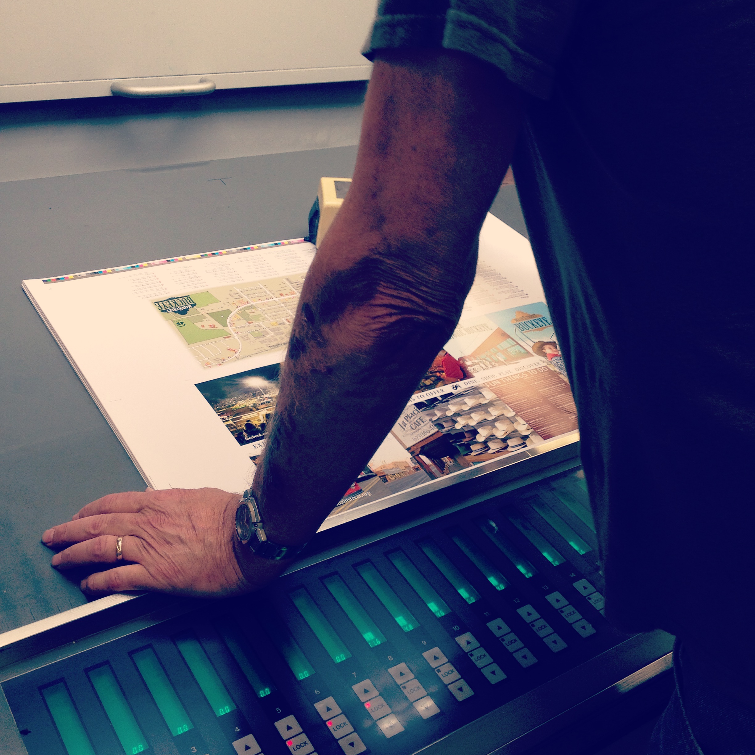
There I was watching our final brochure getting printed out at lightening speed today. This brochure is the second try at coming up with a brochure for Buckeye Main Street Coalition. We are a group that volunteers our time to make Down Town Historic Buckeye look better. We want new and current businesses to thrive on Buckeye Main Street.
This is a big ass printer at a place called http://www.lithotechaz.com/ in downtown Phoenix. Shelly Butler, with Forms Management is a Buckeye girl who helped us find the right place to print this vertical accordian style double sided brochure. The place was on Grand Avenue and 27th Avenue which is pretty industrial place. So I found out that Grand Avenue really has an end point today. It ends at Indian School Road. Now you can all sleep.
Everything looked so sharp and the colors were really deep. I did notice the sky could have been blended a bit better because the cowboy photo was not quite tall enough. So only you and I know. Next printing I guess. No one will care except for me. Even the horse hair is so crazy sharp.
So one side has photos of fun things to do in Buckeye like go to a demolition derby, get a burger at Cafe 25:35, go to a car show, buy some jeans at Saba’s Western Store and have 99 cent tacos at La Placita Cafe. Then on the flip side is the map with location dots. We tried to squeeze everyone on there. If you are not on there just call me up and we will put you on there for the next printing.
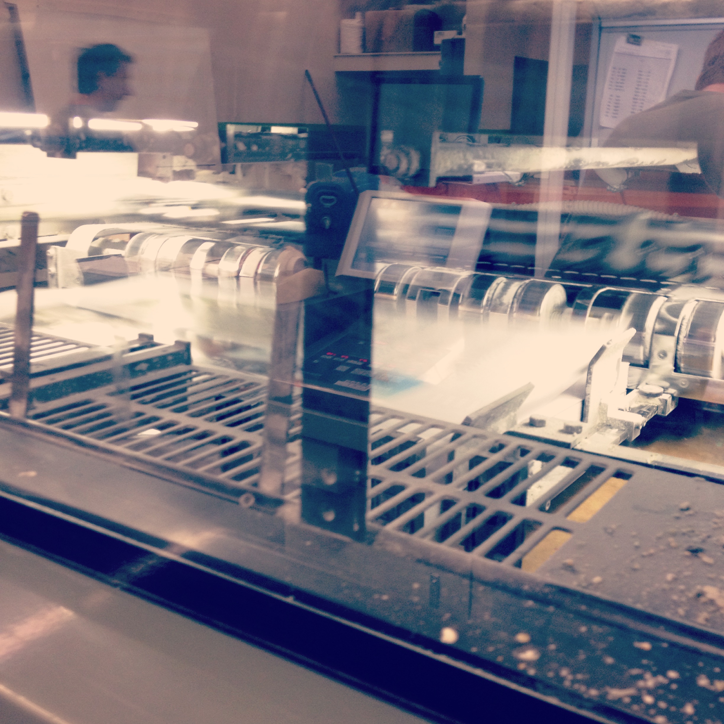
There are so many printing options. I think as being the graphic designer it helps to go and watch how it is actually printed. By visiting a print house it is a great way to learn about new finishes, colors and formats. There were so many exciting projects going on at once at Lithotech today. There is a lot that happens behind the scenes. It is isn’t as easy as design a brochure and poof it magically appears at your doorstep as a folded brochure. There are many steps to the finished product. Right now our brochure is probably waiting to get the bleeded edges cut off and then folded.
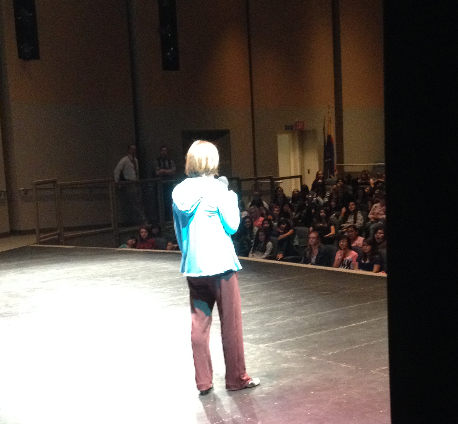
A business friend of mine Julie Sullivan with Dominion Real Estate Partners started Tomorrow’s Winners a youth empowerment program 5 years ago. She invited me to tell my story on how I became an architect at this event today at Buckeye High School.
Heith Reade
Heith Reade with BMO Harris Bank spoke first. All the girls loved his organized and confident message. He had a power point and he connected well with the young women.
Lydia Evanson
Next up was Lydia Evanson with LME Creative Human Resources. The cool thing about her presentation is how she invited the students to come up to the stage and do a career shout out. Lydia and Heith are both business friends from the Buckeye Valley Chamber and The Rotary Club of Buckeye.
Lara Serbin
I was the last speaker today. I felt really relaxed with the huge power point behind me. Forget the need for a laser pointer. I just pointed with my arm. I was impressed with the questions they asked at the end. Most of the questions were regarding why I chose architecture and some of the challenges along the way. I had about 10 questions! A record for me. I have the privilege of speaking again to Youngker High School in Buckeye tomorrow.
A special thanks to Julie Sullivan for giving me this great opportunity and Pat Rovey of the Buckeye Women’s Club for saying those nice things about the cook book cover I designed.
The view from the double swinging aluminum doors of the Chase Bank in Historic Buckeye is quite spectacular. Everything inside is a typical Chase interior except when you glance out the front doors which looks onto the rustic aged super graphics painted on the brick of the historic San Linda two story building. The rustic brick cropped image beyond the glass doors is such a stark contrast to the sleek commercial interior. You know you are in the heart of Historic Buckeye.
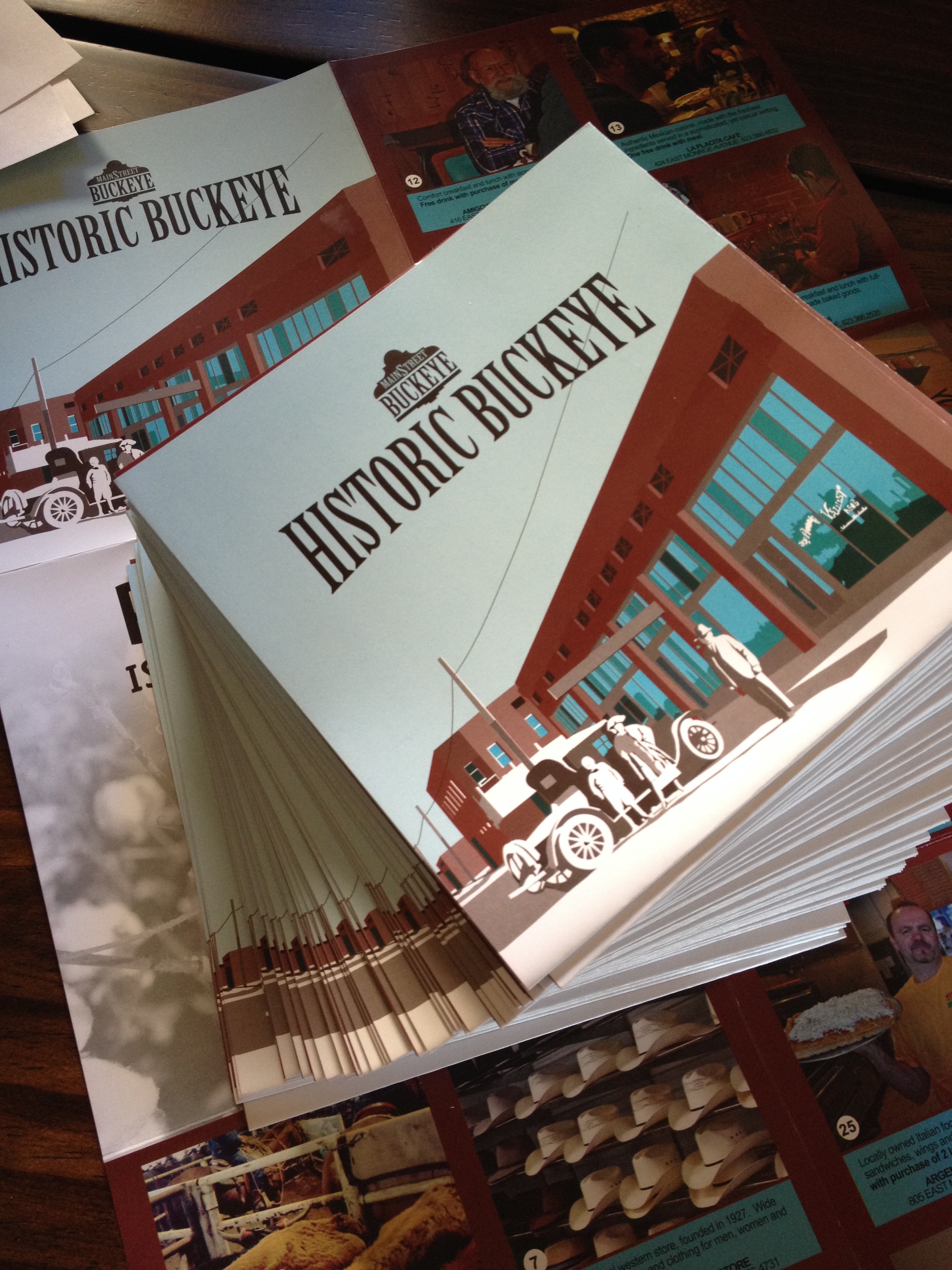
I was dropping off a stack of the brand new maps of Historic Buckeye. I had some banking to do and after I was done I shared the map with teller Blanca Villareal. She became very friendly as she explained, “I have lived in Buckeye since I was 10 years old.” She was excited that something had been done like this for Buckeye. The Buckeye she remembers was a robust down town full of activity and buzz. The flier made her feel hopeful for the future. She thought the maps would be a great item to give to a new client opening up an account. Blanca has noticed that more people are buying homes and opening new accounts in Buckeye. Derek Stephens, a third generation Buckeye local and personal banker for this particular Chase branch was happy to see the fliers. He opened up the flier and his whole face lit up, “This is awesome! I love the photo of Hobo Joe!”.
[print_gllr id=1403]
This map was a group effort designed and printed by the Buckeye Main Street Coalition. I am very proud indeed to be a member of this group. Our group combines the unique skills and vantage points of both public and private sectors to revitalize down town historic Buckeye commercial district. Through a gradual process that begins with small steps, sustainable improvements are being achieved.