by Lara Serbin | Jul 24, 2013 | Architecture, Blog
The trip to Los Angeles was mostly to see the Retrospective show on James Turrell at the Los Angeles County Museum of Art. I was attracted to the show mainly to experience the hype in Light, Action, The alternate realities of James Turrell by Wil. S. Hylton in the June 16, 2013 New York Times Magazine. Jeffrey has a thing for lighting so I thought it would be fun. A very wise architect told me I needed to know about James Turrell. There are actually 3 different shows in 3 separate museums that Turrell is taking on. The LACMA pieces are obviously ongoing but I am pretty sure he is in Texas for another huge installation at the Museum of Fine Arts, Houston, and then to Manhattan, where is opening a show the Guggenheim. I cherished my tickets I had bought a month earlier, the show was sold out the day I was there.
Shallow Space, LACMA, James Turrell
Part I
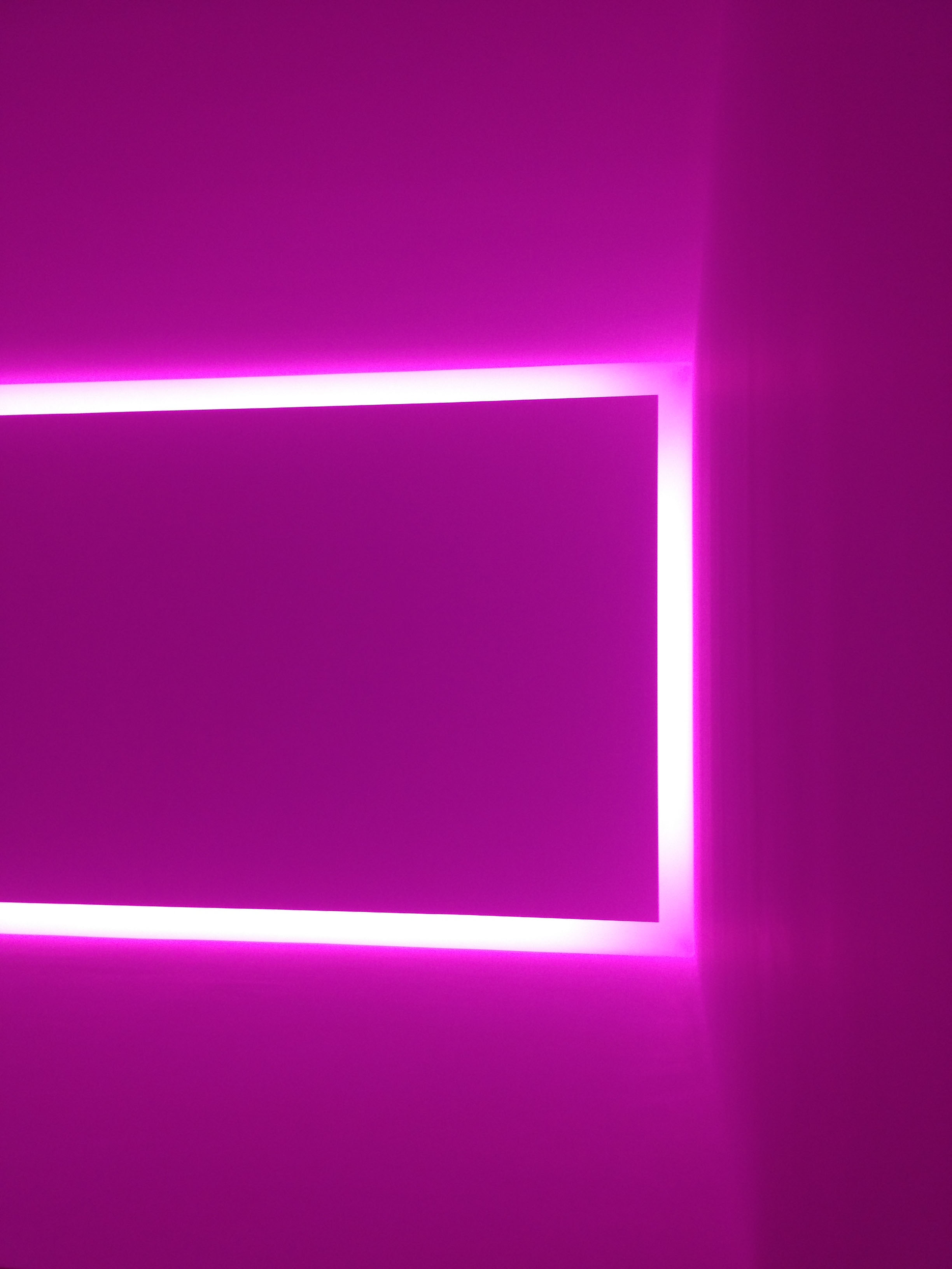
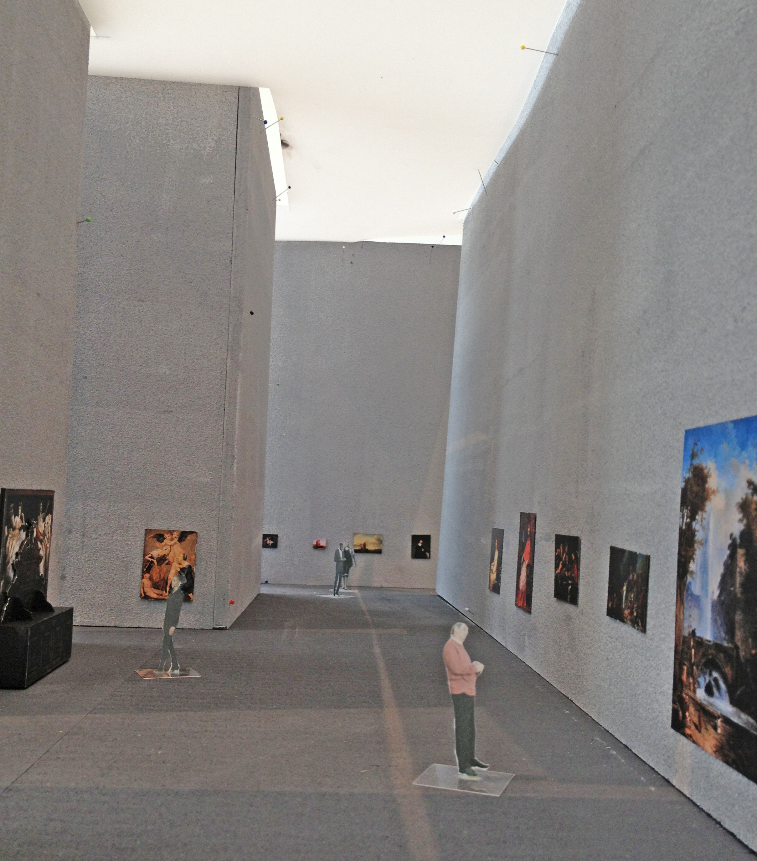
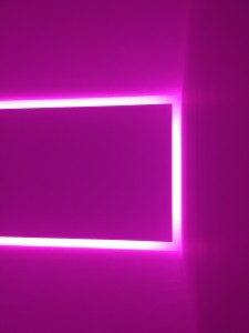
The best way to take in James Turrell is slowly. There were docents in each of the rooms so security was tight. When I went into the Shallow Space room I was blown away by hot pink light that penetrated my senses. I appreciated Turrell’s finely crafted white plaster benches that folded into the walls like soft whipped meringue. Nothing was left to chance in these tightly organized rooms. Everyone was mostly hushed which was nice. Once I sat for about 12 minutes in Shallow Space the pink light did start to turn whiter. After I was busted for taking the above photo I left Shallow Space and into Cross Corner Construction. My eyes had been conditioned, everything including the walls was avocado green with another hologram in the corner. We asked the docent if the walls were painted green, she said, “No, they are white.” Eventually the green faded to the white plaster. Turrell is clever to play with complimentary colors.
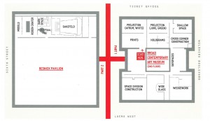
I know this diagram is small. You can enlarge it by clicking on it. This is the floor plan for the exhibit room.
Part II
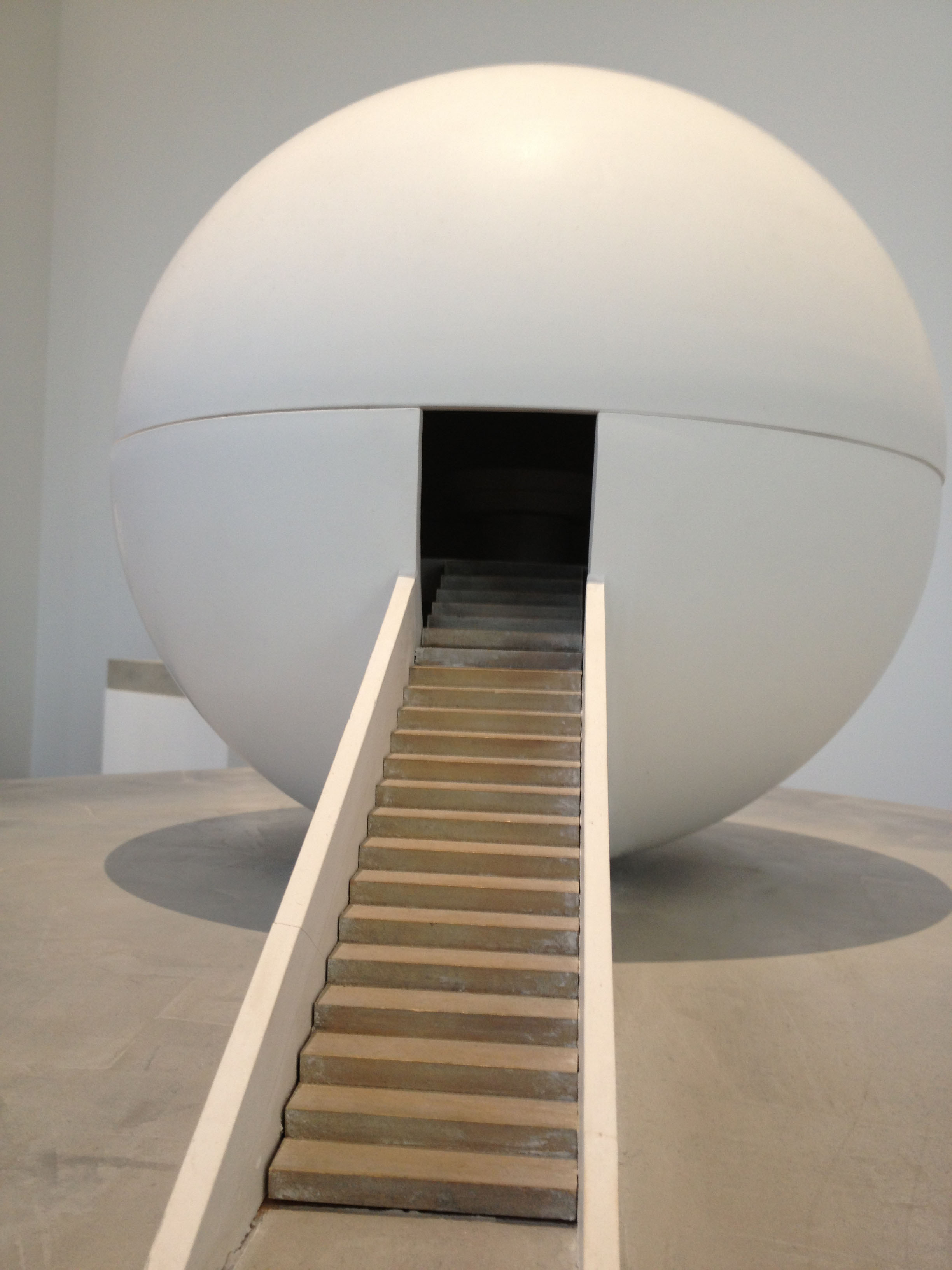
Naturally I was curious about the Perceptual Cell, the climax of the show and booked solid until January of 2014. The Perceptual Cell is a hollow globe about the size of an SUV. There is a cut out for a drawer about 18 inches by 30 inches. When the drawer is pushed out it is about 6 feet long. There are black carpeted steps up to the drawer with 2 clinical chic docents that facilitate the viewer in laying down on their back in the drawer. I watched the viewer get pushed into the globe. There is a panic button for the viewer inside and a dime sized lookout for the docent. I asked one of the docents what he thought of the Perceptual Cell. He said it was like his eyeball had become one with something like a planetarium Pink Floyd light show. At one point the strobes and lasers were getting so intense he shut his eyes. He went on to say even with closed eyes and using his arm as a shield, he could still see the strobing lights.
Model study found at A Retrospective James Turrell, LACMA. Kind of reminds me of the Perceptual Cell.
Dark Space was awesome. In this exhibit I was instructed to hold onto the wall railing and walk down a dark hallway that had 2 bends in it to black out the light from the waiting area. With each 90 degree turn it got darker. I held onto Jeffrey’s shirt so I wouldn’t run into a wall. Once we got to the end it was a matter of feeling my way to the fixed seating. I was giggling because it was so ridicoulsly dark that I felt out of control and a little freaked out. I thought some dragon was going to come up and breath fire on me or something. I was instructed to just look ahead. It was nice to have Jeffrey there on the other stool to say, “Hey, did you see that? While sitting for the required 15 minutes very weird things started to happen. For one, I had to intentionally blink because I didn’t believe my eyes were open in the blackness, but they were open. It was the same blackness with my eyes closed as it was with my eyes open. I could visually feel my brain trying to find what it needed to see. It didn’t take long for a soft peach light to appear, trust me…Jeffrey saw it too. The peach light would flutter a bit like a fuzzy distant apparition trying to complete itself. For me, the apparition was trying to complete itself but the darkness kept clipping the sides. As I emerged from the darkness, the light in the sanctuary was blinding! I spoke with another docent about other viewers experiences in Dark Space. She heard all kinds of crazy stories of course. They probably saw Elvis. I asked her if there was indeed a soft peach light source in the room and she said no. She said that the only thing that was in the room was a painted circle of white on the far back viewing wall which is in complete darkness. It was awesome to watch my eye and brain work at perceiving something that wasn’t there. Or was it?

by Lara Serbin | Jul 13, 2013 | Architecture, Blog
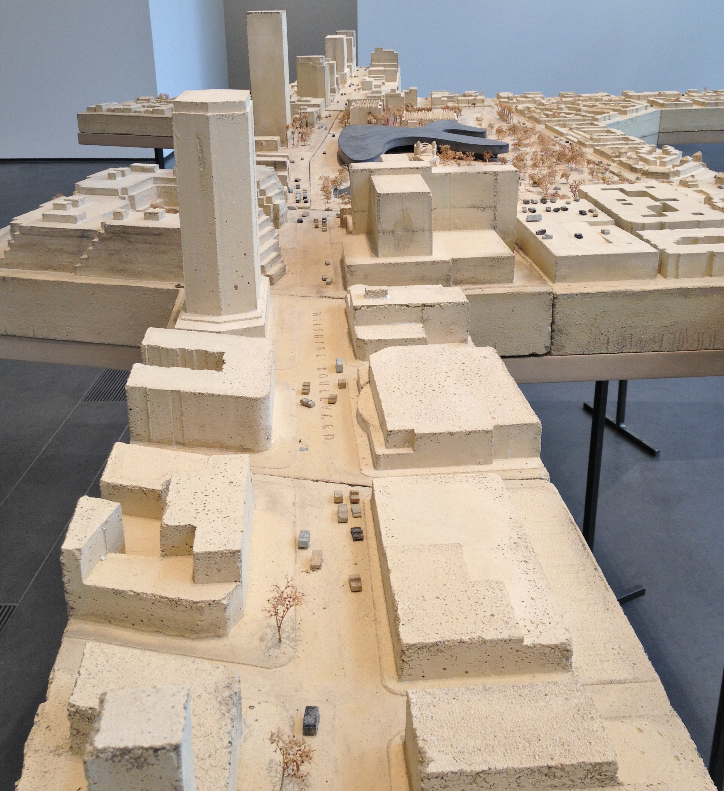
Yesterday I had the privilege of visiting the Los Angeles County Museum of Art to see James Turrell a retrospective. Turrell is really wonderful but I will save that for another post. What blew my mind was the fantastic architectural models done by the Swiss architect Peter Zumthor. He seems like such an approachable architect, so down to earth. I guess that is why his work is on display here at LACMA. This is a quote that I read off the wall at the exhibit: It is an organic shape, like a water lily, floating and open with 360 degrees of glass facing Hancock Park, the La Brea Tar Pits, Wilshire Boulevard, Chris Burden’s Urban Light, and Renzo Piano’s new galleries. Primary circulation is achieved by this curving perimeter – a continuous veranda rather than a classical Beaux-Arts spine. Visitors can look out; those outside can look in. From the ground, and in elevation, the museum is mostly transparent. – Peter Zumthor

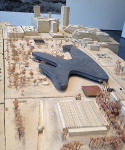
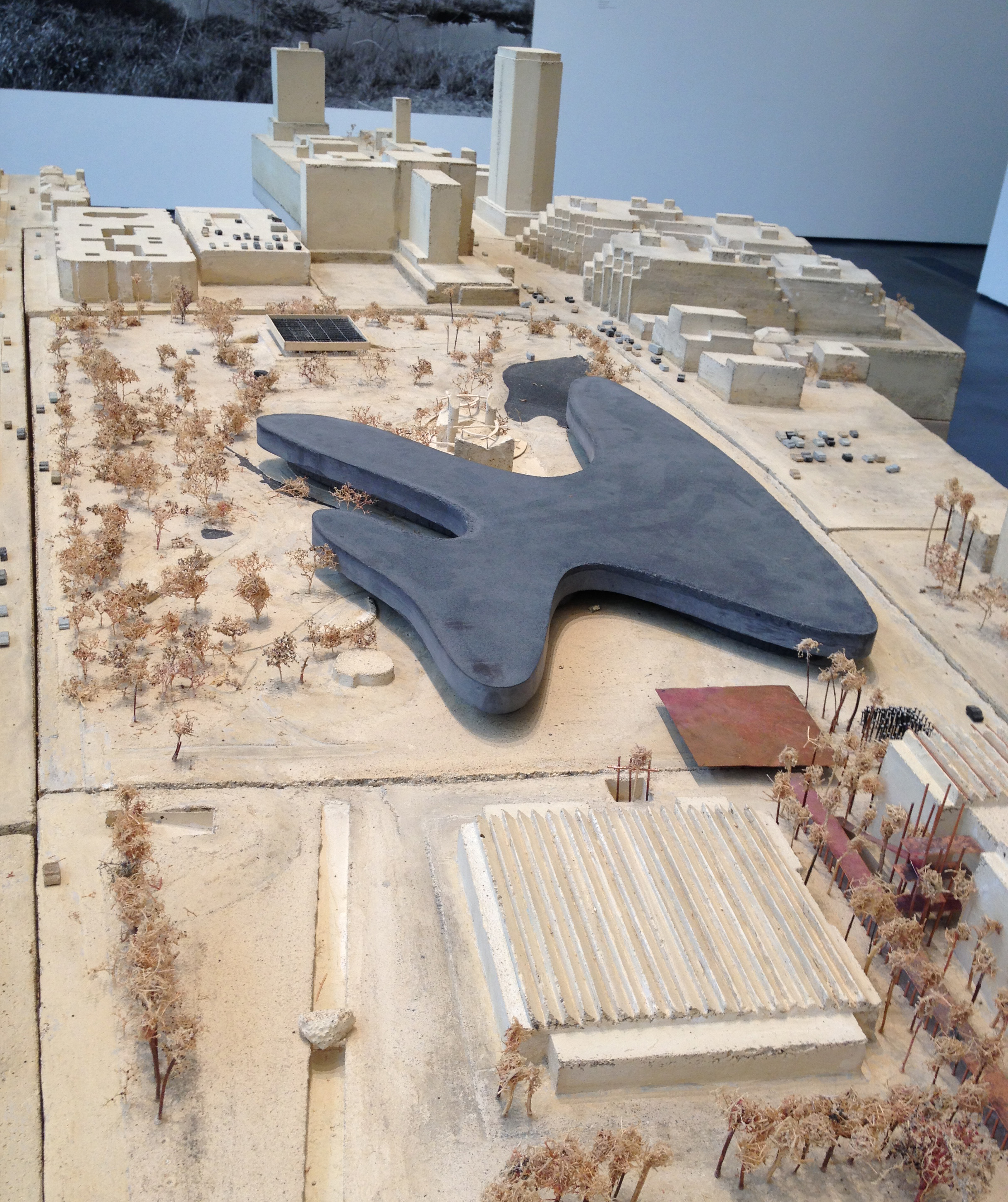
I still can’t get over the base of this site model, the entire base is cast in a concrete plaster mixture. Zumthor must have cast the buildings upside down in a mold. The street names are even cast in the mix. So the black amoeba looking thing is the proposed new museum for LACMA. As far as I understand the design still needs to be approved by the board of the directors, the new building will require the removal of several older structures by other architects. The older buildings are disconnected from one another. When I first read about this project back in Arizona I couldn’t realize the magnitude of it. It wasn’t until I walked the grounds of the LACMA, smelled the bubbling tar pits and felt disconnected by having to go in and out of buildings to see exhibits.
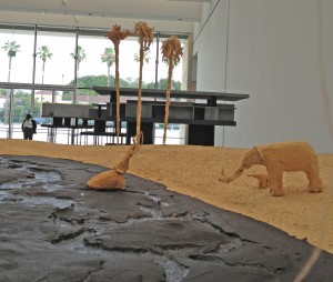
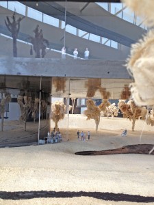
I love the tar pits as shown in the models. The trees on the bigger scale model are tattered muslin on sticks. One of the blob protrusions of the black blob will cantilever over the La Brea Tar Pit. That will be totally cool. As it is now, the tar pits are pretty disconnected from the LACMA experience. I think the older museum buildings are just creepy and dark as well. Getting back to the models, the large scale model of the actual new building is so huge I couldn’t capture it with my Iphone. The photo above on the right is just a snap of what it will be like to see through the glass walls that will be 360 around the entire structure. Of course common sense asks how this big flat black roof will drain and what the sea of proposed solar panels will look like.
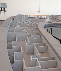
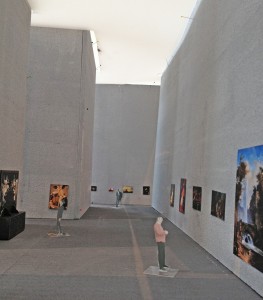
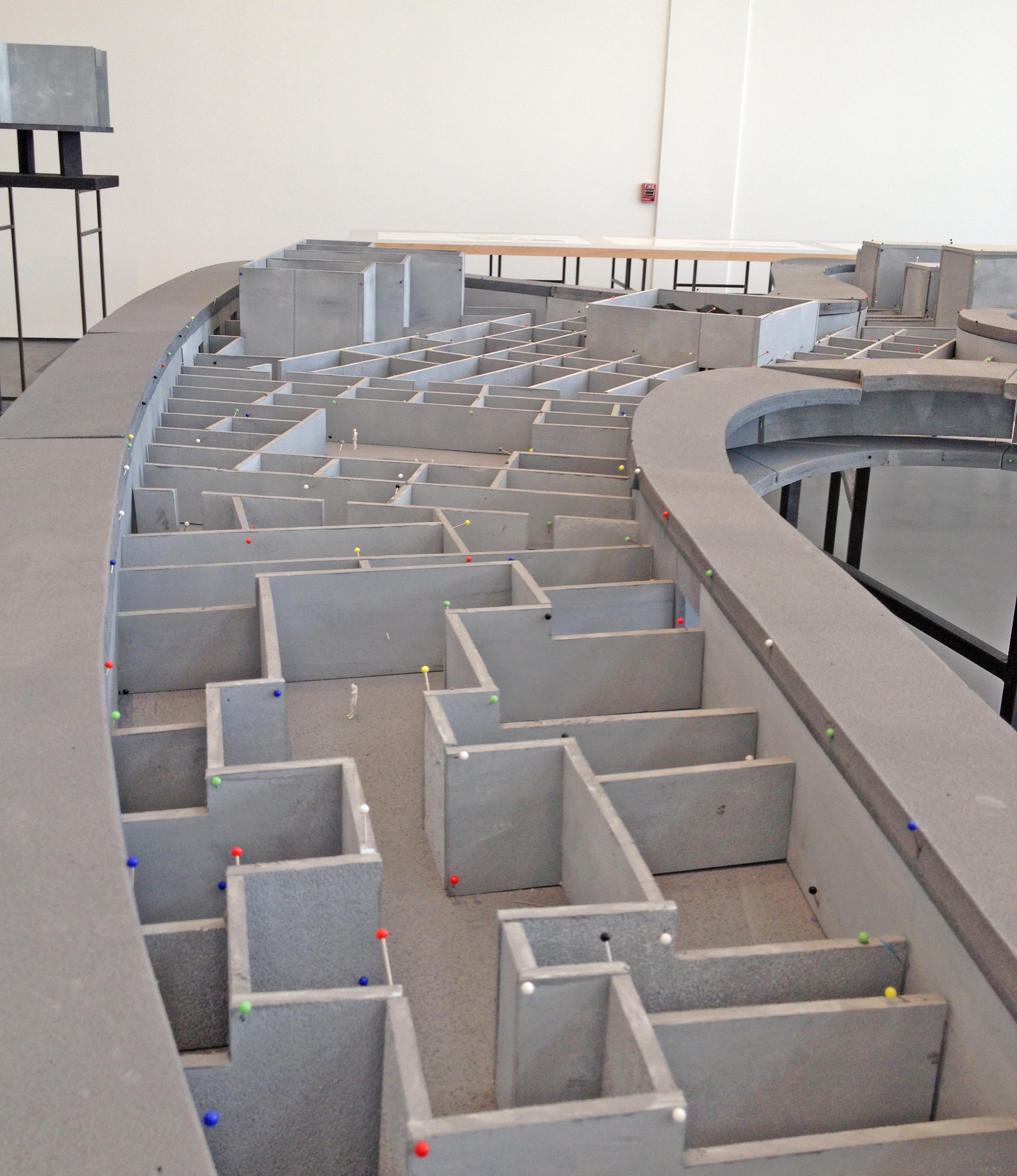
This is a working model on the left. I say working model because of the pins that are holding up the walls. It is supposed to be the largest museum in any city. There are lots of questions in my mind about how storage will work and especially egress. I know at the Phoenix Art Museum there is one main entry and it is highly supervised. I can’t imagine how much it would cost to have 3 museum main entries that Zumthor is proposing for this project. The photo on the right is a study model of light quality for a gallery space. All he did was put a piece of vellum on top of the foam core walls. Museum spaces will not have ambient light if there is a big black flower for a roof?
I enjoyed the models immensely! I am excited to watch this project play out. It is encouraging to know that Zumthor has already been at this project for 6 years and it has not yet been accepted. Zumthor is an inspiration for me in that he comes from a quiet country place in Switzerland and he came to Los Angeles to design an exciting forward looking work of art. He has taken his time to get familiar with Los Angeles and it paid off. I want this black flower to bloom over Los Angeles.

by Lara Serbin | Jun 28, 2013 | Blog
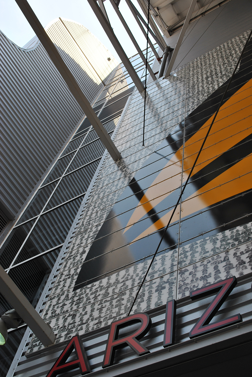
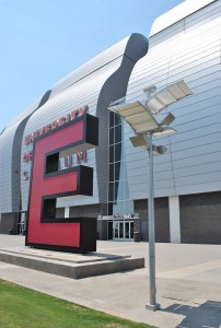
The sun was directly overhead as Lily and I stood outside the box office at the University of Phoenix Stadium, home to the Arizona Cardinals football club. The perfectly round opening in the glass window was shooting chilled air and we wanted to jump through the hole to escape the heat. Off season the round metal covered stadium can easily seat 77 thousand people for Wrestling Mania or host an RV show. As we entered the front shaded birdcage entry I felt transported from the dusty filled sky into a tall shade filled super structure. As I looked up at the silver metal struts, sheathing and brilliant red graphics I was eager for the tour to start. It is a bold structure that Peter Eiseman/HOK designed and Hunt Construction built in 2006.
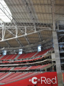
The signage is big and red. Eiseman and his team must have had fun designing the graphics. In the suites the restroom doors have a huge yellow beak. The metal restroom stalls in the locker rooms are orange and red. The signage for the restrooms along the concessions are massive and red. The seating bowl is all cast-in-place concrete with gray and red fixed seating *Lily had to flip each one we walked by*. I was told by the guide that Eiseman used the mandela symbol in the seating accent color. I don’t get it on first, second or third glance but it is nice how the random design breaks up the symmetry of the structure. Great architecture doesn’t need to be understood always.
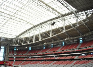
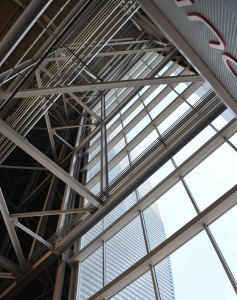
Since I live in Goodyear, I remember when this project was being built. It seemed like the super columns and Brunel *guide was calling them Vierendeel* trusses were standing along the 101 Interstate for ages. Those 87 feet deep Brunel trusses are breath taking spanning 700 feet to support the entire roof. I also love how the blue sky against the ambient light from the roof and the red. Another magical space.
Here is a shot of the super columns. The base of the super concrete support columns are as wide as a standard bedroom. It is lovely how the Brunel trusses sit on the column ever so elegantly. The 500,000 square foot roof is pretty complex. There are two retractable roof panels, which ride on a rail centered on the top of the Brunel trusses, cover the center opening in the roof which is 360 feet long by 240 feet wide. When the panels are open, the entire field to the back of the end zones is exposed so birds can fly in. It would have been nice if the guide was an engineer.
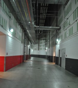
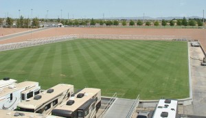
The field level is where all the excitement is during a game. These concrete clad corridors funnel the players out to the field, press and managers pack this floor to make sure everything runs smoothly. Dim the lights, add strobe lights and a killer sound system and we could put all skate rinks in town to shame. Who wants to look at a bunch of RV’s? Could you just imagine these really snazzy skaters all show boating around the football players as they are trooping out there onto the field? Did I tell you about the field? It is 39 inches high and can roll in and out of the stadium. It is a smart idea. I am sure in the beginning it cost a bundle but in the long run the versatility helps keep this place alive in the summer. The platform field is above on the right. It has sprinklers built in that retract and sink below the grade during a game…obviously. I think it would be cool if the players could be standing in freeze form and the field could roll in that way. It takes 70 minutes to roll into the stadium so that would probably bore a few fans.
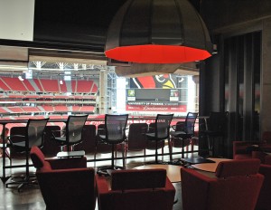
This is one of the 86 lofts available for 140k per season.
Big finish with one last up shot. I walked away from this tour wanting to buy a ticket for a game so I can watch Sam Acho this coming season. I love knowing this master mind project sits on my side of town.
“R.C. Hunt was a gentleman of the old school, rare these days in any circumstance, rarer still in construction. Without him, the stadium project would have been less.” Peter Eiseman
by Lara Serbin | Jun 25, 2013 | Blog
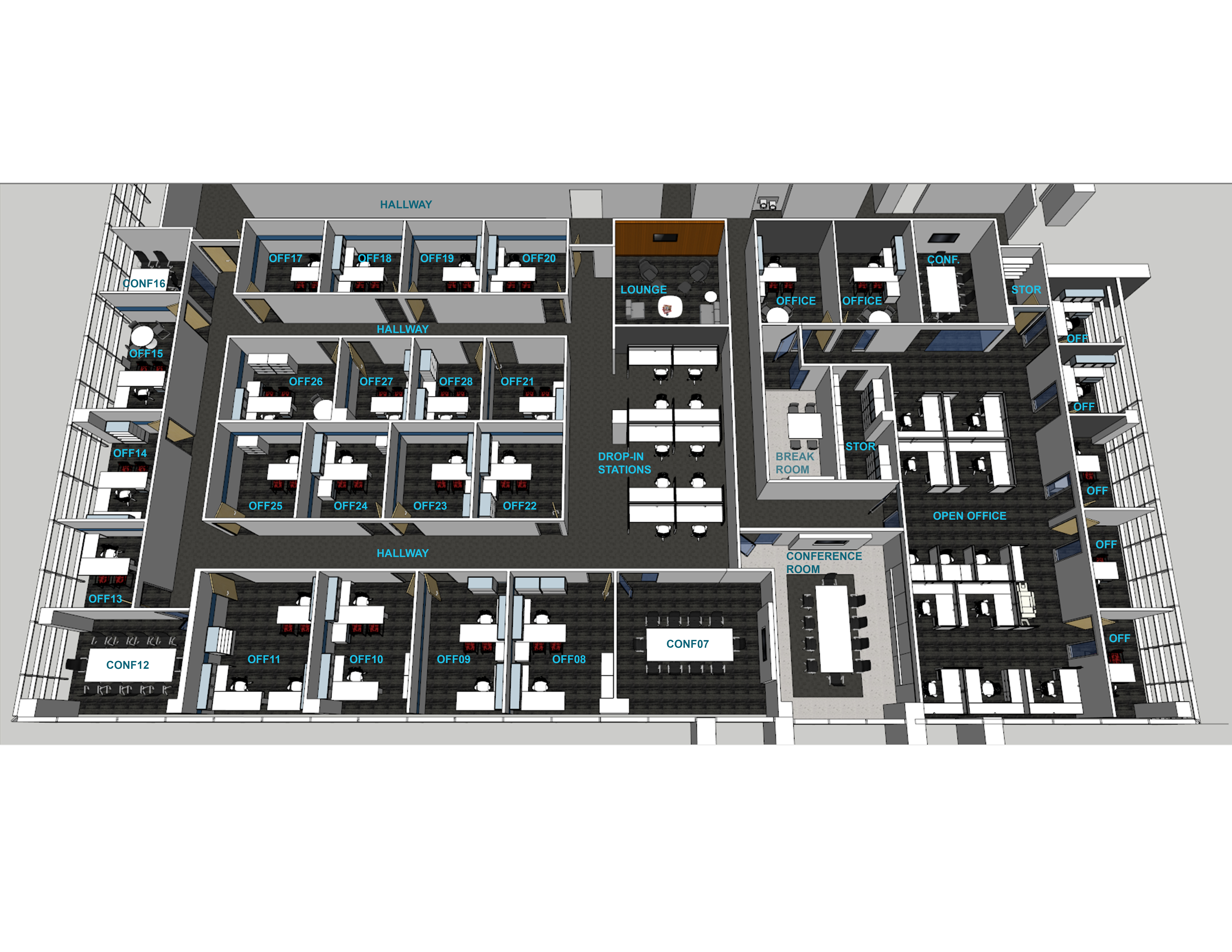
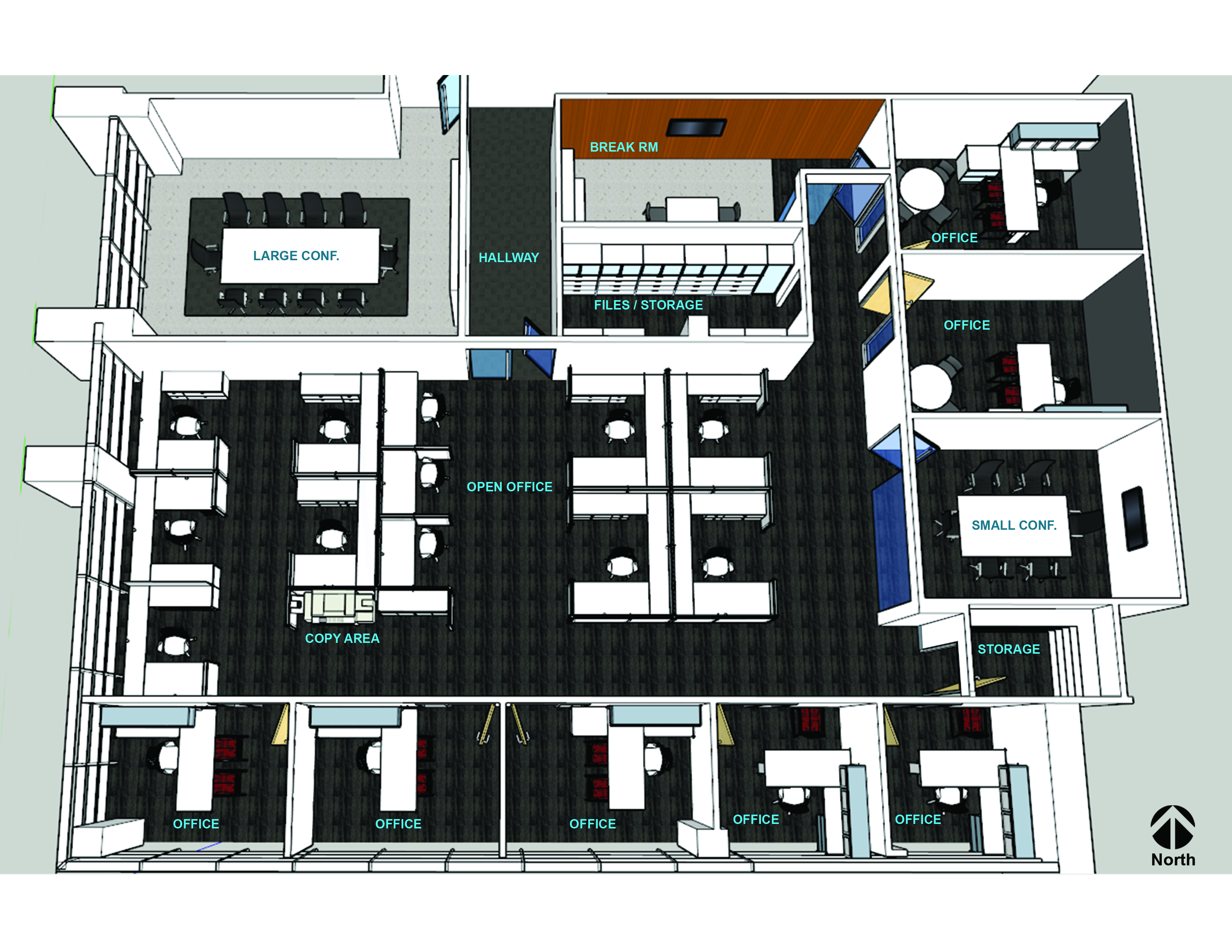
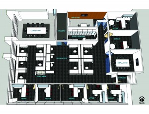
The layout of your office is like organizing your cd’s. If you don’t keep them in a case they will be scratched and eventually useless. Same goes for employees not perform their jobs when their work space is not in order. Before you begin an office redesign, think about the types of tasks employees perform in the space. A good office design is not only functional, but provides comfortable work areas for your staff. Hiring an Architect will assist you in the most efficient and productive space; whether it’s for a new building, revising your existing space or determining if a new space you are considering to rent works. The time planning is important considering that you will be using that space for years to come.
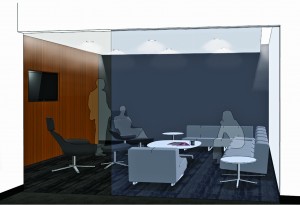
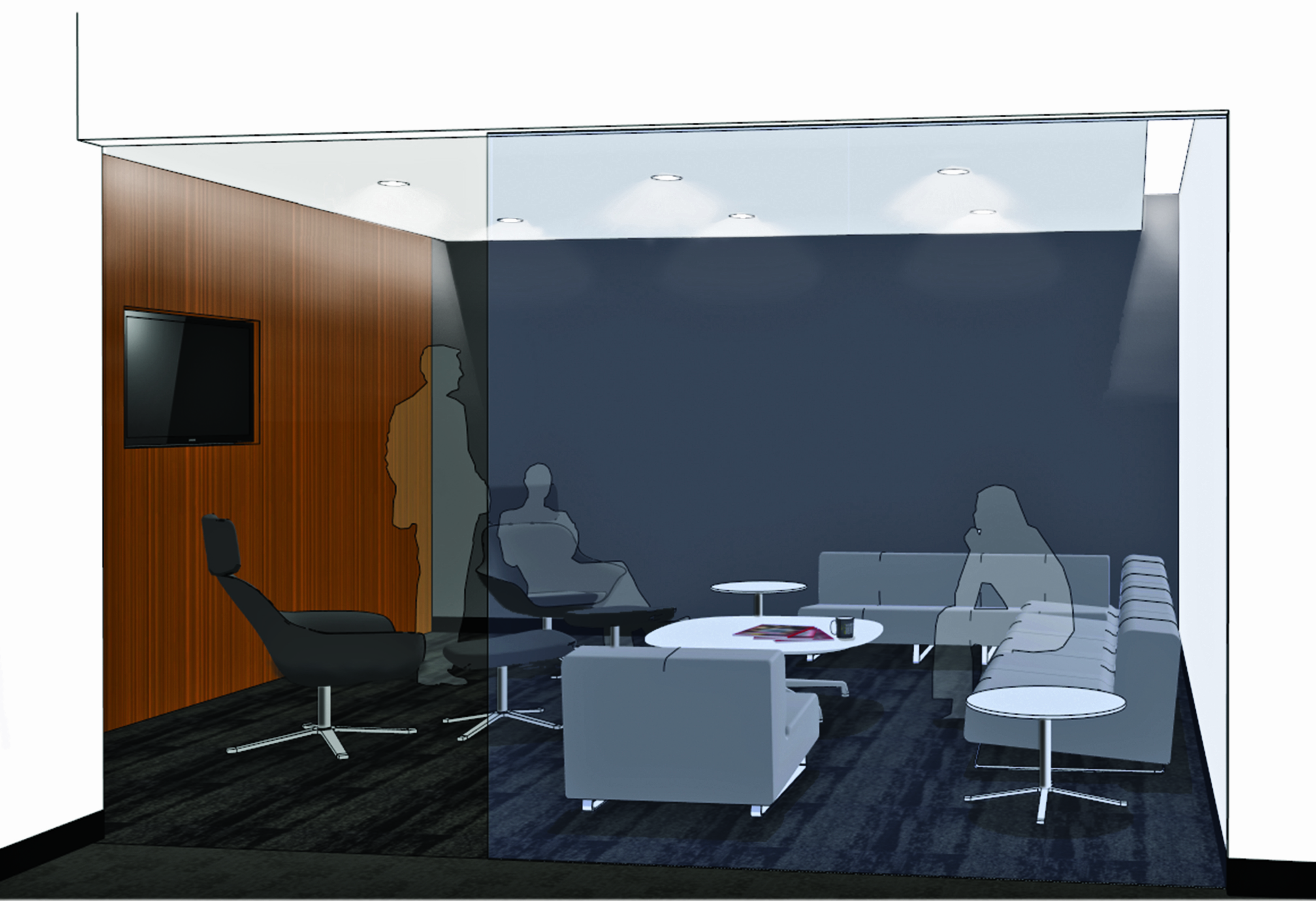
Lounge Space
A comfortable Lounge Spaces in your office layout provides staff with places to meet, collaborate or decompress from the office environment and recharge. By all means don’t make it too task oriented like adding furniture that has the same height as the desk they have just left for the last 3 hours. You want to go beyond a bean bag chair of course. Something casual with an edge. Not too comfortable so they just go to sleep either. Depending on the needs of your group, Lounge Space may include low tables with sweet magazines and chairs that let the body recline and face others to open up casual dialogue. The proximity of Lounge Spaces could be near employee work areas and provide enough room to meet needs of departments that will use them. Break rooms and coffee areas can act as a Lounge Space and should be large enough to accommodate several employees at one time. I try to keep sinks and refrigerators out of the Lounge so someone doesn’t start eating a hoagie and stink up the vibe. You know it will happen.
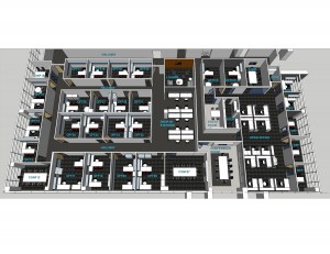
Efficient Workspace
An effective office layout provides employees with the space and tools they need to complete assigned tasks. Work surfaces should be large enough to accommodate files, papers and other documents. The use of comfortable chairs and adequate lighting may reduce muscle aches and eyestrain, which can hurt productivity. If possible, place employee workstations near frequently used office equipment, such as copiers, postage machines and printers. Generally working with a systems furniture company who specializes in certain systems like Knoll, Herman Miller or Teknion can give you the most efficient space *and you will look really cool playing solitaire*. Providing an efficient workspace can also minimize the appearance of clutter if the user can organize their tasks to avoid ‘piling’ of tasks. The furniture systems can also provide a unique space in terms of finishes and fabrics, ranging from cutting edge modern to more modest designs.
Private Spaces versus Open Plan
In an open office, employees work at communal tables or at low-walled workstations that allow them to view and interact with co-workers. However, it’s important to consider whether your employees will benefit from an open plan before you redesign your office. If your employees perform the type of work that requires intense concentration or privacy, traditional offices might be a better option. Not as efficient in terms of space, but possibly more efficient in regards to productivity. Another space to consider is drop-in stations. These are for employees that may either be on the road or work from home. This allows for an employee to have a space in the office for temporary as needed. These spaces allow for a place to touch down, check emails, and charge all their devices. In some instances, a private drop-in space may be required. Many times an un-occupied conference room can be used, but may be in-convenient if it is used frequently.
Convenience
Effective office layout groups people together based on functions they perform. Grouping employees who do the same or related work will help to ensure that documents and papers will be shared and handled in a timely and efficient manner. For Example, it may make sense to group employees who process invoices close to your accounting and purchasing departments, so employees can consult with one other. If you plan to redesign your office layout, make a list of key tasks employees perform, such as speaking to customers on the telephone, handling mail or crunching invoices. The list will serve as a convenient reference when you begin planning. If the designer is familiar with your business practice and can observe the current workspace that you utilizing, this will give them an insight on ways to improve the space. This is generally called ‘programming’. You may also have to just throw out all your scratched cd’s while your at it and go digital.
by Lara Serbin | Jun 14, 2013 | Blog
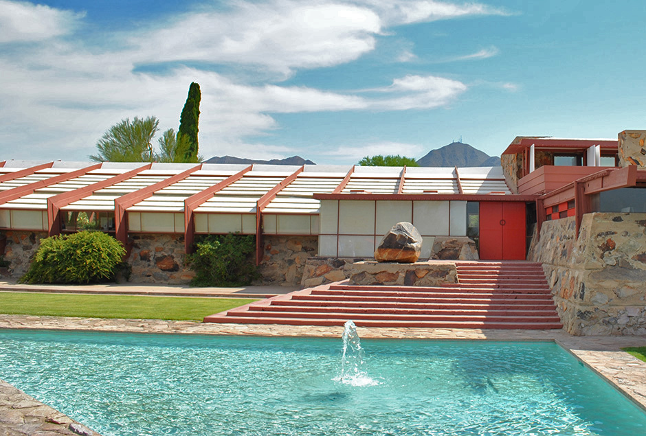
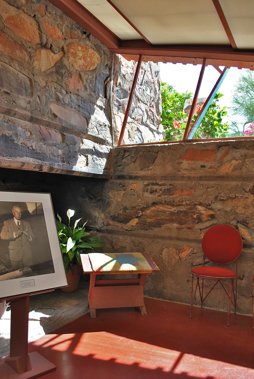
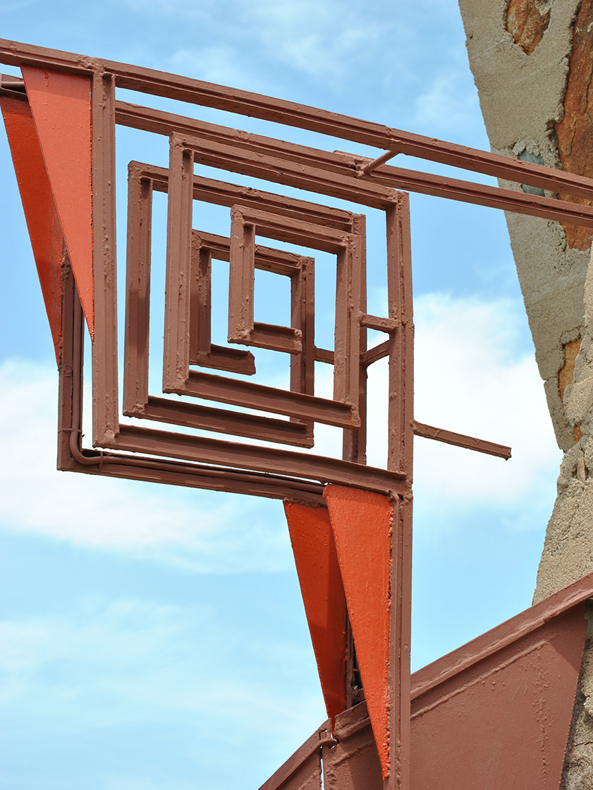
To Taliesin West for a 9am tour is where I was headed today, and my daughters actually enjoyed themselves. Lily wished she lived there which impressed me. When I asked her why she said she liked the secret tight feeling hallways and small funny shaped doorways. The entry ways captivated me most. I found all my favorite colored Prisma colored pencils used in a frozen symphony of texture and rhythm.
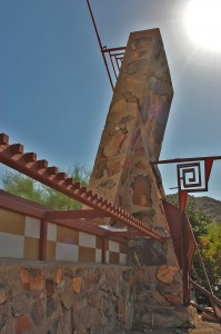
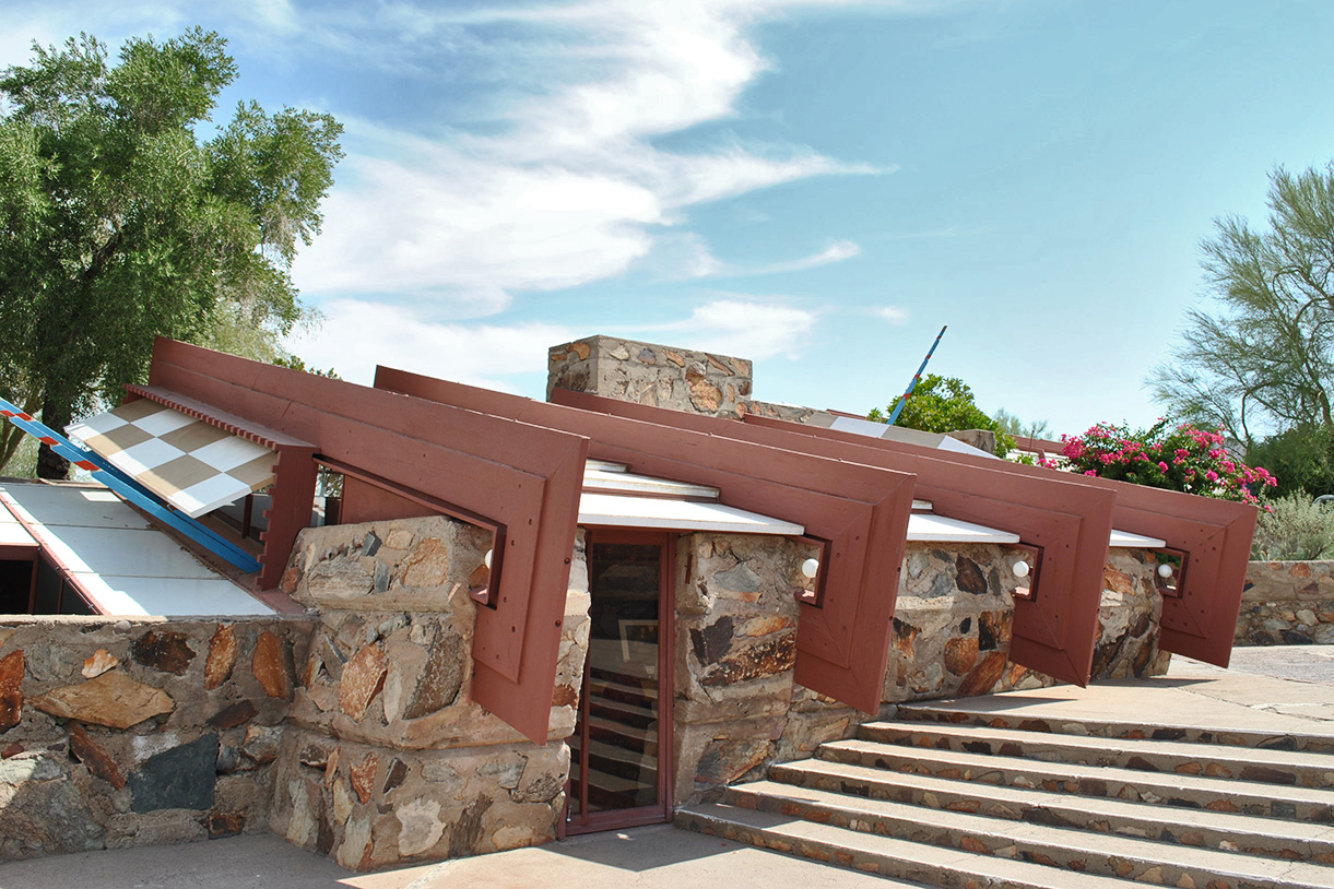
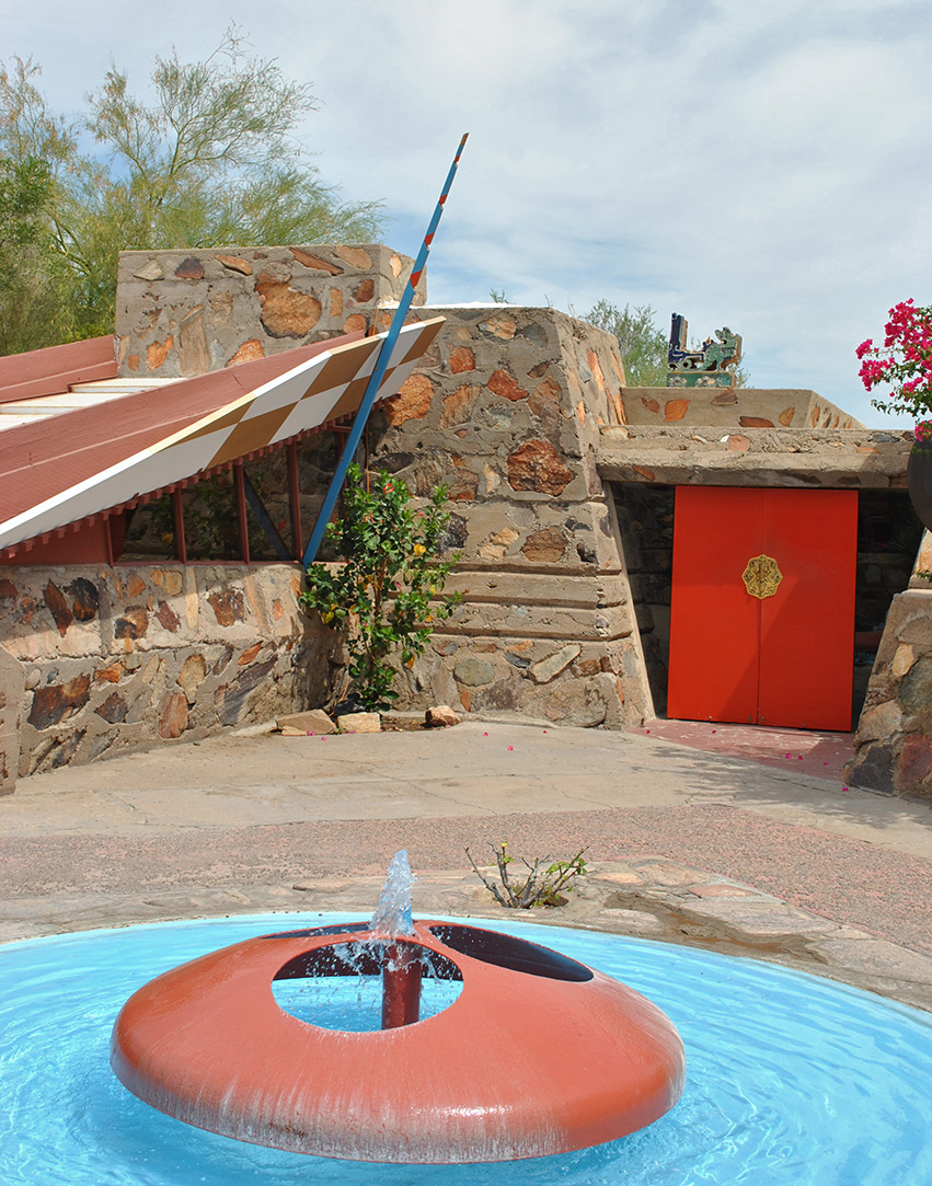
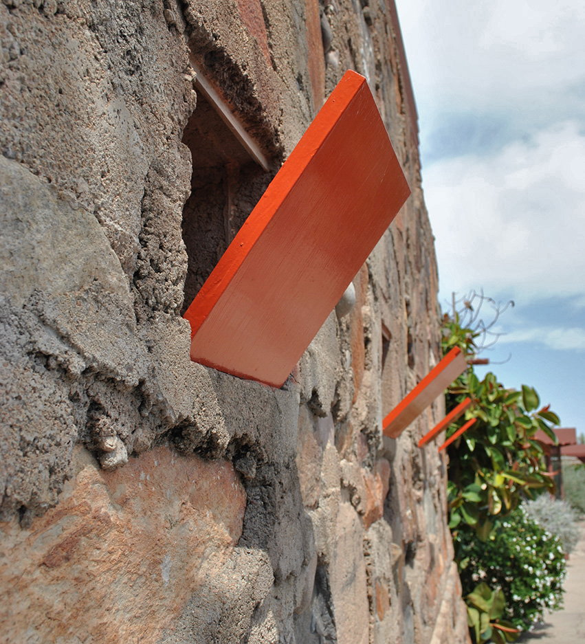
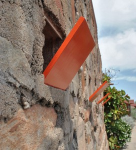
The entry shown in the middle photo is jaw dropping with the turquoise and non-photo blue sky sandwhiching the taupe stone. I love the Cherokee Red used for the punchy accent on the door and checker board window panel to the right of the double doors. The guide had mentioned that this was Frank Lloyd Wrights winter home, working studio and fellowship for his students. Wright called Taliesin West his sketch because it was his design testing laboratory. In the 30’s and 40’s this site in the very north east end of Scottsdale was so remote that he and his fellow architects were uninterrupted to experiment with cutting edge ideas.


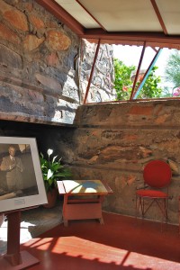
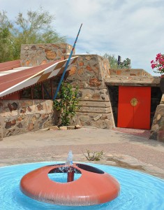
Wright thought the most appropriate primary shape in the desert was the triangle. The triangle having three sides is echoed everywhere at Taliesin West. I loved the reflecting pool in the shape of the triangle. The photo on the right was taken by me as I was sitting in Wrights office. It was here that he would welcome clients and present his impressive ideas, drawings and models on a huge wood table. Back in the day there was no glass in the windows or roof. Hemp cloth was stretched across the terra cotta painted steel above and used as flaps at doorways and window openings. Can you imagine how rustic that must have been? Wright lived and worked here in the winter months so he wore a full tweed suit everyday to work. I could have stayed in this space all day just soaking it in. Wright designed and built a fireplace in every room and outdoor patio. Having an office to receive clients with a fireplace is certainly a nice touch to make them feel at home. I love the terra cotta concrete floors! The middle photo is the entry to Wright’s office. As I entered I felt embraced by the tight space and super low ceiling and then once I walked in I felt expansive as the space opened up.
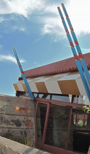
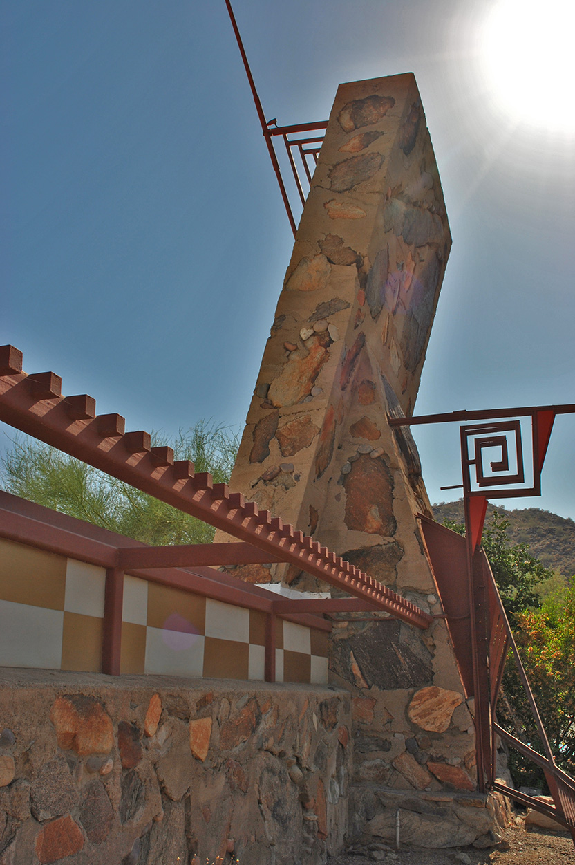
Gold leaf checker board with turquoise spears…glorious! I love the folded planes. The photo on the left is from the building on the first row of photos with the grand entry. This is the Drafting Room. The middle photo is the entry to the underground auditorium used for Taliesin Nights. This underground space has 98% perfect acoustics because there is not one 90 degree angle inside. The poured in place deadens the sound as well. Taliesin Nights was a weekly event for guests, clients, students, artists and family to visit Taliesin West for dinner and entertainment. Everyone dressed for the occasion and met in Mr. Wright’s living room for live piano, second was dinner in the underground theatre and finally, guests would proceed to the Music Pavilion for a live musical or theatre production.

Eva my daughter liked Wrights living room best. She said that it was like a fairy tale. There was no roof but 3 layers of cloth over the terra cotta steel frame. The light quality was perfect when we were sitting there listening to the guide. I was sitting in a Taliesin Wing Back chair designed specifically for the space. Before the air conditioning was installed, all the cloth was removed from the windows and roof members before the facility was vacated for the annual migration back to Taliesin in Wisconsin. When the caravan returned to Arizona in the winter they would have to spend weeks clearing out all the dead and live animals that would roost in the living room space. The photo above is a glimpse inside the fairy tale like space.
I am grateful that I live in Arizona and this place is there for me to visit. Can’t imagine lighting a fire in one of those fireplaces right this red hot minute but the fresh inspiration is so necessary.