Interior design is an important component to our architectural projects. From the selection to finishes, furnishings and equipment, Serbin Studio collaborates with specialists in each field of study. Finishes selected are durable, durable and beautiful. Furnishing are selected to meet the clients functional needs, budgetary goals and for its durability.
In order to establish an interior finish palette, color combinations are studied. We believe that color palettes should contain visual color cues that trigger specific responses. For example, interior finishes that best express the intention of the building. We establish a dominant color, subordinate color and then color accents. Once the color palette has been established and approved by the stakeholders during the design process, the actual finish materials are selected and presented to the client.
INTERIOR FINISHES
Ingleside Veterinary Hospital interior design, 2006-2007.

The interior finish palette was originally conceived with pets and the palette of the outdoors. Pets look their best when sitting under a green canopied tree set against a blue sky with white clouds. The bright blues bring a healing and refreshing color meaning for the clinical function of the animal hospital.
.jpg)
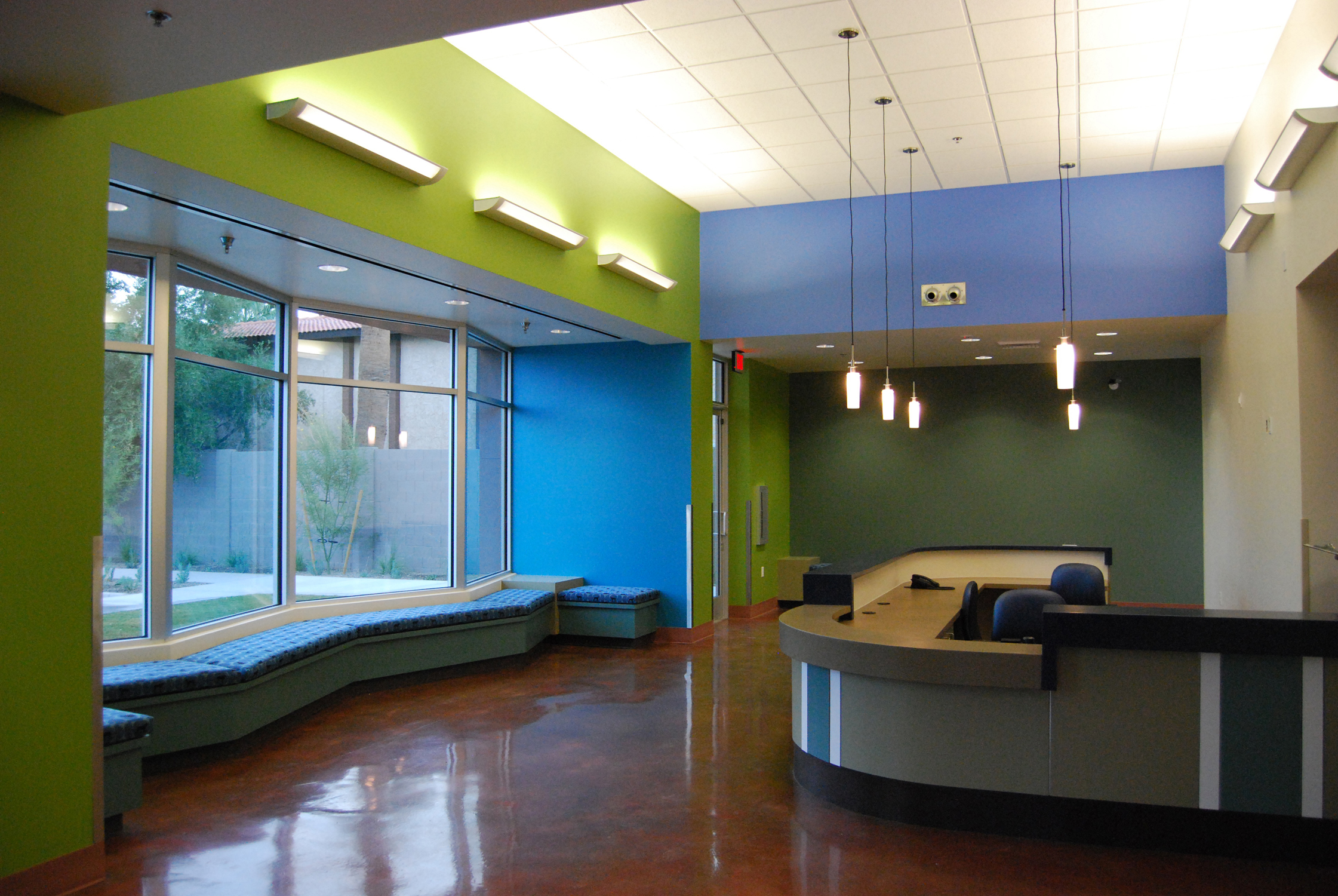
City of Phoenix, Center for the Arts, interior reception.
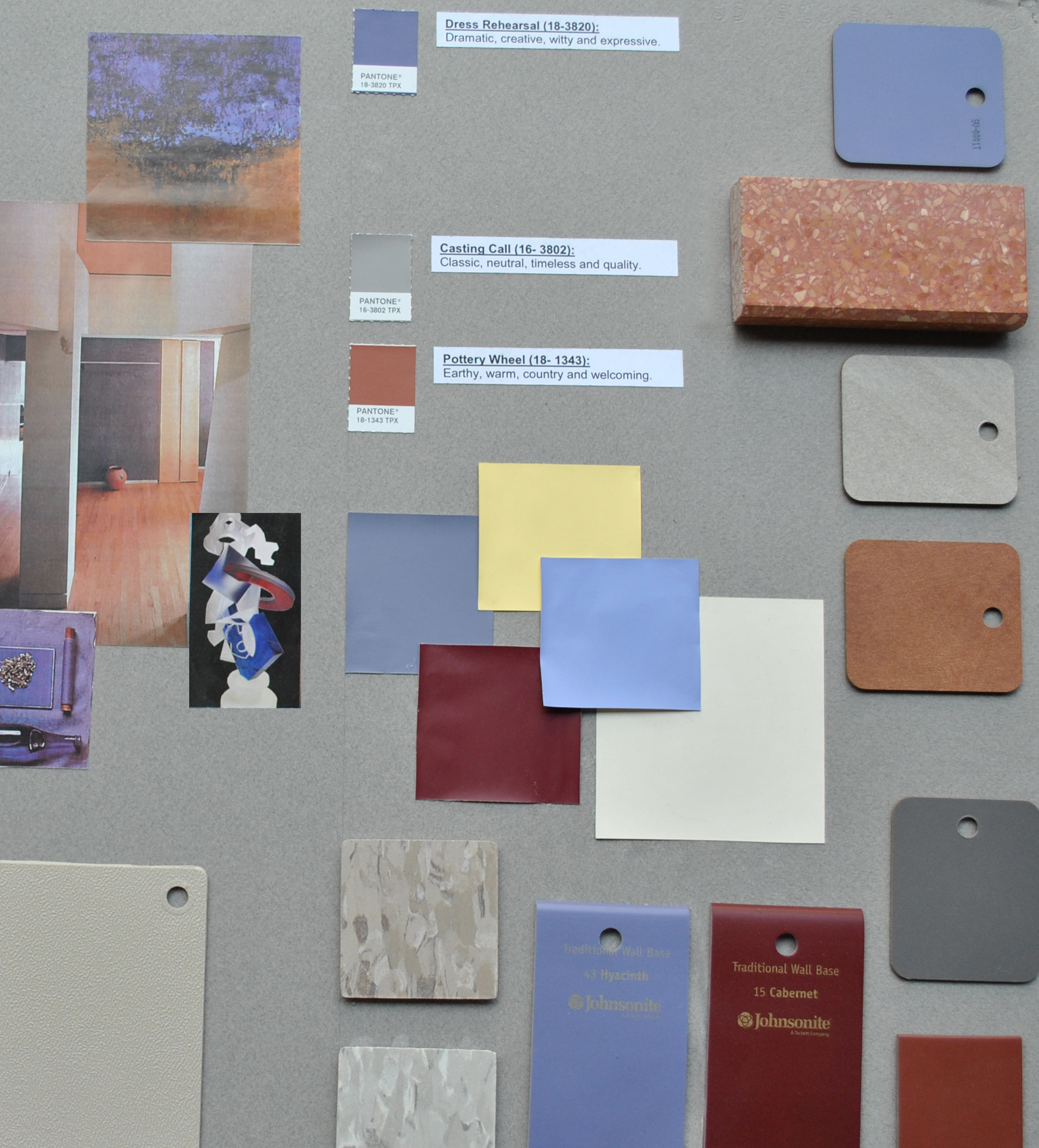
This Center for the Arts color palette started with a dominant pair with neutral gray and terra cotta. The exterior of the existing building was already brick so terra cotta and gray would compliment the earthy and strong response to the colors already in place. The grayish purple was brought in as a subordinate color to reflect the drama productions that are offered at the Center. Purple brings out a response of drama and fantasy. The Center is about creativity with arts and free expression so it was a good fit. The sunlight yellow is a crossover color that was used as accents. This particular yellow works well with all colors and brings a cheerful and happy feel to the space.
EXTERIOR FINISHES
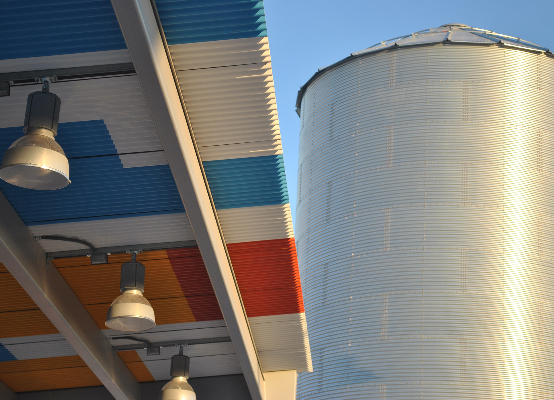
At the East Buckeye Park and Ride in Buckeye, Arizona there was an opportunity for color on the exterior shade structures.
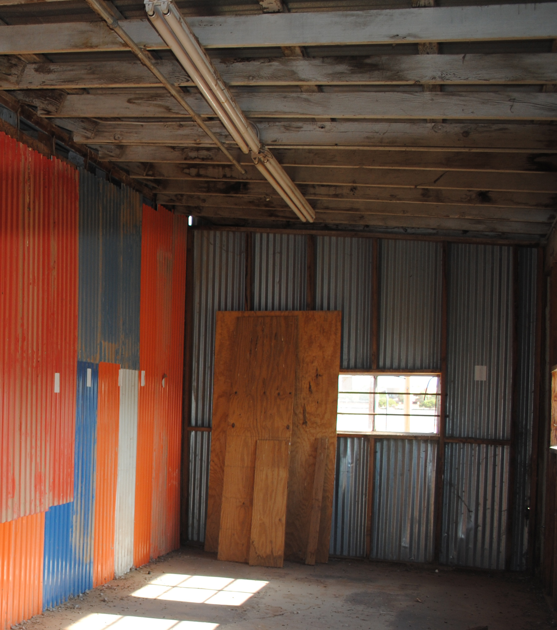
The orange, blue, white and red inspired color palette was inspired by the historic Eastman Cotton Gin that once served as a major economic engine for Buckeye. The photo above was taken from the interior of the Gin. The panels were corrugated panels used to patch the inside of the wall of a by-gone era. The color palette was chosen for historical reference and color meaning: vibrant, happy, welcoming, fun and friendly.
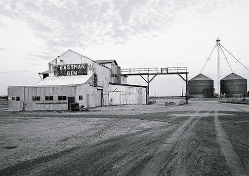
Eastman Cotton Gin, Buckeye, Arizona 2012. Photo credit, Edward Dubrow.