Semi Truck Repair Facility, 2021/2022, Buckeye, Arizona
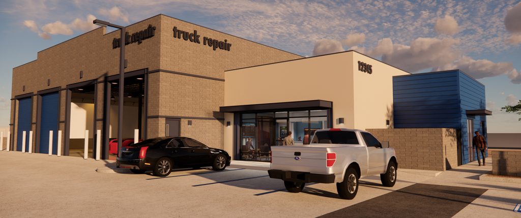
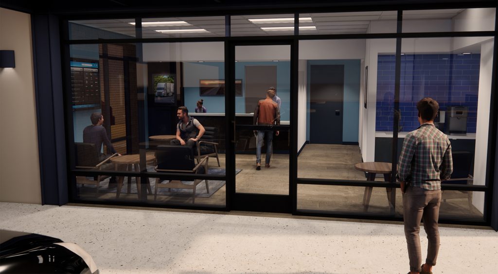
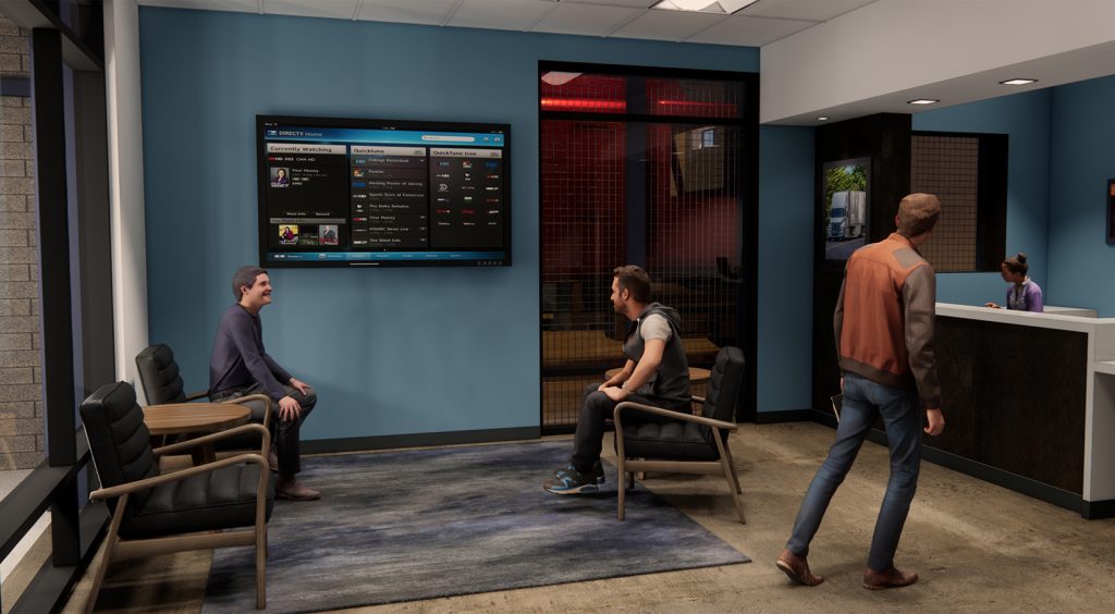
Currently in design is a new facility located in Buckeye, Arizona. The site is 1.4 acres and with 7,634 sf building The building consists of semi truck repair bays, waiting room and offices. The building was designed to reflect the surrounding built environment and will support the surrounding needs as truckers service the West Valley distribution centers. The Site was designed to facilitate the circulation of 18 wheelers. The building is comprised of color integrated cmu, metal accents reflecting on the 18 wheelers tractor trailer design and stucco. State of the art repair bays will service the semi’s while the drivers wait. Project is slated to begin construction in 2023.
Office Building Improvement, 2020/2021, Buckeye, Arizona
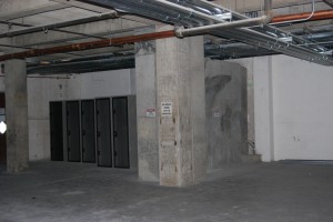
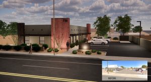
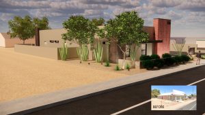
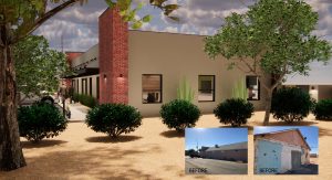
Improvements to an existing building in downtown Buckeye, Arizona. The building, built sometime in the 1960’s has been sitting vacant and in a state of dis-repair. The client asked Serbin Studio to give this building and its site a makeover. The use was to remain as office however the entire interior had been gutted some time back. The design utilized the exterior walls which were structurally stable. The roof structure was in failure therefore a new roof structure was designed. The building which is ~3,000 s.f. is divided into 3 suites. New exterior finishes include red brick, rusted metal and stucco reflect back to the history of downtown while looking forward towards the future. New landscape and site upgrades hope to set the precedent for adjoining building owners to enhance the neighboring commercial downtown core. Designed during 2020 / 2021, with a construction completion in 2022.
Office, Healthcare Improvements, 2020
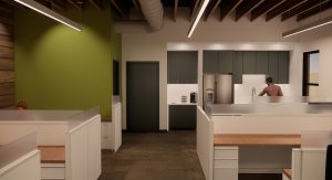
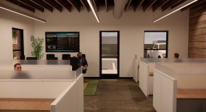
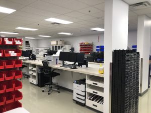
Improvements within an existing business park in the heart of Phoenix. The existing 3,000 s.f. space was originally designed with 25% office with 75% warehouse space. It was a generic and didn’t meet the needs of the new business which was going to occupy the space. The client, Mail-Meds, a state of the art online pharmacy, had unique requirements that included office space, a work room which housed equipment and assembly area for clients prescriptions fulfillment. After a conceptual phase which included taking the clients needs, looking at the current building codes, Serbin Studio came up with an efficient layout. Along with layout, security was also a big factor, so design elements were included to secure the space.
The project begin prior to Covid 19, starting in February 2020 and construction completed in Aug 2020. We were able to navigate through the City of Phoenix Plan review and building permit process seamlessly. The City’s desire or need to streamline the plan review process with an electronic submittal process, actually made the submittal process easier. No longer did we have to print hard copies of the plans and wait hours at the City to submit the drawings. Submittals and correspondence occurred through phone, email and the City of Phoenix portal.
Throughout the construction process, we did have a few minor bumps, such as availability of construction materials and their delivery, however the design team, clients and contractor’s (Adolfson & Peterson Construction) flexibility to change course and select more available materials allowed for a seamless delivery from design through construction.
Office & Lounge Improvements
Chandler, Arizona 2019
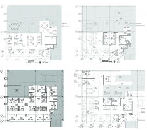
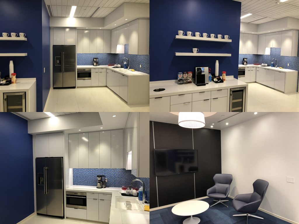
Redesigning an occupied workspace to fulfill the needs of a current companies needs, involves looking at an existing space and exploring various options within the confines of an existing space. Working with a client to understand its needs and desires in the everchanging environment, the architect helps trigger what can be accomplished with the space available. In this project, the client had a mix of private and touch down spaces which had worked well for many years. As the company grew, they dreamed for more work space and additional space to decompress.
Exploring options considering building codes, building circulation and clients needs led to many re-iterations that eventually led to a final plan which satisfied all the important requirements.
Besides coming up with a good plan, the user had a Company DNA which involved the use of materials that tie each location together. We explored the materials (flooring, wall finishes) along with furniture and its variety of choices of fabric to create that environment within the lounge space to allow the staff to decompress from the daily work grind.
Lobby, Customer Lounge, Restroom, Conference Room Improvements
Mesa, Arizona 2018 – Client undisclosed
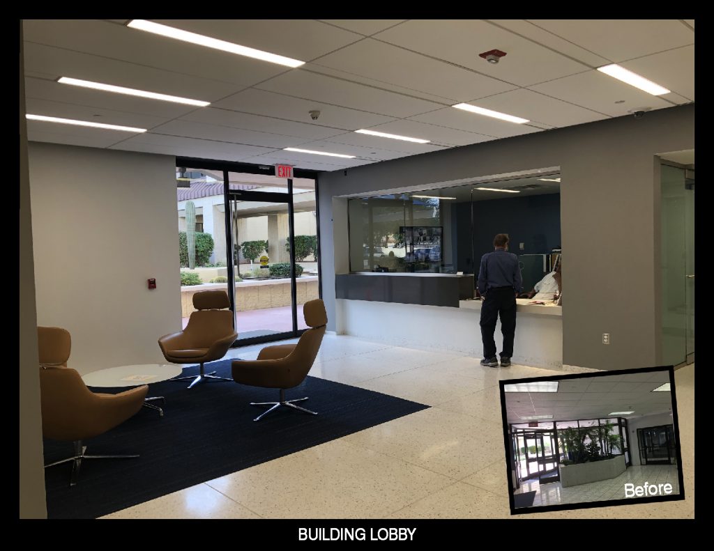
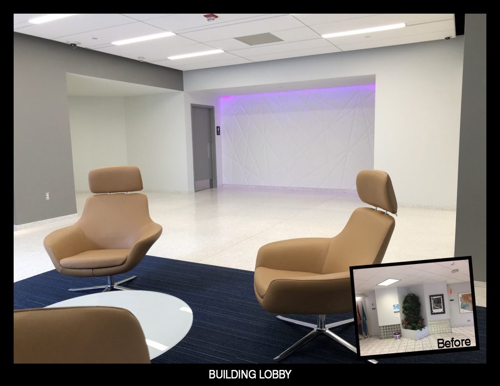
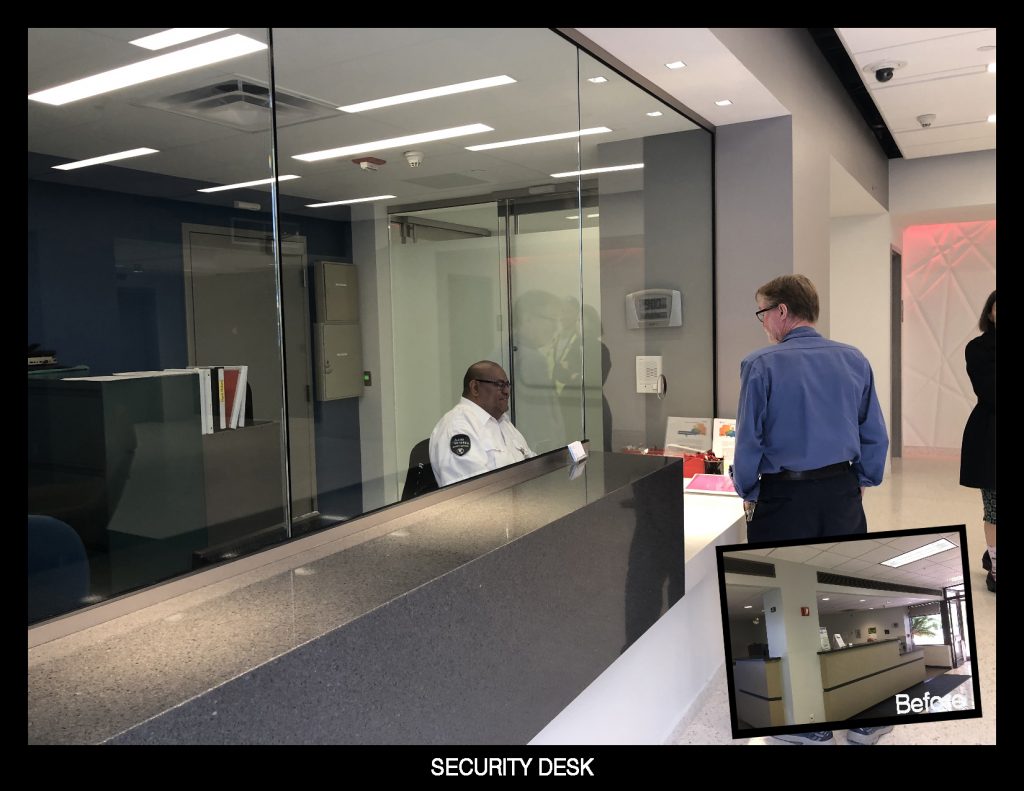
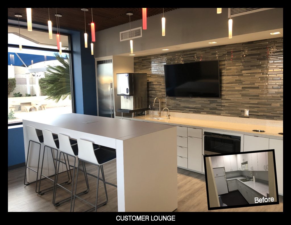
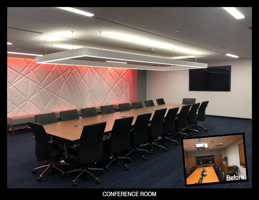
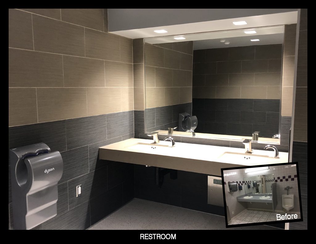
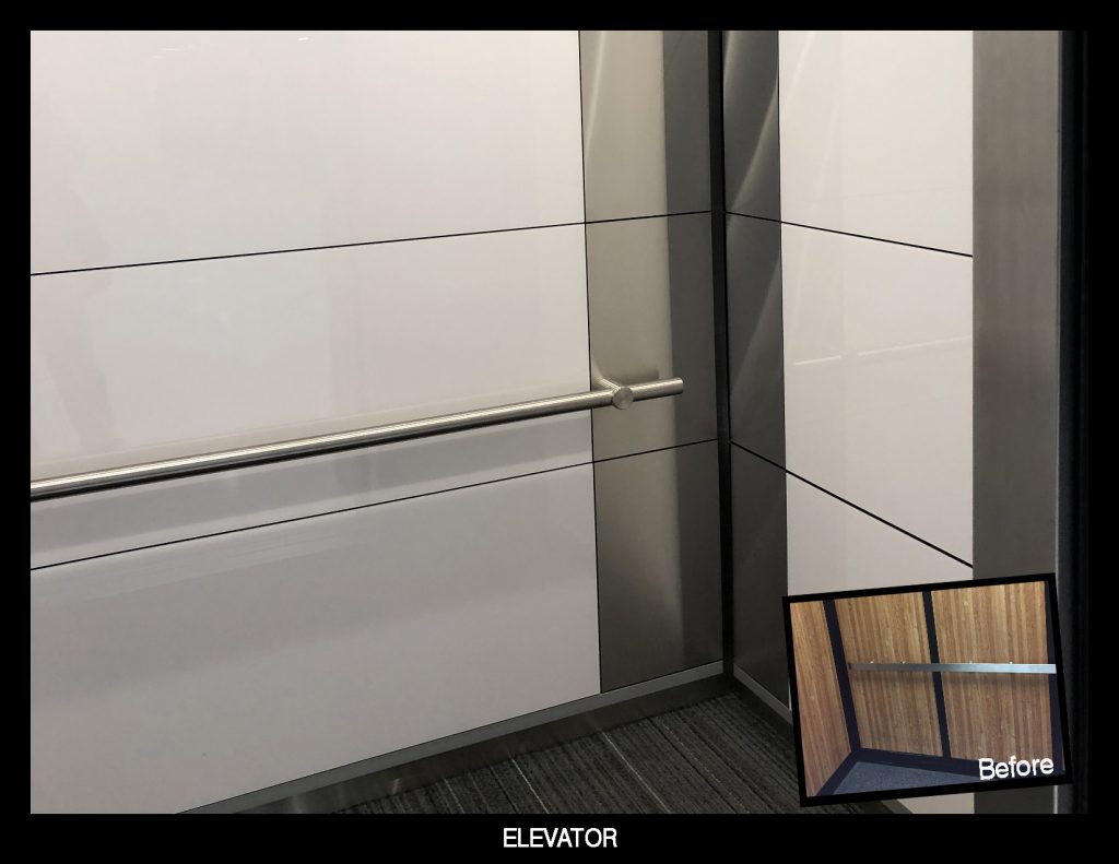
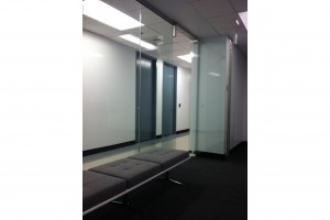
The client, a fortune 500 company, hired Serbin Studio to transform the existing building’s core spaces into a World Class facility with an updated Lobby, Customer Lounge, Restrooms, Elevator Cab, Conference Rooms and Customer Office space. The building had a 1980’s vibe with outdated materials, finishes and colors. Serbin Studio transformation included out with the old and in with the new.
As shown in the before and after photos, out was the glass block and faux planters. With a dark and depressing vibe, the goal was to breathe new life into underutilized spaces and optimize while meeting current code requirements to bring an excitement to the working environment for the building’s users and customers. With over a year’s work of design and construction and the challenges of working within an existing facility operating 24/7, we are excited to present Serbin Studio’s latest masterpiece.
Commercial Retail & Office Design Tenant Improvements
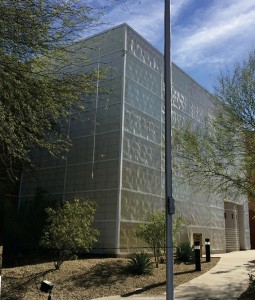
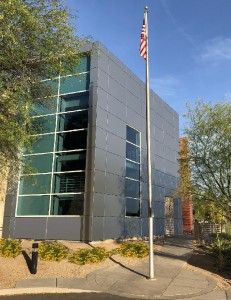
Exterior Refurbishment, Tempe, Arizona – 2018
Upgrade to exterior finishes on existing building.
- Exterior Kalwall fiberglass finish weathered by age
- Exterior skin yellowed and warped from Arizona heat and sun
- Installation of metal panel with high performance 4″ rigid foam insulation knightwall system
- Installation of high performance double insulated window wall glazing system
Landscape Design – Buckeye, Arizona – 2016
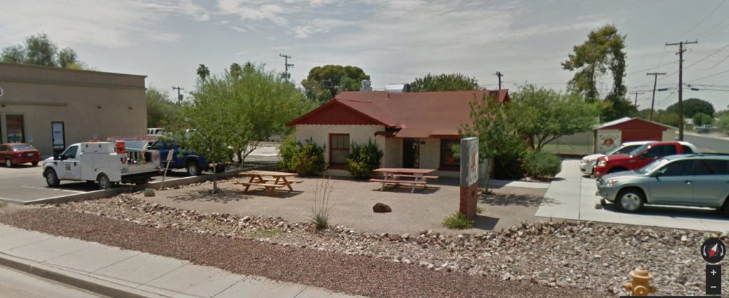
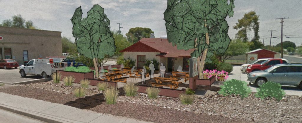
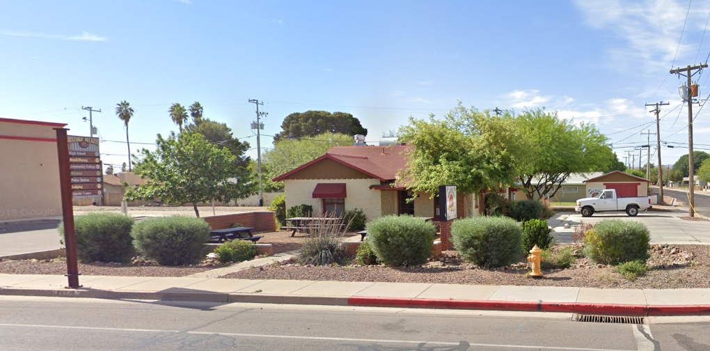
Upgrade to landscape and exterior space at an existing cafe in Downtown Buckeye. The existing building, originally a house converted into a restaurant “Millstone Cafe” over 20+ years ago. The front of the building had a few tables and minimal landscape and was very desolate.
The design outlines a seating area that has landscape site walls, shrubs and trees to soften and provide shade while separating the space from Monroe, the main street through downtown Buckeye. It was important for the user to have a sense of privacy while creating a safe environment from the traffic along Monroe Avenue, the main street through Downtown Buckeye.
Since its inception and construction, the landscape has grown and provided much needed outdoor space and shade for its users.
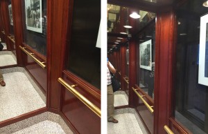
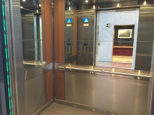
Elevator Refurbishment, Phoenix, Arizona – 2015/2016
Upgrade to Existing elevator systems and cab interiors for a 9 story, 4 cab building. Building was built in 1988 and equipment was in need of upgrades and cab interiors were outdated. The design included:
- New energy efficient machines with regenerative drives
- New elevator controllers with the latest dispatching technology
- New elevator control panels within elevator cabs
- New illuminated call buttons, directional and position indicators at all elevator lobbies
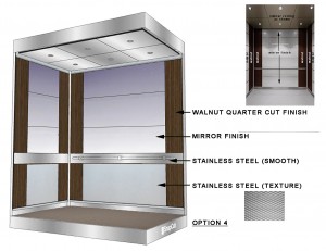
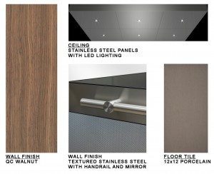
- New modern and durable elevator finishes with energy efficient LED lighting
Proposed Elevator Cab Interiors Elevator Material Board
Tech Company (Undisclosed) Arizona – 2015
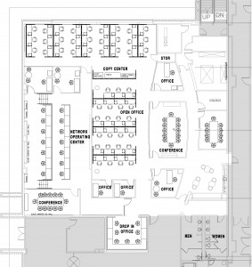
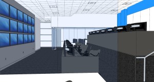
One of the world’s leading Tech Companies faced major changes in 2015. With the expansion of its company and acquiring several others, the current offices that handle day-to-day operations were ready for an expansion.
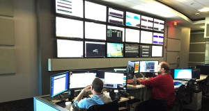
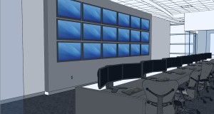
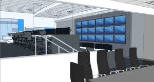
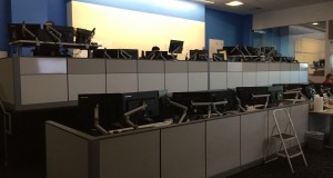
With this need for more office space and an update Network Operating Center NOC, Serbin Studio assisted in expanding their current workspace that allowed for collaboration and comfort for the staff.
We developed a complementary workplace with new furnishings and finishes to replace its outmoded office space and promote cross-disciplinary ways of working.
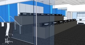
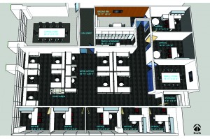
New workstations nearly doubled the amount of staff, a new multi-tiered NOC was developed for better visibility to the video wall, new conference rooms allowed for inter-connectivity to others throughout the country and world and enlarged break rooms allowed for a place to just get away.
Tech Company (Undisclosed) Arizona – 2015
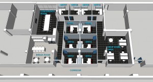
For the offices of one of the largest Data Center managers, Serbin Studio conceptually design transformed their existing space and adjacent previously leased offices into a dynamic office that showcases a creative and dynamic workspace.
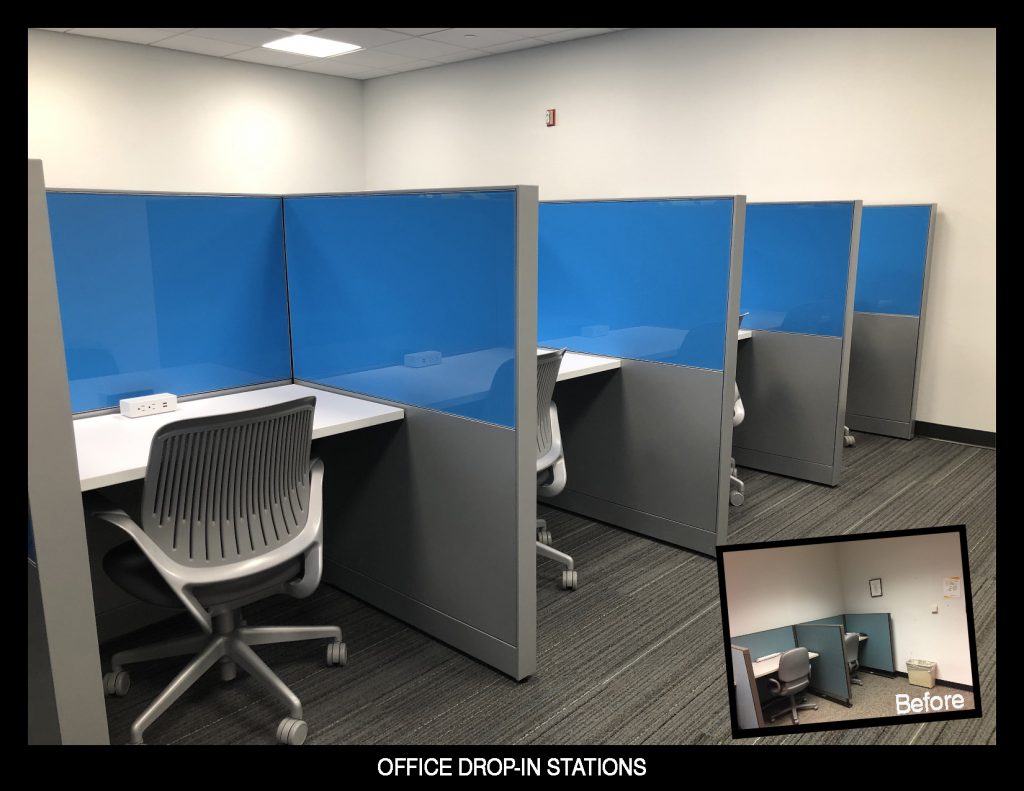
While utilizing and respecting the recent remodel of their existing offices, the intent was to expand and nearly double the space allowing additional staffing needs and providing drop in spaces for visitors. The company has building spread out throughout the country and world and managers for other regions of the country or their main headquarters on occasion need a place to drop anchor for the day.
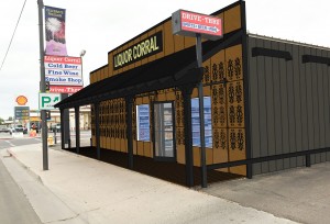
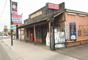
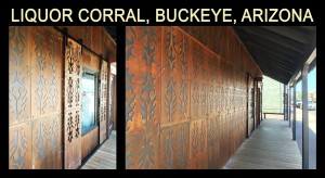
Exterior Facade Upgrade for Liquor Corral – Buckeye Arizona – 2016
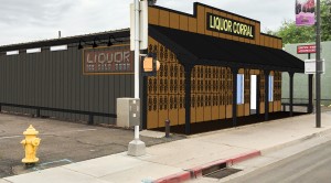
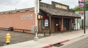
The Liquor Corral, a business in Historic Downtown Buckeye, is revitalizing the façade to bring new life to a building which contains a thriving business, yet a tired exterior appearance.
The original building is your typical standard metal structure you may see on surrounding properties throughout Buckeye. Years ago, a covered wood porch entryway was built on the front north facade to embellish the standard building.
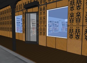
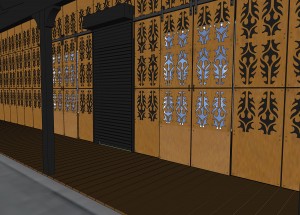
The new improvements include an entry doorway and windows without the present security bars to open the building and make it more welcoming. Sliding barn doors with a cut metal pattern were added for security.
New exterior raw steel material was added to the north building facade along Monroe Avenue with a design elegance reflecting the motive of western wear. The pattern of cowboy boot design was used as the inspiration for the fenestration. Custom steel panels were designed and cut using a sophisticated computer aided machine.
The panels have a natural rust patina finish. This finish is seen throughout the desert southwest in many forms. Architecturally, it brings a warmth and a level of sophistication to the building.
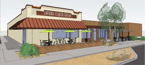
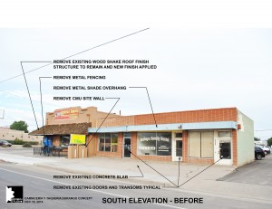
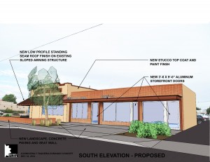
Carniceria Y Taqueria Durango – Buckeye, Arizona – 2015
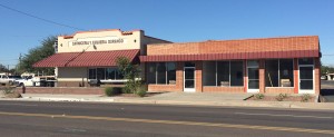
Located in Downtown Buckeye on Monroe at 5th ave, the building was built in the early 1950’s. The Carniceria, longtime tenants decided to purchase the building and improve the remaining vacant spaces.
The design included a facade remodel and improvements of the existing spaces into a grey vanilla shell with the addition of ADA restrooms. The building owner also utilized a Catalyst Grant program through the City of Buckeye to assist them in the development.
Paris Rendez-Vouz – Desert Ridge – Phoenix, Arizona – 2014
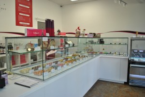
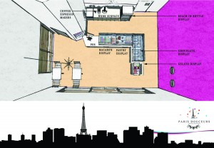
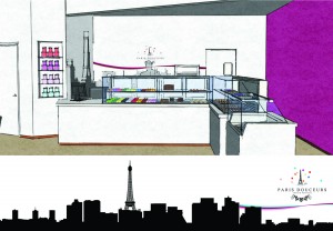
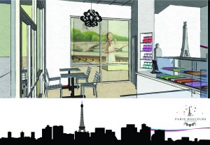
Tenant Improvement at Desert Ridge in Phoenix, Arizona. The project consisted of an improvement of an existing abandoned cafe into a French Macaron and pastry shop. The project consisted of a 800 s.f. space which contained some existing equipment.
Part of the evaluation was to determine what equipment was useful to the new development. As with any small project, the challenge was to figure out how to fit all the requirements and equipment within a small space. Budget was also another challenge and along with the client, looked at various options from used and new equipment. We learned that with enough research, there are many options available. The internet was our best friend.
While working closely with mill work manufacturers, equipment manufacturers, signage companies and a variety of specialty sub-contractors, we developed a design that will bring a fresh and new concept to Desert Ridge.
Fresh Healthy Café – Westgate – Glendale, Arizona – 2014
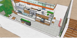
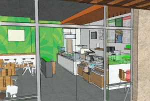
Tenant Improvement at Westgate City Center located adjacent to the University of Phoenix Stadium in Glendale, Arizona. The project consisted of 1,400 s.f. of tenant improvements within an existing suite. Only a few things remained from the original space but a new fresh look to match the branding of Fresh Healthy Café was incorporated. Restaurant design is a coordination of specific equipment with unique electrical and plumbing design. The original layout was a children’s clothing boutique so there were significant changes. The project utilizes sustainable design practices and incorporated environmentally sensitive items such as Bamboo millwork free of formaldehyde binders and harvested using sustainable practices. Use of LED lighting throughout using the latest technology to be energy efficient and minimize maintenance due to bulb replacement. It was important to salvage much of the existing finishes as possible. The wood flooring was retained and the contractor was able to find a match. The existing toilet facilities were retained to minimize waste and un-necessary changes. By salvaging or utilizing much of the existing finishes, there was little waste from the project.
Office Tenant Improvements, Arizona – Tenant undisclosed – 2013
Architectural customization is the driving force behind this signature office space. Taking a vacant shell space within an existing building and creating a work environment that brings both engineering and aesthetics to its design, it created a space which is both functional and comfortable. The space was similar to finding an old car within a barn and conducting a frame up restoration with new mechanical systems, plumbing, electrical systems, walls, doorways and finishes to invent a space that functions like a well oiled machine. Serbin Studio closely collaborated with the client to incorporate their business branding into the space, which serves as a key reminder of their purpose, the world’s leading enterprise with innovative solutions.
Office improvements, Arizona – Tenant undisclosed
[print_gllr id=893]
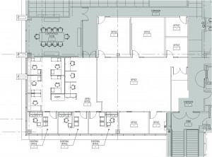
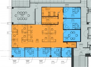
For this existing space, Serbin Studio’s charge was to revitalize the existing 10,000+ s.f. space to create conference rooms, management offices, leasable private offices and public lounge space in a creative, progressive, forward-thinking environment. Approximately 20% of the space to remain occupied during the course of construction. New materials and lighting were incorporated with a result of a seamless integration of old and new that will serve the occupants for years to come.
Ingleside Animal Hospital, Phoenix, Arizona
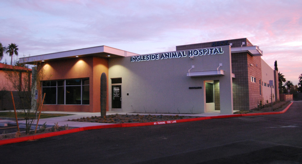
The new commercial facility includes a single story with a basement. The 11,000+ s.f. facility includes 7 exam rooms, pharmacy, offices, treatment, surgery, kennels, grooming, reception and conference room. The building environment is an attractive yet functional and with fresh color palettes and finishes, it creates spaces which are enjoyable to the users, visitors and animals. While LEED certification was not a project goal, the project incorporates many sustainable design practices.
